Comparative Study
. 2025 Apr 1;25(4):13.
doi: 10.1167/jov.25.4.13.

Warm versus cool colors and their relation to color perception

Affiliations
Comparative Study

Warm versus cool colors and their relation to color perception

Jake Manalansan et al. J Vis. .

Abstract

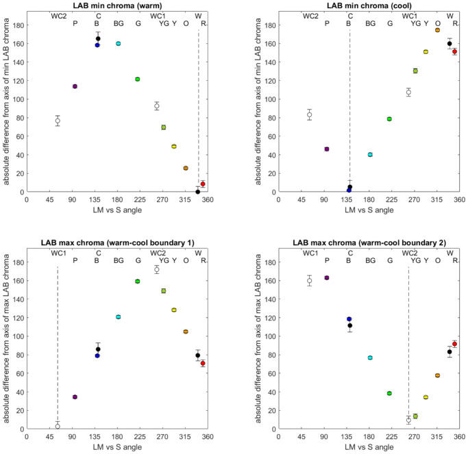
The distinction between warm and cool colors is widely considered a fundamental aspect of human color experience, but whether it reflects properties of color perception or color associations remains unclear. We examined how the warm-cool division is related to perceptual landmarks of color coding and color appearance. Observers made warm-cool ratings for 36 hue angles at three luminance levels and also estimated the angles for their unique (e.g., yellow or red) and binary (e.g., orange) hues. The warm-cool dimension was reliably identified by most observers, was consistent across lightness levels, and varied along an orangish-red to greenish-blue dimension that is intermediate to both the principal chromatic dimensions of early cone-opponent (cardinal) or perceptual-opponent (red-green and blue-yellow) axes. When the stimuli were projected into a uniform color space (CIELAB), a close correspondence was found between the warm-cool dimension and the perceived strength (saturation) of different hues, based on the LAB chroma. Specifically, the peak warm and cool values were hue angles with the weakest saturation, and the boundaries between the two categories corresponded to hue angles with the highest saturation. This pattern could arise if vision is selectively adapted to the spectra of warm and cool colors and provides a potential basis for the strong but unexplained asymmetries in color coding built into perceptually uniform color spaces.


Figures

Figure 1.
Figure 1.
Color space for the experiment, defined by variations in LvsM cone or SvsLM cone signals at constant luminance. Stimuli had a fixed chromatic contrast and varied in angle relative to the neutral gray.
Figure 2.
Figure 2.
Experimental procedure for the warm–cool judgments. Each color was presented in random order and pulsed for 500 ms on, 1500 ms off until the participant rated the warm–cool value using a seven-point scale.
Figure 3.
Figure 3.
Illustration of the experiment for choosing unique and binary hues. The black dot was moved clockwise or counterclockwise to select the angle corresponding to the cued text (red in this example). Note that participants were instructed to estimate the best angle, which could be intermediate to the displayed colors.
Figure 4.
Figure 4.
Representative individual ratings for warm versus cool colors. Each panel shows the mean ratings for warm versus cool (±1 SEM) on a seven-point scale (–3 cool to +3 warm) as a function of the stimulus angle in the LvsM and SvsLM chromatic plane. The three curves show the settings at each luminance level and are arbitrarily shifted vertically by +3 (10 cd/m2 targets), 0 (20 cd/m2), or –3 (40 cd/m2) for clarity. (a) Top panels illustrate typical results from three of 19 observers whose warm–cool ratings systematically varied with chromatic angle. (b) Bottom panels show results from three of six observers who were excluded from subsequent analyses because their settings did not exhibit a consistent warm–cool chromatic axis. Dashed vertical black lines show the LvsM and SvsLM axes of the color space.
Figure 5.
Figure 5.
(ac) Average warm–cool ratings (blue solid line and points) and polynomial fit (red dashed line) for targets at the three luminance levels indicated. Note that the fitted line shows the function used to estimate the cool minimum and warm–cool boundaries. A separate fit (not shown) was used to estimate the warm peak (after phase shifting the data by 180° so that the peak fell closer to the center of the measurement range). Points show the mean across observers ± 1 SE. Colored vertical lines represent the mean values for the eight hue loci, dashed vertical lines represent the LM and S axes, and solid vertical lines represent the warm–cool boundaries.
Figure 6.
Figure 6.
Individual warm–cool boundaries (unfilled symbols, innermost radii) or peaks (second radii), compared to the focal choices for the unique and binary hues, as indicated by the category labels. Dashed lines indicate the average angles for the warm–cool peaks (small dashes) and boundaries (large dashes). The three panels show the settings for the three lightness levels. Note that unique and binary hue settings were only collected at 20 cd/m2 and are repeated across the panels.
Figure 7.
Figure 7.
(af) Comparisons of equivalent stimulus contours in spaces defined by cone-opponent signals (a, c, and e) or scaled for perceptual strength (in CIELAB, b, d, and f). Signals with constant cone-opponent contrast (c) project to stimuli with different predicted saturation (d), and vice versa, so that constant CIELAB chroma (f) project to distorted cone-opponent contrasts (e). Dashed lines in all figures represent the cardinal directions in the cone-opponent plane. Note that our version of the cone-opponent space follows the MacLeod–Boynton diagram in plotting the S (90°–270°) axis as increasing S signals, which is inverted in the CIELAB space.
Figure 8.
Figure 8.
Stimulus sets in the cone-opponent space (left panels) or CIELAB uniform color space (right panels) for the three lightness levels tested. Each panel compares the warm peak (orange), cool peak (cyan), or warm–cool boundaries (gray) to the maxima and minima of the saturations for the constant cone-opponent contrasts in the uniform color space (red).
Figure 9.
Figure 9.
Correspondence between the warm–cool or hue loci and the saturation maxima and minima predicted by the CIELAB chroma of the stimuli. Symbols plot the absolute angular difference between each measured hue angle (given by the labels at the top of each panel) and the angles of each of the four extrema of the LAB contours (shown by the dashed vertical lines). Error bars: ±1 SEM.
Figure 10.
Figure 10.
Predicted warm–cool axis (solid black line) and boundary (dashed line) from the minima (filled symbols) and maxima (unfilled symbols) of iso cone-opponent contrast contours within the CIELAB space. The solid red line plots the warm–cool dimension estimated by Ou et al. (2004).

References

    1. Bosten, J. M., Beer, R. D., & MacLeod, D. I. (2015). What is white? Journal of Vision, 15(16):5, 1–19, 10.1167/15.16.5. - DOI - PMC - PubMed
    1. Bosten, J. M., & Boehm, A. E. (2014). Empirical evidence for unique hues? Journal of the Optical Society of America. A, Optics, Image Science, and Vision, 31(4), A385–A393, 10.1364/JOSAA.31.00A385. - DOI - PubMed
    1. Conway, B. R., Malik-Moraleda, S., & Gibson, E. (2023). Color appearance and the end of Hering's opponent-colors theory. Trends in Cognitive Sciences, 27(9), 791–804, 10.1016/j.tics.2023.06.003. - DOI - PMC - PubMed
    1. Dacey, D. M. (2000). Parallel pathways for spectral coding in primate retina. Annual Review of Neuroscience, 23(1), 743–775, 10.1146/annurev.neuro.23.1.743. - DOI - PubMed
    1. Derrington, A. M., Krauskopf, J., & Lennie, P. (1984). Chromatic mechanisms in lateral geniculate nucleus of macaque. The Journal of Physiology, 357, 241–265, 10.1113/jphysiol.1984.sp015499. - DOI - PMC - PubMed

Publication types

LinkOut - more resources