Review
. 2025 Apr;28(4):e70112.
doi: 10.1111/ele.70112.

Insights Into Spatial Synchrony Enabled by Long-Term Data

Affiliations
Review

Insights Into Spatial Synchrony Enabled by Long-Term Data

Daniel C Reuman et al. Ecol Lett. 2025 Apr.

Abstract

Spatial synchrony, the tendency for temporal fluctuations in an ecological variable to be positively associated in different locations, is a widespread and important phenomenon in ecology. Understanding of the nature and mechanisms of synchrony, and how synchrony is changing, has developed rapidly over the past 2 decades. Many recent developments have taken place through the study of long-term data sets. Here, we review and synthesise some important recent advances in spatial synchrony, with a focus on how long-term data have facilitated new understanding. Longer time series do not just facilitate better testing of existing ideas or more precise statistical results; more importantly, they also frequently make possible the expansion of conceptual paradigms. We discuss several such advances in our understanding of synchrony, how long-term data led to these advances, and how future studies can continue to improve the state of knowledge.

Keywords: changes in synchrony; climate change; long time series; spatial synchrony; stability; timescale‐specific; wavelet.


Figures

FIGURE 1
FIGURE 1
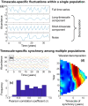
Demonstration of how timescale structure in synchrony can occur and one tool that can help detect it. Panel (a) shows how a single time series can be a superposition of multiple timescale components. This simulated population exhibits both long‐ and short‐timescale fluctuations, plus noncyclical white noise; it is constructed as the mean of these three components. In panel (a), note that the long‐timescale fluctuation (mean period = 7 years) cycles more rapidly over time. We generated 10 time series (panel b) synchronised by this component, but with independently phase‐shifted short‐timescale fluctuations (period = 3 years), and independent noise. Synchrony patterns are not easily visually identified here (b), nor are they detected using conventional pairwise correlations (c); but synchrony is revealed, for instance, by a ‘wavelet phasor mean field’ technique (d) which is among a suite of wavelet tools (e.g., Anderson et al. ; Cazelles et al. ; Cazelles and Stone ; Keitt ; Reuman et al. ; Sheppard et al. , ; Vasseur et al. 2014) now used to study synchrony. The wavelet phasor mean field combines wavelet transforms of multiple time series to reveal aspects of the timescale‐specific structure of synchrony, as well as changes in that structure through time (in this case due to the changing period of the long‐timescale component of panel a). Colours in panel (d) represent intensity of phase synchrony, scaled between 0 and 1, with the black contour line representing significance of phase synchrony (95%). The wavelet phasor mean field is 1Nn=1Npn,σt for the ‘phasors’ pn,σt=wn,σt/wn,σt, where wn,σt is the wavelet transform of the nth available time series evaluated at timescale σ and time t. Significance, here, is tested by comparison to a null hypothesis of random independent phasors (Anderson et al. 2019).
FIGURE 2
FIGURE 2
Prominent timescale structure in synchrony has been explored in a diversity of systems using long‐term data. We here provide some examples. Each panel shows a wavelet phasor mean field, with a significance threshold contour (95%). See Figure 1 for a demonstration of the wavelet phasor mean field technique. Side panels are averages of each main panel across times or timescales. Data were: (a) monthly shorebird counts at 11 beach sites in southern California, USA (Walter et al. 2024); (b) monthly car crash deaths in 41 of the contiguous 48 United States, from the Multiple Cause of Death database, 1999–2020, via the Centers for Disease Control and Prevention Wonder database (Section S1); (c) monthly time series of kelp biomass in 242 locations (500 m stretches of coastline) along the coast of central California, USA (Castorani et al. 2022); (d) annual first‐flight dates of the willow‐carrot aphid ( Cavariella aegopodii ) observed at 11 sites across the UK, from the Rothamsted Insect Survey (Sheppard et al. 2016); (e) annual deer abundance time series in 71 counties in Wisconsin, USA, from the Wisconsin Department of Natural Resources (Anderson et al. 2021); (f) annual time series of phytoplankton abundance as measured by a colour index, from 26 areas, each 2° × 2°, in UK seas, from the Continuous Plankton Recorder Survey (Sheppard et al. 2019); (g) monthly dengue case counts for 72 of the provinces of Thailand, provided by the Thai Ministry of Public Health in their Annual Epidemiological Surveillance Reports (García‐Carreras et al. 2022); and (h) annual ring width index (i.e., growth) time series from 9 bristlecone pine groves in California, Nevada, and Utah, USA, for 1980 years, from the International Tree‐Ring Data Bank (Section S1). Each panel, except for b and h, is a place holder for detailed statistical analyses, reported in the references and differing in nature from system to system, supporting the claim that timescale structure of synchrony in these systems was meaningful and important. Panels (b) and (h) are new, but show similar patterns. Black contours separate plots into a region for which synchrony was significant (containing the reddest colours) and a region where it was not significant (coolest colours) according to the wavelet phasor mean field technique. In some cases, contours include all but the coolest colours. See Section S2 for additional details.
FIGURE 3
FIGURE 3
Synchrony in the phytoplankton colour index (PCI), a colour‐based index of bulk phytoplankton density, in seas around the UK, using (a) data from 1984 to 2013, (b) data from 1958 to 2013, (c) data from 1946 to 2021. Panels show synchrony via the wavelet phasor mean field, with a black contour indicating statistical significance at the 95% level or above (Figure 1), for time series of PCI in 26 locations around the UK. Sheppard et al. (2019) used data from 1958 to 2013 to establish drivers of synchrony (panel b); the shorter and longer time series plots are presented for comparison. Black outlines on panel (a) correspond to the boundaries of the plots on (b) and (c), to facilitate comparisons. The magenta line on panel (c) corresponds to the plot boundaries that would have occurred if data spanned only 1960–1970. Echinoderm larvae and decapod larvae abundances predicted variation of PCI in the 24 year timescale band (this timescale range is spanned by the black bar in panel a), sea surface temperature predicted variation in the 4+ year timescale band (this range is spanned by the red bar in panel b), and Calanus finmarchicus abundance predicted variation across both bands (this range is spanned by the blue bar in panel b). These results were based on the data of Johns (2023).
FIGURE 4
FIGURE 4
Changes in synchrony of three types, demonstrated using idealised time series based on sinusoidal functions with random noise components. Each time series represents a geographically distinct site that is sampled once per unit time (e.g., annually) for 100‐time steps (e.g., years). Panel (a) shows changes in the strength of synchrony: Four locations that initially exhibit no synchrony but begin to fluctuate in unison at a period of 5 years due to decreasing noise and an increasing sinusoidal component. This is reflected in panel (b) with a wavelet mean field depicting synchrony increasing over time at the 5‐year timescale band. Next, panel (c) shows changes in the timescale structure of synchrony: The dominant timescale of synchrony shifts to longer periods over time, caused by modifying the frequency of the sinusoidal functions. This is reflected in panel (d) with a wavelet mean field. The synchronous signal begins at a period of 2 years and increases to a period of 10 years. Black contours in panels (b) and (d) indicate significant synchrony at a given time and timescale. Lastly, panel (e) depicts changes in the geography of synchrony: Four sites exhibit synchrony until experiencing an abrupt change at sites 1 and 2 halfway through the time series. This is demonstrated in panel (f) with two Pearson correlation matrices, visualising among‐site patterns in synchrony before and after the abrupt change. Correlation matrices are used in f because they demonstrate geographies of synchrony in a manner that mean fields cannot.
FIGURE 5
FIGURE 5
Maps showing changing geographies of synchrony in the forb Plantago erecta in Jasper Ridge Biological Preserve following invasion by the non‐native grass Bromus hordeaceus . Synchrony networks (Walter et al. 2017) represent plot locations as network nodes and pairwise synchrony between plots as links (edges). Synchrony was measured using Pearson correlation during two equal‐length periods prior to (1983–2000; panel a) and following (2002–2019; panel b) a marked increase in site‐wide Bromus cover. The strongest 10% of links are drawn. We hypothesise that Bromus becoming widespread altered the competitive environment for Plantago, changing the geography of synchrony. These results were based on a subset of the data from Hallett et al. (2021).
FIGURE 6
FIGURE 6
Figure illustrating the main idea of interacting Moran effects. If each of two environmental variables is itself spatially synchronous, then the degree of alignment of three lags determine the nature of interactions. Solid sine waves (a, c) represent the period‐20 components of an environmental driver in two locations (ϵi1 for i=1,2) and dashed sine waves (b, d) are the period‐20 components of a different driver in the same locations (ϵi2 for i=1,2). Black arrows are peak positive influences of environment on populations, lagged by le1 for ϵi1 and by le2 for ϵi2; these lags differ across the scenarios, but are the same across locations. Red arrows signify maximally negative effects. Peak positive effects of the same variable occur at similar times across locations, illustrated with rectangles, and corresponding to two Moran effects. In the synergistic scenario, the lag between the environmental variables (ln) and the lags of their effects (le1 and le2) are aligned, so peak effects of ϵi1 coincide with peak effects of ϵi2, augmenting synchrony. In the antagonistic scenario, lags are misaligned. So peak positive effects of ϵi1 coincide with peak negative effects of ϵi2, and vice versa, reducing synchrony. Adapted with permission from Reuman et al. (2023).
FIGURE 7
FIGURE 7
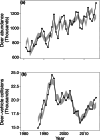
Fluctuations in deer abundance (a) and deer‐vehicle collisions (b) across a 36‐year period. The solid black lines indicate statewide totals across Wisconsin, USA; 3–7 year fluctuations are visible, though superimposed on a trend (a) or a longer‐timescale fluctuation (b). The grey band indicates the 95% quantiles of state‐total time series based on surrogate (i.e., appropriately randomised) county‐level time series modelling what would have occurred if 3–7 year synchrony between the county‐level time series were absent (Anderson et al. 2021) but these local fluctuations were otherwise statistically unchanged: 3–7 year fluctuations in state‐total time series are then absent or much reduced, simply because of the removal of 3‐ to 7‐year synchrony between the county‐level time series. This indicates how timescale‐specific synchrony helps produce the state‐level periodicity. This figure adapted from Anderson et al. (2021).
FIGURE 8
FIGURE 8
Asymmetric tail associations in population synchrony and their mechanisms. (a, b) Right‐tail ATAs lead to greater synchrony at higher population sizes, leading to synchronous population booms. (c, d) Left‐tail ATAs lead to greater synchrony at lower population sizes, leading to synchronous busts. Left‐tail ATAs with synchronous population crashes may arise from ATAs in underlying environmental drivers or from nonlinear population responses to the environment (e, f), see Section 5.3 for details. Panels (a–d) are reproduced from Walter et al. (2022).

References

    1. Abbott, B. W. , Gruau G., Zarnetske J. P., et al. 2018. “Unexpected Spatial Stability of Water Chemistry in Headwater Stream Networks.” Ecology Letters 21: 296–308. - PubMed
    1. Abbott, K. 2007. “Does the Pattern of Population Synchrony Through Space Reveal if the Moran Effect Is Acting?” Oikos 116, no. 6: 903–912. 10.1111/j.0030-1299.2007.15856.x. - DOI
    1. Albert, P. , and Reuman D.. 2023. “Asymmetric Relationships and Their Effects on Coexistence.” Ecology Letters 2023: e06795. - PubMed
    1. Allstadt, A. J. , Liebhold A. M., Johnson D. M., Davis R. E., and Haynes K. J.. 2015. “Temporal Variation in the Synchrony of Weather and Its Consequences for Spatiotemporal Population Dynamics.” Ecology 96: 2935–2946. - PubMed
    1. Anderson, T. , Sheppard L., Walter J., et al. 2019. “The Dependence of Synchrony on Timescale and Geography in Freshwater Plankton.” Limnology and Oceanography 64, no. 2: 483–502. 10.1002/lno.11054. - DOI

LinkOut - more resources