. 2025 May;29(9):e70521.
doi: 10.1111/jcmm.70521.

Target Screening and Single Cell Analysis of Diabetic Retinopathy and Hepatocarcinoma

Affiliations

Target Screening and Single Cell Analysis of Diabetic Retinopathy and Hepatocarcinoma

Yinan Shao et al. J Cell Mol Med. 2025 May.

Abstract

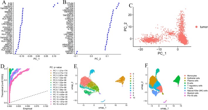
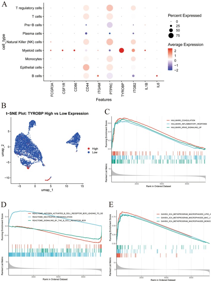
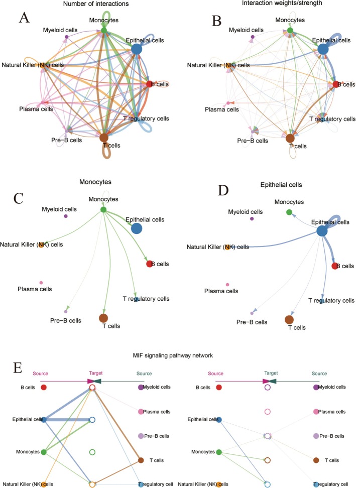
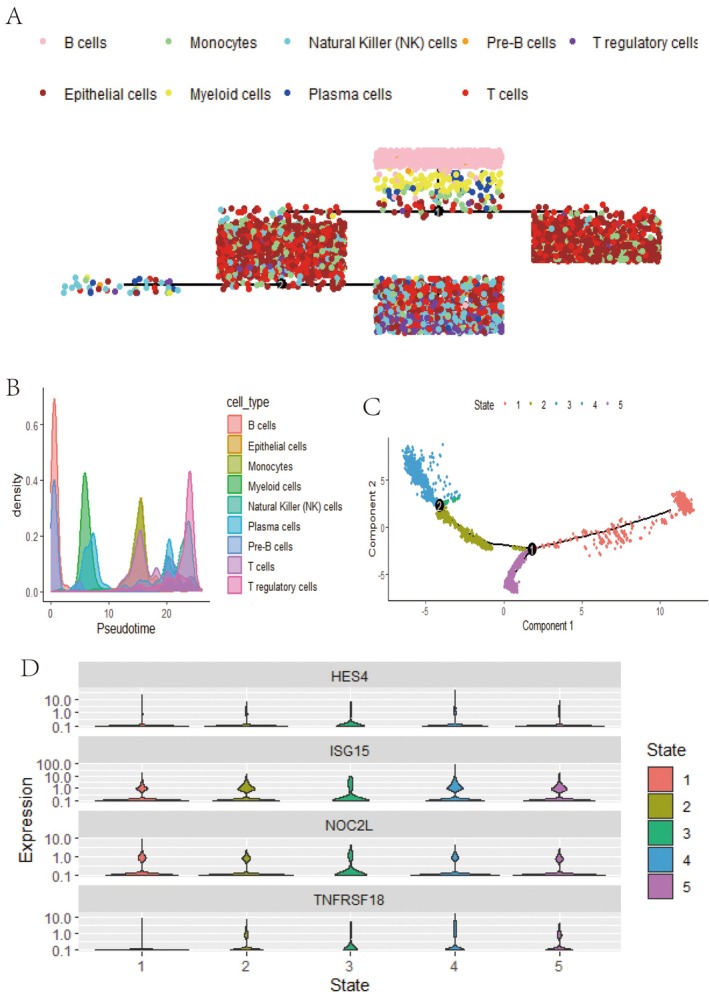
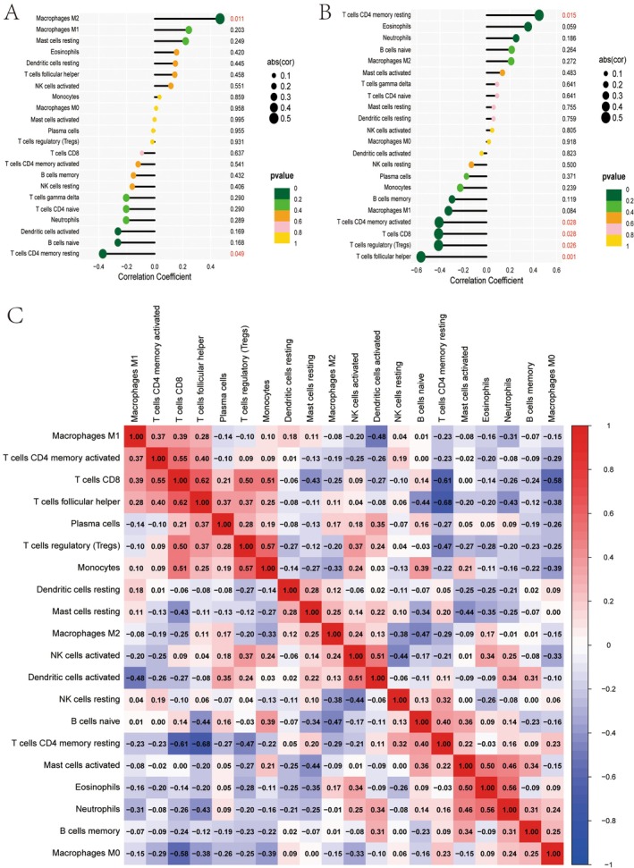
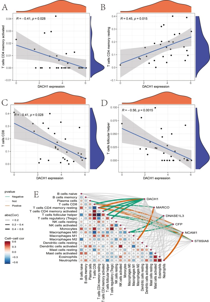
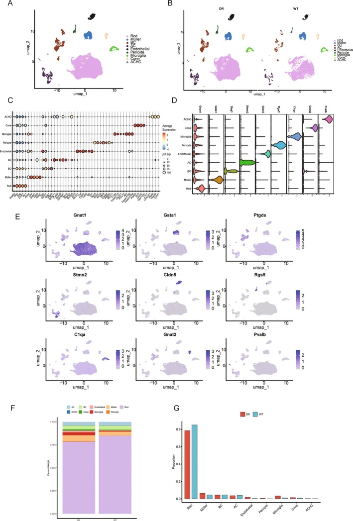
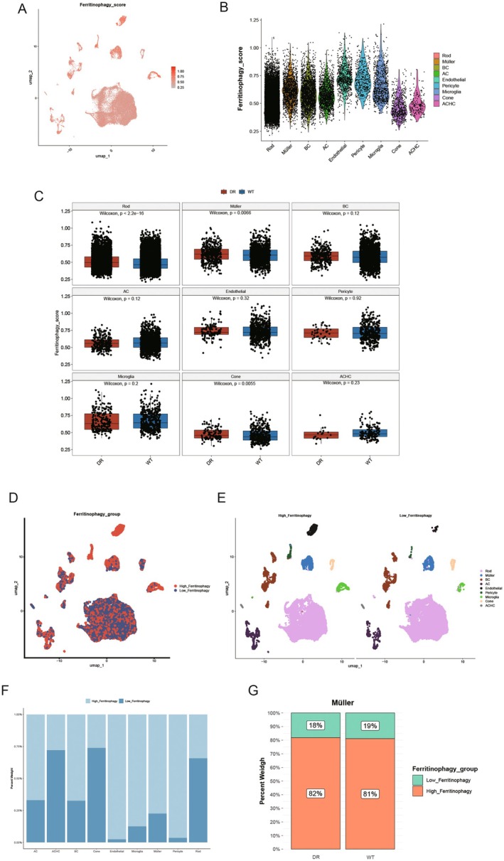
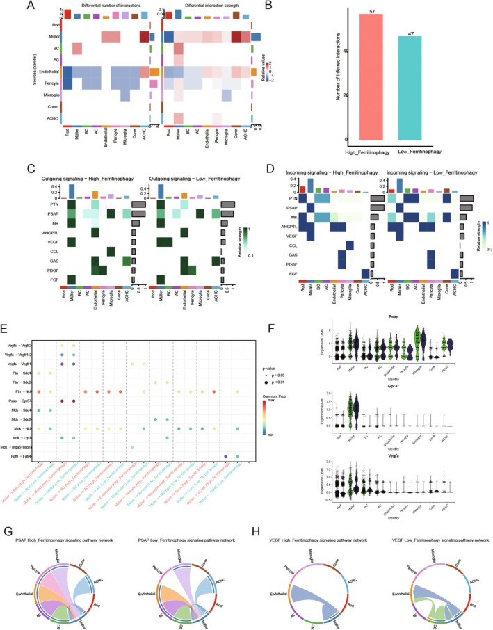
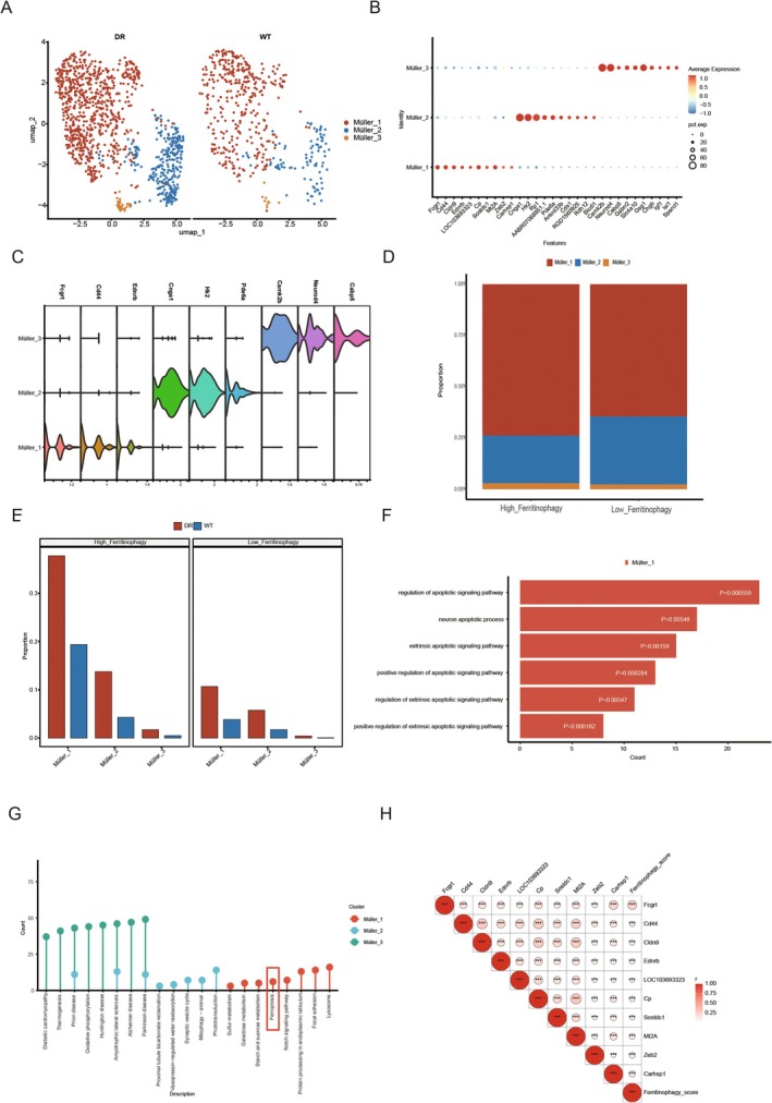
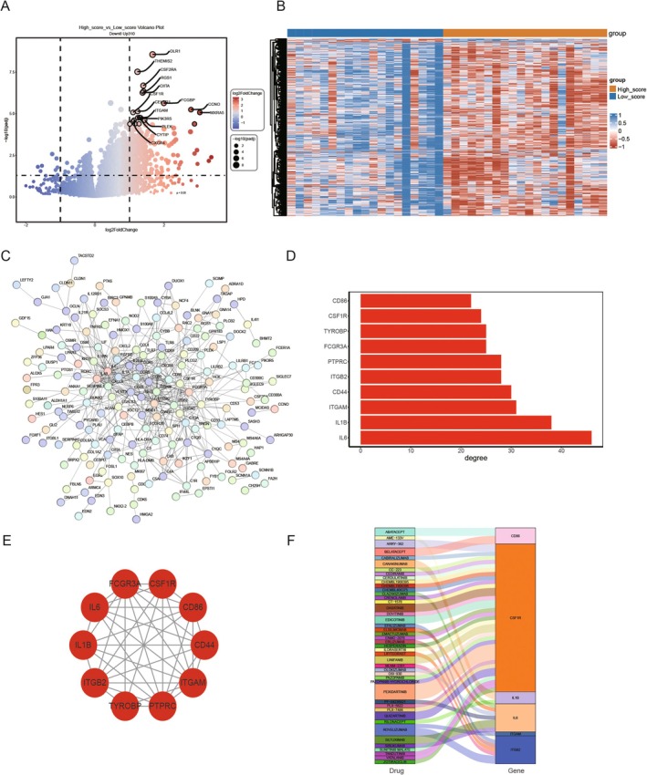
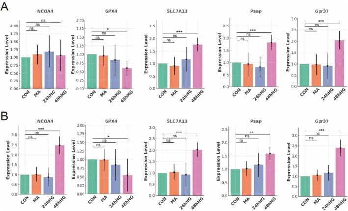
The association between liver cancer and diabetes has been a longstanding focus in medical research. Current evidence suggests that diabetes is an independent risk factor for the development of liver cancer. Diabetic retinopathy (DR), a prevalent neurovascular complication of diabetes, has yet to be fully characterised concerning liver cancer. Therefore, this study seeks to identify shared genes and pathways between liver cancer and DR to uncover potential therapeutic targets. Immune infiltration and cell communication in liver cancer were analysed using the GEO single-cell dataset GSM7494113. Single-cell RNA sequencing data from rat retinas were obtained from the GEO datasets GSE209872 and GSE160306. Ferritin phagocytosis-related genes were retrieved from the GeneCards database. The SeuratR package was employed for single-cell clustering analysis, while the CellChat package assessed differences in intercellular communication. Genes shared between DR and liver cancer were identified, and the DGIDB database was consulted to predict potential drug-gene interactions targeting membrane proteins involved in ferritin phagocytosis. Key ferritin phagocytosis (FRHG) genes were further validated using quantitative real-time polymerase chain reaction (qRT-PCR). After annotating the single-cell data through dimensionality reduction and clustering, the expression of genes associated with membrane protein-related ferritinophagy was notably elevated in both HCC and DR samples. Based on the expression of ferritinophagy-related genes, the ferritin deposition score in Müller cells from the DR group was significantly higher than that in the control group. Cell communication analysis revealed that central hub genes associated with ferritinophagy, such as PSAP and MK, along with other signalling pathways, were significantly upregulated in the high Müller group compared to the low Müller group. In contrast, VEGF expression was enhanced in the low Müller group. Importantly, the machine learning model constructed using these key hub genes demonstrated high diagnostic efficacy for both HCC and DR. Finally, by simulating a hyperosmotic diabetic microenvironment, we confirmed in vitro that high glucose conditions significantly stimulate the expression of the shared key hub genes in both HCC and DR. The present study identified the connection between ferritinophagy-related subgroups of cells and key hub genes in both HCC and DR, providing new insights into DR-associated biomarkers and the shared pathological regulatory pathways with HCC. These findings further suggest potential therapeutic targets for both diseases.

Keywords: Müller cells; diabetic retinopathy; ferritin phagocytosis; liver cancer.


Conflict of interest statement

The authors declare no conflicts of interest.

Figures

FIGURE 1
FIGURE 1
Interpreting the tumour microenvironment heterogeneity of liver cancer. (A, B) Single‐cell gene contributions of PC analysis. (C) Identification and PC analysis of identified HCC cells. (D) PC trajectory of identified sub‐cluster cells in HCC tissue. (E, F) Principle‐based and annotation‐based u‐map of HCC tissue.
FIGURE 2
FIGURE 2
Expression and functional pathway study of TYROBP in cancer. (A) The expression of TYROB and CD44 genes in different immune cells. (B) The differential expression of TYROBP in different immune cells. (C–E) TYROBP and other gene enrichment in pathways such as marker coagulation and marker inflammatory response.
FIGURE 3
FIGURE 3
Cell communication in tumour microenvironment. (A) The number of interactions between different cell types. (B) The weights and strengths of these interactions. (C) The communication network of monocytes. (D) The communication network of endothelial cells. (E) The MIF signalling pathway network.
FIGURE 4
FIGURE 4
Analysis of cell types and gene expression dynamics. (A) Cell type trajectory: Different colours represent each cell type's distribution and evolutionary path along the pseudotime axis. (B) Density plot: Shows the density distribution of different cell types along the pseudotime axis, highlighting transitions in cell populations. (C) Pseudotime trajectory: A dimensionality reduction plot displays the distribution of cells in different states and their progression path. (D) Gene expression: Violin plots show the expression changes of specific genes across different cell states.
FIGURE 5
FIGURE 5
Gene expression and network analysis. (A) Gene expression heatmap: Displays the expression levels of various genes in “Control” and “Treat” group samples, with colours ranging from blue to red indicating low to high expression. (B) Scale independence plot: The relationship between soft‐thresholding power and the scale‐free topology fit index used to select appropriate network parameters. (C) Mean connectivity plot: Illustrates the relationship between soft‐thresholding power and mean connectivity, ensuring network connectivity.
FIGURE 6
FIGURE 6
Weighted gene co‐expression network analysis (WGCNA). (A) Module feature gene clustering: Cluster analysis shows modules with similar expression patterns. (B) Gene tree diagram and module colour: Genes are divided into co‐expressed modules of different colours. (C) Module trait relationship: Heat map displays the correlation between modules and external traits (such as Control and Treat). (D) Gene significance in modules: A bar chart displays the average significance of genes and traits in each module. (E) Black module: Scatter plot displays the correlation between module membership relationships and gene significance within the black module. (F) Blue‐green module: Similar to E, but specific to the blue‐green module.
FIGURE 7
FIGURE 7
Machine learning models and differential gene expression. (A) AUC heatmap: Displays AUC values for different models on the training and GSE25097 datasets, assessing model performance. (B) ROC curve for training Data: AUC is 0.992, indicating excellent performance on the training set. (C) ROC curve for GSE25097 dataset: AUC is 0.798, showing good performance but lower than the training set. (D) Confusion matrix (Train): Shows classification accuracy of the model on the training set. (E) Volcano plot: Illustrates differential gene expression, highlighting significantly up‐regulated and downregulated genes.
FIGURE 8
FIGURE 8
Comprehensive analysis involving gene expression and cell type distribution. (A) Correlation matrix: Displays the correlation and significance between genes. (B) Cell type distribution: Compare the proportion of different immune cell types in the “Control” and “Treat” groups. (C) Gene expression differences: A bar chart displays the average expression differences of specific genes between two groups. (D) ROC curve: The higher the AUC value, the better the predictive performance of different genes or models. (E) Cell type stacking diagram: The relative proportion changes of different cell types in each sample.
FIGURE 9
FIGURE 9
Analysis of immune cell correlations and their associations with specific traits or conditions. (A) Feature 1: Display the correlation between immune cells and Feature 1. (B) Feature 2: Display the correlation between immune cells and Feature 2. (C) Cell correlation heatmap: Displays the positive and negative correlations between immune cells.
FIGURE 10
FIGURE 10
The correlation between DACH1 gene expression and various immune cell types. (A–D) Correlation diagram: The positive and negative correlations between DACH1 and different immune cells and the negative correlation with CD8 T cells. (E) Gene cell network: Displays significant interactions between genes and immune cells, with lines indicating correlation strength and direction.
FIGURE 11
FIGURE 11
Single‐cell dimension reduction cluster analysis of DR. (A) Cell annotation UMAP display; (B) Cell annotated UMAP disease and control group display; (C) Bubble map of marker gene. (D) Violin map of the cell marker gene. (E) Scatter map of marker genes in cells, where one figure represents one gene. (F) Cell proportion bar stack diagram. (G) Cell proportion bar diagram.
FIGURE 12
FIGURE 12
Impact of Ferritinophagy gene on single cells of DR. (A) UMAP display of Ferritinophagy score in cells; (B) Ferritinophagy scores were shown in different cells. (C) Box diagram for analysis of differences in Ferritinophagy scores among different cell disease controls, with one figure representing one cell; (D, E) UMAP shows the grouping of high Ferritinophagy and low Ferritinophagy in cells. (F) Histogram of the proportion of different cells in the high‐low Ferritinophagy group; (G) The proportion of the high‐low Ferritinophagy group in Müller cells in the disease control group was histogram stacked.
FIGURE 13
FIGURE 13
Membrane protein‐mediated Ferritinophagy communication. (A) Compared with the heat map of the number of cell ligand‐receptor pairs in the high‐Ferritinophagy group and the low‐Ferritinophagy group, the closer the colour is to red, the higher the frequency and intensity of cell communication in the high‐Ferritinophagy group, and the closer the colour is to blue, the higher the frequency and intensity of cell communication in the low‐Ferritinophagy group. (B) Bar chart of cell communication frequency in the disease group and control group; (C, D) heat map of the pathway of cell generation communication information (efferent and afferent) in high‐rated and low‐rated groups. The abscess represents the cell, and the ordinate represents the name of the communication pathway. (E) heat maps of up‐regulated and down‐regulated receptor pairs of cells in high and low‐rated groups; (F) expression of ligand‐receptor genes belonging to membrane proteins; (G) the PSAP signalling pathway was shown in the chord diagram between different cells; (H) the Vegf signalling pathway between different cells was shown in the chord diagram. Different colours indicated the communication between different cells, and the width indicated the intensity of communication.
FIGURE 14
FIGURE 14
Analysis of Subsets of Ferritinophagy related cells. (A)UMAP display of Müller subpopulation heterogeneity; (B) marker gene bubble map of the Müller subgroup; (C) marker gene violin diagram of Müller subgroup; (D) Müller subpopulation in high and low ranking group proportion histogram; (E) Histogram of the proportion of Müller subgroup in the disease control group; (F) Bar diagram of autophagy‐related pathways for GO enrichment analysis of subpopulation characteristic genes; (G) Rod diagram for KEGG enrichment analysis; (H) Heat map of correlation between top 10 characteristic genes of Müller1 subgroup and Ferritinophagy score.
FIGURE 15
FIGURE 15
Potential target membrane protein‐mediated iron‐autotropic key subtype gene drugs. (A) Volcano map of differentially expressed genes between high‐rated subgroup and low‐rated subgroup of Bulk cohort; (B) heat map of differential genes; (C) differential gene protein interaction Network (PPI); (D) protein interaction network top10hub gene connectivity display; (E) hub gene network diagram; (F) target drug prediction of hub gene.
FIGURE 16
FIGURE 16
Validation ferritin phagocytosis‐related genes NCOA4, GPX4, SLC7A11 PSAP and GPR37 in Müller and HCC cells. (A) External validation of NCOA4, GPX4, SLC7A11 PSAP, and GPR37 mRNA levels by qRT‐PCR in untreated (control group), mannitol hypertonic group, 24 h high glucose treated group and 48 h high glucose treated group in Müller cells (n = 5). (B) External validation of NCOA4, GPX4, SLC7A11 PSAP, and GPR37 mRNA levels by qRT‐PCR in untreated (control group), mannitol hypertonic group, 24 h high glucose treated group and 48 h high glucose treated group in HepG2 (HCC) cells (n = 5). *p < 0.05; **p < 0.01; ***p < 0.001.

Similar articles

References

    1. O'Neill R. S., Leaver P., Ryan C., Liang S., Sanagapalli S., and Cosman R., “Metastatic Melanoma: An Unexpected Cause of Acute Liver Failure,” Clinical Journal of Gastroenterology 17, no. 6 (2024): 1125–1129, 10.1007/s12328-024-02039-1. - DOI - PMC - PubMed
    1. Cao J. Z., Wang C. Q., Shi Z., et al., “NOVA2 Regulates the Properties of Liver Cancer Stem Cells and Lenvatinib Resistance in Hepatocellular Carcinoma via the Wnt Pathway,” Journal of Gastrointestinal Oncology 15, no. 4 (2024): 1674–1685. - PMC - PubMed
    1. Kubo T., Yanagihara K., Nishimura Y., et al., “Antitumor Effect of Oleoyl‐siRNA Against Pancreatic Cancer Using a Portal Vein Infusion Liver‐Metastatic Mouse Model,” Molecular Pharmaceutics 21 (2024): 5115–5125. - PubMed
    1. Sun Z., Liu L., Xin M., et al., “Tumor Complete Response and Pyogenic Liver Abscess Secondary to Concurrent Microwave Ablation Plus Atezolizumab and Bevacizumab in Liver Cancer: A Case Report,” Journal of Gastrointestinal Oncology 15, no. 4 (2024): 1973–1980. - PMC - PubMed
    1. Ho N. T., Abe S. K., Rahman M. S., et al., “Diabetes Is Associated With Increased Liver Cancer Incidence and Mortality in Adults: A Report From Asia Cohort Consortium,” International Journal of Cancer 155, no. 5 (2024): 854–870. - PubMed

MeSH terms