. 2025 Apr 28;16(1):3961.
doi: 10.1038/s41467-025-59246-8.

Multi-country and intersectoral assessment of cluster congruence between pipelines for genomics surveillance of foodborne pathogens

Affiliations

Multi-country and intersectoral assessment of cluster congruence between pipelines for genomics surveillance of foodborne pathogens

Verónica Mixão et al. Nat Commun. .

Abstract

Different laboratories employ different Whole-Genome Sequencing (WGS) pipelines for Food and Waterborne disease (FWD) surveillance, casting doubt on the comparability of their results and hindering optimal communication at intersectoral and international levels. Through a collaborative effort involving eleven European institutes spanning the food, animal, and human health sectors, we aimed to assess the inter-pipeline clustering congruence across all resolution levels and perform an in-depth comparative analysis of cluster composition at outbreak level for four important foodborne pathogens: Listeria monocytogenes, Salmonella enterica, Escherichia coli, and Campylobacter jejuni. We found a general concordance between allele-based pipelines for all species, except for C. jejuni, where the different resolution power of allele-based schemas led to marked discrepancies. Still, we identified non-negligible differences in outbreak detection and demonstrated how a threshold flexibilization favors the detection of similar outbreak signals by different laboratories. These results, together with the observation that different traditional typing groups (e.g., serotypes) exhibit a remarkably different genetic diversity, represent valuable information for future outbreak case-definitions and WGS-based nomenclature design. This study reinforces the need, while demonstrating the feasibility, of conducting continuous pipeline comparability assessments, and opens good perspectives for a smoother international and intersectoral cooperation towards an efficient One Health FWD surveillance.


Conflict of interest statement

Competing interests: The authors declare no competing interests.

Figures

Fig. 1
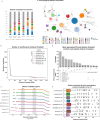
Fig. 1. Summary of the different countries and sectors involved in the assessment of pipeline cluster congruence.
The diversity of pipelines used for FWD surveillance is indicated per country, sector, and species.
Fig. 2
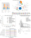
Fig. 2. Assessment of allele-based clustering at all possible threshold levels for L. monocytogenes and comparison with traditional MLST.
a Composition of the L. monocytogenes dataset used in this study in terms of ST in comparison with datasets of previous studies (Maury et al. 2016 and Moura et al. 2016), the LiSeq project and the BIGSdb database, as of November 2021. A GrapeTree visualization of the MST obtained with the INNUENDO-like pipeline is shown. Nodes (i.e., samples) are collapsed at the threshold with the highest congruence with CC (508 ADs for this pipeline) and colored according to the ST classification. b Number of partitions obtained by each pipeline at each possible distance threshold. c Clustering stability regions determined for each pipeline. To better distinguish each region (represented by separated rectangle blocks), the different blocks are vertically phased, starting in a different line. Distance thresholds (x axis) are presented in log2 scale. d Barplot (top) with the number of samples of the top represented STs (≥50 samples) in L. monocytogenes dataset, with a swarmplot (bottom) indicating the AD threshold at which each pipeline clusters together all samples of each ST. e Distribution of the AD thresholds at which each pipeline clusters together all samples of a given ST (n = 219). Boxplots show the interquartile range (25% to 75%) and median, and whiskers extend 1.5 times the range, with outliers (diamond symbol) plotted separately. The outlier STs are indicated above the respective symbol. Source data are provided as a Source Data file.
Fig. 3
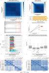
Fig. 3. Cluster congruence at all threshold levels and overlap in detecting outbreak signals for L. monocytogenes.
a Heatmap with the CS of two pipelines (details on each pairwise comparison are in Supplementary Data 2, with chewieSnake vs. Bionumerics using the HC algorithm being presented here as an example). The inverted dendrogram (i.e., from the highest to the lowest resolution) and dashed red lines illustrate how the congruence is related with the dataset’s phylogenetic structure (dendrogram obtained with Bionumerics and visualized in auspice.us). b Zoom-in in the high resolution level highlighted in the orange square of (a). c Bi-directional corresponding points (gray lines) connecting thresholds providing similar clustering in the two pipelines exemplified in (a). d Illustrative linear trend lines expected for the corresponding points with a slope deviation of 10% and 20% to be used as scale reference for the boxplots. Boxplots present the slope distribution for allele vs. allele (orange, n = 58) and SNP. vs. SNP (blue, n = 22) pipeline comparisons for the linear trend lines with a r2 ≥ 0.99, illustrated in Supplementary Data 2 and detailed in Supplementary Data 6 (“n” refers to the number of comparisons with r2 ≥ 0.99 over the total number of comparisons). The boxplot of the allele vs. SNP scenario is not presented due to the low number of comparisons with r2 ≥ 0.99 (Supplementary Data 6). e Density of the distance thresholds required for the identification of clusters detected by at least one allele-based pipeline at 7 ADs. Only clusters having the same composition in all allele-based pipelines were included (n = 316). f Distribution of the difference between the minimum and maximum AD threshold needed to detect the same clusters across allele-based pipelines, using the clusters of (e) (n = 316). g Overlap between the genetic clusters detected at 7 ADs. h Overlap between the genetic clusters detected by one pipeline at 7 ADs and those detected by the others at ≤ 9 ADs. Boxplots in (d) and (f) show the interquartile range and median, and whiskers extend 1.5 times the range, with outliers plotted separately. Source data are provided as a Source Data file.
Fig. 4
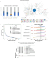
Fig. 4. Assessment of allele-based clustering at all possible threshold levels for S.enterica and comparison with traditional MLST and serotype.
a Composition of the S. enterica dataset used in this study in terms of serotype and in comparison with datasets of previous studies (INNUENDO and BioProject PRJEB20997), and the Enterobase database, as of November 2021. A GrapeTree visualization of the MST obtained with the INNUENDO-like-INNUENDO99 pipeline is shown. Nodes (i.e., samples) are collapsed at the threshold with highest congruence with serotype (1514 ADs for this pipeline) and colored according to the ST classification. b Number of partitions obtained by each pipeline at each possible distance threshold. c Clustering stability regions determined for each pipeline. To better distinguish each region (represented by separated rectangle blocks), the different blocks are vertically phased, starting in a different line. Distance thresholds (x axis) are presented in log2 scale. d Barplot (top) with the number of samples of the top represented serotypes (≥50 samples) in S. enterica dataset, with a swarmplot (bottom) indicating the AD threshold at which each pipeline clusters together all samples of each serotype. Source data are provided as a Source Data file.
Fig. 5
Fig. 5. Cluster congruence at all threshold levels and of overlap in detecting outbreak signals for S. enterica.
a Heatmap with the CS of two pipelines (details on each pairwise comparison are in Supplementary Data 10, with Bionumerics vs. chewieSnake using the HC algorithm being presented here as an example). The inverted dendrogram (i.e., from the highest to the lowest resolution) and dashed red lines illustrate how the congruence is related to the dataset’s phylogenetic structure (dendrogram obtained with chewieSnake and visualized in auspice.us). b Zoom-in in on the high resolution level highlighted in orange in (a). c Bi-directional corresponding points (gray lines) connecting thresholds providing similar clustering in the two pipelines exemplified in (a). d Illustrative linear trend lines expected for the corresponding points with a slope deviation of 10% and 20% to be used as scale reference for the boxplots. The boxplot presents the slope distribution for allele vs. allele (orange, n = 90) pipeline comparisons for the linear trend lines with r2 ≥ 0.99, illustrated in Supplementary Data 10 and detailed in Supplementary Data 14 (“n” refers to the number of comparisons with r2 ≥ 0.99 over the total number of comparisons). The boxplots of the SNP vs. SNP and allele vs. SNP scenarios are not presented due to the low number of comparison with r2 ≥ 0.99 (Supplementary Data 14). e Density of the distance thresholds required for the identification of clusters detected by at least one allele-based pipeline at 14 ADs. Only clusters having the same composition in all allele-based pipelines were included (n = 255). f Distribution of the difference between the minimum and maximum AD threshold needed to detect the same clusters across allele-based pipelines, using the clusters of (e) (n = 255). g Overlap between the genetic clusters detected at 14 ADs. h Overlap between the genetic clusters detected by one pipeline at 14 ADs and those detected by the others at ≤16 ADs. Boxplots in (d) and (f) show the interquartile range and median, and whiskers extend 1.5 times the range, with outliers plotted separately. Source data is provided as a Source Data file.
Fig. 6
Fig. 6. Assessment of allele-based clustering at all possible threshold levels for E. coli and comparison with traditional MLST and serotype.
a Composition of the E. coli dataset used in this study in terms of serotype in comparison with the composition of the datasets of previous studies (INNUENDO and BioProject PRJNA230969,), and the Enterobase database, as of November 2021. A GrapeTree visualization of the MST obtained with the INNUENDO-like-INNUENDO99 pipeline is shown. Nodes (i.e., samples) are collapsed at the threshold with the highest congruence with serotype (620 ADs for this pipeline) and colored according to the ST classification. b Number of partitions obtained by each pipeline at each possible distance threshold. c Clustering stability regions are determined for each pipeline. To better distinguish each region (represented by separate rectangular blocks), the different blocks are vertically phased, starting in a different line. Distance thresholds (x axis) are presented in log2 scale. d Barplot (top) with the number of samples of the most represented serotype (O157:H7) and ST (ST11) in E. coli dataset, with a swarmplot (bottom) indicating the AD threshold at which each pipeline clusters together all samples of each of them. Source data are provided as a Source Data file.
Fig. 7
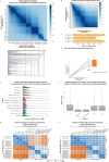
Fig. 7. Cluster congruence at all threshold levels and overlap in detecting outbreak signals for E. coli.
a Heatmap with the CS of two pipelines (details on each pairwise comparison are in Supplementary Data 19, with INNUENDO-like-Enterobase vs. INNUENDO-like-INNUENDO99 using the HC algorithm being presented here as an example). The inverted dendrogram (i.e., from the highest to the lowest resolution) and dashed red lines illustrate how the congruence is related with the dataset’s phylogenetic structure (dendrogram obtained with INNUENDO-like-INNUENDO99 and visualized in auspice.us). b Zoom-in in the high resolution level highlighted in orange in (a). c Bi-directional corresponding points (gray lines) connecting thresholds providing similar clustering in the two pipelines exemplified in (a). d Illustrative linear trend lines expected for the corresponding points with a slope deviation of 10% and 20% to be used as scale reference for the boxplots. The boxplot presents the slope distribution for allele vs. allele (orange, n = 68) pipeline comparisons for the linear trend lines with r2 ≥ 0.99, illustrated in Supplementary Data 19 and detailed in Supplementary Data 23 (“n” refers to the number of comparisons with r2 ≥ 0.99 over the total number of comparisons). The boxplot of the allele vs. SNP scenario is not presented due to the low number of comparisons with r2 ≥ 0.99 (Supplementary Data 23). e Density of the distance thresholds required for the identification of clusters detected by at least one allele-based pipeline at 9 ADs. Only clusters having the same composition in all allele-based pipelines were included (n = 185). f Distribution of the difference between the minimum and maximum AD threshold needed to detect the same clusters across allele-based pipelines, using the clusters of (e) (n = 185). g Overlap between the genetic clusters detected at 9 ADs. h Overlap between the genetic clusters detected by one pipeline at 9 ADs and those detected by the others at ≤ 12 ADs. Boxplots in (d) and (f) show the interquartile range and median, and whiskers extend 1.5 times the range, with outliers plotted separately. Source data are provided as a Source Data file.
Fig. 8
Fig. 8. Assessment of allele-based clustering at all possible threshold levels for C.jejuni and comparison with traditional MLST.
a Composition of the C. jejuni dataset used in this study in terms of CC and in comparison with the composition of the INNUENDO dataset and the PubMLST database, as of November 2021. A GrapeTree visualization of the MST obtained with the INNUENDO-like-PubMLST pipeline is shown. Nodes (i.e., samples) are collapsed at the threshold with highest congruence with CC (839 ADs for this pipeline) and colored according to the ST classification. b Number of partitions obtained by each pipeline at each possible distance threshold. c Clustering stability regions determined for each pipeline. To better distinguish each region (represented by separated rectangle blocks), different blocks are vertically phased, starting in a different line. Distance thresholds (x axis) are presented in log2 scale. d Barplot (top) with the number of samples of the top represented CCs (≥50 samples) in C. jejuni dataset, with a swarmplot (bottom) indicating the AD threshold at which each pipeline clusters together all samples of each CC. Source data are provided as a Source Data file.
Fig. 9
Fig. 9. Cluster congruence at all threshold levels and overlap in detecting outbreak signals for C.
jejuni. a Heatmap with the CS of two pipelines (details on each pairwise comparison are in Supplementary Data 28, with Bionumerics vs. INNUENDO-like-INNUENDO99 using the HC algorithm being presented here as an example). The inverted dendrogram (i.e., from the highest to the lowest resolution) and dashed red lines illustrate how the congruence is related with the dataset’s phylogenetic structure (dendrogram obtained with INNUENDO-like-INNUENDO99 and visualized in auspice.us). b Zoom-in in the high resolution level highlighted in orange in (a). c Bi-directional corresponding points (gray lines) connecting thresholds providing similar clustering results in the two pipelines exemplified in (a). d Illustrative linear trend lines expected for the corresponding points with a slope deviation of 10% and 20% to be used as scale reference for the boxplots. The boxplot presents the slope distribution for allele vs. allele (orange, n = 104) pipeline comparisons for the linear trend lines with r2 ≥ 0.99, illustrated in Supplementary Data 28 and detailed in Supplementary Data 32 (“n” refers to the number of comparisons with r2 ≥ 0.99 over the total number of comparisons). The boxplots of the SNP vs. SNP and allele vs. SNP scenarios are not presented due to the low number of comparisons with r2 ≥ 0.99 (Supplementary Data 32). e Density of the distance thresholds required for the identification of clusters detected by at least one allele-based pipeline at 4 ADs. Only clusters having the same composition in all allele-based pipelines were included (n = 430). f Distribution of the difference between the minimum and maximum AD threshold needed to detect the same clusters across allele-based pipelines, using the clusters of (e) (n = 430). g Overlap between the genetic clusters detected at 4 ADs. h Overlap between the genetic clusters detected by one pipeline at 4 ADs and those detected by the others at ≤4 ADs. Boxplots in (d) and (f) show the interquartile range and median, and whiskers extend 1.5 times the range, with outliers plotted separately. Source data are provided as a Source Data file.

Similar articles

Cited by

References

    1. WHO. Estimating the burden of foodborne diseases: A practical handbook for countries. https://www.who.int/publications/i/item/9789240012264 (2021).
    1. Gardy, J. L. & Loman, N. J. Towards a genomics-informed, real-time, global pathogen surveillance system. Nat. Rev. Genet.19, 9–20 (2018). - PMC - PubMed
    1. Mackenzie, J. S. & Jeggo, M. The One Health Approach-Why Is It So Important? Trop. Med. Infect. Dis.4, 88 (2019). - PMC - PubMed
    1. Gerner-Smidt, P. et al. Whole genome sequencing: bridging one-health surveillance of foodborne diseases. Front Public Health7, 172 (2019). - PMC - PubMed
    1. Struelens, M. J. et al. Real-time genomic surveillance for enhanced control of infectious diseases and antimicrobial resistance. Front. Sci. Ser.2, 1298248 (2024).

LinkOut - more resources