[Preprint]. 2025 Apr 10:arXiv:2504.07824v1.

Go Figure: Transparency in neuroscience images preserves context and clarifies interpretation

Affiliations

Go Figure: Transparency in neuroscience images preserves context and clarifies interpretation

Paul A Taylor et al. ArXiv. .

Abstract

Visualizations are vital for communicating scientific results. Historically, neuroimaging figures have only depicted regions that surpass a given statistical threshold. This practice substantially biases interpretation of the results and subsequent meta-analyses, particularly towards non-reproducibility. Here we advocate for a "transparent thresholding" approach that not only highlights statistically significant regions but also includes subthreshold locations, which provide key experimental context. This balances the dual needs of distilling modeling results and enabling informed interpretations for modern neuroimaging. We present four examples that demonstrate the many benefits of transparent thresholding, including: removing ambiguity, decreasing hypersensitivity to non-physiological features, catching potential artifacts, improving cross-study comparisons, reducing non-reproducibility biases, and clarifying interpretations. We also demonstrate the many software packages that implement transparent thresholding, several of which were added or streamlined recently as part of this work. A point-counterpoint discussion addresses issues with thresholding raised in real conversations with researchers in the field. We hope that by showing how transparent thresholding can drastically improve the interpretation (and reproducibility) of neuroimaging findings, more researchers will adopt this method.


Figures

Figure 1.
Figure 1.
Results reporting examples, showing a single slice of task-based FMRI data (see Chen, Pine, et al., 2022). Each neuroimaging panel shows the same axial slice in MNI template space at z = 36S (image left = subject left), with thresholding is applied at voxelwise p = 0.001 and cluster size = 40 voxels (FWE = 5%). The data used for both overlay coloration and thresholding are the Z-score statistics. Panel A displays FMRI results using conventional strict (or opaque) thresholding, and shows one cluster in the right intraparietal sulcus. Panel B displays the same results with transparent thresholding (suprathreshold regions are opaque and outlined; subthreshold regions fade as the statistic decreases), revealing relevant context in the subthreshold regions that are hidden in A. Panel C shows a classic example from Anscombe (1973) of the risks of over-reducing data, here for a simple scatterplot. Panel D shows how the same considerations apply to neuroimaging: each dataset would have very different interpretations and biological implications, which can be appreciated with transparent thresholding (same colorbar as B), but when using opaque thresholding that context is lost and each slice reduces to the same image (that of panel A). Only by displaying the more full context with subthreshold visualization can the degeneracy be broken and results more accurately understood. Opaque thresholding removes context and can often lead to a misinterpretation of results.
Figure 2.
Figure 2.
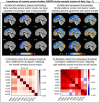
Visualizing results from 9 teams who participated in NARPS (Botvinik-Nezer et al., 2020); team IDs are shown in each panel. Panels A-B show Z and t statistic maps in the same sagittal slice of MNI space and thresholded at |Z| or |t| = 3. Panel A shows the results with opaque thresholding (in line with the study’s primary meta-analysis), which suggest high variability, inconsistency and disagreement across teams. Panel C shows the corresponding similarity matrix (using Dice coefficients for the binarized cluster maps), which quantifies the generally poor agreement. Panel B shows the same data with transparent thresholding (in line with the study’s second meta-analysis), where it becomes apparent that the results actually agree strongly for most subjects, but with varied strength. Panel D shows the corresponding similarity matrix (using Pearson correlation for the continuous statistic maps), showing the typically higher similarity. Transparent thresholding does not uniformly increase similarity, but allows for clearer interpretation of real differences (e.g., bottom right image). Opaque thresholding biases towards dissimilarity (e.g., 3rd column, top and middle). See Taylor et al. (2023) for similar comparisons across the full set of NARPS teams and hypotheses, where the same patterns hold.
Figure 3.
Figure 3.
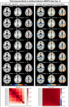
Each panel shows the same axial slices in MNI template space at z = 21S, 32S, 43S (image left = subject left) from NARPS data, Hyp. 2 and 4. The overlay values are effect estimates, in units of BOLD% signal change per dollar for this gambling task, and statistic values were used for thresholding (voxelwise p = 0.001; cluster-level FWE = 5%). All suprathreshold clusters are highlighted with white outlines, for visibility. The top row shows the full group number of subjects (Nsubj), and subsequent rows show results with 1 subject removed. Changes in cluster count (Nclust) are noted for each row. Changes in cluster results —in terms of both coverage and number—are more apparent in Panel A, where opaque thresholding is used. The changes are not simply convergent or monotonic. The magenta arrow highlights a cluster in the left inferior parietal lobule which disappears and reappears with varying Nsubj. The results with transparent thresholding in Panel B are less sensitive to Nsubj changes and also provide useful context. For example, the region highlighted with the magenta arrow appears to have left-right symmetry in negative BOLD response; this information is missed with opaque thresholding. The bottom of each column shows a similarity matrix for each thresholding style (as in Fig. 2), for an extended set of Nsubj. These reflect the striking sensitivity of opaque thresholding (Dice_all, left) with the more stable transparent thresholding (Corr_coef, right).
Figure 4.
Figure 4.
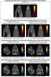
Panel A shows the lone figure from the famous “dead salmon study” (Bennett et al., 2009; with permission of the authors). The figure is opaquely thresholded and only shows results before the recommended multiple comparisons adjustment; by not including the after image, many readers have misinterpreted the overall study message, even though it is clearly repeated throughout the text. Panel B shows a simple improvement to make the figure’s message clearer and reduce the likelihood of misinterpretation, by including both before- and after-adjustment images. Panel C shows the new validation salmon in the same manner as Panel B, replicating the original results with opaque thresholding. Panel D shows how more complete context can be added to further reduce risks of misinterpretation by thresholding transparently (suprathreshold regions outlined in green), displaying the effect estimate in units of BOLD % signal change as overlay colors, and even showing results outside the subject anatomy. This extra information would provide valuable evidence that any cluster that might survive here—which is possible even when including multiple comparisons adjustment—is likely noise due to the background pattern, high noise floor and likely low effect estimate value.
Figure 5.
Figure 5.
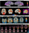
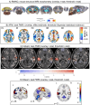
Example images of transparent thresholding from various software implementations (and see Figs. 6 and 7 for more examples). Descriptions of the data and software usage are provided in the Supplements.
Figure 6.
Figure 6.
Example images of transparent thresholding from various software implementations (and see Figs. 5 and 7 for more examples). Descriptions of the data and software usage are provided in the Supplements.
Figure 7.
Figure 7.
Example images of transparent thresholding from various software implementations (and see Figs. 5 and 6 for more examples). Descriptions of the data and software usage are provided in the Supplements.

References

    1. Ad-Dab’bagh Y, Einarson D, Lyttelton O, Muehlboeck J-S, Mok K, Ivanov O, Vincent RD, Lepage C, Lerch J, Fombonne E, Evans AC (2006). The CIVET image-processing environment: A fully automated comprehensive pipeline for anatomical neuroimaging research. Proc. OHBM-2006. http://www.bic.mni.mcgill.ca/users/yaddab/Yasser-HBM2006-Poster.pdf
    1. Allen EA, Erhardt EB, Calhoun VD (2012). Data Visualization in the Neurosciences: overcoming the Curse of Dimensionality. Neuron 74:603–608. - PMC - PubMed
    1. Amrhein V, Greenland S, McShane B (2019). Scientists rise up against statistical significance. Nature 567:305–307 - PubMed
    1. Anscombe FJ (1973). Graphs in Statistical Analysis. The American Statistician 27(1):17–21
    1. Bacchetti P (2013). Small sample size is not the real problem. Nat Rev Neuroscience 14, 585. - PubMed

Publication types

LinkOut - more resources