. 2025 Jun;642(8068):653-661.
doi: 10.1038/s41586-025-08946-8. Epub 2025 Apr 30.

Plant diversity dynamics over space and time in a warming Arctic

Affiliations

Plant diversity dynamics over space and time in a warming Arctic

Mariana García Criado et al. Nature. 2025 Jun.

Abstract

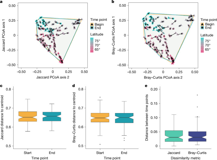
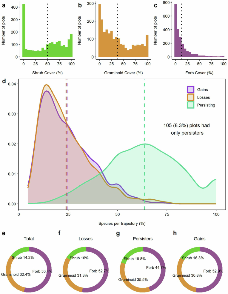
The Arctic is warming four times faster than the global average1 and plant communities are responding through shifts in species abundance, composition and distribution2-4. However, the direction and magnitude of local changes in plant diversity in the Arctic have not been quantified. Using a compilation of 42,234 records of 490 vascular plant species from 2,174 plots across the Arctic, here we quantified temporal changes in species richness and composition through repeat surveys between 1981 and 2022. We also identified the geographical, climatic and biotic drivers behind these changes. We found greater species richness at lower latitudes and warmer sites, but no indication that, on average, species richness had changed directionally over time. However, species turnover was widespread, with 59% of plots gaining and/or losing species. Proportions of species gains and losses were greater where temperatures had increased the most. Shrub expansion, particularly of erect shrubs, was associated with greater species losses and decreasing species richness. Despite changes in plant composition, Arctic plant communities did not become more similar to each other, suggesting no biotic homogenization so far. Overall, Arctic plant communities changed in richness and composition in different directions, with temperature and plant-plant interactions emerging as the main drivers of change. Our findings demonstrate how climate and biotic drivers can act in concert to alter plant composition, which could precede future biodiversity changes that are likely to affect ecosystem function, wildlife habitats and the livelihoods of Arctic peoples5,6.


Conflict of interest statement

Competing interests: The authors declare no competing interests.

Figures

Fig. 1
Fig. 1. Representation of our dataset in geographical, climatic and biotic space and its temporal resolution.
a, Distribution of study areas, coloured according to mean plot-level plant richness per study area (n = 45). This mean calculation is for visualization purposes only, with all analyses and estimates presented elsewhere using individual plot-level richness, unless stated otherwise. A few study areas are labelled for reference. Polar projection with a southern limit of 57° N. Map created in R with the ggOceanMapsData package v.1.4, which uses base layers from Natural Earth (https://www.naturalearthdata.com/). b, Subsites included in this study as a function of their climatic space, coloured according to their mean plot-level richness (n = 115). Background grey points represent a selection of 1,189 randomly extracted geographical coordinates from the Circumpolar Arctic Vegetation Map. Subsites included in our study cover an extensive gradient of Arctic climatic conditions (Extended Data Fig. 4). c, Relationship between mean cover (calculated as average cover over the entire monitoring period) of the different functional groups per plot (n = 2,174). Species-rich plots had greater forb cover, whereas greater graminoid cover was associated with species-poor plots. Cover of all three functional groups were negatively correlated. Points represent plots and are coloured according to mean plot richness. Black points indicate mean plot cover for each functional group on each axis and the black point inside the ternary plot indicates the mean cover overall. d, Duration of monitoring for all plots in our dataset (n = 2,174). Only plots that were monitored for more than 5 years (in dark grey) were included in temporal analyses (n = 1,266 plots), while those monitored shorter than 5 years (in light grey) were included only in the spatial analyses (n = 908 plots). The dotted line indicates the 5-year duration boundary. For a survey timeline, see Extended Data Fig. 3.
Fig. 2
Fig. 2. There was no directional change in Arctic species richness on average.
a, There was no clear relationship between species richness change and latitude (Supplementary Table 3, model 51). Richness change values were calculated as the slope estimate of the linear models of richness change over time per plot and then averaged to the study area level (n = 25) for visualization purposes. Points are coloured and sized according to their richness change value. Polar projection map created in R with the ggOceanMapsData package v.1.4, which uses base layers from Natural Earth (https://www.naturalearthdata.com/). b, Richness did not change directionally over time. Points represent richness per plot and per year, coloured according to latitude. The dashed line and grey band represent the output from the high-level model in Supplementary Table 1. c, Mean richness change (n = 1,266 plots) as the slope of richness over time per plot. The dashed blue line represents mean richness change. Histogram bin width is 0.1. Model structure and output are from the high-level model in Supplementary Table 1. d, Richness did not increase at subsites with stronger long-term warming trends. Points represent richness change as slope subsite-level estimates (n = 90), extracted from the high-level model in Supplementary Table 1 and coloured according to climatology. MTWQ, mean temperature of the warmest quarter. e, Richness decreased where erect shrubs (but not dwarf shrubs) increased over time (Supplementary Table 3, models 52 and 52b). Points are coloured according to mean shrub cover. f, Richness increased where forbs increased over time (Supplementary Table 3, model 53). Points are coloured according to mean forb cover per plot. Richness change estimates per plot in e and f are extracted from the richness-over-time linear model. Dashed lines indicate a model in which the CIs on the slope overlapped with zero, solid lines indicate CIs that did not overlap with zero and bands show the 95% CIs of the models.
Fig. 3
Fig. 3. Local climate, climate change and shrubification influenced temporal turnover and species trajectories.
a, Relationships between MTWQ and two temporal turnover metrics: Jaccard (presence–absence turnover) and Bray–Curtis (presence–absence and abundance turnover). Model outputs are in Supplementary Table 3, models 12 and 20; note that the significance of the Bray–Curtis models differed between the univariate and multivariate models (Supplementary Table 4). b, Relationships between temperature change over time (slopes from linear models) and the two turnover metrics (n = 1,266). Model outputs are in Supplementary Table 3, models 16–18 and 24–26; note that the significance of the Bray–Curtis models differed between the univariate and multivariate models (Supplementary Table 4). The univariate model is presented here for visualization purposes. Nearly half of the plots (526 plots, 41.5%) did not change in terms of presence–absence turnover (Jaccard) whereas only six (0.4%) plots did not change when considering both presence–absence and abundance turnover (Bray–Curtis); these are indicated by a turnover value of 0 in ac. c, Turnover metrics were not directly associated with shrub cover change over time (Supplementary Table 3, models 16 and 21). d, Relationships between MTWQ and the proportion of species lost or gained for each trajectory. Model outputs are in Supplementary Table 3, models 36 and 44. e, Relationships between MTWQ and the proportion of species lost and gained. Model outputs are in Supplementary Table 3, models 40–42 and 48–50. f, Increases in shrub cover over time were associated with decreased species gains (although this effect was not significant) and increased species losses (Supplementary Tables 2, 3 (models 40 and 48) and 4). Lines and bands represent predicted model fits and the 95% CIs, respectively. Dashed lines indicate CIs that overlapped with zero and solid lines indicate CIs that did not overlap with zero. All analyses are Bayesian hierarchical models.
Fig. 4
Fig. 4. Subsites showed no homogenization or differentiation over time across the Arctic.
a,b, Jaccard and Bray–Curtis β-diversity metrics. We calculated temporal change in spatial turnover (β diversity) between the start (baseline) and end (final) time period for all subsites. PCoAs are shown with the Jaccard (a) and Bray–Curtis (b) β-diversity metrics. Triangles represent the start time point and circles represent the end time points for all subsites, joined by an arrow for each subsite, indicating the direction of change over time. Points are coloured according to latitude. Enclosing convex hulls are drawn around subsites. c,d, Jaccard and Bray–Curtis scores derived from PCoAs. Box plots show the mean distance to centroid for all subsites at the start versus the end for Jaccard (c) and Bray–Curtis (d) scores derived from PCoAs (n = 90 for each time point). e, Mean distances in ordination space between time points (start versus end) for all subsites, calculated as Cartesian coordinates (n = 90 for each metric). These values show how much plant communities have changed in composition and abundance. Additional β-diversity metrics are presented in Extended Data Fig. 10. In ce data are represented as box plots in which the middle line is the median, the lower and upper hinges are the first and third quartiles, the upper whisker extends from the hinge to the largest value within 1.5 × the interquartile range (IQR) from the hinge and the lower whisker extends from the hinge to the lowest value within 1.5 × IQR of the hinge. Data beyond the end of the whiskers are outliers and plotted as points.
Extended Data Fig. 1
Extended Data Fig. 1. Comparison of data collection methods and overview of surveyed plot area across our dataset.
a) Current species richness at the plot level obtained by different field surveying methods. Mean values of richness are similar across point-framing data with and without coordinate values, with slightly lower values for top-only data as would be expected. Boxes are coloured according to the main survey method (n = 2,174 plots). Central boxplot lines represent medians and vertical whiskers represent the 25% and 75% percentiles. pf_plot = pointframing with no coordinates (sum of hits), pf_XY = pointframing with XY coordinates, top = top hits only, topbot = top and bottom hits only, all = all hits (including middle hits). Variability in b) plot size, c) number of plots per subsite, and d) total surveyed area, calculated as plot size * plots per subsite.
Extended Data Fig. 2
Extended Data Fig. 2. Overview of plant composition data types and their conversion to comparable cover.
Conceptual diagram showing the different types of data compiled within the ITEX+ dataset and the process to convert them to comparable cover values. The total number of plots in the dataset is 2,174.
Extended Data Fig. 3
Extended Data Fig. 3. Timeline of the surveying and monitoring period for each plot included in our dataset.
Each colour represents a study area, with lines showing the duration of the monitoring period and points representing survey years per plot. Lines and points are coloured by study area and ordered alphabetically from top to bottom. Plots monitored for shorter than five years were only included in the spatial analyses.
Extended Data Fig. 4
Extended Data Fig. 4. Overview of the climatic space of our plots and their climate change over time.
All plots experienced warming and the majority of plots experienced increasing precipitation. a) Climatologies of all subsites across the tundra according to their temperature and precipitation variables over the 1978–2013 time period. Each line represents a subsite, and each coloured point a temperature variable. MTCQ = mean temperature of the coldest quarter, MAT = mean annual temperature, MTWQ = mean temperature of the warmest quarter. Change over time in b) temperature, and c) precipitation in our Arctic plots, calculated as the slopes of annual climate change over time. Dotted colour lines in b) and c) represent the mean slope of climatic change across plots. Black lines positioned at zero are included for reference.
Extended Data Fig. 5
Extended Data Fig. 5. Functional group composition and species trajectories.
a-c) Mean cover of the different functional groups across all ITEX+ plots. a) Shrub and b) graminoid proportions are similar, while proportion of c) forb cover is much smaller across plots. High frequency of shrubs was relatively common across plots, and several plots were fully dominated by shrubs and by graminoids. Dotted lines indicate overall mean cover per functional group. d) There were substantially more species persisting in plots over time (64%) than species gained (19%) or lost (17%) species across plots. Proportion of species per trajectory across plots (gains, losses, persisting). Each plot is represented in each density curve via the proportion of species belonging to each trajectory. Dashed lines represent the mean proportion of species per trajectory and per plot. e-h) Proportions of species becoming lost, persisting or gained were similar across functional groups, and to overall dataset composition. Doughnut charts show the relative abundance of each functional group within a given trajectory: e) represents functional group composition proportion within the dataset for comparison with f) species losses, g) persisting species, and h) species gains.
Extended Data Fig. 6
Extended Data Fig. 6. Relationship between latitude and species richness.
Species richness is greater at lower latitudes across the Arctic. a) Richness per plot at the last monitoring year across our latitudinal gradient of 20.78°. Each point represents a plot, coloured by the mean plot richness per study area, and darker shades indicate overlap of multiple plots (n = 2,174). The black line represents the predicted model fit and bands show the 95% credible intervals. b) Mean plot-level richness per study area, coloured according to the richness gradient. This mean calculation is done for visualisation purposes only, with all analyses and estimates elsewhere using individual plot-level richness, unless directly indicated. A few sites are labelled for reference. Polar projection with a southern limit of 57° latitude. Map created in R with the ggOceanMapsData package v.1.4.
Extended Data Fig. 7
Extended Data Fig. 7. Relationships between richness and its change with functional group cover and its change.
a) Plot richness change was related to shrub cover increases over time, but it was not dependent on starting shrub cove (Supplementary Table 5). Each arrow connects the first and last monitoring point for each plot, with the arrow head pointing at the end time point. Arrow colours indicate the relationship between shrub cover increase and plot richness. ‘Positive’ indicates that plot richness increased as shrub cover increased. ‘Negative’ indicates that plot richness decreased as shrub cover increased. Arrow thickness indicates the magnitude of shrub change over time. Only plots where shrub cover increased over time are displayed (n = 432). b-d) Models of richness change as a function of functional group change (without extreme values of cover change). Values were removed when the slopes of functional group change were greater than three times the standard deviation. We found that the relationships hold up for shrub cover change (slope = −0.03, 95%CI = −0.04 to −0.02, conditional R2 = 0.15, marginal R2 = 0.06) and for forb cover change (slope = 0.06, 95%CI = 0.05 to 0.07, conditional R2 = 0.21, marginal R2 = 0.1). Graminoid change remains non-significant (slope = 0.002, 95%CI = −0.007 to 0.01, conditional R2 = 0.14, marginal = 0.04). b) Richness decreased as shrub cover increased over time, but increased when c) forb cover increased. d) There was no relationship between richness change and graminoid cover change. Scatterplots represent richness change over time as a function of changes in cover of shrubs, forbs and graminoids. Points represent slopes of linear models of change in richness and in functional group change per plot over time. Lines represent predicted model fits and bands show the 95% credible intervals. Dashed lines indicate models whose credible intervals overlapped zero, and solid lines show models whose credible intervals did not overlap zero.
Extended Data Fig. 8
Extended Data Fig. 8. Relationships between species trajectories and species richness and evenness, and between turnover and duration.
a-f) More species-rich and/or even plots had a greater proportion of persisting species, and fewer local species losses and gains over time. a-c) Proportion of species per trajectory as a function of mean plot richness over time (as number of species) for a) species losses, b) persisting species, and c) species gains (n = 1,266). d-f) Proportion of species per trajectory as a function of plot mean evenness over time for d) species losses, e) persisting species and f) species gains (n = 1,263). Points are coloured by turnover (measured as Bray-Curtis). g-h) Relationship between turnover metrics and study duration. g) There is a non-significant relationship between Jaccard turnover and study duration and h) a positive relationship between Bray-Curtis turnover and study duration (n = 1,266 for each metric). Each point represents a plot. Solid lines represent predicted model fits (whose credible intervals do not overlap zero) and a dashed line represents a model estimate whose credible intervals overlap zero. The bands show the 95% credible intervals.
Extended Data Fig. 9
Extended Data Fig. 9. Relationships between main drivers of diversity change (temperature increases and shrub expansion).
These reflect the post hoc analyses, with model outputs in Supplementary Table 7. a) Shrub cover change was not related to latitude (n = 503). b) Shrub cover sensitivity to the mean MTWQ of the previous five years differed between shrub categories: erect shrub cover was greater at warmer temperatures, and dwarf shrub cover was lower at warmer temperatures. Mean temperatures are centred per subsite to account for variability and enable model convergence (n = 6,715). c) Shrub cover change rates per plot were not related to temperature change rates over the 1987−2013 period (n = 665). Lines represent predicted model fits and bands show the 95% credible intervals. Dashed lines indicate models whose credible intervals overlapped zero.
Extended Data Fig. 10
Extended Data Fig. 10. Ordination analyses with multiple metrics.
Subsites showed no homogenisation or differentiation over time across the Arctic. The panel shows Principal Coordinate Analyses with six β-diversity metrics. Yellow triangles and blue circles represent the start (i.e., baseline) and the end (i.e., final) time points for all subsites, respectively. Convex hulls are drawn around them following the same colour scheme. The boxplots show the mean distance to centroid for all start versus end subsites. In boxplots, the middle line is the median, the lower and upper hinges are the first and third quartiles, the upper whisker extends from the hinge to the largest value within 1.5 * IQR from the hinge (where IQR is the inter-quartile range) and the lower whisker extends from the hinge to the lowest value within 1.5 * IQR of the hinge. Data beyond the end of the whiskers are outliers and plotted as points.

Similar articles

References

    1. IPCC. Climate Change 2021: The Physical Science Basis. Contribution of Working Group I to the Sixth Assessment Report of the Intergovernmental Panel on Climate Change (eds Masson-Delmotte, V. et al.) (Cambridge Univ. Press, 2021).
    1. Elmendorf, S. C. et al. Plot-scale evidence of tundra vegetation change and links to recent summer warming. Nat. Clim. Change2, 453–457 (2012).
    1. Myers‐Smith, I. H. & Hik, D. S. Climate warming as a driver of tundra shrubline advance. J. Ecol.106, 547–560 (2018).
    1. García Criado, M., Myers‐Smith, I. H., Bjorkman, A. D., Lehmann, C. E. R. & Stevens, N. Woody plant encroachment intensifies under climate change across tundra and savanna biomes. Glob. Ecol. Biogeogr.29, 925–943 (2020).
    1. Wookey, P. A. et al. Ecosystem feedbacks and cascade processes: understanding their role in the responses of Arctic and alpine ecosystems to environmental change. Glob. Chang. Biol.15, 1153–1172 (2009).

LinkOut - more resources