. 2025 May 8;25(1):201.
doi: 10.1186/s12883-025-04212-6.

Diagnostic biomarkers and immune infiltration profiles common to COVID-19, acute myocardial infarction and acute ischaemic stroke using bioinformatics methods and machine learning

Affiliations

Diagnostic biomarkers and immune infiltration profiles common to COVID-19, acute myocardial infarction and acute ischaemic stroke using bioinformatics methods and machine learning

Ya-Nan Ma et al. BMC Neurol. .

Abstract

Background: COVID-19 is a disease that affects people globally. Beyond affecting the respiratory system, COVID-19 patients are at an elevated risk for both venous and arterial thrombosis. This heightened risk contributes to an increased probability of acute complications, including acute myocardial infarction (AMI) and acute ischemic stroke (AIS). Given the unclear relationship between COVID-19, AMI, and AIS, it is crucial to gain a deeper understanding of their associations and potential molecular mechanisms. This study aims to utilize bioinformatics to analyze gene expression data, identify potential therapeutic targets and biomarkers, and explore the role of immune cells in the disease.

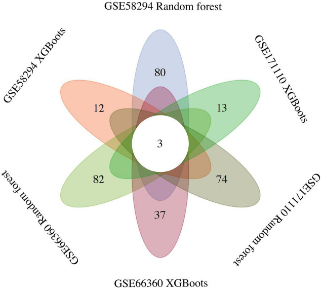
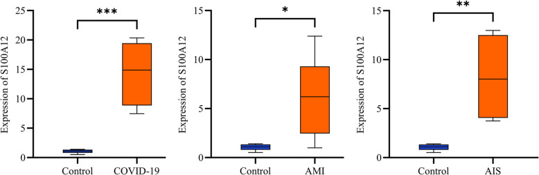
Methods: This study employed three Gene Expression Omnibus (GEO) datasets for analysis, which included data on COVID-19, AMI and AIS. We performed enrichment analysis on the co-DEGs for these three diseases to clarify gene pathways and functions, and also examined the relationship between co-DEGs and immune infiltration. Machine learning techniques and protein-protein interaction networks (PPI) were used to identify hub genes within the co-DEGs. Finally, we employed a dual validation strategy integrating independent GEO datasets and in vitro experiments with human blood samples to comprehensively assess the reliability of our experimental findings.

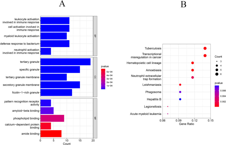
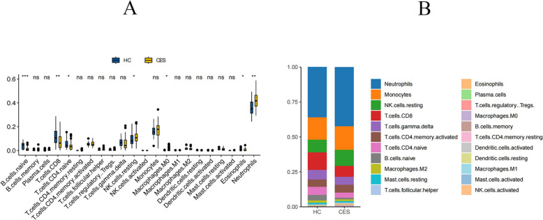
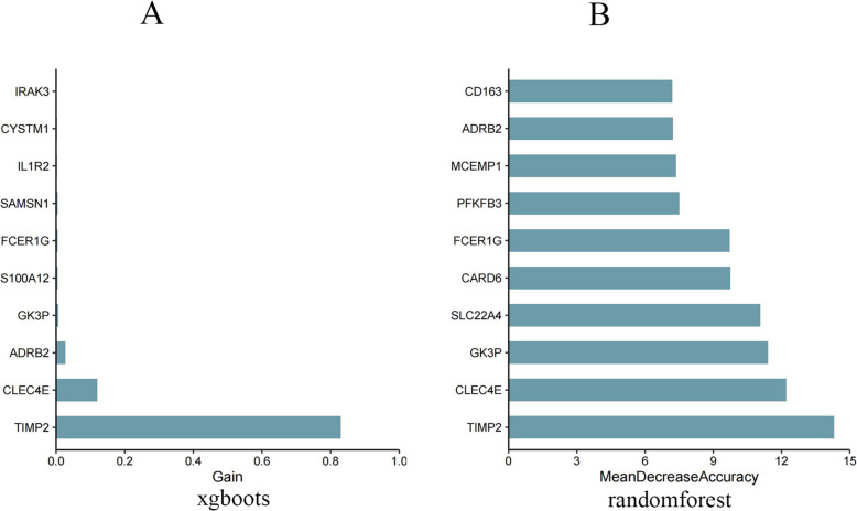
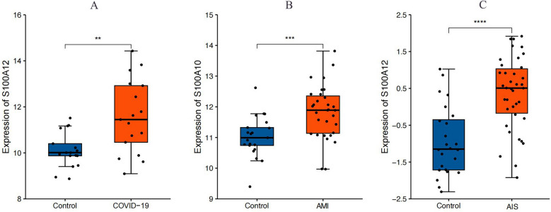
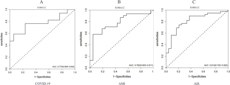
Results: We identified 88 co-DEGs associated with COVID-19, AMI and AIS. Enrichment analysis results indicated that co-DEGs were significantly enriched in immune inflammatory responses related to leukocytes and neutrophils. Immune infiltration analysis revealed significant differences in immune cell populations between the disease group and the normal group. Finally, genes selected through machine learning methods included: CLEC4E, S100A12, and IL1R2. Based on the PPI network, the top ten most influential DEGs were identified as MMP9, TLR2, TLR4, ITGAM, S100A12, FCGR1A, CD163, FCER1G, FPR2, and CLEC4D. The integration of the protein-protein interaction (PPI) network with machine learning techniques facilitated the identification of S100A12 as a potential common biomarker for early diagnosis and a therapeutic target for all three diseases. Ultimately, validation of S100A12 showed that it was consistent with our experimental results, confirming its reliability as a biomarker. Moreover, it demonstrated good diagnostic performance for the three diseases.

Conclusion: We employed bioinformatics methods and machine learning to investigate common diagnostic biomarkers and immune infiltration characteristics of COVID-19, AMI and AIS. Functional and pathway analyses indicated that the co-DEGs were primarily enriched in immune inflammatory responses related to leukocytes and neutrophils. Through two machine learning approaches and the PPI network, and subsequent validation and evaluation, we identified S100A12 as a potential common therapeutic target and biomarker related to immune response that may influence these three diseases.

Keywords: Bioinformatics; Biomarker; Blood clotting abnormality; COVID-19; Immune infiltration; Machine learning.


Conflict of interest statement

Declarations. Ethics approval and consent to participate: Data retrieved from the GEO database were uploaded in accordance with the guidelines established by the GEO Ethics, Law and Policy Group, so ethical review and informed consent were not required. The research involving human subjects has been approved by the Medical Research Ethics Review Committee of the General Hospital of Ningxia Medical University (Approval No.: KYLL-2025–0941). The study was conducted in compliance with local laws and institutional requirements, and informed consent was obtained from all participants. Consent for publication: All authors have given consent for publication. Competing interests: The authors declare no competing interests.

Figures

Fig.1
Fig.1
Volcano plots exhibit DEGs of (A)COVID-19, (B)AMI and (C)AIS (CES). Red for up-regulated and green for down-regulated. (D)The Venn diagram depicts the co-DEGs among GSE171110(COVID-19), GSE66360(AMI) and GSE58294(AIS). The results showed that they had a total of 88 co-DEGs
Fig.2
Fig.2
(A)The bar graphs of the ontological analysis of the co-DEGs among COVID-19, AMI and AIS(CES). BP, biological progress; CC, cellular component; MF, molecular function. (B)Bubble graphs indicate the results for KEGG analysis based on the co-DEGs among COVID-19, AMI and AIS
Fig.3
Fig.3
(A) Boxplots were used to show the proportional distribution of different types of immune cells in HC group and COVID-19 group. The results showed that 13/22 immune cells were significantly different between the COVID-19 and HC groups. (B) Stacked bar graphs were used to demonstrate the immune cell composition of HC group and COVID-19 group. The results showed a large difference in immune cell levels between the two groups. P values were showed as:*, p < 0.05;**, p < 0.01;***, p < 0.001, ****, p < 0.0001
Fig.4
Fig.4
The heatmap matrix is used to demonstrate the correlation between different types of immune cells. The colors and significance markers reflect the strength and significance of the correlation between the cells. Red: positive correlation, the darker the color, the stronger the correlation. Blue: negative correlation, the darker the color, the stronger the negative correlation. White: weak or no significant correlation. P values were showed as: *, p < 0.05; **, p < 0.01; ***, p < 0.001
Fig.5
Fig.5
(A) Boxplots were used to show the proportional distribution of different types of immune cells in HC group and AMI group. The results showed that 9/22 immune cells were significantly different between the AMI and HC groups. (B) Stacked bar graphs were used to demonstrate the immune cell composition of HC group and AMI group. The results showed a large difference in immune cell levels between the two groups. P values were showed as:*, p < 0.05;**, p < 0.01;***, p < 0.001, ****, p < 0.0001
Fig.6
Fig.6
The heatmap matrix is used to demonstrate the correlation between different types of immune cells. The colors and significance markers reflect the strength and significance of the correlation between the cells. Red: positive correlation, the darker the color, the stronger the correlation. Blue: negative correlation, the darker the color, the stronger the negative correlation. White: weak or no significant correlation. P values were showed as: *, p < 0.05; **, p < 0.01; ***, p < 0.001
Fig.7
Fig.7
(A) Boxplots were used to show the proportional distribution of different types of immune cells in HC group and AIS(CES) group. The results showed that 7/22 immune cells were significantly different between the AIS and HC groups. (B) Stacked bar graphs were used to demonstrate the immune cell composition of HC group and AIS group. The results showed a difference in immune cell levels between the two groups. P values were showed as:*, p < 0.05;**p < 0.01;***, p < 0.001, ****, p < 0.0001
Fig.8
Fig.8
The heatmap matrix is used to demonstrate the correlation between different types of immune cells. The colors and significance markers reflect the strength and significance of the correlation between the cells. Red: positive correlation, the darker the color, the stronger the correlation. Blue: negative correlation, the darker the color, the stronger the negative correlation. White: weak or no significant correlation. P values were showed as: *, p < 0.05; **, p < 0.01; ***, p < 0.001
Fig. 9
Fig. 9
PPI network and hub genes. Proteins are represented as nodes and functional relationships by edges. The top 10 most influential genes were MMP9, TLR2, TLR4, ITGAM, S100 A12, FCGR1 A, CD163, FCER1G, FPR2, and CLEC4D
Fig. 10
Fig. 10
Feature importance analysis using two machine learning methods: XGBoost and random forest model. A) corresponds to COVID-19, B) to AMI and C) to AIS. These plots show the rankings of feature importance derived from the XGBoost model (Plot A) and the Random Forest model (Plot B). In plot A, feature importance is assessed by gain (Gain), which indicates the contribution of each gene to the predictive power of the model. In plot B, importance is measured by mean accuracy decrease, which indicates the importance of each gene to the model's prediction accuracy
Fig. 11
Fig. 11
Feature importance analysis using two machine learning methods: XGBoost and random forest model. A) corresponds to COVID-19, B) to AMI and C) to AIS. These plots show the rankings of feature importance derived from the XGBoost model (Plot A) and the Random Forest model (Plot B). In plot A, feature importance is assessed by gain (Gain), which indicates the contribution of each gene to the predictive power of the model. In plot B, importance is measured by mean accuracy decrease, which indicates the importance of each gene to the model's prediction accuracy
Fig. 12
Fig. 12
Feature importance analysis using two machine learning methods: XGBoost and random forest model. A) corresponds to COVID-19, B) to AMI and C) to AIS. These plots show the rankings of feature importance derived from the XGBoost model (Plot A) and the Random Forest model (Plot B). In plot A, feature importance is assessed by gain (Gain), which indicates the contribution of each gene to the predictive power of the model. In plot B, importance is measured by mean accuracy decrease, which indicates the importance of each gene to the model's prediction accuracy
Fig.13
Fig.13
The Venn diagram is used to show the overlap of important genes obtained from different datasets when feature screening is performed using XGBoost and Random Forest models. The different ellipses in the figure represent the set of feature genes for different combinations of datasets and algorithms, and the overlap in the central region indicates the common genes identified in all combinations. By screening the genes using two separate machine learning methods on each disease dataset, the final co-DEGs for them were CLEC4E, S100 A12, IL1R2
Fig.14
Fig.14
Expression of S100 A12 in the validation dataset. A The expression of S100 A12 was increased and significant in the COVID-19 group relative to the HC group. B The expression of S100 A12 was increased and significant in the AMI group relative to the HC group. C The expression of S100 A12 was increased and meaningful in the AIS group relative to the HC group. Orange indicates the disease group and blue indicates the normal group, P values are shown as *, P < 0.05; **, P < 0.01; ***, P < 0.001
Fig.15
Fig.15
ROC curves for S100 A12 in the validation dataset. (A) ROC curve of S100 A12 in the COVID-19 dataset. (B) ROC curve of S100 A12 in the AMI dataset. (C) ROC curve of S100 A12 in the AIS dataset. The horizontal coordinate is the rate of false positives, expressed as 1-specificity, and the vertical coordinate is the rate of true positives, expressed as sensitivity
Fig.16
Fig.16
QRT-PCR was performed to validate the expression of S100 A12 in patients with COVID-19, AMI, and AIS. S100 A12 expression was relatively low in healthy individuals, while significant up-regulation was observed in patients. Orange indicates the disease group and blue indicates the normal group, P values are shown as *, P < 0.05; **, P < 0.01; ***, P < 0.001

Similar articles

References

    1. Katz JM, et al. COVID-19 Severity and Stroke: Correlation of Imaging and Laboratory Markers. American J Of Neuroradiology. 2020;42(2):257–61. 10.3174/ajnr.a6920. - PMC - PubMed
    1. Merkler AE, et al. Risk of Ischemic Stroke in Patients With Coronavirus Disease 2019 (COVID-19) vs Patients With Influenza. JAMA Neurol. 2020;77(11):1366. 10.1001/jamaneurol.2020.2730. - PMC - PubMed
    1. Xie Y, Xu E, Bowe B, Al-Aly Z. Long-term cardiovascular outcomes of COVID-19. Nat Medicine. 2022;28(3):583–90. 10.1038/s41591-022-01689-3. - PMC - PubMed
    1. Bull TM. Clotting and COVID-19. Chest. 2021;159(6):2151–2. 10.1016/j.chest.2021.02.067. - PMC - PubMed
    1. H. Jing, X. Wu, M. Xiang, L. Liu, V. A. Novakovic, and J. Shi, “Pathophysiological mechanisms of thrombosis in acute and long COVID-19,” Frontiers in Immunology, vol. 13, 2022, 10.3389/fimmu.2022.992384. - PMC - PubMed