. 2025 May;57(5):1155-1167.
doi: 10.1038/s41588-025-02167-5. Epub 2025 May 9.

The multilayered transcriptional architecture of glioblastoma ecosystems

Affiliations

The multilayered transcriptional architecture of glioblastoma ecosystems

Masashi Nomura et al. Nat Genet. 2025 May.

Abstract

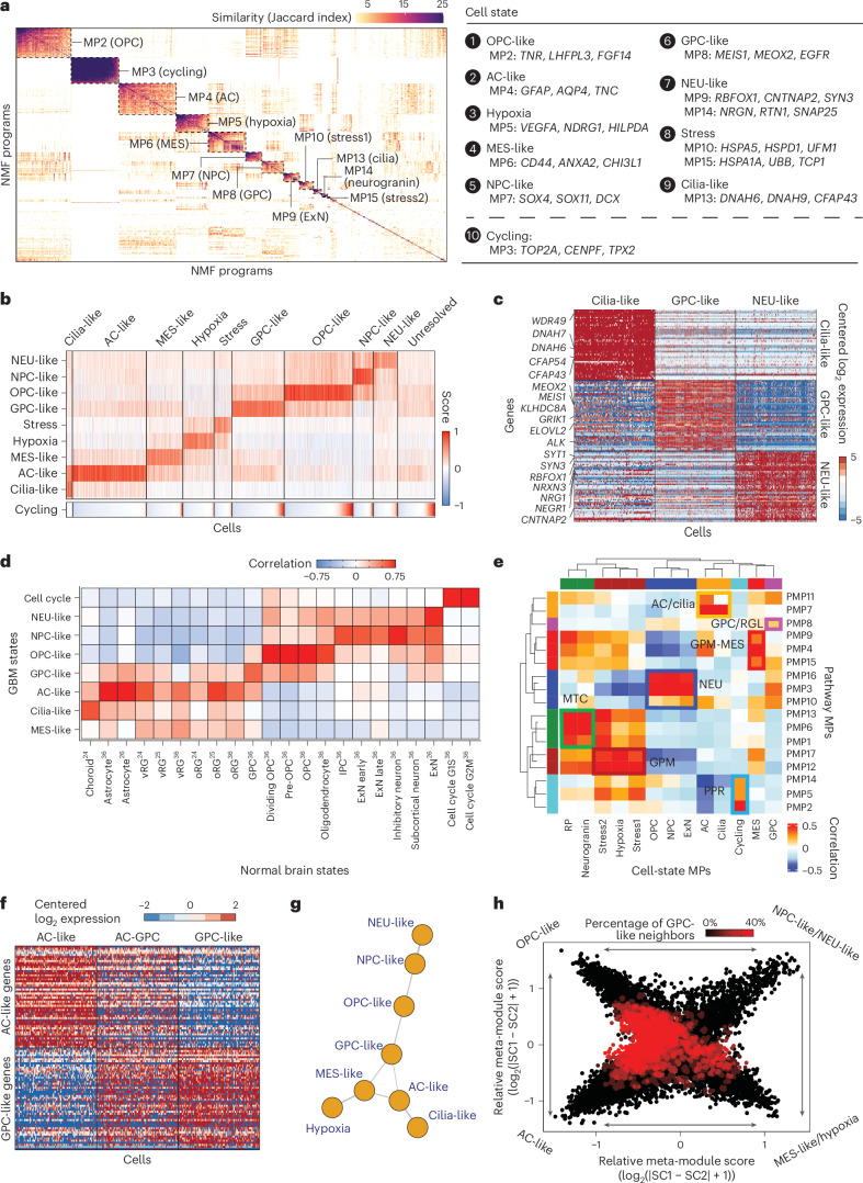
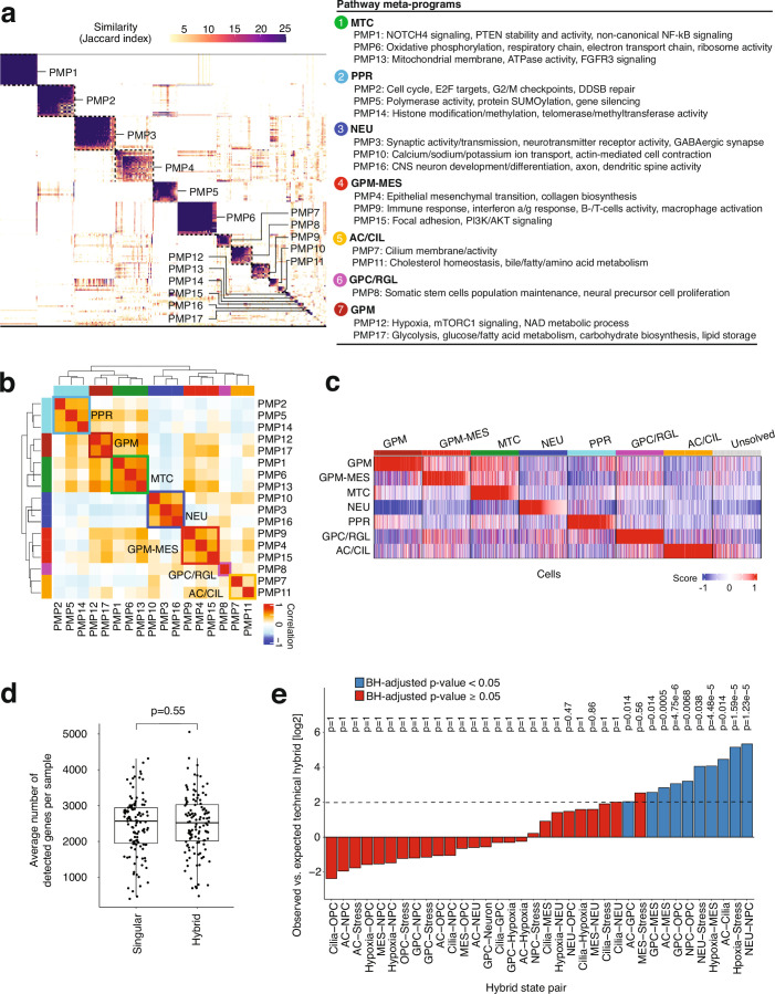
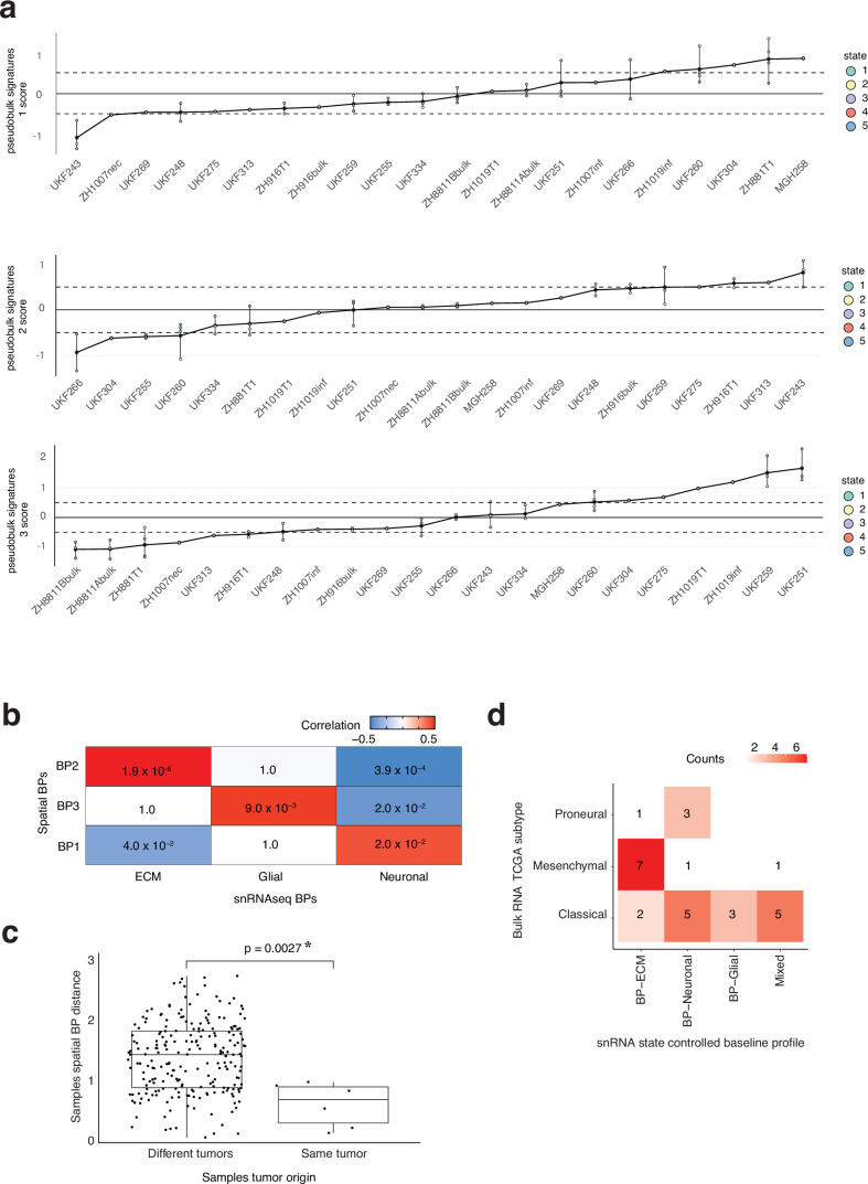
In isocitrate dehydrogenase wildtype glioblastoma (GBM), cellular heterogeneity across and within tumors may drive therapeutic resistance. Here we analyzed 121 primary and recurrent GBM samples from 59 patients using single-nucleus RNA sequencing and bulk tumor DNA sequencing to characterize GBM transcriptional heterogeneity. First, GBMs can be classified by their broad cellular composition, encompassing malignant and nonmalignant cell types. Second, in each cell type we describe the diversity of cellular states and their pathway activation, particularly an expanded set of malignant cell states, including glial progenitor cell-like, neuronal-like and cilia-like. Third, the remaining variation between GBMs highlights three baseline gene expression programs. These three layers of heterogeneity are interrelated and partially associated with specific genetic aberrations, thereby defining three stereotypic GBM ecosystems. This work provides an unparalleled view of the multilayered transcriptional architecture of GBM. How this architecture evolves during disease progression is addressed in the companion manuscript by Spitzer et al.


Conflict of interest statement

Competing interests: M.L.S. is equity holder, scientific cofounder and advisory board member of Immunitas Therapeutics. I.T. is advisory board member of Immunitas Therapeutics and scientific cofounder of Cellyrix. R.G.W.V. is a cofounder and equity holder of Boundless Bio. The authors declare that such activities have no relationship to the present study. The other authors declare no competing interests.

Figures

Fig. 1
Fig. 1. Study workflow and dataset overview.
a, Scheme describing the workflow of our study. b, The proportion (%) of patients (n = 46) in the dataset in which a genetic aberration was detected is shown. Arm-level refers to whole-chromosome arm amplification or deletion. CNA refers to gene-level amplification or deletion. Single-nucleotide variant (SNV) refers to single-nucleotide mutations. c, Uniform manifold approximation and projection (UMAP) for dimension reduction based on gene expression of the 429,305 cells in our cohort colored according to the inferred cell type. d, Pie chart demonstrating the proportion (%) of each cell type in this dataset. amp, amplification; del, deletion.
Fig. 2
Fig. 2. Revisiting malignant state heterogeneity.
a, Jaccard similarity indices of the robust NMF programs (n = 707) based on their top 50 genes. Programs are ordered according to clustering and grouped into MPs (Methods). MP10 (stress1) and MP15 (stress2) were coalesced into a single stress state. MP9 (excitatory neuron (ExN)) and MP14 (neurogranin neuron) were coalesced into a single NEU-like state. The ‘cycling’ MP is separated to emphasize it as a feature that cells can have on top of their neurodevelopmental identity (and not as an independent state; Extended Data Fig. 3a). b, Gene expression scores of each cell for the different cellular states and the cell cycle. Cells are aggregated according to the state to which they were classified and are ordered within each group according to their cell cycle score. ‘Unresolved’ represents cells that could not be confidently classified to a particular state. c, Relative expression (centered log2) of the three new MPs discovered in this work. Each row represents a gene and each column a cell. d, Association between the malignant MPs (rows) and gene sets reflecting normal brain development and adult brain cell types (columns). Each cell in the heatmap represents the Pearson correlation coefficient between the gene expression scores of an MP and a normal brain gene set across the malignant cells in the dataset. e, Association between pathway-based (rows) and gene-based (columns) MPs. Each cell in the heatmap represents the Pearson correlation coefficient between the gene expression scores of the pathway-based and gene-based MPs. The colored squares represent the seven groups of PMPs and their associated MPs. f, Demonstration of the hybrid state concept. The rows represent genes, which are aggregated according to the MP to which they belong. The columns represent cells, which are aggregated according to their singular (AC, GPC) or hybrid (AC-GPC) state. The heatmap of genes’ centered log2 expression shows that hybrids express two MPs to the same extent, whereas singulars highly express a single MP. g, GBM cellular hierarchy model stemming from the high-frequency hybrid pairs. Each vertex represents a state; vertices are connected when they represent a high-frequency hybrid state. h, Two-dimensional representation of cellular states. Each quadrant reflects a cellular state and each dot represents a malignant cell; exact cell positions reflect their relative scores for the MPs, and their colors reflect the proportion of cells around them classified to the GPC state.
Fig. 3
Fig. 3. BPs of intertumor heterogeneity.
a, Schematic of state-controlled analysis to define the BPs. b, Intertumor and intratumor variability of the BPs (n = 3) and MPs (that is, cell states, n = 7). Intertumor variability reflects the average variability measured between scores of different samples (defined as the average s.d. of program scores in each state across all states). Intratumor variability reflects the average variability measured between scores of same samples (defined as the average s.d. of program scores in each sample across all samples). Intertumor variability was significantly larger in BPs relative to MPs (mean score = 1.05 versus 0.65, P = 0.0005, one-sided t-test) whereas intratumor variability was significantly higher in MPs relative to BPs (mean score = 0.76 versus 0.62, P = 0.028, one-sided t-test). P values were not corrected for multiple testing. c, Intra-sample variability in BP scores across state-specific pseudo-bulk profiles. Each dot reflects a state-specific pseudo-bulk profile, is colored according to state and aggregated horizontally according to sample. The black horizontal lines connect pseudo-bulk profiles from the same sample as a visualization aid and have no other meaning. The black dots reflect the mean BP score of each sample and are connected using a line for visualization purposes. The dashed lines mark y = −1 and y = 1 to aid in visualization. The y axis shows the difference between the ECM and NEU BPs. d, Top, two-dimensional representation of the BPs. Each dot represents a specific sample (the mean score across the pseudo-bulks for each BP) and are colored according to the maximal score. The y axis reflect the BP-glial score, the x axis reflects the difference between the NEU and ECM BPs as follows: sign(NEU-ECM) × max(NEU, ECM). Bottom, limited intratumor variability in BP scores. Cells are colored according to the maximal BP score. Cellular states that reflects each quadrant are indicated on the right.
Fig. 4
Fig. 4. Heterogeneity within the microenvironmental cell states.
a, Donut chart representing the number of cells per cell type analyzed to identify robust NMF MPs, labeled with the number of cells and MPs found in each cell type. The size of the donut represents the relative proportion of all TME cells. b, Selected TME NMF state composition of tumors assigned to each BPs. The statistical significance of TME composition between samples with assigned BP to ECM (n = 23), glial (n = 39) or NEU (n = 35) was computed using a two-sided Kruskal–Wallis test (n = 97). c, Interaction graph between malignant cell states and TME cell type abundance. Each node represents malignant cell-state (red) or TME cell type nodes (colored according to cell type as presented). The thickness and color of the edge indicate the strength of the Pearson correlation. d, Correlation heatmap for the Pearson correlation between the relative malignant cell-state proportions (rows) and relative TME cell-state abundance (columns), which show representative associations for the hypoxic environment. e, Ligand–receptor cross-talk graph. Each green circled node represents a malignant cell state versus nonmalignant cell type pair, while each squared node represents a ligand–receptor interaction; there is an edge if that cross-talk is present. The thickness and color of the edge indicate the percentage of tumors in which both malignant cell state and nonmalignant cell type are present and the cross-talk exist. Open ‘(’ and closed ‘)’ parentheses reflect multiple ligand or receptor interaction from the same family. Specifically, closed parentheses ‘)’ indicated multiple ligands interacting with the same receptor, and viceversa for closed ‘)’ parentheses, multiple receptors interacting with the same ligand. UPR, unfolded protein response.
Fig. 5
Fig. 5. Genetic associations with transcriptional states and GBM multilayered ecosystems.
a, Association between genetic aberrations and malignant cell-state abundance. Two-sided Wilcoxon rank-sum tests are presented. P value adjustments for multiple hypothesis testing were not performed. b, Cell type composition of each of the tumors (n = 121) in the dataset, aggregated based on their composition group. c, Malignant cell-state proportions (rows) in each tumor sample (n = 111 with at least 50 malignant cells; columns). Tumors are aggregated according to the dominant malignant state (at least 30% of cells). d, Interaction graph between the different layers of GBM (composition groups, malignant state groups, BPs, gene-level CNAs and single-nucleotide mutations). Each node represents a layer; nodes are connected with an edge if a statistically significant association exists between the nodes. mut, mutation.
Fig. 6
Fig. 6. Stereotype transcriptomic architectures in GBM.
a, Layer map of the 54 samples that could be classified to one of the multilayer groups. b, Model for stereotype architecture in GBM, with exemplar tumors for each ecosystem and their compositional, cell-state and BPs. Multiple intercorrelated transcriptomic layers make up the GBM ecosystems.
Extended Data Fig. 1
Extended Data Fig. 1. Study workflow and dataset overview.
a, Total counts (left), number of detected genes (middle), and mitochondrial expression proportion (right) per cell across the whole dataset. The vertical lines represent the 10% and 90% quantiles. b, Flow diagram of the CNA calling algorithm used to classify cells as malignant or non-malignant. CNA signal reflects the extent of CNAs on each chromosome per cell. CNA correlation reflects the similarity between the CNA pattern of each cell and the overall CNA pattern of the tumor. SNV - single nucleotide variation. c, Sample-level copy number aberrations. Rows represent samples, columns represent chromosomes, values reflect the average CNA signal across all cells classified as malignant in the tumor. d, Cost-effectiveness of the 2nd step of classification. Top panel shows the % of misclassified cells (that is cells harboring a malignant SNV that were classified as non-malignant in the 1st step) that remain for each CNA correlation threshold. Bottom panel shows the % discarded cells for each CNA correlation threshold. Dashed line marks the upper threshold for non-malignancy (0.35).
Extended Data Fig. 2
Extended Data Fig. 2. GBM cell type expression patterns and abundance.
a, UMAP colored by the lab that processed the tumor specimens and generated the 10x snRNA-seq data. b, Proportion (%) of samples contributing to each cluster of cells. Each dot represents a cluster and is colored by the dominant cell type in the cluster (n = 195, 11, 6, 6, 43, 5, 45, 6 for Malignant, Excitatory neuron, Endothelial, Astrocyte, Oligodendrocyte, Inhibitory neuron, TAM and Lymphocyte cell types respectively). Y axis reflects the proportion (%) of samples (out of all samples in which the cell type was detected) that contribute to the cluster. c, Heatmaps representing the average gene expression level (log2 relative expression) of cell type marker genes within each TME cell type for the 10x dataset. d, Gating strategy for single nuclei sorting for Smart-seq2. First, ruby positive proportion (P1, top) was selected by 570 nm laser. Then, doublet discrimination was performed by strict forward scatter height (FSC-H) versus area (FSC-A) criteria (P2, bottom left). It was further gated by removing 480 nm laser positive fraction was to exclude false positive proportion (P3, bottom right), and was sorted into 96 well plates for Smart-seq2. e, Heatmaps representing the average gene expression level (log2 relative expression) of cell type marker genes within each TME cell type for the Smart-seq2 dataset. Data generated at the two different labs was analyzed separately. f, Pie chart demonstrating the proportion (%) of each cell type in the Smart-seq2 dataset (two labs data combined, left), and 10x dataset considering only the same samples profiled also by Smart-seq2 (right). g, Boxplots of cell type proportions (%) in each tumor (n = 44) in both 10x (red) and Smart-seq2 (SS2, blue). Pearson’s correlations of the proportions of each cell type are reported below each panel. Lines connect the cell type proportions of the patient’s tumor profiled with both 10x and SS2.
Extended Data Fig. 3
Extended Data Fig. 3. Revisiting malignant state definition, and contextualization with state-of-the-art classification schemes.
a, Jaccard similarity indices of the robust NMF programs (n = 835) based on their top 50 genes. Programs are ordered by clustering and grouped into meta-programs (Methods). MP10 (Stress1) and MP15 (Stress2) were coalesced into a single Stress state. MP9 (ExN) and MP14 (NRGN neuron, NRGN) were coalesced into a single NEU-like state. MP1 (Ribosomal protein, RP), MP11 (Doublet), MP12 (Low quality, LQ) reflect low quality and are not considered a state. b, Correlation between cell state scores of meta-programs derived from this dataset (columns) and those derived by Neftel et al. (rows). Each cell was scored within tumor-of-origin for both sets of meta-program signatures. Pearson’s correlation coefficient was computed across all cells for each pair of meta-programs. c, Jaccard similarity between meta-programs derived from this dataset (columns) and those derived by Neftel et al. (rows). d, Distribution of scores in this dataset (upper panel) and Neftel et al. (lower panel) dataset of cells that scored maximally for both corresponding states (for example to both AC-like signatures derived from this dataset and from Neftel et al.) across all corresponding states. Dashed vertical lines mark the mean score of each distribution. e, Association between the malignant MPs from our datasets (rows) and malignant signatures from other studies (columns). Each cell in the heatmap represents the Pearson correlation coefficient between the gene expression scores of an MP and other signature scores across the malignant cells in the dataset.
Extended Data Fig. 4
Extended Data Fig. 4. Consistency of meta-programs across platforms and technical covariates.
a, Percent cycling cells in each subpopulation across samples with at least 50 cells in any of the states (n = 84, 16, 51, 67, 60, 65, 61, 28, 70 for AC-like, Cilia-like, Hypoxia, MES-like, Stress, NEU-like, GPC-like, NPC-like and OPC-like states respectively). NPC-like (13.6%) vs. NEU-like (9.5%) p = 0.012, GPC-like (12.5%) vs. AC-like (1%) p < 2.2−16 and vs. MES-like (6.6%) p = 0.0001 (one-sided Wilcoxon rank sum test for all comparisons). b, Pearson’s correlation coefficient heatmap between GBM state signature scores defined in this dataset and published functional gene signature scores. The published signature name is followed by each study’s lead author in parentheses. c, Pearson’s correlation of the proportions (%) of cells classified in each MP per tumor in both 10x (rows) and Smart-seq2 (columns). d, Similarity of MPs derived using all samples (x-axis) and MPs derived using primary (untreated) samples. e, Proportion (%) of contributing samples to each MP (relative to the number of samples profiled by each lab). f, Proportion (%) of contributing samples to each MP (relative to the number of samples provided from each sample source).
Extended Data Fig. 5
Extended Data Fig. 5. Pathway-based meta-programs and putative cellular hierarchy.
a, Jaccard similarity indices of the robust NMF programs based on their top 50 pathways. Programs are ordered by clustering and grouped into Pathway-based metaprograms (PMPs) according to their functional activities. b, Clustering of the PMPs based on their pairwise Pearson correlations reveal functional activity groups. c, Scores of each cell for the different PMPs. Cells are aggregated by the PMP to which they were classified. “Unresolved” represents cells that could not be classified to a PMP. d, Average number of detected genes per sample (n = 121) for singular and hybrid cells. Two-sided t-test was used to test for statistical significance. e, Relative frequency (in log2 scale) of observed hybrids vs. expected technical hybrids (Methods) for each of the possible state pairs (order within a pair is meaningless). Dashed line marks log2(Fold Change) = 2 to aid in visualization. Statistical significance was assessed for each hybrid state pair using a one-sided Fisher’s exact test. P values were corrected for multiple testing using the Benjamini-Hochberg method. The bar plots were colored according to the BH-adjusted p-value.
Extended Data Fig. 6
Extended Data Fig. 6. BP of inter-tumor heterogeneity.
a, Jaccard similarity matrix of the PCA-derived gene programs colored by cluster (see Methods). b, GO enrichment results for C1 (BP-ECM), C3 (BP-Neuronal) and C5 (BP-Glial) program clusters. Nodes represent enriched terms. Node color represents the extent of statistical significance and size represents the number of overlapping genes. Edges connect terms with a Jaccard similarity above 0.2 c, Same as Fig. 3c but here shown are the three BP scores. d, Observed vs. expected within-sample standard deviation (SD) of BP scores. Observed SD was defined as the SD across state-specific pseudo-bulk profiles in each tumor, shown are n = 98 samples with at least 3 pseudo-bulk profiles. Expected SD was estimated by randomly sampling n = 100 times 3 pseudo-bulk profiles and computing the SD across these PBs. Statistical significance was assessed with a two-sided Wilcoxon rank sum test. Each box plot represents a specific group (that is observed or expected) that spans from the first to third quartiles, median values are indicated by a horizontal line, whiskers show 1.5× interquartile range, and each dot reflects a specific standard deviation value. e, Same as Fig. 3d but here shown are the individual state scores in the 3-axis plane.
Extended Data Fig. 7
Extended Data Fig. 7. De-novo BP of inter-tumor heterogeneity in spatial transcriptomic data.
a, Same as Fig. 3c for the BP derived de-novo from the spatial transcriptomics data. For each tumor sample on the x-axis, the points represent the scores of the pseudobulk of that sample for a specific spatial equivalent of a state (Methods). b, Pearson’s correlation between scores of de-novo spatial BPs (rows) and those derive from the snRNAseq data (columns) with p-values (unadjusted for multiple testing) for each comparison in the tile. c, Euclidean distance between BP scores of samples resected from the same tumor (n = 6 distances from 4 tumor samples) and samples resected from different tumors (n = 225 distances from 22 tumor samples). Each point represents a Euclidian distance between BP scores of two samples. Statistical significance was estimated using a two-sided t-test. d, TCGA subtype and the association with BP assignment. The samples profiled by both bulk RNA-seq and snRNA-seq were used (n = 28).
Extended Data Fig. 8
Extended Data Fig. 8. Heterogeneity within the microenvironmental cell states.
a-b, Gene ontology term (rows) enrichment (log10 of adjusted p-values) for each metaprogram’s 50 gene list (columns) against background for a, TAMs and b, astrocytes. Statistical significance was assessed with a two-sided Fisher’s exact test and Benjamini-Hochberg p-value adjustment was performed. c-d, Pairwise Pearson correlation heatmap for all c, CARE TAMs and d, astrocytes scored for both this dataset’s MPs as well as publicly available cell type-specific gene signatures. e, Jaccard similarity index representing the intersection of genes for both malignant and non-malignant (astrocytes and TAMs) metaprograms. 50 genes per metaprogram.
Extended Data Fig. 9
Extended Data Fig. 9. Co-occurrence of TME cell state abundance.
Correlation heatmap for the Pearson correlation between the relative TME cell state abundances (n = 121 samples). Only correlations with unadjusted P < 0.05 are shown and increasing size of circle reflects increasing absolute value of correlation coefficient.
Extended Data Fig. 10
Extended Data Fig. 10. Genetic associations with transcriptional states and GBM multi-layered ecosystems, and stereotype transcriptomic architectures in GBM.
a, Association between genetic aberrations and cell state abundances. Color intensity reflects the statistical significance from two-sided Wilcoxon rank sum tests comparing state abundances in tumors with and without each genetic alteration (log10 of adjusted p-values). b, Association between abundance of GPC-like cells and the representative genomic alterations in GBM (either of chr.7 gain, 10p loss, EGFR amplification, and TERT promoter mutations, n = 87, P = 0.003, two-sided Wilcoxon rank sum test). c, The difference of the BP scores between samples with and without the representative genomic alterations in GBM (either of chr.7 gain, 10p loss, EGFR amplification, and TERT promoter mutations). Two-sided Wilcoxon rank sum test (n = 95 samples with sufficient mutation, copy number, and malignant cell data) were not corrected for multiple hypothesis testing. Boxplots span from the first to third quartiles, median values are indicated by a horizontal line, whiskers show 1.5× interquartile range, and outlier points are not shown. The violin plots surrounding the boxplots represent the continuous distribution of the data. d, Same as in Fig. 6a but for samples that could not be classified to an ecosystem.

References

    1. Louis, D. N. et al. The 2021 WHO Classification of Tumors of the Central Nervous System: a summary. Neuro Oncol.23, 1231–1251 (2021). - PMC - PubMed
    1. Sottoriva, A. et al. Intratumor heterogeneity in human glioblastoma reflects cancer evolutionary dynamics. Proc. Natl Acad. Sci. USA110, 4009–4014 (2013). - PMC - PubMed
    1. Patel, A. P. et al. Single-cell RNA-seq highlights intratumoral heterogeneity in primary glioblastoma. Science344, 1396–1401 (2014). - PMC - PubMed
    1. Neftel, C. et al. An integrative model of cellular states, plasticity, and genetics for glioblastoma. Cell178, 835–849 (2019). - PMC - PubMed
    1. Venkataramani, V. et al. Glioblastoma hijacks neuronal mechanisms for brain invasion. Cell185, 2899–2917 (2022). - PubMed

Substances

LinkOut - more resources