. 2025 May;57(5):1168-1178.
doi: 10.1038/s41588-025-02168-4. Epub 2025 May 9.

Deciphering the longitudinal trajectories of glioblastoma ecosystems by integrative single-cell genomics

Affiliations

Deciphering the longitudinal trajectories of glioblastoma ecosystems by integrative single-cell genomics

Avishay Spitzer et al. Nat Genet. 2025 May.

Abstract

The evolution of isocitrate dehydrogenase (IDH)-wildtype glioblastoma (GBM) after standard-of-care therapy remains poorly understood. Here we analyzed matched primary and recurrent GBMs from 59 patients using single-nucleus RNA sequencing and bulk DNA sequencing, assessing the longitudinal evolution of the GBM ecosystem across layers of cellular and molecular heterogeneity. The most consistent change was a lower malignant cell fraction at recurrence and a reciprocal increase in glial and neuronal cell types in the tumor microenvironment (TME). The predominant malignant cell state differed between most matched pairs, but no states were exclusive or highly enriched in either time point, nor was there a consistent longitudinal trajectory across the cohort. Nevertheless, specific trajectories were enriched in subsets of patients. Changes in malignant state abundances mirrored changes in TME composition and baseline profiles, reflecting the co-evolution of the GBM ecosystem. Our study provides a blueprint of GBM's diverse longitudinal trajectories and highlights the treatment and TME modifiers that shape them.


Conflict of interest statement

Competing interests: M.L.S. is an equity holder, scientific cofounder and advisory board member of Immunitas Therapeutics. I.T. is an advisory board member of Immunitas Therapeutics and a scientific cofounder of Cellyrix. R.G.W.V. is a cofounder and equity holder in Boundless Bio. The authors declare that such activities have no relationship to the present study. The other authors declare no competing interests.

Figures

Fig. 1
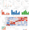
Fig. 1. Longitudinal profiling of a clinically annotated GBM cohort.
a, Schematic representation describing the workflow of our study. TMZ, temozolomide; RT, radiotherapy; int., intermediate. b, Clinical and technical information on all 59 patients in this dataset, including surgical interval, age at diagnosis, gender, location at recurrence (rec), MGMT promoter status, therapy and omic data type. c, UMAP for dimension reduction based on gene expression values of the cells in our cohort colored according to the cell type (top) and time point (bottom). d, Proportion (%) of patients in the dataset in which a genetic aberration was detected, colored by time point. The donut chart at the top represents average somatic mutation distribution for whether an alteration was detected at both time points (T1 + T2), the primary tumor only (T1) or the recurrent tumor only (T2). The bar plot at the bottom is for the known driver genomic events and the representative phenotypes related to the genomic alterations—arm-level refers to whole chromosome arm amplification (amp) (chr7q)/deletion (del) (chr10q), CNA refers to high-level gene amplification or deletion, and SNV refers to single-nucleotide mutations. De novo hypermutation (HM) indicates a high mutation burden at both time points without evidence for treatment-associated mutational signatures. Small deletion indicates tumors with increased small deletion burden at recurrence. UMAP, uniform manifold approximation and projection; chr, chromosome; assoc., associated.
Fig. 2
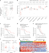
Fig. 2. Prognostically significant longitudinal cell-type changes in the TME, global similarity of cell states between primary and recurrent tumors.
a, Proportion (%) of each cell type across the two time points (primary and recurrence, n = 118) in which a statistically significant difference was observed. P values were computed with a two-sided Wilcoxon rank-sum test. b, Group-differentiating features and breakdown across primary/recurrence status for composition (left), malignant state frequency (middle) and baseline profiles (right). P values were computed using Fisher’s exact test. c, Kaplan–Meier curves depicting the survival time after the second resection according to the transcriptomic features at the second resection. Left, 12 patients that recurred with a glio-neural composition group versus 47 patients with other types of recurrences. Right, six patients that recurred with MES/hypoxia cell state group versus 53 patients with other types of recurrences. X axis reflects the time from the second resection to outcome. Statistical significance of survival difference between the groups in each panel was computed using the log-rank test. d, Heatmap showing the Pearson correlation between transcriptomic features. Correlations were computed separately in primary samples (top-left) and in recurrent samples (bottom-right) and are ordered according to the hierarchical clustering pattern of the recurrent samples. NS, not significant.
Fig. 3
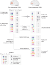
Fig. 3. Divergence of individual sample pairs.
a, Sankey plots depicting the transitions between time points across the composition (left), malignant states (middle) and baseline profile groups (right). The width of the features represents the proportion of tumors with the indicated classification. Light gray links reflect transitions from one group (T1) to a different group at T2. b, Longitudinal transcriptomic changes in the two pairs profiled at three time points highlight unpredictable gene expression trajectories. Detailed clinical information including treatment regimen and tumor MRI (top), heatmap representing proportions and scores from three transcriptomic layers (middle) and mutation fraction between time points are shown (bottom). INF, interferon; BEV, bevacizumab; T1Gd, T1-weighted post-gadolinium image. c, Observed (colored bar) versus expected (black dot) conservation across time points. P values were computed using a binomial test and adjusted for multiple testing using Holm’s method. Error bars represent confidence intervals derived from the binomial test. Asterisk indicates a Holm-adjusted P < 0.01. MRI, magnetic resonance imaging.
Fig. 4
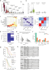
Fig. 4. MGMT expression in GBM single cells influences recurrence trajectories.
a, Average MGMT expression in malignant cells per sample across time points. Samples were included only if the MGMT promoter status was verified using a methylation assay and were annotated as methylated/unmethylated according to the status of the primary sample (n = 12 methylated and n = 19 unmethylated). Dashed lines connect matched samples. Statistical significance was estimated using a two-sided Wilcoxon rank-sum test; unadjusted P values are shown. In a, for within-group comparisons, a Wilcoxon signed rank test (paired) was used. b, MGMT expression level in each cell type between methylated and unmethylated samples. Statistical significance was estimated using a two-sided Wilcoxon rank-sum test; unadjusted P values are shown. c, Survival curve for the patients included in this analysis stratified according to MGMT expression level. X axis reflects the time from first to second resection. Statistical significance of survival difference between the groups in each panel was computed using the log-rank test. d, Survival curves for MGMT-MET patients stratified according to MGMT expression level. X axis reflects the time from first to second resection. Statistical significance of survival difference between the groups in each panel was computed using the log-rank test. e, Survival curves for MGMT expression high group stratified according to MGMT promoter methylation status. X axis reflects the time from first to second resection. Statistical significance of survival difference between the groups in each panel was computed using the log-rank test. NOS, not otherwise specified. f, Difference in MES-like cell state proportion (%) across the two time points (primary and recurrence) stratified by MGMT expression level in this study and in ref. . All sample points are shown as jittered points. Statistical significance was estimated using a two-sided Wilcoxon rank-sum test; unadjusted P values are shown. g, MGMT-specific signatures plotted for patients included in the analysis. Value represents the T2–T1 difference (log2(FC) of gene expression) for each patient. Patients are ordered according to the difference between signature scores. Genes are ordered according to their correlation (across patients) with the difference between signature scores. FC, fold change.
Fig. 5
Fig. 5. Mutational signatures associated with recurrence trajectories.
a, Longitudinal difference in the relative proportion of mutations assigned to COSMIC v3 mutational signatures at each time point for select SBS signatures (SBS1, clock-like; SBS11, alkylating agent; and SBS21, defective DNA mismatch repair). Outlier points are shown. Dashed lines connect values from the same patient at T1 and T2. P values represent two-sided paired Wilcoxon rank-sum test. b, Longitudinal difference in small deletion burden between T1 and T2 with dashed lines connecting patient values and red indicating patients who were assigned to the increased small deletion burden group. Analysis restricted to nonhypermutant cases. P values reflect two-sided paired Wilcoxon rank-sum test. c, A waterfall plot of the relative change in hypoxia-related malignant state sorted by decreasing longitudinal change. Patients are represented by a single bar (x axis). Presence of increased small deletion burden or SBS21 signature is presented in black annotation bars below. The reported P values indicate two-sided paired Wilcoxon rank-sum test for the longitudinal change in the hypoxia malignant state for those patients with small deletion or SBS21 increase. d, Bulk RNA data from the GLASS consortium were scored for the hypoxia snRNA malignant metaprogram signature and the relative ssGSEA score is presented on the y axis. The panels show the longitudinal change in the hypoxia signature for those patients whose tumor had a small deletion increase (left) and for those that did not have small deletion burden increase (right). P values from two-sided paired Wilcoxon rank-sum test. e, Scatterplot that represents the scaled genetic distance (bulk DNA—proportions of private mutations and differences in copy-number altered regions) versus scaled transcriptional distance (snRNA), with the linear regression line shown in blue. The Pearson’s correlation coefficient and associated P value are shown (n = 38). ssGSEA, single-sample gene set enrichment analysis; diff., differences.
Fig. 6
Fig. 6. Longitudinal GBM cell state trajectories.
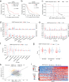
Analysis of the GBM CARE dataset reveals key patterns of GBM evolution following treatment. (1) The most common observation was in the cell-type composition layer, where many samples exhibited a reduced malignant cell fraction at recurrence. (2) At the malignant state level, many tumors recurred with an unpredictable trajectory that likely reflects patient-specific evolution (top). A smaller subset of tumors recurred with more predictable trajectories, such as reduced MES-like fraction for MGMT-MET versus MGMT-UM primary tumors (middle) or increased hypoxia fraction for samples with increased small deletion burden following treatment (bottom). Columns separated into malignant and nonmalignant fractions indicate the relative proportions per tumor. Only selected nonmalignant and malignant cell states are shown for clarity. Hyp, hypoxia.
Extended Data Fig. 1
Extended Data Fig. 1. Longitudinal profiling of a clinically annotated GBM cohort.
a, Number of cells per sample (post QC) across the 3 time points. Each point represents a sample. There are no statistically significant differences between the groups (tested with two-sided Kruskal–Wallis test, p = 0.51). b, Average number of detected genes per sample (post QC) across the 3 time points. Each point represents a sample. There are no statistically significant differences between the groups (tested with two-sided Kruskal–Wallis test, p = 0.27). c, Overview of SNV and CNA in the GBM cohort. Each column represents a single patient with longitudinal DNA data and a matched normal blood sample. The top panel indicates the total proportion of mutations that are either detected across both T1 and T2 (that is, shared), only in T1 or only in T2, which are sorted by decreasing shared mutation fraction. The middle panel represents the mutation variant status for driver genes in GBM, while the bottom panel presents the driver CNAs.
Extended Data Fig. 2
Extended Data Fig. 2. Longitudinal cell-type changes in the TME, global similarity of cell states between primary and recurrent samples and prognostically significant cell-type profiles.
a, Relative granular cell-type abundance across the two time points (primary and recurrence). Unadjusted two-sided paired Wilcoxon rank-sum test is shown (n = 56 patients). Dotted lines connect patient values. b, Relative granular non-malignant cell state abundance across the two time points (primary and recurrence) that showed statistical significance between time points following adjustment for multiple comparisons. Unadjusted two-sided paired Wilcoxon rank-sum test is shown (n = 56 patients). Dotted lines connect patient values. c, Average proportion of cellular composition (left) of malignant cell state composition (middle) and average baseline profile score (right) for each feature group. d, Available clinical data information for this study and ref. dataset. e, Comparison of the number of detected genes per cell in cells passing quality filters between this study and ref. dataset. Two-sided Wilcoxon rank-sum test is shown. Box plots span from the first to third quartiles, median values are indicated by a horizontal line, whiskers show 1.5× interquartile range and outlier points are not shown. Continuous distributions of all values are shown to the right of each box plot. f, Proportion (%) of samples from ref. assigned to each compositional group across the two time points (primary and recurrence). g, Kaplan–Meier curves depicting the survival time after 2nd resection according to the transcriptomic features at 2nd resection, which shows the statistical significance in the distribution between groups. Top panel is for composition group. Bottom panel is for malignant state groups. Statistical significance of survival difference between the groups in each panel was computed using the log-rank test. h, Forest plot reflects Cox proportional hazard model for time from 2nd resection to outcome, including relevant biological and clinical covariates in addition to composition group (top) and malignant state group (bottom). Each variable is presented along with its categorical possibilities and sample size on the left, while the boxes represent the hazard ratio and lines represent the 95 % confidence interval.
Extended Data Fig. 3
Extended Data Fig. 3. Malignant state abundance and malignant-TME interactions across time points.
a,b, Malignant cell state abundance across time points. Dotted lines connect patient values. Unadjusted two-sided paired Wilcoxon rank-sum tests are shown. a, This study (n = 50 patients with at least 50 malignant cells in both time points). b, ref. dataset. (n = 25 patients). c, Proportion (%) of tumors in each malignant group in the ref. dataset. d, Box plots of the average BP scores per sample across the two time points. e, Interaction graph of associations between features conserved across time points. Edges represent statistically significant (p < 0.05) Pearson correlation in both time points. f, Heatmap of ligand–receptor cross-talks. Each row represents a ligand–receptor interaction, while each column represents a non-malignant cell type—malignant cell state pair, such that the ligand is expressed by the corresponding non-malignant cell type and the receptor by the malignant cell state. The colors represent the log(odds ratio) from the two-sided Fisher’s exact test for checking whether the ligand–receptor interaction is significantly present in T2 (log(odds ratio >0), purple scale) or T1 (log(odds ratio <0), orange scale). Only significant interactions are reported in the heatmap (**p < 0.01, *p < 0.05).
Extended Data Fig. 4
Extended Data Fig. 4. Divergence of individual sample pairs.
a, Sankey plots depicting the transitions between time points across malignant states for ref. dataset. b, Representative two pairs that showed opposite longitudinal transcriptomic changes in the two pairs profiled at two time points highlight unpredictable gene expression trajectories. Heatmap representing three transcriptomic layers between time points are shown.
Extended Data Fig. 5
Extended Data Fig. 5. MGMT expression in GBM single cells influences recurrence trajectories.
a, Surgical interval for the patients included in this analysis stratified by the MGMT promoter methylation status. X axis reflects the time from 1st to 2nd resection. Statistical significance of survival difference between the groups in each panel was computed using the log-rank test. b, Surgical interval analysis for the IDH-wildtype patients in the GLASS cohort stratified by the MGMT promoter methylation status. X axis reflects the time from 1st to 2nd resection. Statistical significance of survival difference between the groups in each panel was computed using the log-rank test. c, Logistic regression model using the average of MGMT gene expression in primary samples to infer the MGMT methylation status in the ref. dataset. d, Proportion (%) of each cell type across the two time points (primary and recurrence) stratified by MGMT expression level. For dg, box plots represent the median value as a solid horizontal line, lower and upper edges correspond to the first and third quartiles (the 25th and 75th percentiles), and the whiskers represent plus and minus 1.5× the interquartile range. Individual sample values are shown as jittered points. e, Proportion (%) of each malignant cell state across the two time points (primary and recurrence) stratified by MGMT expression level. f, Difference within patients in proportion (% in R − % in P) of each cell type across MGMT expression levels. g, Difference within patients in BP scores (score in R − score in P) across MGMT expression levels. h, Differentially expressed genes between MGMT-low and high groups across the recurrence trajectories (Methods). Each dot represents a gene, and dots are colored according to the group of DE genes to which they belong. i, CONS-UP and CONS-DN signatures plotted for patients included in the analysis. Value represents the T2–T1 difference (log2(FC) of gene expression) for each patient. Patients are ordered according to the difference between signature scores. Genes are ordered according to their correlation (across patients) with the difference between signature scores.
Extended Data Fig. 6
Extended Data Fig. 6. Mutational signatures associated with recurrence trajectories.
a, Mutation burden at both time points for patients with matched normal blood DNA (n = 46 samples per time point, two-sided paired Wilcoxon test). b, COSMIC v3 mutational signature contribution for two patients with high mutation burden at both time points with minimal contribution from SBS11 (alkylating agent signature). c, Selected single base substitution (SBS) mutational signature proportions for GLASS IDH-wildtype cases for both time point 1 and time point 2. Dotted lines connect samples from the same patients. SBS1 (aging/clock-like etiology), SBS11 (alkylating agent) and SBS21 (defective mismatch repair). P values represent two-sided paired Wilcoxon rank-sum test. d, Longitudinal difference in small insertion burden between T1 and T2 with dotted lines connecting patient values. Analysis restricted to non-hypermutant cases. P-value reflects two-sided paired Wilcoxon rank-sum test. e, Longitudinal change (T2–T1) in the hypoxia cell state abundance is plotted on the y axis against the small deletion burden specific to the recurrent tumor with the linear regression line shown in blue. The Pearson correlation coefficient and P value are presented. f, Longitudinal change in the hypoxia and MES-like cell state relative abundances for patients that acquired SBS21 mutations but that did not acquire small deletion burden increase. g, Bulk RNA data from the GLASS consortium were scored for the MES-like snRNA malignant metaprogram signature, and the relative single-sample gene set enrichment analysis (ssGSEA) score is presented on the y axis. The panel shows the longitudinal change in the MES-like signature for those patients whose tumor had a small deletion increase. P value from paired Wilcoxon rank-sum test. h,i, Scatterplots that represent the scaled genetic distance for SNVs (proportions of private mutations) h, and CNAs (differences in copy-number altered regions, i, versus scaled transcriptional distance (snRNA). Shown is the Pearson’s correlation coefficient, associated P value, with the linear regression line shown in blue for both h and i.

References

    1. Louis, D. N. et al. The 2021 WHO classification of tumors of the central nervous system: a summary. Neuro Oncol.23, 1231–1251 (2021). - PMC - PubMed
    1. Hegi, M. E. et al. Gene silencing and benefit from temozolomide in glioblastoma. N. Engl. J. Med.352, 997–1003 (2005). - PubMed
    1. Stupp, R. et al. Radiotherapy plus concomitant and adjuvant temozolomide for glioblastoma. N. Engl. J. Med.352, 987–996 (2005). - PubMed
    1. Mu, Q. et al. Identifying predictors of glioma evolution from longitudinal sequencing. Sci. Transl. Med.15, eadh4181 (2023). - PubMed
    1. Kim, J., Lee, I., Cho, H. J., Lee, J. & Park, P. J. Spatiotemporal evolution of the primary glioblastoma genome article spatiotemporal evolution of the primary glioblastoma genome. Cancer Cell28, 318–328 (2015). - PubMed

Substances

LinkOut - more resources