. 2025 May 12;16(1):4373.
doi: 10.1038/s41467-025-59487-7.

Spatial mapping of the brain metabolome lipidome and glycome

Affiliations

Spatial mapping of the brain metabolome lipidome and glycome

Harrison A Clarke et al. Nat Commun. .

Abstract

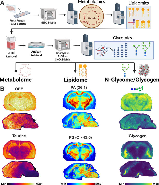
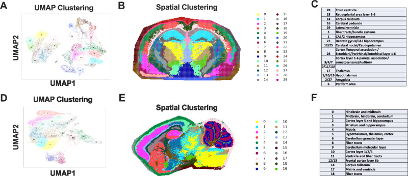
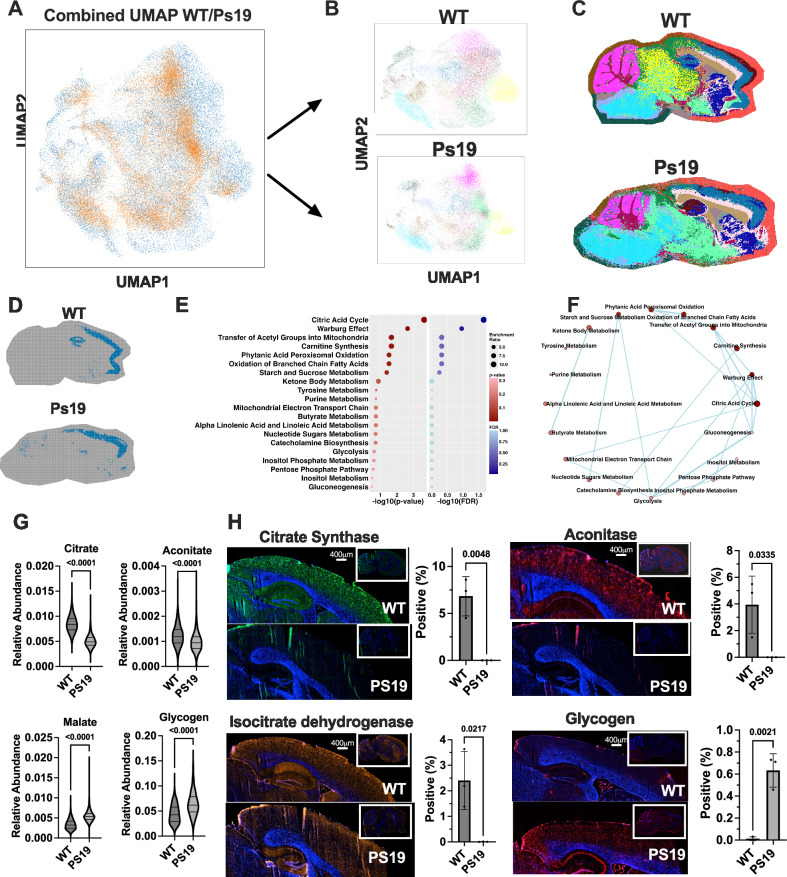
Metabolites, lipids, and glycans are fundamental but interconnected classes of biomolecules that form the basis of the metabolic network. These molecules are dynamically channeled through multiple pathways that govern cellular physiology and pathology. Here, we present a framework for the simultaneous spatial analysis of the metabolome, lipidome, and glycome from a single tissue section using mass spectrometry imaging. This workflow integrates a computational platform, the Spatial Augmented Multiomics Interface (Sami), which enables multiomics integration, high-dimensional clustering, spatial anatomical mapping of matched molecular features, and metabolic pathway enrichment. To demonstrate the utility of this approach, we applied Sami to evaluate metabolic diversity across distinct brain regions and to compare wild-type and Ps19 Alzheimer's disease (AD) mouse models. Our findings reveal region-specific metabolic demands in the normal brain and highlight metabolic dysregulation in the Ps19 model, providing insights into the biochemical alterations associated with neurodegeneration.


Conflict of interest statement

Competing interests: R.C.S. has research support and received consultancy fees from Maze Therapeutics. R.C.S. is a member of the Medical Advisory Board for Little Warrior Foundation and M.S.G. is a member of the science advisory board for Chelsea’s Hope, Glut1-deficiency syndrome, and the adult polyglucosan body disease foundation. M.S.G. has research support and research compounds from Maze Therapeutics, Valerion Therapeutics, Ionis Pharmaceuticals. M.S.G. also received consultant fees from Maze Therapeutics. The remaining authors declare no competing interests.

Figures

Fig. 1
Fig. 1. High-content spatial imaging of metabolome, lipidome, and glycome in a single mouse brain tissue.
A Workflow for the sequential spatial analysis of the metabolome, lipidome, and glycome in mouse brain tissue sections using MALDI imaging. The process initiates with the slicing of fresh frozen mouse brains into 10 μm thick sections, either coronal or sagittal, followed by the application of the NEDC matrix for initial metabolite and lipid imaging. The same tissue sections are subsequently processed for glycomic analysis, involving isoamylase and PNGase F treatments before the application of the CHCA matrix, facilitating the visualization of complex carbohydrates like N-glycans and glycogen. Created in BioRender. Sun, R. (2025) https://BioRender.com/k02u528. B Spatial heatmaps/ion images that highlight the distribution of select biomolecules identified during the MALDI imaging of metabolome, lipidome, and glycome (n = 2, 1 for coronal section and 1 for sagittal section). The images represent both coronal and sagittal sections of mouse brains and are generated from the same tissue section following the workflow outlined in panel a. Biomolecule of interest is labeled above each heatmap/ion image, including o-phosphoethanolamine (OPE), Phosphatidic Acid (PA) (36:1), Taurine, Phosphatidylserine (PS) (O- 45:6), and Glycogen. Color scale is not absolute but is relative to the highest local concentration of the biomolecule within each specific image, allowing for spatial visualization within the sample but not between different biomolecules or samples.
Fig. 2
Fig. 2. Spatial augmented multiomics interface (Sami) framework.
A Sami computational framework: integration and spatial analysis of metabolomic, lipidomic, and glycomic data. The process begins with the co-registration of individual omics datasets, utilizing their spatial coordinates. Following this, correlation networks are established to identify low and high positive correlations between molecules, which then undergo spatial clustering to reveal the molecular architecture of the tissue. The final phase involves pathway enrichment analysis, which is complemented by manual annotation for data interpretation. Created in BioRender. Sun, R. (2025) https://BioRender.com/f55v050. B Scatter plots showing the strong Pearson correlation coefficient between paired metabolome and lipidome datasets after multiomics integration, demonstrating the quantitative relationship between these two omics layers. C Paired spatial heatmap images of selected lipids and metabolites, such as 862.606 m/z and 256.995 m/z, reveal the distribution similarities between these molecules within the brain tissue. The color scale indicates the relative abundance from minimum (blue) to maximum (red). The monoisotopic masses and annotations are provided beneath each heatmap. The color scale corresponds to the highest pixel intensity detected for each individual biomolecule in each respective brain region. D Network analysis depicting the intricate intra- and interdomain connections of the integrated multiomics dataset. The metabolome (green), lipidome (blue), and glycome (red) nodes are connected within their respective domains (intradomain) by grey lines, while interdomain connections across different omic layers are shown in yellow.
Fig. 3
Fig. 3. Spatial dimensionality reduction, and manual annotation in brain tissues.
A Application of high-dimensionality reduction via UMAP on a dataset derived from a coronal brain section that has been processed through a triple-omics workflow. The UMAP plot visualizes the clustering of multidimensional omics data into a two-dimensional space, facilitating the identification of distinct clusters within the brain tissue. B The subsequent spatial clustering map displays the localized distribution of these clusters based on the precise x and y coordinates captured by the MALDI imaging laser spots. Each color on the map corresponds to a specific cluster, with the legend on the right side denoting the cluster numbers. C The clusters are then manually annotated with their respective anatomical regions by a neuropathologist using the Allen Brain Atlas as a reference. D Similar to panel a, a UMAP plot presents the high-dimensionality reduction of omics data obtained from a sagittal brain section subjected to the same triple-omics workflow, delineating the diverse molecular landscapes across different brain structures. E The subsequent spatial clustering map displays the localized distribution of these clusters based on the precise x and y coordinates captured by the MALDI imaging laser spots. Each color on the map corresponds to a specific cluster, with the legend on the right side denoting the cluster numbers. F Each cluster number is again correlated with specific anatomical regions identified in the sagittal section, guided by manual annotation by a neuropathologist with the Allen Brain Atlas.
Fig. 4
Fig. 4. Metabolic diversity in distinct brain regions of a normal mouse brain.
A Spatial clustering map depicting anatomical regions in a normal mouse brain, with a focus on the CA3 region, compared to the rest of the brain. A corresponding volcano plot elucidates the significant metabolic differences between the CA3 area and the rest of the brain, using adjusted p-value threshold of 0.05 to denote significance (Wilcoxon Rank-Sum test, Benjamini-Hochberg (BH) procedure for multiple comparison). Metabolomic features that are elevated in the CA3 region are indicated in red, while those that are decreased are shown in blue. B Metabolic pathway enrichment analysis, constructed using the MetaboAnalyst 3.2 R package integrated within the Sami, pinpoints the specific metabolic pathways that are significantly enriched in the CA3 region (Wilcoxon Rank-Sum test, Benjamini-Hochberg (BH) procedure for multiple comparison). The analysis is complemented by a metabolic network visualization, which connects the metabolic pathways identified by pathway enrichment analysis with more than 25% share metabolites, enhancing our understanding of the metabolic interplays and diversity within the CA3 region. Nodes represent biochemical pathways. The size of the nodes and color correlate with the degree of enrichment. C relative abundance of metabolites changed in the citric acid cycle, bar graphs represent pixel by pixel data from CA3 (n = 527 pixels) and non-CA3 (n = 20,000 pixels) regions of the same brain (n = 1). (mean ± SEM; p-values indicated; two-tailed t-test). Source data are provided as a Source Data file.
Fig. 5
Fig. 5. Pathway enrichment analysis for Ps19 and WT mouse brains.
A UMAP plot displays the integration of data from Ps19 (brown) and matched WT (blue) sagittal mouse brains (n = 1 each). B Separate UMAP plots for Ps19 and WT brains are shown, detailing the full range of clusters within each brain type. C Spatial clustering maps overlay UMAP clusters onto the anatomical structures of both Ps19 and WT mouse brains. D Spatial UMAP plots highlight a specific cluster corresponding to the frontal cortex region in sagittal sections of both Ps19 and WT brains. E Pathway enrichment analysis, using the MetaboAnalyst 3.2 R package integrated within Sami, identifies metabolic pathways that are differentially enriched in the Ps19 brain as compared to WT (Hypergeometric test, Benjamini-Hochberg (BH) procedure for multiple comparison). F A metabolic network diagram connects the enriched pathways, highlighting the relationships and potential dysregulation occurring in Ps19 brains relative to WT. Nodes represent biochemical pathways. The network graphically summarizes the interconnected pathways with more than 25% overlapping metabolites. G Relative abundance of metabolites changed in the Citric acid cycle, bar graphs represent pixel by pixel data from the isocortex region of the WT (n = 2043 pixels) and Ps19 (n = 2295 pixels) brains. H Representative immunofluorescence staining images show the localization of Citrate Synthase, Aconitase, Isocitrate Dehydrogenase, and Glycogen in brain sections from WT and Ps19 mice, scale bar = 400 µm. Whole brain image is in the insert on the top right. Each row displays the enzyme or glycogen marker in both WT (top) and Ps19 (bottom) sections, with the corresponding quantification bar graphs (% positive and positive area) presented on the right (mean ± SEM, n = 3 WT and Ps19 animals; p-values indicated; two-tailed t-test). Source data are provided as a Source Data file.

Update of

References

    1. Lisec, J., Schauer, N., Kopka, J., Willmitzer, L. & Fernie, A. R. Gas chromatography mass spectrometry–based metabolite profiling in plants. Nat. Protoc.1, 387–396 (2006). - PubMed
    1. Fiehn, O. Metabolomics—the link between genotypes and phenotypes. Funct. genomics48, 155–171 (2002). - PubMed
    1. Gibney, M. J. et al. Metabolomics in human nutrition: opportunities and challenges. Am. J. Clin. Nutr.82, 497–503 (2005). - PubMed
    1. Han, X. & Gross, R. W. Shotgun lipidomics: electrospray ionization mass spectrometric analysis and quantitation of cellular lipidomes directly from crude extracts of biological samples. Mass Spectrom. Rev.24, 367–412 (2005). - PubMed
    1. Cajka, T. & Fiehn, O. Toward merging untargeted and targeted methods in mass spectrometry-based metabolomics and lipidomics. Anal. Chem.88, 524–545 (2016). - PubMed

Substances

LinkOut - more resources