. 2025 May;57(5):1189-1200.
doi: 10.1038/s41588-025-02188-0. Epub 2025 May 12.

Three-dimensional genome landscape of primary human cancers

Affiliations

Three-dimensional genome landscape of primary human cancers

Kathryn E Yost et al. Nat Genet. 2025 May.

Abstract

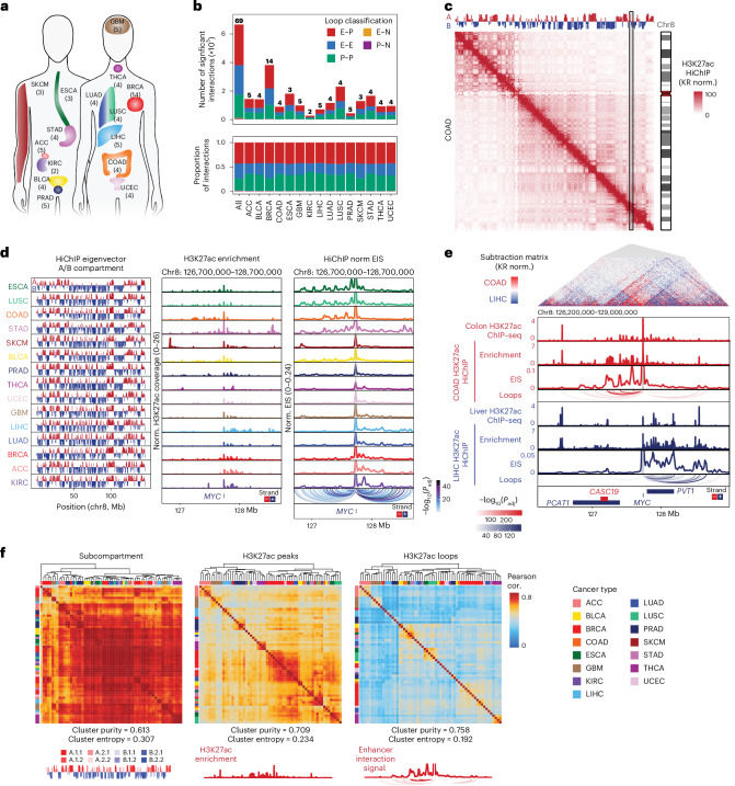
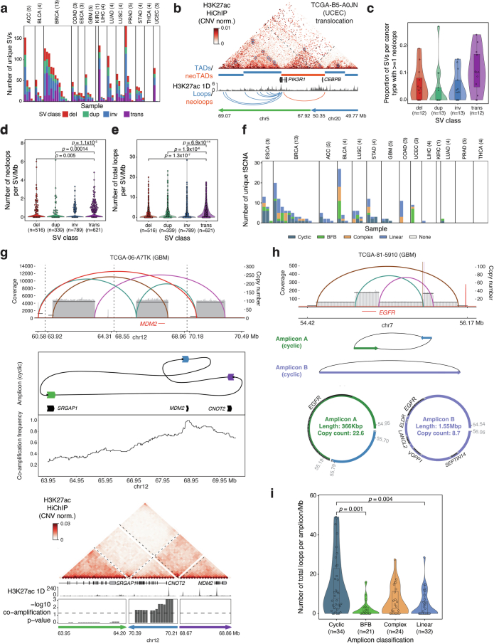
Genome conformation underlies transcriptional regulation by distal enhancers, and genomic rearrangements in cancer can alter critical regulatory interactions. Here we profiled the three-dimensional genome architecture and enhancer connectome of 69 tumor samples spanning 15 primary human cancer types from The Cancer Genome Atlas. We discovered the following three archetypes of enhancer usage for over 100 oncogenes across human cancers: static, selective gain or dynamic rewiring. Integrative analyses revealed the enhancer landscape of noncancer cells in the tumor microenvironment for genes related to immune escape. Deep whole-genome sequencing and enhancer connectome mapping provided accurate detection and validation of diverse structural variants across cancer genomes and revealed distinct enhancer rewiring consequences from noncoding point mutations, genomic inversions, translocations and focal amplifications. Extrachromosomal DNA promoted more extensive enhancer rewiring among several types of focal amplification mechanisms. These results suggest a systematic approach to understanding genome topology in cancer etiology and therapy.


Conflict of interest statement

Competing interests: H.Y.C. is a cofounder of Accent Therapeutics, Boundless Bio, Cartography Biosciences and Orbital Therapeutics; was an advisor of 10x Genomics, Arsenal Biosciences, Chroma Medicine and Spring Discovery until 15 December 2024 and is an employee and stockholder of Amgen as of 16 December 2024. K.E.Y. is a consultant for Cartography Biosciences. A.D.C. receives research funding from Bayer and is a consultant for KaryoVerse. P.W.L. is an advisor for Tagomics, FOXO Biosciences and AnchorDX. W.J.G. is named as an inventor on patents describing ATAC–seq methods. 10x Genomics has licensed intellectual property on which W.J.G. is listed as an inventor. W.J.G. holds options in 10x Genomics and is a consultant for Ultima Genomics and Guardant Health. W.J.G. is a scientific cofounder of Protillion Biosciences. V.B. is a cofounder, serves on the scientific advisory board of Boundless Bio and Abterra and holds equity in both companies. The other authors declare no competing interests.

Figures

Fig. 1
Fig. 1. HiChIP identifies high-resolution chromosome conformation in primary human cancers across multiple scales.
a, Schematic representation of the 15 cancer types profiled in this study. b, Stacked bar plot of the number of unique significant FitHiChIP interactions identified by H3K27ac HiChIP by cancer type and colored by loop classification (E–P, E–E, P–P, E–N and P–N). The numbers shown above each bar represent the number of samples profiled for each cancer type. c, KR matrix balancing-normalized H3K27ac HiChIP contact matrix at 250-kb resolution for merged COAD samples on chromosome 8. Top track displays the first principal component of Pearson’s matrix eigenvector of the KR-normalized observed/expected matrix, corresponding to A/B compartment. d, First eigenvector of the KR-normalized observed/expected matrix, corresponding to A/B compartment, for all samples merged by cancer type (left). One-dimensional H3K27ac signal enrichment at the MYC locus normalized by reads overlapping TSS for all samples merged by cancer type (middle). Interaction profiles of the MYC promoter representing EIS for all samples merged by cancer type (right). Significant loop interactions colored by adjusted P value are shown below. P values were calculated using a two-sided binomial test and corrected using the BH procedure. Cancer types are ordered based on H3K27ac signal bias at the MYC locus. e, Subtraction matrix comparing KR-normalized H3K27ac HiChIP at 10-kb resolution from merged COAD and LIHC samples at the MYC locus (top). Tracks visualize H3K27ac ChIP–seq enrichment from normal tissue profiled by ENCODE, HiChIP 1D H3K27ac enrichment, interaction profiles of the MYC promoter, and significant loop interactions colored by adjusted P value. P values were calculated using a two-sided binomial test and corrected using the BH procedure. f, Unsupervised hierarchical clustering of vectorized HiChIP subcompartment annotations (left), HiChIP 1D H3K27ac signal (middle), and HiChIP 2D interaction signal (right). Heatmap colored by Pearson correlation coefficients. Cluster purity quantifies the degree that samples of the same cancer type cluster together with higher values, indicating better clustering performance, while for cluster entropy, lower values indicate better clustering performance. Representative subcompartments, H3K27ac enrichment and EIS tracks illustrating the data type used for correlation analysis are shown at bottom.
Fig. 2
Fig. 2. Differential contributions of CN and enhancer activity explain variability in oncogene expression.
a, Interaction profiles of the MET and KRAS promoters for individual samples with high (rank 1 and 2 of 56 samples with matched RNA-seq, WGS and HiChIP data), intermediate (rank 28 and 29) or low (rank 55 and 56) RNA expression with significant loop interactions colored by adjusted P value. P values were calculated using a two-sided binomial test and corrected using the BH procedure. Bar plots visualize RNA expression and CN inferred from WGS. b, Schematic representation of analysis to infer contribution of enhancer interaction gain or gene CN to oncogene mRNA expression level. c, Oncogenes with variance in RNA expression >1 (n = 45) ranked by the fraction of RNA variance explained by CNV or linked enhancer activity across cancer samples. Each column is a gene. Genes with dark blue-colored bars on the top are significantly explained by CNV, while genes with orange-colored bars on the bottom are significantly explained by enhancer signal (E–P; H3K27ac term with the highest relative importance for each gene is shown). Genes in bold dark blue or orange text are also significant when cancer type is included in regression analysis. d, Scatter plot of the relationship between DNA CN and RNA expression for copy-driven gene KRAS (top) and E–P interaction signal and RNA expression for enhancer-driven gene MET (bottom). FPKM, fragments per kilobase of transcript per million mapped reads.
Fig. 3
Fig. 3. Deconvolution of HiChIP signal resolves malignant and immune cell-specific chromatin conformation in TME.
a, Schematic representation showing identification of cell-type-specific enhancer–promoter interactions using integration of HiChIP and scATAC–seq data. b, Signal tracks showing scATAC–seq and H3K27ac HiChIP at CD274 locus (encoding PD-L1) for sample TCGA-86-A4P8. The scATAC–seq track indicates the chromatin accessibility of different cells in TME (top). The H3K27ac HiChIP track indicates the bulk H3K27ac signal (middle). The interaction track indicates the CD274 promoter-associated interactions. The shaded area indicates the myeloid cell-specific H3K27ac peak. c, Bar plot of loop annotation based on scATAC–seq/HiChIP integration for samples with matched scATAC and H3K27ac HiChIP. d, Integrative virtual 4C and scATAC–seq signal tracks showing the myeloid cell-specific enhancer–promoter interaction for CD274 (encoding PD-L1). The virtual 4C plot shows the EIS changes (left) with matched CD274 RNA expression and myeloid cell percentages based on scATAC–seq (right). The scATAC–seq track indicates the chromatin accessibility of myeloid cells, noncancer cells and cancer cells across eight different cancer types (bottom). The marked area indicated the myeloid cell-specific H3K27ac peak. Significant loop interactions are colored by adjusted P value, and P values were calculated using a two-sided binomial test and corrected using the BH procedure. e, Scatter plot showing the correlation between the enhancer–promoter interaction and CD274 RNA expression. The correlation coefficient was calculated using Pearson correlation, and the P value was calculated using a two-sided t test. f, Scatter plot showing the correlation between the enhancer–promoter interaction and RNA-seq-derived leukocyte fraction estimation. The correlation coefficient was calculated using Pearson correlation, and the P value was calculated using a two-sided t test. g, Signal tracks showing the integrative track of scATAC–seq and H3K27ac HiChIP at MYC locus. The scATAC–seq track indicates the chromatin accessibility of different noncancer and cancer cells in eight cancer types (top). The H3K27ac HiChIP track indicates the bulk level H3K27ac signal in BLCA, BRCA and COAD (middle). The interaction track indicates the MYC promoter-associated interactions. The shaded area indicates H3K27ac peaks that overlap with cancer risk-associated SNPs. Significant loop interactions are colored by adjusted P value, and P values were calculated using a two-sided binomial test and corrected using the BH procedure.
Fig. 4
Fig. 4. Integration of WGS and HiChIP identifies cancer-relevant regulatory mutations and target genes.
a, Schematic representation showing the workflow of identifying the H3K27ac-associated noncoding mutations. b, Scatter plot indicating the relationship between oncogene promoter-associated HiChIP and WGS allele frequency differences and the effect size (T score) of the associated H3K27ac signal change between mutant and wild-type patients. The T score was calculated by a two-sided t test. c, Bar plot showing the allele frequency of chr3: 169,267,090-T>C (MECOM) mutant between HiChIP and WGS for sample TCGA-HF-A5NB (STAD). The P value was calculated by Fisher’s exact test and corrected using the BH procedure. d, Signal tracks showing the integrative track of H3K27ac HiChIP at MECOM locus normalized by reads in TSS. The H3K27ac 1D signal track indicates the bulk level H3K27ac signal in STAD samples (left). Mutant patient TCGA-HF-A5NB is highlighted in blue. The chr3: 169,267,090-T>C mutant position is labeled in red line. Bar plots indicate matched H3K27ac signal (CN corrected), MECOM expression and CN at MECOM locus. e, Scatter plot quantifying the relationship between enhancer activity and enhancer–promoter interaction changes for oncogene-associated enhancers with somatic variants. f, Bar plot showing the allele frequency of chr8: 38,553,516-C>T (FGFR1 enhancer) mutant between HiChIP and WGS for sample TCGA-BL-A3JM (BLCA). The P value was calculated by Fisher’s exact test and corrected using the BH procedure. g, Signal tracks showing the integrative track of HiChIP 1D H3K27ac enrichment at FGFR1 locus normalized by reads in TSS. The H3K27ac 1D signal track indicates the bulk level H3K27ac signal (CN corrected) and FGFR1 enhancer–promoter interactions in BLCA samples (left). Mutant patient TCGA-BL-A3JM is highlighted in purple. The chr8: 38,553,516-C>T mutant position was labeled in red line. Bar plots indicate matched H3K27ac signal, FGFR1 expression and CN at FGFR1 locus. Significant loop interactions are colored by adjusted P value, and P values were calculated using a two-sided binomial test and corrected using the BH procedure. h, Scatter plot indicating the association between chr8: 38,553,516-C>T mutant-involved motif enrichment changes and motif enrichment scores in chr8: 38,553,516-C>T mutant region. i, Motif sequence plot showing the overlap between the mutant sequence and the enriched motif sequence for TFCP2L1. AF, allele frequency.
Fig. 5
Fig. 5. Impact of structural rearrangement and ecDNA amplification on enhancer connectivity.
a, Workflow of the joint HiChIP–WGS analysis for simple structural variants and complex focal amplifications. b, Distribution of cyclic, BFB, complex and linear somatic focal amplifications detected across 62 tumor whole-genome samples with corresponding HiChIP data and 62 patient-matched normal samples as controls. c, Distribution of cyclic, BFB, complex, linear fSCNA affecting oncogenes. d, Raw HiChIP contact matrix of ERBB2 rearrangement with tracks visualizing H3K27ac 1D signal enrichment, CN inferred from WGS, SVs identified by WGS and amplicon prediction (top). The raw, unnormalized HiChIP contact matrix allows for visualization of regions of high HiChIP signal before normalization, which correspond to amplifications and structural rearrangements detected by WGS. CN-normalized HiChIP contact matrix with tracks visualizing TADs/neoTADs, H3K27ac 1D signal enrichment and loops/neoloops (bottom). e, Raw HiChIP contact matrix of a cyclic (ecDNA-like) EGFR rearrangement with tracks visualizing H3K27ac 1D signal enrichment, CN inferred from WGS, SVs identified by WGS, amplicon prediction and co-amplification frequency across all TCGA WGS samples (top). Tracks visualizing H3K27ac 1D signal enrichment and significance of co-amplification with CN-normalized HiChIP matrix below (bottom). Arrow indicates increased interaction signal indicative of a circular amplicon. f, Violin and box plot quantifying neoloops per megabase within cyclic, BFB, complex, linear amplifications identified by NeoLoopFinder (n = number of unique amplifications). Loop counts are quantified for each focal amplification, normalized by the size of the focal amplification and classified as a neoloop if they span an SV breakpoint. P values were calculated using a two-sided Wilcoxon rank-sum test and adjusted using the BH procedure. Box centerline, median; box limits, upper and lower quartiles; box whiskers, 1.5× interquartile range. fSCNA, focal somatic CN amplifications.
Extended Data Fig. 1
Extended Data Fig. 1. Quality control of H3K27ac HiChIP and WGS data.
a, Enrichment of HiChIP 1D H3K27ac signal at transcription start sites for all samples merged by cancer type. H3K27ac enrichment per base pair at regions ±2000 bp from the transcription start site is normalized to the number of insertions between ±1900–2000 bp from the transcription start site. b, Box plot of the transcription start site enrichment values for all samples of each cancer type. Number of samples from different donors listed for each cancer type. Box centerline, median; box limits, upper and lower quartiles; box whiskers, 1.5× interquartile range. c, Box plot of the total valid interaction pairs for all samples of each cancer type. Number of samples from different donors listed for each cancer type. Box centerline, median; box limits, upper and lower quartiles; box whiskers, 1.5× interquartile range. d, Genotype correlations between HiChIP genotype and SNP array-derived genotype. Correlation with the next closest match is derived from correlating with all other 69 donors profiled by SNP array by TCGA. Samples that match their expected donor better than all other donors have a correlation difference value above zero (red line, left). Heatmap showing the pairwise Pearson correlation between HiChIP genotype and SNP array genotype, with high correlation along the diagonal indicating HiChIP sample genotypes are most highly correlated with the expected donor genotype based on SNP array (right). e, Box plot of the mean read depth per sample for tumor WGS and matched normal WGS. Dashed lines indicate targeted coverage of 70× for tumor WGS and 25× for matched normal WGS. Number of samples from different donors listed for each cancer type. Box centerline, median; box limits, upper and lower quartiles; box whiskers, 1.5× interquartile range. f, Genome-wide frequencies of copy-number alterations (CNVs) identified by WGS quantified as proportion of cases with CNV gain (log2(CNV) > 1) or CNV loss (log2(CNV) < −1) in 1 Mb genomic windows. Identified CNV alterations are consistent with prior findings, such as chromosome 8q gain in BRCA and LIHC and chromosome 3q gain in LUSC ,.
Extended Data Fig. 2
Extended Data Fig. 2. Comparison of HiChIP data with prior epigenomic profiling.
a, Stacked bar plot of unique H3K27ac 1D peaks by cancer type colored by peak classification. N = number of samples per cancer type. b, Stacked bar plot of unique H3K27ac 1D peaks by cancer type colored by overlap with ENCODE H3K27ac ChIP–seq peaks (Supplementary Table 8). c, Bar plot of interacting promoters linked to H3K27ac peaks. d, Bar plot of genes skipped by HiChIP loops. e, Violin with box plots of the average RNA expression of genes at loop anchors (n = 256,888 gene–loop pairs) and skipped genes between loop anchors (n = 218,050 gene–loop pairs). P value determined by two-sided Wilcoxon rank-sum test and not adjusted for multiple comparisons. Box centerline, median; box limits, upper and lower quartiles; box whiskers, 1.5× interquartile range. f, Violin with box plot of loop distances by cancer type. N = number of loops detected for each cancer type. Box plot components as in (e). g, Stacked bar plot of unique significant interactions identified by H3K27ac HiChIP by cancer type and colored by overlap with previously identified loops in HiChIPdb. h, Comparison of the first eigenvector of the DNA methylation correlation matrix with the H3K27ac HiChIP eigenvector by cancer type. i, Comparison of H3K27ac 1D signal enrichment and bulk ATAC–seq for individual COAD and LIHC samples at the MYC locus (left). Bar plot of MYC RNA expression and copy number from WGS (right). j, KR-normalized H3K27ac HiChIP contact matrix at the MYC locus at 50 kb resolution for all samples merged by cancer type. k, Box plots of H3K27ac peak (left) and loop (right) signal before and after copy-number normalization for peaks or loops with relative copy number ≤1 (n = 1,684,034 sample-peak pairs and n = 1,051,956 sample–loop pairs), 1 < CN ≤ 2 (n = 2,384,070 sample-peak pairs and n = 978,152 sample–loop pairs), or >2 (n = 166,180 sample-peak pairs and n = 543,760 sample–loop pairs). Box plot components as in (e). l, Scatter plot of H3K27ac 1D signal enrichment in the union peak set in two PRAD samples. Each dot represents an individual peak.
Extended Data Fig. 3
Extended Data Fig. 3. Unsupervised clustering of H3K27ac peaks and HiChIP interactions.
a, Heatmap showing the unsupervised clustering of ATAC–seq, RNA-seq and DNA methylation array. Heatmap colored by Pearson correlation coefficients. Cluster purity quantifies the degree that samples of the same cancer type cluster together with higher values indicating better clustering performance, while for cluster entropy lower values indicate better clustering performance. b, Unsupervised t-SNE on the top 15 principal components for the top 10,000 variable H3K27ac peaks in the union peak set across all cancer types. Each dot represents a unique sample colored by cancer type. c, Unsupervised t-SNE on the top 10 principal components for the top 10,000 variable H3K27ac HiChIP loops in the union loop set across all cancer types. Each dot represents a unique sample colored by cancer type. d, t-SNE colored by bulk ATAC–seq cluster annotations from ref. . e, t-SNE colored by BRCA subtype. f, t-SNE colored by ESCA subtype.
Extended Data Fig. 4
Extended Data Fig. 4. Cancer-type-specific H3K27ac peaks and HiChIP interactions.
a, Heatmap of H3K27ac enrichment at cancer-type-specific peaks (n = 28,716). b, Heatmap of HiChIP contact enrichment at cancer-type-specific loops (n = 5,073). c, TF motif enrichment in cancer-type-specific H3K27ac peaks. d, TF motif enrichment in cancer-type-specific loops. e, Bar plot of linked differential peaks for oncogenes with >5 differential peaks, colored by number of cancer types with differential peaks. f, Stacked bar plot of differential loops colored by overlap with differential peaks for each cancer type (left). All differential loops overlap at least one H3K27ac peak. Stacked bar plot of differential peaks colored by overlap with differential loops for each cancer type (right). Only differential peaks overlapping any identified loops were considered (27,166/28,716 differential peaks). g, H3K27ac HiChIP signal z scores across samples for the enhancer–promoter (E–P) interaction between ESR1 promoter and −9 kb H3K27ac peak (top of top panel). H3K27ac 1D signal z scores across samples for −9 kb H3K27ac peak (top of bottom panel). Box plot of ESR1 RNA expression (n = number of samples from different donors) and schematic showing the differential E–P interaction (bottom left). Box centerline, median; box limits, upper and lower quartiles; box whiskers, 1.5× interquartile range. Tracks visualize HiChIP 1D H3K27ac enrichment, interaction profiles of the −9 kb enhancer and significant loop interactions colored by adjusted P value (bottom right). P values were calculated using a two-sided binomial test and corrected using the Benjamini–Hochberg procedure. Two alternative TSS for ESR1 are annotated; the enhancer is -9kb from the ENST00000440973.5 TSS and looping interactions are analyzed for the ENST00000206249.7 TSS. h, H3K27ac HiChIP signal z score across patients for E–P interactions between ATF7IP, PLBD1, C12orf60, RERG and EPS8 promoters and H3K27ac peak at the H4-16 locus (top of top panel). H3K27ac 1D signal z score across patients for the H4-16 H3K27ac peak (top of bottom panel). Heatmap of ATF7IP, PLBD1, C12orf60, RERG and EPS8 RNA expression and schematic showing the differential E–P interactions (bottom left). Tracks visualize HiChIP 1D H3K27ac enrichment, interaction profiles of the H4-16 H3K27ac peak and significant loop interactions colored by adjusted P value (bottom right). P values were calculated using a two-sided binomial test and corrected using the Benjamini–Hochberg procedure.
Extended Data Fig. 5
Extended Data Fig. 5. Modeling variance in RNA expression explained by copy number or enhancer activity.
a, H3K27ac HiChIP interaction profiles for NRAS and EGFR for all samples merged by cancer type (right). Significant loop interactions colored by adjusted P value shown below. P values were calculated using a two-sided binomial test and corrected using the Benjamini–Hochberg procedure. b, Scatter plot of average loop variance per oncogene between cancer types versus maximum log2(fold change) colored by oncogene classification. c, Bar plot of unique enhancer–promoter loops for indicated oncogenes. d, Box plot of cumulative variance explained by top 5 principal components (PCs) of H3K27ac signal. Each point represents a gene (n = 11,324 genes with linked H3K27ac peaks for each PC). Box centerline, median; box limits, upper and lower quartiles; box whiskers, 1.5× interquartile range. e, Heatmap of average Pearson correlation between RNA expression, CNV and top 5 H3K27ac PCs of for all genes (n = 12,570) before and after copy-number regression. f, Box plot of variance explained per gene by CNV, top 5 H3K27ac PCs and all variables (left). Box plot of variance explained per gene by CNV, top 5 H3K27ac PCs, cancer type and all variables (right). P value determined by two-sided Wilcoxon rank-sum test and not adjusted for multiple comparisons. Box plot components as in (d). g, All genes with variance in RNA expression >1 (n = 5,985) ranked by fraction of RNA variance explained by CNV across cancer samples, modeled without including cancer type as a variable. Each column is a gene. Genes highlighted on top are significantly (adjusted P value < 0.05) explained by CNV (dark blue), while genes highlighted on the bottom are significantly (adjusted P value < 0.05) explained by E–P signal (orange). P values were calculated using a two-sided t test and corrected using the Benjamini–Hochberg procedure. h, Scatter plot of proportion variance explained by copy number with and without including cancer type in regression analysis. P value determined by two-sided t test and not adjusted for multiple comparisons. i, Scatter plot of proportion variance explained by H3K27ac signal with and without including cancer type in regression analysis. P value determined by two-sided t test and not adjusted for multiple comparisons.
Extended Data Fig. 6
Extended Data Fig. 6. Copy-driven and enhancer-driven gene classification.
a, Stacked bar plot of gene classification based on whether variance in RNA expression is significantly explained by DNA copy number, enhancer activity, both or neither based on multiple linear regression analysis for all genes (left), oncogenes (middle) or oncogenes grouped by enhancer usage classification (right). Genes with variance in RNA expression >1 included in modeling analysis (n = 5,985 total genes and n = 45 oncogenes). b, Box plot of copy-number distribution for all oncogenes, ranked by CNV contribution in regression analysis for all samples included in analysis (n = 62). Box centerline, median; box limits, upper and lower quartiles; box whiskers, 1.5× interquartile range. c, Scatter plot of the relationship between top E–P component and RNA expression for enhancer-driven genes PIM1, MECOM and ERBB4. d, Scatter plot of the relationship between DNA copy number and RNA expression for copy-driven genes PIK3CA, TP53 and MYCN.
Extended Data Fig. 7
Extended Data Fig. 7. Validation of HiChIP deconvolution framework in tumor microenvironment.
a, Signal tracks at the CCND3 locus. scATAC–seq track shows chromatin accessibility in TCGA-86-A4P8 cells (top), H3K27ac HiChIP track shows bulk H3K27ac signal (middle) and interaction track indicates promoter-associated loops. Shaded region marks a cancer-cell-specific H3K27ac peak. b, Violin and box plot showing differences in ImmuneScore correlation coefficients between immune cell-specific (n = 1,029) and cancer-cell-specific (n = 1,551) enhancer–promoter (E–P) interactions. P value was calculated using a two-sided Wilcoxon rank-sum test. c, Violin and box plot comparing correlation with tumor purity (CPE score) between immune- and cancer-cell-specific E–P interactions. P value calculated using a two-sided Wilcoxon rank-sum test. In (b,c), box centerline denotes median; box limits, upper and lower quartiles; whiskers, 1.5× interquartile range. d, Bar plot showing Gene Ontology enrichment of genes regulated by cell-type-specific E–P interactions. P values were determined using two-sided Fisher’s exact test. e, Scatter plot showing correlation between E–P interaction strength and myeloid cell fraction. Correlation coefficient calculated using Pearson correlation; P value by two-sided t test. f, Signal tracks at the IKZF1 locus showing merged scATAC–seq signal across eight cancer types (top) and H3K27ac HiChIP interactions (bottom). Shaded region indicates a T/NK cell-specific H3K27ac peak. g, Scatter plots showing correlation between IKZF1 E–P interaction and leukocyte fraction (left) or CPE tumor purity score (right), with Pearson correlation coefficients and P values from two-sided t-tests. h, Scatter plot showing correlation between IKZF1 E–P interaction and IKZF1 RNA expression. Correlation was calculated using Pearson correlation; P value by a two-sided t test. i, Signal tracks at the VSIR locus showing scATAC–seq signal in noncancer and cancer cells across eight cancer types (top) and promoter-associated interactions (bottom). j, Scatter plot showing correlation between MYC E–P interaction and MYC RNA expression, with Pearson correlation coefficient and P value from two-sided t test. k, Scatter plots showing correlation between MYC E–P interaction and leukocyte fraction (left) or CPE tumor purity score (right), with Pearson correlation coefficients and two-sided t test P values. l, Signal tracks showing scATAC–seq and H3K27ac HiChIP signal at a MYC enhancer in COAD, with shaded regions indicating known COAD risk-associated SNPs.
Extended Data Fig. 8
Extended Data Fig. 8. Validation of noncoding mutation-associated H3K27ac signal change.
a, Density plot showing distribution of correlation coefficients between mutant allele frequencies derived from H3K27ac HiChIP and ATAC data. b, Dot plot showing relationship between promoter-associated HiChIP and WGS allele frequency differences and effect size (T score) of corresponding H3K27ac signal changes between mutant and wild-type patients. T score was calculated using a two-sided t test. c, Box plot showing H3K27ac signal differences in the chr3:169267090-T>C region (±1 kb) between mutant (n = 20 bins from one sample) and wild-type patients (n = 60 bins from three samples). P value calculated by two-sided t test and adjusted using Benjamini–Hochberg procedure. Box centerline, median; box limits, upper and lower quartiles; whiskers, 1.5× interquartile range. d, Density plot showing distribution of MECOM expression in stomach cancer RNA-seq cohort; mutant patient labeled by a red dashed line. e, Density plot showing distribution of H3K27ac signal at the MECOM promoter in the TCGA HiChIP cohort; mutant patient labeled in red dashed line. f, Dot plot showing association between mutant-involved motif enrichment changes at chr3:169267090-T>C and motif enrichment scores. g, Motif sequence plot showing overlap between the mutated sequence and the enriched AHR motif. h, Bar plot showing RNA expression of enriched transcription factors FOXM1 and AHR in the TCGA-HF-A5NB RNA-seq dataset. i, Box plot showing H3K27ac signal difference in the chr12: 32385775-C>T region (±1 kb) between mutant and wild-type patients. P value calculated by two-sided t test and corrected using Benjamini–Hochberg method. j, Volcano plot showing association between enhancer mutations and changes in enhancer activity and enhancer–promoter interactions. k, Box plot showing H3K27ac signal difference in the chr8: 38553516-C>T region (±1 kb) between mutant and wild-type patients. Statistical testing as in (i). l, Density plots showing distribution of FGFR1 expression, enhancer H3K27ac signal, and enhancer–promoter interactions in the TCGA cohort, with mutant patient values marked by red dashed lines. m, Bar plot showing expression of enriched transcription factors UBP1, TFCP2L1 and TCF7L2 in TCGA-BL-A3JM RNA-seq data. n, Kaplan–Meier plot showing prognostic value of FGFR1 expression; patients stratified into high and low groups based on top and bottom 25% percentiles. P value by log-rank test.
Extended Data Fig. 9
Extended Data Fig. 9. Structural rearrangements affecting enhancer rewiring.
a, Distribution of simple SVs detected across individual samples (del = deletion, dup = duplication, inv = inversion, trans = translocation). b, Copy-number-normalized HiChIP contact matrix for PIK3R1 translocation with tracks visualizing TADs/neoTADs, H3K27ac 1D signal enrichment and loops/neoloops. c, Box and violin plots of the proportion of SVs per cancer type with ≥1 neoloop detected (n = number of cancer types). SVs that overlap with focal amplification breakpoints identified by AmpliconArchitect are excluded in ce. Box centerline, median; box limits, upper and lower quartiles; box whiskers, 1.5× interquartile range. d, Box and violin plots of the number of neoloops per SV per megabase (n = number of SVs). Box centerline, median; box limits, upper and lower quartiles; box whiskers, 1.5× interquartile range. e, Box and violin plots of the number of total loops per SV per megabase (n = number of SVs). Box centerline, median; box limits, upper and lower quartiles; box whiskers, 1.5× interquartile range. f, Distribution of cyclic, BFB, complex, linear focal somatic copy-number amplifications (fSCNA) detected across individual samples. g, Cyclic structural rearrangement predicted by AmpliconArchitect affecting the MDM2 locus (top). Amplicon structure and co-amplification frequency across all TCGA WGS samples (middle). Tracks visualizing H3K27ac 1D signal enrichment and significance of co-amplification with copy-number normalized HiChIP matrix below (bottom). h, Cyclic structural rearrangement predicted by AmpliconArchitect affecting the EGFR locus (top). Schematic of predicted ecDNA structures (bottom). i, Number of loops within cyclic, BFB, complex, linear amplifications identified by NeoLoopFinder. Loop counts are quantified for each focal amplification, normalized by the size of the focal amplification. P values were calculated using a two-sided Wilcoxon rank-sum test and adjusted using the Benjamini–Hochberg procedure. Box centerline, median; box limits, upper and lower quartiles; box whiskers, 1.5× interquartile range.

References

    1. Lieberman-Aiden, E. et al. Comprehensive mapping of long-range interactions reveals folding principles of the human genome. Science326, 289–293 (2009). - PMC - PubMed
    1. Nora, E. P. et al. Spatial partitioning of the regulatory landscape of the X-inactivation centre. Nature485, 381–385 (2012). - PMC - PubMed
    1. Dixon, J. R. et al. Topological domains in mammalian genomes identified by analysis of chromatin interactions. Nature485, 376–380 (2012). - PMC - PubMed
    1. Lupiáñez, D. G. et al. Disruptions of topological chromatin domains cause pathogenic rewiring of gene–enhancer interactions. Cell161, 1012–1025 (2015). - PMC - PubMed
    1. Bintu, B. et al. Super-resolution chromatin tracing reveals domains and cooperative interactions in single cells. Science362, eaau1783 (2018). - PMC - PubMed

MeSH terms

Grants and funding

LinkOut - more resources