. 2025 Aug;9(8):1710-1725.
doi: 10.1038/s41562-025-02156-y. Epub 2025 May 12.

Biological markers and psychosocial factors predict chronic pain conditions

Affiliations

Biological markers and psychosocial factors predict chronic pain conditions

Matt Fillingim et al. Nat Hum Behav. 2025 Aug.

Abstract

Chronic pain is a multifactorial condition presenting significant diagnostic and prognostic challenges. Biomarkers for the classification and the prediction of chronic pain are therefore critically needed. Here, in this multidataset study of over 523,000 participants, we applied machine learning to multidimensional biological data from the UK Biobank to identify biomarkers for 35 medical conditions associated with pain (for example, rheumatoid arthritis and gout) or self-reported chronic pain (for example, back pain and knee pain). Biomarkers derived from blood immunoassays, brain and bone imaging, and genetics were effective in predicting medical conditions associated with chronic pain (area under the curve (AUC) 0.62-0.87) but not self-reported pain (AUC 0.50-0.62). Notably, all biomarkers worked in synergy with psychosocial factors, accurately predicting both medical conditions (AUC 0.69-0.91) and self-reported pain (AUC 0.71-0.92). These findings underscore the necessity of adopting a holistic approach in the development of biomarkers to enhance their clinical utility.


Conflict of interest statement

Competing interests: The authors declare no competing interests.

Figures
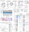
Fig. 1
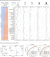
Fig. 1. Classifying pain-associated diagnoses using biological and psychosocial modalities.
a, A schematic illustrating the study workflow. b, Top: bar plots presenting the prevalence of chronic pain across 35 pain-associated diagnoses, categorized by the number of self-reported pain sites and ordered by overall chronic pain prevalence. Counts of diagnoses at baseline are in black and 9-year follow-up in grey. Bottom: a heat map displaying the prevalence of pain sites for each diagnosis, normalized (z score) across conditions for each specific site. The diagnosis-free control group is labelled in light grey. c, Bar plots displaying the mean test set ROC-AUC of models in classifying pain diagnoses, with error bars indicating the 95% CI, estimated from 1,000 bootstrap samples over five iterations of fivefold CV (n = 25). Overlaid points correspond to AUC scores from individual validation folds (n = 25 points total). The bars represent the highest ROC-AUC scores achieved, separated into biological (left) and psychosocial (right) modalities. Bubble heat maps show ROC-AUC scores for modality subcategories, where applicable; bubble colour indicates the absolute AUC score, and bubble size reflects the z score of the AUC relative to other diagnoses within a given modality or subcategory. Only diagnoses with z scores above zero, indicating performance above the group mean AUC, are shown. For clearer visualization, diagnoses are grouped by their best biological modality performance (that is, highest AUC score) into four categories, from poor [0.60–0.65 AUC) to excellent (0.75+ AUC). d, A scatterplot showing the comparison of AUC scores between the best biological and psychosocial modalities for each pain diagnosis, with points coloured according to the best biological modality and labelled by diagnosis. The point size reflects the absolute AUC score difference, highlighting the discrimination discrepancy between biological and psychosocial factors for each diagnosis. Adjacent Venn diagrams depict unique and shared deviance explained (D2), such as pain diagnoses (for example, RA and fibromyalgia) and self-reported chronic pain by the best biological (left circle) and psychosocial modality (right circle), with overlaps shown in the centre. Corresponding stacked bar plots display the same D2 information, with each segment colour-coded by modality. Ha, headache; F, facial; N/S, neck or shoulder; S/A, stomach or abdominal; B, back; Hp, hip; K, knee; IBS, irritable bowel syndrome; Dx, diagnosis; Infl., inflammatory; COPD, chronic obstructive pulmonary disease; Psych. - Bio. AUC, area under the curve difference between psychosocial and biological predictors.
Fig. 2
Fig. 2. Deriving and validating a composite blood assay signature of pain-associated conditions.
a, A schematic of the composite signature’s development for 13 pain-related diagnoses, plus a timeline of UK Biobank data points used. b, The diagnostic and prognostic efficacy of the signature, assessed by Cohen’s d and ROC-AUC, comparing individuals with and without diagnoses, and those who develop diagnoses versus those remaining diagnosis-free. Diagnostic accuracy is measured at baseline, prognostic accuracy at 4 and 9 years post-baseline. Bars show the mean Cohen’s d from 1,000 bootstrap resamples, with error bars indicating the ±95% CI. Overlaid points are a random subsample (n = 50) of these 1,000 resamples. c, A circular graph depicting the signature’s structure: the outer heat map displays blood marker coefficients; the middle layers show individual diagnosis marker coefficients, numbered as in b; and the inner layer presents the standard deviation of marker coefficients. Each segment corresponds to inflammatory/immune, metabolic or haematological assays. d, Pooled effect sizes from c, measured by Cohen’s d, compare baseline diagnoses or diagnoses developing by 4 or 9 years with diagnosis-free individuals. A two-sided Wilcoxon rank-sum test used to compute P values. e, Temporal changes in the signature for participants with ongoing diagnoses, newly developing diagnoses at 4 or 9 years, or remaining diagnosis-free. The significance of signature change between each group and the Stay Dx-free control group was estimated using two-sided linear mixed-effects models, with adjustments for multiple comparisons using Bonferroni correction (Pongoing = 0.07, P4-yr < 0.001, P9-yr = 0.001; Pbonf. < 0.05). Data are presented as mean ± 95% CI from 1,000 bootstrap resamples. f, A simplified model using the top 10 assays was validated with data from the AoU. g, Its discriminatory power is shown via Cohen’s d and ROC-AUC. Bars indicate the mean from 1,000 bootstraps (±95% CI), with overlaid subsampled points (n = 50). Inflammatory/immune markers: CRP, C-reactive protein; Neut, neutrophil; WBC, white blood cell; Mono, monocyte; Eos, eosinophil; baso, Basophil; Lymph, lymphocyte. Metabolic markers: GGT, gamma glutamyl transferase; Cys C, cystatin C; TG, triglyceride; ALP, alkaline phosphatase; UA, uric acid; HbA1c, glycated haemoglobin, Glu, glucose; ALT, alanine aminotransferase; AST, aspartate aminotransferase; Cr, creatinine; TP, total protein; Testo, testosterone; Ca, calcium; ApoB, apolipoprotein b; TBil, total bilirubin; IGF1, insulin-like growth factor; LDL-C, low-density lipoprotein cholesterol; Alb, albumin; TC, total cholesterol. Haematological markers: HLR, high light scatter reticulocyte percentage; Retic, reticulocyte; IRF, immature reticulocyte fraction; RDW, red blood cell distribution width; PCT, platelet count; PLT, platelet count; PDW, platelet distribution width; nRBC; nucleated red blood cell; SCV, sphered cell volume; MPV, mean platelet volume; Hct, haematocrit; Hgb, haemoglobin; Dx, diagnosis; UKBB, UK Biobank; nos, not otherwise specified; Dist., distribution.
Fig. 3
Fig. 3. Deriving and validating a multivariate functional connectivity signature of nociplastic pain.
a, A schematic describing the steps implemented to develop the NFS. The Venn diagram shows the sample sizes and sample overlap among the three nociplastic conditions—fibromyalgia, chronic fatigue syndrome and chronic widespread pain—used to derive a combined nociplastic pain phenotype (n = 535). Bar plots show ROC-AUC results from models trained on brain imaging modalities to classify this phenotype, with error bars denoting the 95% CIs from 1,000 bootstrap samples over five iterations of fivefold CV. b. Top: donut plots displaying the proportions of positive versus negative structure coefficients from models predicting the component nociplastic conditions, based on resting-state fMRI (rsfMRI) data. Bottom: cortical surface renderings visualizing connectivity, thresholded to highlight the top 25% of structure coefficients, which represent the sum of dynamic conditional correlation across brain parcels. Arrows interlinking the cortical renderings depict the association (two-sided Pearson correlation, all P < 0.001 Bonferroni corrected) between the complete unthresholded vectors of structure coefficients (parcel-to-parcel connectivity) for the respective conditions. c, Visualization of nociplastic signature connectivity, thresholded to emphasize the top 25% of structure coefficients that denote the sum of dynamic conditional correlations across brain parcels. d, A Circos plot illustrating the top 10% of connectivity links (represented by structure coefficients) that constitute the nociplastic signature from the resting-state fMRI model, mapped across the canonical resting-state networks. e, Validation of the resting-state fMRI nociplastic signature (NFS) in four aggregated external cohorts from the OpenPain repository (n = 250), benchmarked against a prevalidated neural signature of capsaicin-induced sustained pain (ToPS). The performance in discriminating pain versus pain-free groups across various densities of NFS and ToPS within the OpenPain cohorts is depicted in the plot to the right along with the standard deviation band of a null classification model generated from 10,000 permutations of the NFS. Nocip, nociplastic; T1, T1 structural brain imaging; DWI, diffusion-weighted imaging; All, combination of the features from the T1, DWI and fMRI brain imaging modalities; dlPFC, dorso-lateral prefrontal cortex; S1, primary somatosensory cortex; S2, secondary somatosensory cortex; BOLD, blood-oxygen-level-dependent; PAG, periaqueductal grey.
Fig. 4
Fig. 4. Classifying chronic pain phenotypes using biological and psychosocial modalities.
a, An anatomical body map of chronic pain sites and their counts for the full (baseline) sample and for individuals with a follow-up visit 9 years later. b, The performance of machine learning models in classifying participants reporting acute (light blue) and chronic (dark blue) pain from pain-free (nchronic = 2,679–42,985; nacute 1,012–16,259). Bars show mean test set ROC-AUC scores, with error bars indicating the 95% CI, estimated from 1,000 bootstrap samples over five iterations of fivefold CV (n = 25). Overlaid points correspond to AUC scores from individual validation folds (n = 25 points total). Also included are heritability estimates from GWAS for both acute and chronic pain types. These heritability estimates are significant according to a two-sided, FDR-corrected Wald Test (PFDR < 0.001 for both). c, Left: body map of chronic pain sites. Right: bar plots grouped by modality, showing machine learning model performance (ROC-AUC) in distinguishing participants with specific pain sites from pain-free controls, as described in b. Bars represent mean test set ROC-AUC scores, with error bars indicating the 95% CI, estimated from 1,000 bootstrap samples over five iterations of fivefold CV (n = 25). Heritability estimates are shown for each pain site and are significant using a two-sided, FDR-corrected Wald test (all PFDR < 0.001), except for facial pain (PFDR = 0.093). d, Left: body map showing aggregation of chronic pain sites to depict a phenotype based on the number of self-reported pain sites (that is, anatomical pain spread), ranging from 1 to 4 or more distinct sites. Right: violin plots illustrate the distribution of test set ROC-AUC scores across five iterations of fivefold CV (25 total AUC scores) for models classifying chronic pain spread versus pain-free individuals. Below, bar plots indicate the frequency of each pain spread phenotype in modality-specific models. Ha, headache; F, facial; N/S, neck or shoulder; S/A, stomach or abdominal; B, back; Hp, hip; K, knee. The asterisk denotes a Bonferroni-corrected P value of less than 0.05.
Fig. 5
Fig. 5. Assessing biopsychosocial synergy in the prognosis of pain-associated medical conditions.
a, An overview of the development of diagnosis risk stratification models based on pooled probabilities from biological (blood, brain and bone) and psychosocial modalities. (i) Biological and psychosocial risk scores were segmented into quantiles for stratification. (ii) A Sankey diagram visualizes the possible combinations blood and psychosocial risk quintiles; this operation is similarly conducted for bone and brain risk models. b, Top: diagnosis-associated ORs for each diagnosis are computed for participants within each risk quantile of blood assay risk scores, psychosocial risk scores and combined risk scores, in comparison with all other participants. Bottom: the ORs are transformed to log-odds to elucidate the protective effect associated with lower risk quantiles. c, The performance of the pooled risk scores for each diagnosis was measured against diagnosis-free participants using Cohen’s d effect size. The heat map displays the log-ORs of having a diagnosis across all risk quintile combinations, highlighting the synergistic impact of high combined biological and psychosocial risks and the protective effects conferred by lower combined risks. d,e, The analysis performed in c was replicated for diagnoses most accurately classified by the brain (d) and bone (e) modalities. f, log-ORs depict the synergy between blood assay biomarkers and psychosocial factors in disease prognosis 4 years later. g, Kaplan–Meier curves show the cumulative incidence of receiving a diagnosis up to 15 years after baseline, segregated into four groups according to combinations of blood and psychosocial risk quantiles (high–high, high–low, low–high and low–low). HRs are calculated using Cox-proportional hazard models, while the P value of the differences between groups is calculated using a two-sided log-rank test (PHH < 0.001, PHL = 0.047, PLH = 0.055, PLL < 0.001). h, Bar plots illustrate the association between biological and psychosocial risk scores for blood (left), bone (top right) and brain (bottom right) risks with categories of pain site spread (ranging from 1 to 4+ sites) The R2 values indicate the strength of these associations, as determined by Spearman’s rank correlation. *P < 0.001.
Fig. 6
Fig. 6. A holistic biopsychosocial framework for the development of chronic pain.
A framework for the development of chronic pain over time is depicted through a data-driven structural equation model utilizing longitudinal data. The baseline biological risk is calculated using a blood risk score for RA, derived from 52 blood markers encompassing inflammatory and immune, metabolic and haematological assays. Baseline psychosocial risk is quantified using a psychosocial risk score for RA, derived from 90 pain-agnostic features that include mental, physical and sociodemographic factors. Pain diagnosis denotes the onset of healthcare diagnosed RA between the initial risk assessment and the online follow-up pain questionnaire roughly 10 years later. Pain outcomes encompass the interference of chronic pain across several dimensions (pain impact), the count of self-reported chronic pain sites (pain spread) and the rating of the worst pain in the last 24 h (pain intensity) in the online pain questionnaire. Arrows are labelled with regression coefficients derived from the structural equation modelling. Arrows are drawn only for significant associations. *P < 0.0001; bootstrap (1,000 iterations) tests were used for significance testing of regression coefficients; Med., median; Num., number.
Extended Data Fig. 1
Extended Data Fig. 1. Candidate modalities and machine learning pipeline.
a, Top: A timeline depicts the collection of biological and psychosocial modalities across 3 different UK Biobank study sessions, with the number of samples available for analysis after data cleaning indicated above each modality icon. Below: Each modality is broken down into subcategories where applicable, with a description of example measures within these subcategories. Modalities are highlighted in large, bold font; subcategories in smaller bold font; and example measures are listed in regular font with bullets. b, A schematic outlines the machine learning pipeline employed to evaluate the ability of candidate modalities to classify pain endpoints. A nested Cross-Validation (CV) approach with 5-fold inner and 5-fold outer CV was utilized to optimize model performance without data leakage. The inner loop optimizes performance by training a model on each training fold and tuning hyperparameters on the validation fold to maximize the score. In the outer loop, the model's generalizability is gauged by averaging the scores across left-out test sets. Three machine learning algorithms we're assessed: gradient boosting trees, logistic regression, and linear support vector machines. This process was iterated five times for each modality, with participant order randomized in each iteration to prevent model performance bias based on train/test participant arrangement. GBT, Gradient boosting trees; LR, Logistic regression; SVM, Support vector machine; ROC-AUC, Receiver operating characteristic area under the curve.for age distribution, both for the full cohort and stratified by each diagnosis.
Extended Data Fig. 2
Extended Data Fig. 2. Ethnicity and age in the UK Biobank.
a, Ethnicity prevalence for the entire UK Biobank cohort (n = 502,407) is shown in the pie chart, with a breakdown of on non-white ethnicity prevalence across each pain-associated diagnosis shown using stacked barplots. In part b, data are visualized for age distribution, both for the full cohort and stratified by each diagnosis.
Extended Data Fig. 3
Extended Data Fig. 3. Performance of Pain-Diagnosis Classification Models, Stratified by Sex and Ethnicity.
a, The stacked barplot shows the sex prevalence for each pain-associated diagnosis assessed, with the overall UK Biobank cohort sex prevalence indicated by a dotted line. Models trained on both males and females were evaluated separately in males and females, using ROC-AUC scores from cross-validation testing folds. These scores depict the 95% confidence interval (1,000 bootstrap resamples) from 5 iterations of 5-fold CV for each model. Two-sided Wilcoxon signed-rank tests assessed significant performance differences between sexes, with results Bonferroni corrected for multiple comparisons. In the visualization, orange dots represent classification performance in females, blue dots denote performance in males, and green dots reflect the performance on both sexes (full model). b, Evaluation of the composite blood assay signature for 13 pooled pain diagnoses was conducted separately across racial groups (white, black, Asian, and mixed) within both the UK Biobank and the All of Us cohort, using Cohen’s d (left) and ROC curves (right). The forest plot displays mean Cohen’s d values, with error bars showing the 95% confidence interval, derived from 1,000 bootstrap resamples. The specific diagnoses included: Gout, Polymyalgia rheumatica, Stroke, Crohn's disease, Angina, Rheumatoid arthritis, Psoriatic arthropathy, Peripheral neuropathy, Ankylosing spondylitis, Carpal tunnel syndrome, Pulmonary embolism, Ulcerative colitis, and Arthritis.
Extended Data Fig. 4
Extended Data Fig. 4. Evaluating alternative classification algorithms.
a, Bar plots depict mean test set Receiver Operating Characteristic Area Under the Curve (ROC-AUC) scores for three candidate algorithms—logistic regression, support vector machine (SVM), and gradient boosting trees—in classifying pain-associated diagnoses. Error bars represent the standard deviation across 5-fold cross-validation. Overlaid points indicate AUC scores from individual validation folds (n = 25 for logistic regression; n = 5 for SVM and gradient boosting trees). ROC-AUC scores are color-coded according to the modality that most accurately predicted each outcome, with results arranged based on the performance of the logistic regression model. b, c, e, Regression density plots illustrate the association between the predicted probability of a diagnosis (b, c) or chronic pain site (e) (averaged across all models within a given modality) and confounding factors such as age and/or head motion. These associations are quantified using two-sided Pearson’s correlations, with significance assessed through 1,000 permutation tests. d, Performance (ROC-AUC) for self-reported chronic pain body sites is shown, with error bars calculated as in a.
Extended Data Fig. 5
Extended Data Fig. 5. Biological and psychosocial cross-prediction models for pain diagnoses.
a, Models trained on specific diagnoses were evaluated for their ability to predict other diagnoses that they weren’t trained on based on averaged performance metrics (ROC-AUC, sensitivity, specificity) across untrained diagnoses. This cross-prediction analysis was conducted for the diagnoses that were most accurately classified using blood, brain, and bone modalities alongside psychosocial models. b, Average cross-prediction ROC-AUC curves are displayed for both biological and psychosocial models within each biological modality. c, Quadrant plots show the average sensitivity and specificity of cross-prediction for each diagnosis. Points within the plots are color-coded by modality and labeled by the diagnosis on which the model was trained. Here, sensitivity measures the model's accuracy in detecting untrained diagnoses, while specificity gauges its precision in identifying diagnosis-free controls.
Extended Data Fig. 6
Extended Data Fig. 6. Impact of medications (Rx) on composite blood signature performance.
a, Schematic of the medication-based exclusion approach to assess medication impact on the composite signature. b, Network analysis using edge-betweenness clustering on chi-squared values shows medication-diagnosis communities across 13 diagnoses and 11 medication families. c, Adjusted mean composite signature values for diagnosed participants, excluding those taking specific medications, are shown with error bars representing 99% confidence intervals (CI) estimated from 1,000 bootstrap samples. d, The composite signature's diagnostic performance after medication-based exclusion is evaluated for classifying 13 diagnoses. Performance metrics include Cohen’s d and ROC-AUC, comparing diagnosed individuals to diagnosis-free controls. Bars represent the mean Cohen’s d, with error bars depicting 99% CI, estimated from 1,000 bootstrap samples. e, Medication (Rx) families are organized by their corresponding Anatomical Therapeutic Chemical (ATC) classification codes and displayed in a table format.
Extended Data Fig. 7
Extended Data Fig. 7. Validation datasets demographics.
Top: Color legend indicates the categories for the three demographic dimensions analyzed in each validation dataset (sex, race/ethnicity, and age). a, Demographics for the All of Us Research Program (AoU) are shown with pie charts for the entire cohort and stacked barplots for the subset of participants used for validation of the composite blood signature, categorized by each diagnosis and the healthy control group. Demographics are similarly depicted for the OpenPain datasets b, Ethnicity/race data were not available for the OpenPain datasets. c, Cohen’s d analysis shows the Cohen’s d effect size of pain impact comparing patient and control groups within a subset of OpenPain, measured by the Brief Depression Inventory (BDI) and Visual Analogue Scale (VAS) for pain intensity in the last 24 hours. Error bars indicate the 95% confidence interval, estimated from 1,000 bootstrap samples. Statistical significance is determined use a two-sided Wilcoxon rank-sum test (all P < 0.001). d, Demographic and general health characteristics within the UK Biobank (Top row) and All of Us Research Program (Bottom row) are shown with pie charts for the entire cohorts.
Extended Data Fig. 8
Extended Data Fig. 8. Biological pattern amplification in chronic pain spread.
a, Schematic of chronic pain spreading, quantified by the total number of chronic pain sites, alongside the investigated biological modalities: blood, brain, bone, and genetics. Biological patterns, represented by structure coefficients, associated with pain spread severity were derived from models distinguishing between levels of pain spread severity, ranging from low (one chronic pain site versus pain-free) to high (four or more chronic pain sites versus pain-free). b, Structure coefficients from models are shown for each level of pain spread, ordered by severity and segmented by subcategory. Additionally, coefficients for a generalized chronic pain model, encompassing any number of pain sites, are also shown. c, Cortical surface renderings visualize resting functional connectivity, thresholded to highlight the top 25% of structure coefficients, which represent the sum of dynamic conditional correlation across brain parcels. Arrows interlinking the cortical renderings depict the association (two-sided Pearson correlation, all P < 0.001 bonferonni corrected) between the complete unthresholded vectors of structure coefficients (parcel to parcel connectivity) for adjacent levels of pain spread. d, Skeletal body maps show bone segments colored based on structure coefficients for each assessed bone system, using DXA-derived bone density, mineral content, and area estimates. For each spreading level, averages of these three estimates for each bone system (e.g., head, spine, leg) are depicted on the maps. e, Heritability estimates derived from polygenic risk scores (PRS) are shown. These heritability estimates are significant according to a two-sided, FDR-corrected Wald Test (all P < 0.001). The top 5% of FDR-corrected gene ontology pathways for each PRS are tallied and organized by biological process. The corresponding bars are shaded based on the average explained variance (R2) across pathways within each biological process.

References

    1. Fillingim, R. B. Individual differences in pain: understanding the mosaic that makes pain personal. Pain158 (Suppl 1.), S11–S18 (2017). - PMC - PubMed
    1. van der Miesen, M. M., Lindquist, M. A. & Wager, T. D. Neuroimaging-based biomarkers for pain: state of the field and current directions. Pain Rep.4, e751 (2019). - PMC - PubMed
    1. Davis, K. D. et al. Discovery and validation of biomarkers to aid the development of safe and effective pain therapeutics: challenges and opportunities. Nat. Rev. Neurol.16, 381–400 (2020). - PMC - PubMed
    1. Yusuf, E., Kortekaas, M. C., Watt, I., Huizinga, T. W. J. & Kloppenburg, M. Do knee abnormalities visualised on MRI explain knee pain in knee osteoarthritis? A systematic review. Ann. Rheum. Dis.70, 60–67 (2011). - PubMed
    1. Button, K. S. et al. Power failure: why small sample size undermines the reliability of neuroscience. Nat. Rev. Neurosci.14, 365–376 (2013). - PubMed

LinkOut - more resources