

Predicting dementia in people with Parkinson's disease
- PMID: 40360514
- PMCID: PMC12075756
- DOI: 10.1038/s41531-025-00983-4
Predicting dementia in people with Parkinson's disease
Abstract
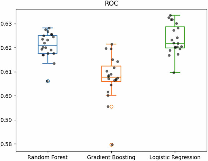
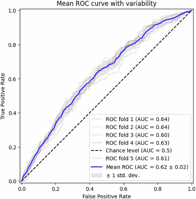
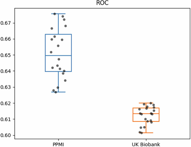
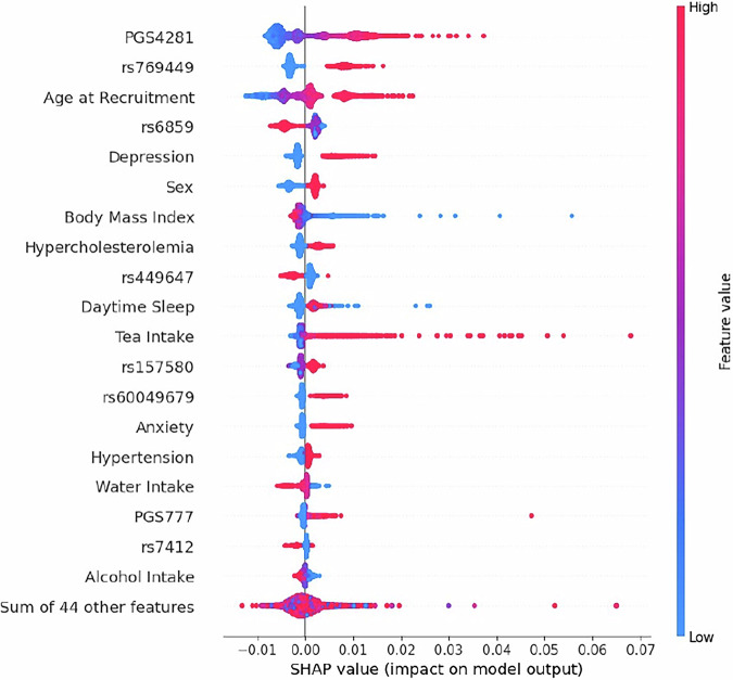
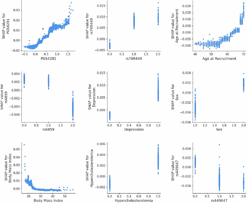
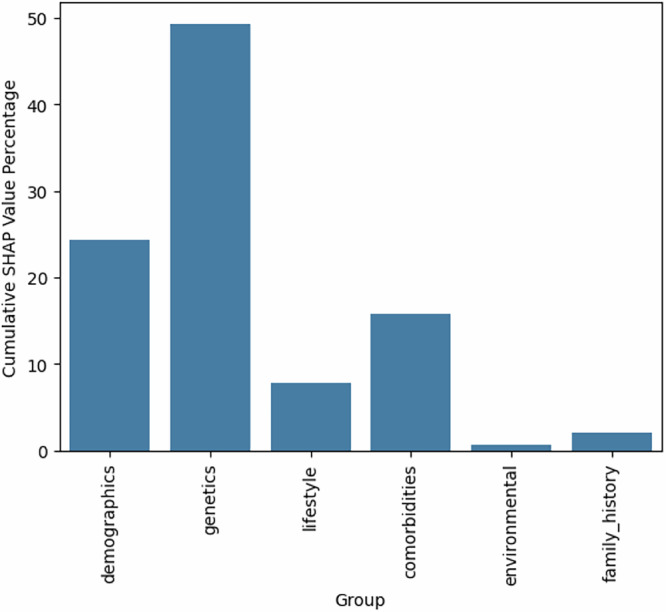
Parkinson's disease (PD) exhibits a variety of symptoms, with approximately 25% of patients experiencing mild cognitive impairment and 45% developing dementia within ten years of diagnosis. Predicting this progression and identifying its causes remains challenging. Our study utilizes machine learning and multimodal data from the UK Biobank to explore the predictability of Parkinson's dementia (PDD) post-diagnosis, further validated by data from the Parkinson's Progression Markers Initiative (PPMI) cohort. Using Shapley Additive Explanation (SHAP) and Bayesian Network structure learning, we analyzed interactions among genetic predisposition, comorbidities, lifestyle, and environmental factors. We concluded that genetic predisposition is the dominant factor, with significant influence from comorbidities. Additionally, we employed Mendelian randomization (MR) to establish potential causal links between hypertension, type 2 diabetes, and PDD, suggesting that managing blood pressure and glucose levels in Parkinson's patients may serve as a preventive strategy. This study identifies risk factors for PDD and proposes avenues for prevention.
© 2025. The Author(s).
Conflict of interest statement
Competing interests: The authors declare no competing interests.
Figures
Similar articles
-
Mild cognitive impairment in Parkinson's disease and its progression onto dementia: a 16-year outcome evaluation of the Denbighshire cohort.Int J Geriatr Psychiatry. 2015 Oct;30(10):1048-55. doi: 10.1002/gps.4261. Epub 2015 Feb 11. Int J Geriatr Psychiatry. 2015. PMID: 25676160
-
Incidence of Mild Cognitive Impairment and Dementia in Parkinson's Disease: The Parkinson's Disease Cognitive Impairment Study.Front Aging Neurosci. 2019 Feb 8;11:21. doi: 10.3389/fnagi.2019.00021. eCollection 2019. Front Aging Neurosci. 2019. PMID: 30800065 Free PMC article.
-
A Single-institution Study on Predictors of Short-term Progression from Mild Cognitive Impairment in Parkinson's Disease to Parkinson's Disease with Dementia.Yonago Acta Med. 2020 Jan 9;63(1):28-33. doi: 10.33160/yam.2020.02.004. eCollection 2020 Feb. Yonago Acta Med. 2020. PMID: 32158330 Free PMC article.
-
Cognitive training interventions for dementia and mild cognitive impairment in Parkinson's disease.Cochrane Database Syst Rev. 2020 Feb 26;2(2):CD011961. doi: 10.1002/14651858.CD011961.pub2. Cochrane Database Syst Rev. 2020. PMID: 32101639 Free PMC article.
-
Meta-Analysis of Cognition in Parkinson's Disease Mild Cognitive Impairment and Dementia Progression.Neuropsychol Rev. 2022 Mar;32(1):149-160. doi: 10.1007/s11065-021-09502-7. Epub 2021 Apr 16. Neuropsychol Rev. 2022. PMID: 33860906 Review.
References
-
- McNaught, K. S. et al. Effects of isoquinoline derivatives structurally related to 1-methyl- 4-phenyl-1,2,3,6-tetrahydropyridine (MPTP) on mitochondrial respiration. Biochem. Pharmacol.51, 1503–1511 (1996). - PubMed
-
- Pouchieu, C. et al. Pesticide use in agriculture and Parkinson’s disease in the AGRICAN cohort study. Int. J. Epidemiol.47, 299–310 (2018). - PubMed
LinkOut - more resources
Full Text Sources
