. 2025 May 14;15(5):326.
doi: 10.3390/metabo15050326.

Exploring the Mechanism of Luteolin in Protecting Chickens from Ammonia Poisoning Based on Proteomic Technology

Affiliations

Exploring the Mechanism of Luteolin in Protecting Chickens from Ammonia Poisoning Based on Proteomic Technology

Yu Jin et al. Metabolites. .

Abstract

Background: Ammonia (NH3), a harmful gas, reduces livestock productivity, threatens their health, and causes economic losses. Luteolin (Lut), an anti-inflammatory flavonoid, may counteract these effects.

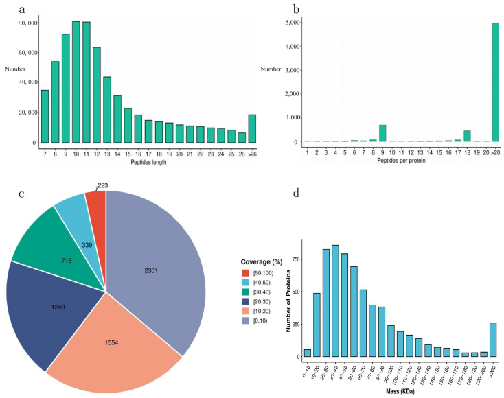
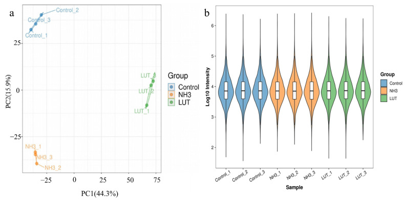
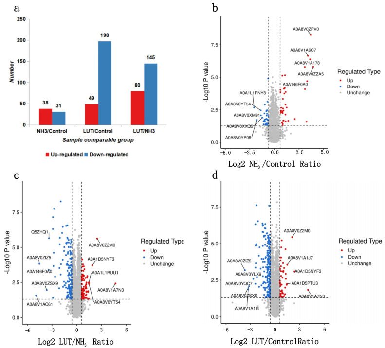
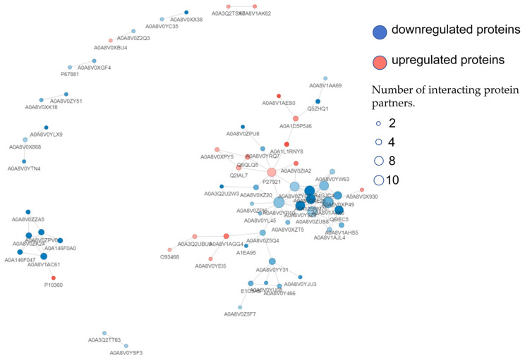
Methods: Our study explored luteolin's protective mechanisms on chicken splenic lymphocytes under ammonia stress using a simulation model and four-dimensional fast data-independent acquisition (4D-FastDIA) proteomics. We identified 316 proteins, with 69 related to ammonia's negative effects and 247 to Lut's protection. Thirty differentially expressed proteins (DEPs) were common to both groups, with 27 showing counter-regulation with Lut.

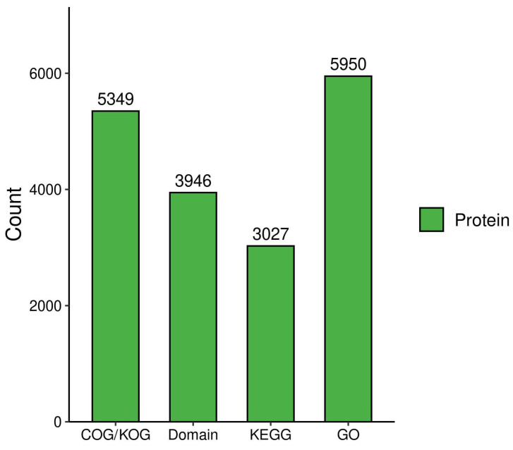
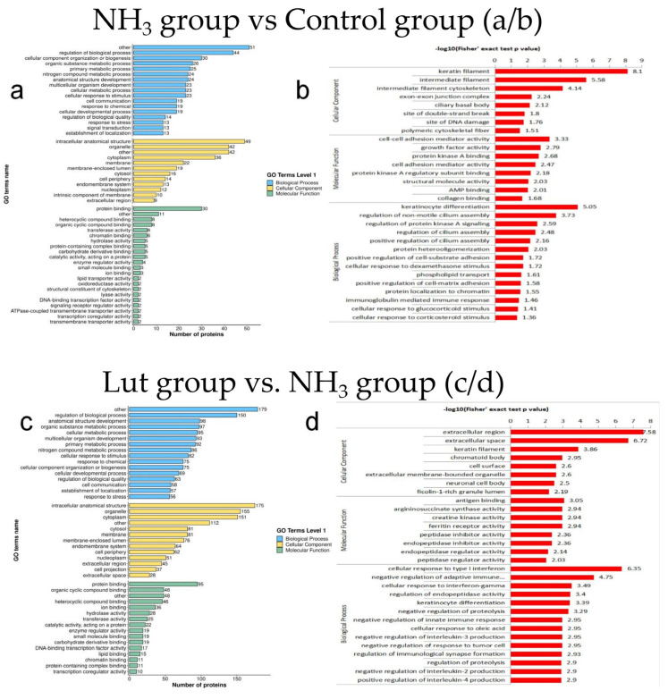
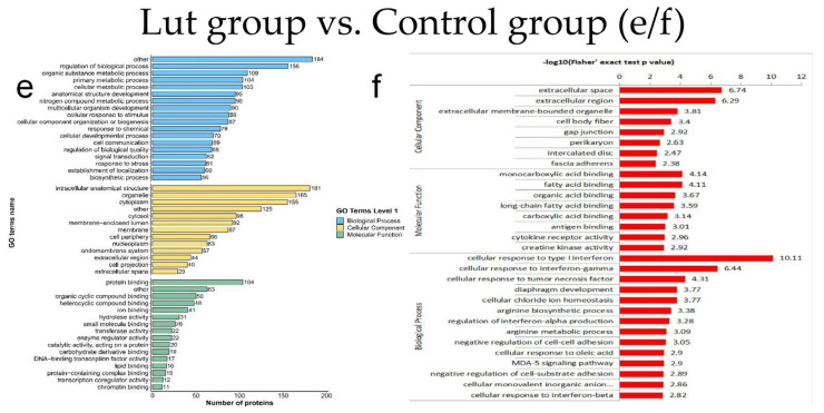
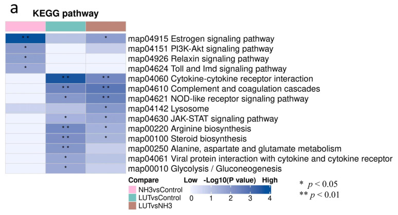
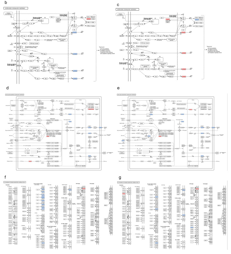
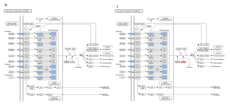
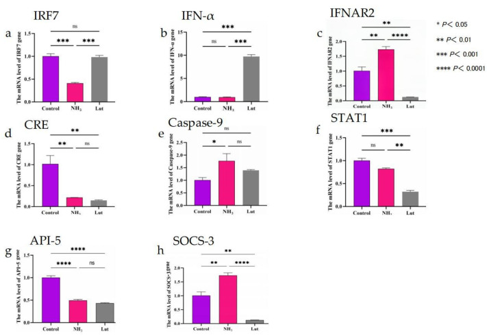
Results: Gene Ontology (GO) analysis showed DEPs enriched in molecular responses to interferons and the negative regulation of immune responses, mainly located extracellularly. Molecular function analysis revealed DEPs in antigen binding and synthase activity. Kyoto Encyclopedia of Genes and Genomes (KEGG) analysis linked DEPs to pathways like estrogen signaling, NOD-like receptor signaling, cytokine-cytokine receptor interaction, and JAK-STAT signaling. The quantitative real-time polymerase chain reaction (qRT-PCR) results indicated that the mRNA levels of Interferon Alpha and Beta Receptor subunit 2 (IFNAR2) and Signal Transducer and Activator of Transcription 1 (STAT1) were trending downward. This observation was in strong agreement with the downregulation noted in the proteomics analysis.

Conclusions: Lut's protective role against ammonia's adverse effects on chicken splenic lymphocytes is linked to the modulation of key signaling pathways, offering insights for further research on treating ammonia exposure with Lut.

Keywords: ammonia; anti-inflammatory; apoptosis; chicken; luteolin; proteomics.


Conflict of interest statement

The authors certify that there are no competing interests that could potentially bias the impartiality of this report.

Figures

Figure 1
Figure 1
Proteomics data quality control. (a) Peptide length distribution plot. The horizontal axis represents the length of the peptides, and the vertical axis represents the number of peptides. (b) Peptide count distribution plot. The horizontal axis represents the number of peptides per protein, and the vertical axis represents the number of proteins. (c) Protein coverage distribution plot. Different colored areas in the plot represent different protein coverage intervals, with the numbers in parentheses indicating the number of proteins in each interval and the percentages showing the proportion of proteins in that interval relative to the total number of proteins. (d) Protein molecular weight distribution plot. The horizontal axis represents the molecular weight, and the vertical axis represents the number of proteins.
Figure 2
Figure 2
Quantitative analysis in proteomics. (a) Principal component analysis (PCA) plot. The horizontal and vertical axes display the explained variance of PC1 and PC2, with higher values indicating greater explained variance. The degree of clustering within a group represents the quality of replicate sampling within that group. (b) Intensity violin distribution plot. The horizontal axis represents the sample names, and the vertical axis represents the intensity values after Log10 transformation. The color of the violin represents different groups. Inside the violin plot is a boxplot, where the box represents the middle 50% distribution interval of the data for that group, and the outer part is a kernel density plot. The larger the area of the regional shape, the greater the probability of the corresponding value distribution. Horizontal comparison can roughly show the dispersion of data distribution within and between groups.
Figure 3
Figure 3
Protein function annotation. Bar chart illustrating the quantitative distribution of proteins across four major functional databases: COG/KOG (5349 proteins), domain analysis (3946 proteins), KEGG (3027 proteins), and GO (5950 proteins). The Y-axis represents protein counts (scale: 0–6000).
Figure 4
Figure 4
Number of DEPs between groups and volcano plot. (a) Bar graph of the number of DEPs between groups. (b) Volcano plot of differential proteins between the NH3 group and the control group. (c) Volcano plot of differential proteins between the Lut group and the NH3 group. (d) Volcano plot of differential proteins between the Lut group and the control group. In Figure 4 (bd), the horizontal axis represents the Log2-transformed fold change (Ratio) values of differential expression between comparison groups; the vertical axis represents the −Log10-transformed p values from the T-test; red dots indicate significantly upregulated proteins; blue dots indicate significantly downregulated proteins, and gray indicates no significant difference. The top 5 upregulated and downregulated proteins (ranked by the absolute value of the Log2 ratio from largest to smallest) are also labeled on the plots.
Figure 5
Figure 5
Differential expression protein GO function annotation and enrichment analysis between groups. (a) Bar chart of GO classification for DEPs between the NH3 group and the control group. (b): Bar chart of GO enrichment analysis for DEPs between the NH3 group and the control group. (c) Bar chart of GO classification for DEPs between the Lut group and the NH3 group. (d) Bar chart of GO enrichment analysis for DEPs between the Lut group and the NH3 group. (e) Bar chart of GO classification for DEPs between the Lut group and the control group. (f) Bar chart of GO enrichment analysis for DEPs between the Lut group and the control group. Figure 5b,d,f display the top 20 most significantly enriched functions, with the vertical axis representing the corresponding GO functional descriptions and the horizontal axis indicating the −Log10-transformed enrichment significance p-values; the larger the value, the stronger the enrichment significance.
Figure 5
Figure 5
Differential expression protein GO function annotation and enrichment analysis between groups. (a) Bar chart of GO classification for DEPs between the NH3 group and the control group. (b): Bar chart of GO enrichment analysis for DEPs between the NH3 group and the control group. (c) Bar chart of GO classification for DEPs between the Lut group and the NH3 group. (d) Bar chart of GO enrichment analysis for DEPs between the Lut group and the NH3 group. (e) Bar chart of GO classification for DEPs between the Lut group and the control group. (f) Bar chart of GO enrichment analysis for DEPs between the Lut group and the control group. Figure 5b,d,f display the top 20 most significantly enriched functions, with the vertical axis representing the corresponding GO functional descriptions and the horizontal axis indicating the −Log10-transformed enrichment significance p-values; the larger the value, the stronger the enrichment significance.
Figure 6
Figure 6
Cluster analysis of differential protein KEGG pathways. (a): KEGG clustering analysis diagram. The color blocks corresponding to the functional descriptions enriched by DEPs in different comparison groups indicate the level of enrichment significance. Blue represents high enrichment significance; blue-white represents low enrichment significance; * indicates p-value < 0.05; ** indicates p-value < 0.01. (b) Estrogen signaling pathway diagram for the NH3 vs. Control group. (c) Estrogen signaling pathway diagram for the Lut vs. NH3 group. (d) NOD-like receptor signaling pathway diagram for the Lut vs. NH3 group. (e) NOD-like receptor signaling pathway diagram for the Lut vs. Control group. (f) Interaction between cytokines and cytokine receptors diagram for the Lut vs. NH3 group. (g) Interaction between cytokines and cytokine receptors diagram for the Lut vs. Control group. (h) JAK-STAT signaling pathway diagram for the Lut vs. NH3 group. (i) JAK-STAT signaling pathway diagram for the Lut vs. Control group.
Figure 6
Figure 6
Cluster analysis of differential protein KEGG pathways. (a): KEGG clustering analysis diagram. The color blocks corresponding to the functional descriptions enriched by DEPs in different comparison groups indicate the level of enrichment significance. Blue represents high enrichment significance; blue-white represents low enrichment significance; * indicates p-value < 0.05; ** indicates p-value < 0.01. (b) Estrogen signaling pathway diagram for the NH3 vs. Control group. (c) Estrogen signaling pathway diagram for the Lut vs. NH3 group. (d) NOD-like receptor signaling pathway diagram for the Lut vs. NH3 group. (e) NOD-like receptor signaling pathway diagram for the Lut vs. Control group. (f) Interaction between cytokines and cytokine receptors diagram for the Lut vs. NH3 group. (g) Interaction between cytokines and cytokine receptors diagram for the Lut vs. Control group. (h) JAK-STAT signaling pathway diagram for the Lut vs. NH3 group. (i) JAK-STAT signaling pathway diagram for the Lut vs. Control group.
Figure 7
Figure 7
Protein–protein interaction networks. In the diagram, the red filling represents upregulated proteins; the blue filling represents downregulated proteins; circles in the diagram represent DEPs, with different colors indicating the protein’s expression changes (blue for downregulated proteins and red for upregulated proteins); the deeper the color, the greater the fold change, and the size of the circle indicates the number of proteins it interacts with; proteins that are commonly differentially expressed between NH3 vs. Control and Lut vs. NH3 are marked with red borders in the diagram.
Figure 8
Figure 8
Expression levels of mRNA for apoptosis-related genes. In the figure, the control group is denoted by purple, the NH3 group by pink, and the Lut group by gray. Panel (a) depicts the mRNA expression levels of IRF7; panel (b) shows the mRNA expression levels of IFN-α; panel (c) illustrates the mRNA expression levels of IFNAR2; panel (d) presents the mRNA expression levels of CRE; panel (e) indicates the mRNA expression levels of Caspase-9; panel (f) reveals the mRNA expression levels of STAT1; panel (g) displays the mRNA expression levels of API-5; and panel (h) reflects the mRNA expression levels of SOCS-3.

Similar articles

References

    1. Shah S.W.A., Chen J., Han Q., Xu Y., Ishfaq M., Teng X. Ammonia inhalation impaired immune function and mitochondrial integrity in the broilers bursa of fabricius: Implication of oxidative stress and apoptosis. Ecotoxicol. Environ. Saf. 2020;190:110078. doi: 10.1016/j.ecoenv.2019.110078. - DOI - PubMed
    1. Naseem S., King A.J. Ammonia production in poultry houses can affect health of humans, birds, and the environment-techniques for its reduction during poultry production. Environ. Sci. Pollut. Res. Int. 2018;25:15269–15293. doi: 10.1007/s11356-018-2018-y. - DOI - PubMed
    1. Miles D.M., Rowe D.E., Cathcart T.C. Litter ammonia generation: Moisture content and organic versus inorganic bedding materials. Poult. Sci. 2011;90:1162–1169. doi: 10.3382/ps.2010-01113. - DOI - PubMed
    1. Liu J., Liu H., Tang H., Ran L., Wang D., Yang F., Zhang H., Teng X., Chen D. Golgi apparatus regulated pyroptosis through the miR-32-5p/Golga7/NLRP3 axis in chicken splenic lymphocytes exposure to ammonia. Environ. Pollut. 2024;362:124923. doi: 10.1016/j.envpol.2024.124923. - DOI - PubMed
    1. Chen D., Ning F., Zhang J., Tang Y., Teng X. NF-κB pathway took part in the development of apoptosis mediated by miR-15a and oxidative stress via mitochondrial pathway in ammonia-treated chicken splenic lymphocytes. Sci. Total Environ. 2020;729:139017. doi: 10.1016/j.scitotenv.2020.139017. - DOI - PubMed

LinkOut - more resources