. 2025 Jul;17(7):1842-1867.
doi: 10.1038/s44321-025-00253-z. Epub 2025 May 27.

Ontology-guided clustering enables proteomic analysis of rare pediatric disorders

Affiliations

Ontology-guided clustering enables proteomic analysis of rare pediatric disorders

Ericka C M Itang et al. EMBO Mol Med. 2025 Jul.

Abstract

The study of rare pediatric disorders is fundamentally limited by small patient numbers, making it challenging to draw meaningful biological conclusions. To address this, we developed a framework integrating clinical ontologies with proteomic profiling, enabling the systematic analysis of rare conditions in aggregate. We applied this approach to urine and plasma samples from 1140 children and adolescents, encompassing 394 distinct disease conditions and healthy controls. Using advanced mass spectrometry workflows, we quantified over 5000 proteins in urine, 900 in undepleted (neat) plasma, and 1900 in perchloric acid-depleted plasma. Embedding SNOMED CT clinical terminology in a network structure allowed us to group rare conditions based on their clinical relationships, enabling statistical analysis even for diseases with as few as two patients. This approach revealed molecular signatures across developmental stages and disease clusters while accounting for age- and sex-specific variation. Our framework provides a generalizable solution for studying heterogeneous patient populations where traditional case-control studies are impractical, bridging the gap between clinical classification and molecular profiling of rare diseases.

Keywords: Pediatrics; Plasma; Proteomics; SNOMED CT; Urine.


Conflict of interest statement

Disclosure and competing interests statement. MM is an indirect shareholder in EvoSep Biosystems. The remaining authors declare no competing interests.

Figures

Figure 1
Figure 1. Overview of the cohort and the proteomics workflow.
(A) Composition of the study cohort, characterized by biological sex, age, and group (control or diagnosed). (B) Distribution of the pediatric disorders within the study cohort, illustrating the top 10 most frequent diagnostic categories, including the “Well child (finding)” label for the control group. (C) Venn diagram showing participants who provided urine samples, plasma samples, or both. (D) Workflow for urine proteome profiling using the dimethyl-based multiplexed-DIA (mDIA) approach. Created with BioRender.com. (E) Workflow for plasma proteome profiling using the label-free DIA approach. Both neat and PCA-N plasma were analyzed. The depletion strategy was conducted using perchloric acid to selectively precipitate out high-abundance proteins. Created with BioRender.com.
Figure 2
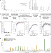
Figure 2. Dependency of the proteome profile on age and biological sex.
(A) Left panel: Distribution of urine samples across the first two principal components, with each dot representing an individual sample, color-coded by age in years. Right panel: Distribution of the first principal component (PC1) across different age groups shown as boxplots with overlaid jitter plots. The boxes represent the interquartile range (IQR; 25th to 75th percentiles), with the median value indicated by a central line. Whiskers extend to the minimum and maximum values within 1.5 times the IQR from the box. A legend on the right specifies the number of samples per age group. (B) Left panel: Distribution of neat plasma samples across the first two principal components, with each dot representing an individual sample, color-coded by age in years. Right panel: Distribution of the first principal component (PC1) across different age groups shown as boxplots with overlaid jitter plots. The boxes represent the interquartile range (IQR; 25th to 75th percentiles), with the median value indicated by a central line. Whiskers extend to the minimum and maximum values within 1.5 times the IQR from the box. A legend on the right specifies the number of samples per age group. (C) Left panel: Hierarchical clustering analysis of sex-specific proteins significantly associated with age in the urine proteome. The heat map displays z-scored mean protein intensities across sex and age. Right panel: Protein intensity trajectories across age of the five selected modules from the left panel. Solid lines represent the mean values across age groups, and shaded areas indicate the 95% confidence intervals. (D) Same analysis as in (C), but for neat plasma samples.
Figure 3
Figure 3. Differential protein expression in the ten most prevalent pediatric diseases.
Sample sizes: control group, n = 131; cystic fibrosis, n = 79; celiac disease, n = 68; diabetes mellitus type 1, n = 29; Crohn’s disease, n = 25; adrenogenital disorder, n = 22; hemophilia A, n = 19; short stature disorder, n = 18; disorder of immune function, n = 17; chronic ulcerative colitis, n = 16; and familial Mediterranean fever, n = 15. (A) Volcano plot showing differential protein expression in the neat plasma proteome of cystic fibrosis patients (n = 79) compared to healthy controls (n = 131), analyzed using ANCOVA with sex and age as covariates. Proteins with significant changes (FDR-adjusted P value < 0.05) are highlighted. This panel is also shown as part of the representative plots in Fig. EV4D. (B) Boxplots comparing aldolase B (ALDOB), cadherin 1 (CDH1), and immunoglobulin delta heavy chain (IGHD) expression in the neat plasma proteome of the control group labeled as “Well child (finding)” and the ten most prevalent diseases in the cohort. Protein intensities are normalized against the median protein intensity of the control group. The boxes represent the interquartile range (IQR), with the median indicated by a central line. Whiskers extend to the farthest point within 1.5 times the IQR from the box. Outliers are removed for clarity. A horizontal dashed line marks the zero point (median protein intensity of the control group). (C) Same as in (A) but for the PCA-N plasma proteome. This panel is also shown as part of the representative plots in Fig. EV4E. (D) Same as in (B) but for the expression of guanylin (GUCA2A), ADAM-like decysin 1 (ADAMDEC1), fatty acid-binding protein 1 (FABP1), and glycoprotein 2 (GP2) in the PCA-N plasma proteome. Protein intensities are normalized against the median protein intensity of the control group. The boxes represent the interquartile range (IQR), with the median indicated by a central line. Whiskers extend to the farthest point within 1.5 times the IQR from the box. Outliers are removed for clarity. A horizontal dashed line marks the zero point (median protein intensity of the control group). (E) Volcano plot showing differential protein expression in the urine proteome of adrenogenital disorder patients (n = 22) compared to healthy controls (n = 131), analyzed using ANCOVA with sex and age as covariates. Proteins with significant changes (FDR-adjusted P value < 0.05) are highlighted. This panel is also shown as part of the representative plots in Fig. EV4C. (F) Boxplots comparing haptoglobin (HP) and F-actin-capping protein subunit alpha-2 (CAPZA2) expression in the urine proteome of the control group labeled as “Well child (finding)” and the ten most prevalent diseases in the cohort. Protein intensities are normalized against the median protein intensity of the control group. The boxes represent the interquartile range (IQR), with the median indicated by a central line. Whiskers extend to the farthest point within 1.5 times the IQR from the box. Outliers are removed for clarity. A horizontal dashed line marks the zero point (median protein intensity of the control group).
Figure 4
Figure 4. Analysis of SNOMED CT-based disease clusters and their proteome profiles.
(A) Pairwise Euclidean distances between disease nodes within each cluster, calculated from node2vec embeddings. Lower distances indicate greater biological and clinical similarity. (B) Two-dimensional UMAP visualization of node2vec embeddings for SNOMED CT diagnosis nodes in the cohort. Each point represents a disease term, colored and labeled by cluster assignments from k-means clustering (k = 43). (C) Coefficient of variation (CV) analysis for urine proteome clusters. The left panel shows boxplots representing the interindividual CVs for protein intensities within each cluster. Cluster 18 (n = 4), highlighted in red, exhibits the lowest CV among the clusters. The right panel shows the overall biological CV across all quantified proteins in the urine proteome. In both panels, boxplots show the distribution of values across groups: the center line indicates the median, box limits represent the interquartile range (25th to 75th percentiles), and whiskers extend to the most extreme data point within 1.5 times the IQR. Outliers were removed for visualization clarity. The accompanying tree diagram below illustrates the SNOMED CT terms and the number of patients associated with cluster 18. (D) Coefficient of variation (CV) analysis for PCA-N plasma proteome clusters. The left panel shows boxplots representing the interindividual CVs for protein intensities within each cluster. Cluster 16 (n = 2), highlighted in red, exhibits the lowest CV among the clusters. The right panel shows the overall biological CV across all quantified proteins in the PCA-N plasma proteome. In both panels, boxplots show the distribution of values across groups: the center line indicates the median, box limits represent the interquartile range (25th to 75th percentiles), and whiskers extend to the most extreme data point within 1.5 times the IQR. Outliers were removed for visualization clarity. The accompanying tree diagram below illustrates the SNOMED CT terms and the number of patients associated with cluster 16. (E) Volcano plot of differential protein expression in the urine proteome between cluster 18 (n = 4) and healthy controls (n = 131), using Welch’s t test with FDR-adjusted P value < 0.05. Proteins with significant expression differences are highlighted and color-coded based on their adjusted P values. (F) Volcano plot of differential protein expression in the PCA-N plasma proteome between cluster 16 (n = 2) and healthy controls (n = 131), using Welch’s t test with FDR-adjusted P value < 0.05. Proteins with significant expression differences are highlighted and color-coded based on their adjusted p values.
Figure EV1
Figure EV1. Assessment of data quality in the urine and neat plasma proteomics datasets.
(A) Dimethyl labeling efficiency in the urine dataset, assessed by comparing the intensity ratios of Δ0-labeled peptides to all detected peptides in DDA mode across three technical replicates (n = 3). (B) Distribution of precursor identifications for a Δ0-labeled pooled urine sample analyzed through the mDIA workflow across three technical replicates (n = 3). (C) Median number of precursor identifications for each of the three dimethyl labeling channels (Δ0/Δ4/Δ8), calculated across three technical replicates for a Δ0-labeled pooled urine sample (n = 3). The secondary axis displays the percentage of false discovery rate (FDR), derived from the ratio of false precursor identifications in the Δ4 and Δ8 channels relative to the Δ0 channel. (D) Violin plot of analytical coefficients of variation (%CV) for protein groups identified in the reference channel of the urine proteomics dataset, filtered by a channel q-value < 0.2, across 553 technical replicates (n = 553). A horizontal dashed line indicates the median analytical CV of 21%. The internal boxplot shows the interquartile range (IQR), with whiskers extending to the most extreme point within 1.5 times the IQR. Outliers are not shown for clarity. (E) Violin plot of analytical coefficients of variation (%CV) for protein groups identified in the QC samples of the neat plasma proteomics dataset, filtered by a channel q-value < 0.2, across 112 technical replicates (n = 112). A horizontal dashed line indicates the median analytical CV of 13%. The internal boxplot shows the interquartile range (IQR), with whiskers extending to the most extreme point within 1.5 times the IQR. Outliers are not shown for clarity.
Figure EV2
Figure EV2. Proteomic profiling of urine and neat plasma samples in a pediatric cohort.
(A) Cumulative protein group identifications in each body fluid. Proportion of protein groups with <50% and <20% biological CV for both is shown. (B) Abundance rank plot of protein groups based on median protein intensities. The top ten most abundant protein groups for each body fluid are listed. (C) Data completeness curve for each body fluid (left: urine; right: neat plasma). Number of protein groups quantified with >60% data completeness is shown.
Figure EV3
Figure EV3. Integration of urine and neat plasma proteome data.
(A) Venn diagram showing distinct protein group identifications in the urine and neat plasma proteomes, or in both. (B) Abundance map of the commonly identified proteins in the urine and neat plasma proteomes, showing the correlation between their median protein intensities in log2 space. Apolipoproteins, complement system proteins, coagulation factors, and other known plasma proteins are highlighted in red. Proteins related to kidney function and filtration, as well as structural and epithelial proteins such as keratins and mucins are highlighted in yellow. A diagonal line representing x = y is shown as a gray, dashed line. (C) Volcano plot displaying Pearson correlation coefficients between protein intensities in the urine and neat plasma proteome across the cohort, along with their associated FDR-adjusted P values (Benjamini–Hochberg correction). Statistically significant, moderately correlating proteins (FDR-corrected P value < 0.01 and Pearson’s r ≥ 0.4) are highlighted. (D) Correlation plots of log2-transformed protein intensities of the urine and neat plasma proteomes for each individual protein highlighted in (C). Regression lines are shown as solid black lines, and the Pearson’s r values are displayed.
Figure EV4
Figure EV4. Differential expression analysis of the top ten most prevalent diseases versus healthy controls.
(A) Number of differentially regulated protein groups (raw P value < 0.01) in the urine proteome for each disease in the top ten most prevalent diseases, as identified by ANCOVA with age and sex as covariates. Highlighted in darker yellow color is the number of differentially regulated protein groups that have an FDR-adjusted (Benjamini–Hochberg correction) P value < 0.05. (B) Number of differentially regulated protein groups (P value < 0.01) in the plasma proteome for each disease in the top ten most prevalent diseases, as identified by ANCOVA with age and sex as covariates. The neat plasma dataset measured on the Bruker timsTOF HT is shown in red, while the PCA-N plasma dataset measured on the Thermo Orbitrap Astral is shown in green. Highlighted in darker colors are the number of differentially regulated protein groups that have an FDR-adjusted (Benjamini–Hochberg correction) P value < 0.05. (C) Representative volcano plots illustrating differential protein expression for each disease compared to healthy controls in the urine proteome, analyzed using ANCOVA with sex and age as covariates. Note that the volcano plot for adrenogenital disorder is also shown in Fig. 3E. (D) Representative volcano plots illustrating differential protein expression for each disease compared to healthy controls in the neat plasma proteome, analyzed using ANCOVA with sex and age as covariates. Note that the volcano plot for cystic fibrosis is also shown in Fig. 3A. (E) Representative volcano plots illustrating differential protein expression for each disease compared to healthy controls in the PCA-N plasma proteome, analyzed using ANCOVA with sex and age as covariates. Note that the volcano plot for cystic fibrosis is also shown in Fig. 3C.
Figure EV5
Figure EV5. Construction and clustering of SNOMED CT ontology network for disease grouping.
(A) Distribution of patient counts across disease categories before and after SNOMED CT-based clustering. The main histogram shows the number of original disease categories in the cohort (prior to clustering), binned by patient count. The dashed vertical line at n = 5 indicates the threshold for identifying the number of disease groups containing less than five patients. The inset displays the corresponding distribution after clustering, demonstrating a marked reduction in the number of small patient groups. (B) Schematic of the SNOMED CT-based clustering pipeline. (C) Depth from diagnosis node to root node across different inclusion windows (1, 2, or 3 levels of ancestors and descendants). For each subgraph, we calculated the maximum upward path length from each cohort diagnosis node to the most distant ancestor. (D) Silhouette score curves across values of k (number of clusters) ranging from 10 to 200 for k-means clustering. The best k was defined as the point where the Silhouette score reached 97% of its maximum. (E) Same as in (D) but for agglomerative clustering. (F) Same as in (D) but for spectral clustering. (G) Total number of significantly altered protein groups identified per body fluid after ontology-guided disease clustering. Bar plots show the number of differentially expressed proteins in each proteomics dataset—urine, neat plasma, and PCA-N plasma—compared to healthy controls. Significance was determined using Welch’s t test with Benjamini–Hochberg correction (FDR < 0.05).

References

    1. Albrecht V, Müller-Reif JB, Mann M, Brennsteiner V (2025) A simplified perchloric acid workflow with neutralization (PCA-N) for democratizing deep plasma proteomics at population scale. Preprint at 10.1101/2025.03.24.645089
    1. Ammar C, Schessner JP, Willems S, Michaelis AC, Mann M (2023) Accurate label-free quantification by directLFQ to compare unlimited numbers of proteomes. Mol Cell Proteom 22:100581 - PMC - PubMed
    1. Benjamin RJ, McLaughlin LS (2012) Plasma components: properties, differences, and uses. Transfusion 52:9S–19S - PubMed
    1. Bertaggia E, Scabia G, Dalise S, Lo Verso F, Santini F, Vitti P, Chisari C, Sandri M, Maffei M (2014) Haptoglobin is required to prevent oxidative stress and muscle atrophy. PLoS ONE 9:e100745 - PMC - PubMed
    1. Bjelosevic S, Pascovici D, Ping H, Karlaftis V, Zaw T, Song X, Molloy MP, Monagle P, Ignjatovic V (2017) Quantitative age-specific variability of plasma proteins in healthy neonates, children and adults. Mol Cell Proteom 16:924–935 - PMC - PubMed

LinkOut - more resources