. 2025 Jul;12(25):e2413052.
doi: 10.1002/advs.202413052. Epub 2025 May 28.

Key Connectomes and Synaptic-Compartment-Specific Risk Genes Drive Pathological α-Synuclein Spreading

Affiliations

Key Connectomes and Synaptic-Compartment-Specific Risk Genes Drive Pathological α-Synuclein Spreading

Yuanxi Li et al. Adv Sci (Weinh). 2025 Jul.

Abstract

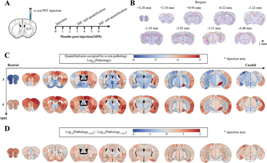
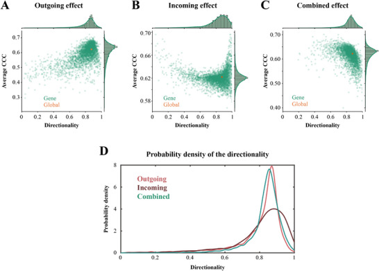
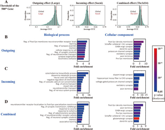
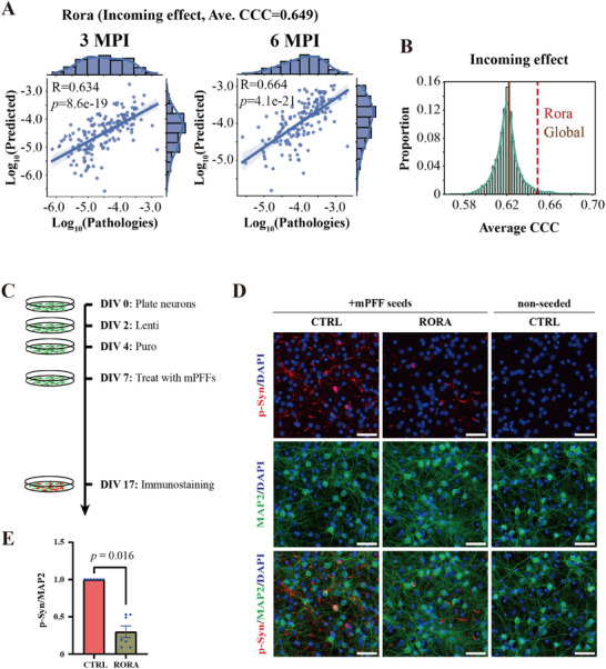
Previous studies have suggested that pathological α-synuclein (α-Syn) mainly transmits along the neuronal network, but several key questions remain unanswered: 1) How many and which connections in the connectome are necessary for predicting the progression of pathological α-Syn? 2) How to identify risk genes that affect pathology spreading functioning at presynaptic or postsynaptic regions, and are these genes enriched in different cell types? Here, these questions are addressed with novel mathematical models. Strikingly, the spreading of pathological α-Syn is predominantly determined by the key subnetworks composed of only 2% of the strongest connections in the connectome. Genes associated with the selective vulnerability of brain regions to pathological α-Syn transmission are further analyzed to distinguish those functioning at presynaptic versus postsynaptic regions. Those risk genes are significantly enriched in microglial cells of presynaptic regions and neurons of postsynaptic regions. Gene regulatory network analyses are then conducted to identify "key drivers" of genes responsible for selective vulnerability and overlapping with Parkinson's disease risk genes. By identifying and discriminating between key gene mediators of transmission operating at presynaptic and postsynaptic regions, this study has demonstrated for the first time that these are functionally distinct processes.

Keywords: key connectomes; mathematical models; pathological α‐synuclein; risk genes; systems biology analyses.


Conflict of interest statement

The authors declare no conflict of interest.

Figures

Figure 1
Figure 1
Immunohistochemistry experiments and quantitative biology. A) Experiment schematic: pathological α‐Syn PFF was stereotaxically injected into the iCP region. Mice were euthanized at 3 and 6 months‐post‐injection prior to immunohistochemistry, which were then quantitatively assessed for α‐Syn inclusions using QuPath. B) Representative images of brain sections and annotations. 9 brain bregma levels were selected per mouse, and 196 gray matter regions were manually annotated. C) Heatmap of regions affected by α‐Syn pathologies (log10‐transformed; *, injection area). Warmer colors represent areas with higher pathology burdens, while cooler colors represent areas with lower pathology burdens. D) Differences of regional pathology burdens between 3 and 6 MPI, where the color indicates the fold change in regional pathology burden between 3 and 6 MPI. Scale bar in (B): 1 mm.
Figure 2
Figure 2
Global spread model based on the mesoscale connectome revealed the spread directionality of α‐Syn in WT mice was predominantly retrograde with a minor anterograde component. A) Best model results (Ave. CCC = 0.622) with the directionality parameter of s = 0.87. B) Model results (Ave. CCC = 0.274) with the fully anterograde parameter of s = 0. C) Model results (Ave. CCC = 0.609) with the fully retrograde parameter of s = 1. D) Model results (Ave. CCC = 0.595) with the unbiased directionality parameter of s = 0.5. The directionality of pathological α‐Syn spread is shown by the arrows in the box, while the length of the line indicates the proportion of spread direction. Each dot represents one brain region, and the x‐axis and y‐axis represent the pathology (log10‐transformed) found empirically and predicted by the model, respectively. For each situation, the Pearson's correlation coefficient and the best regression lines for both 3 and 6 MPI are also displayed. The shaded ribbon represented the 95% prediction interval. Abbreviations: R, Pearson's correlation coefficient; p, p values from linear regression.
Figure 3
Figure 3
The spread of pathological α‐Syn was driven by the key connectomes composed of only top 2% strongest connections. A) Distribution of model fitting results using 1000 matrices with entries sampled from the standard uniform distribution in place of the actual connectome (Ave. CCC at 95th percentile = 0.169). B) Distribution of model fitting results using matrices with randomly permuted elements of the actual connectome (Ave. CCC at 95th percentile = 0.194). C,D) Distributions of model fitting results by removing random subsets of connections of various sizes at a 5% incremental gradient, resampling the connectome 1000 times per subset size. (C) Showing the model performance: for each, the dashed line represented the median, and the two solid lines represented the 25% and 75% percentiles. (D) Showing the range (maximum minus minimum Ave. CCC value) within the group. E,F) Model fitting results after removing proportions of edges from the connectome in order of connection strength. (E) Model fitting results after removing from weakest connections; note that the model did not fit successfully when removing 99% of the weakest connections. (F) Model fitting results after removing the strongest connections. The dotted line of the actual connectome showed the best model fitting of the global spread model with the actual (whole) connectome (Ave. CCC = 0.622). G–I) Visualization of key connectomes (2% of the strongest connections), showing heatmaps of the connection values, where the warmer colors represent stronger connections (log10(weight + 1)‐transformed). (G) Showing 2% of the strongest connections of the connectome. (H) Showing the whole connectome. (I) Heatmap of the adjacency matrix corresponding to (G). The actual connectome here consists of 410 brain regions with 168 100 connections, and 2% of connectome equals to 3362 connections.
Figure 4
Figure 4
Model results of gene expression model for the outgoing, incoming, and combined effects. A–D) Schematics of the global spread model (A) and gene expression models (B, outgoing effect; C, incoming effect; D, combined effect): the circles in different colors indicates brain regions; Gi in the circles indicate the regional gene expression; and Cij indicates the axonal projection strength from brain region i to j. The regional gene expression had different updated effects on the connectome by revising nothing (A, global spread model), revising only the outgoing connections (B, outgoing effect), only the incoming connections (C, incoming effect), or both equally (D, combined effect). E) Model results of the best outgoing effect gene (Dok5). F) Model results of the best incoming effect gene (Grid2ip). G) Model results of the best combined effect gene (Pde1a). H–J) Model results of Snca gene for its outgoing (H), incoming (I), and combined effects (J), respectively. K) The distribution of model results of outgoing effect (model performance: Dok5 > Snca > Gba > Vps35 > Global). L) The distribution of model results of incoming effect (model performance: Grid2ip > Snca > Global > Vps35 > Gba). M) The distribution of model results of combined effect (model performance: Pde1a > Snca > Gba > Vps35 > Global). Each dot in (E–J) represents one brain region, while the x‐axis and y‐axis represent the pathology (log10‐transformed) found empirically and predicted by the model, respectively. The Pearson's correlation coefficient and the best regression lines for both 3 and 6 MPI are also displayed. The shaded ribbon in (E–J) represents the 95% prediction interval. Abbreviations: R, Pearson's correlation coefficient; p, p values from linear regression.
Figure 5
Figure 5
The relationship between individual gene expression and the spread directionality of the gene model. A–C) Directionality versus Ave. CCC, where each green dot represents one gene and the orange dot represents the best results for the global spread model. The x‐axis and y‐axis represent their directionality parameter values and Ave. CCC, respectively. D) Probability density of the directionality of the three groups, where the x‐axis and y‐axis represent the directionality parameter values and the probability density, respectively.
Figure 6
Figure 6
GO analyses for the top 500 genes of outgoing, incoming, and combined effect. A) Threshold of the 500th gene of the three groups (Large for the outgoing effect, Socs6 for the incoming effect, and Tbc1d14 for the combined effect). Each of the three groups exhibited better performance than the global spread model (p < 0.0001, one sample Wilcoxon test against the Ave. CCC value of global spread model). B–D) Biological process and cellular component of GO analyses for the candidate genes from (B) outgoing effect; (C) incoming effect; (D) combined effect. For each GO entry, the displayed results were strictly sorted by the highest fold enrichment and statistically significant after Bonferroni correction. The colors of the bars represent the p values, and the length represents the fold enrichment. Only the primary hierarchy is shown. Abbreviations: Reg., regulation; Post‐Syn, postsynaptic; Pre‐Syn, presynaptic.
Figure 7
Figure 7
Results of cell‐type, key driver (KD), and GWAS‐associated enrichment analyses for the candidate (top 500) genes of outgoing, incoming, and combined effects. A) Cell‐type analyses based on the enrichment of cell‐type marker genes among the candidate genes of each effect. The sizes of the circles indicate FDR values within each row and the face colors indicate enrichment. Circles with black boundaries were statistically significant after FDR correction (α = 0.05). The gray cells indicate missing results. Abbreviations: Ex – excitatory, In – inhibitory, OPC – oligodendrocyte progenitor cell. B) The union neuronal SCING gene regulatory network of three individual regulatory networks of the top KDs for the candidate genes with outgoing, incoming, and combined effects. Gene regulatory networks were constructed using SCING and neuronal scRNAseq data from different single cell Atlases including the Allen Brain Single Cell Atlas, the Mouse Cell Atlas (MCA), Tabula Muris, and Tabula Muris Senis (see the Experimental Section). SCING networks were constructed from each dataset and the union network was used for key driver analysis. The larger, labeled circles indicate genes that were identified to be KDs, and smaller circles indicate candidate genes with the three effects. The direction of edges between genes indicates the regulatory relationship within SCING networks. For KDs, the color inside of each circle indicates from which candidate gene set the KD was identified, and multiple colors indicate the KD gene was a KD for multiple categories of candidate genes. The boundary color indicates whether the KD gene itself appeared as a candidate gene in any effect (or multiple effects). C) Enrichment analyses between the GWAS PD risk genes and our regulatory network genes. The outgoing, incoming, combined, and union represent the genes from different SCING networks (Figures S24–S26 (Supporting Information) and (B)). The p values were Bonferroni corrected with n = 4.
Figure 8
Figure 8
RORA overexpression reduces α‐Syn inclusions in mouse primary neurons. A) Model results of RORA gene for its incoming effect (ranking 120th). Each dot represents one brain region, while the x‐axis and y‐axis represent the pathology (log10‐transformed) found empirically and predicted by the model, respectively. The Pearson's correlation coefficient and the best regression lines for both 3 and 6 MPI are also displayed. The shaded ribbon represents the 95% prediction interval. Abbreviations: R, Pearson's correlation coefficient; p, p values from linear regression. B) The distribution of model results of incoming effect and the ranking position of RORA. C) Schematic representation of the experimental timeline for the primary mouse cortical neuron assay of synuclein inclusion formation. Embryonic cortical neurons were plated on day in vitro 0 (DIV0), followed by the addition of homemade lentivirus at DIV2. Puromycin selection began two days later (DIV4), and recombinant mouse PFFs were introduced at DIV7. At DIV17, cultures were detergent‐extracted and fixed before immunostaining with an anti‐α‐Syn Phospho (Ser129) antibody (81A) to detect synuclein pathology, MAP2 as a neuronal health marker, and DAPI to visualize cell nuclei. Plates were imaged, and quantification was performed for total integrated density of the 81A signal, total MAP2‐positive area, and DAPI‐positive cell counts/area. D) Representative images showing α‐Syn pathology with a significant reduction upon RORA overexpression. Cultures were also stained with DAPI to visualize cell nuclei and MAP2 to assess neuronal morphology, which were unaffected by mpffs treatment or RORA overexpression. Scale bar = 50 µm. E) Quantification of relative α‐Syn inclusions in control and RORA‐overexpressing groups, with synuclein pathology (IntDen sum) normalized to MAP2 signal (area). Statistical analysis was performed using one sample Wilcoxon test. Each dot represents an independent experiment (n = 7), and error bars indicate standard error of the mean.

Update of

Similar articles

Cited by

References

    1. Peng C., Gathagan R. J., Covell D. J., Medellin C., Stieber A., Robinson J. L., Zhang B., Pitkin R. M., Olufemi M. F., Luk K. C., Nature 2018, 557, 558. - PMC - PubMed
    1. Peng C., Trojanowski J. Q., Lee V. M.‐Y., Nat. Rev. Neurol. 2020, 16, 199. - PMC - PubMed
    1. Spillantini M. G., Crowther R. A., Jakes R., Hasegawa M., Goedert M., Proc. Natl. Acad. Sci. USA 1998, 95, 6469. - PMC - PubMed
    1. El‐Agnaf O. M., Salem S. A., Paleologou K. E., Curran M. D., Gibson M. J., Court J. A., Schlossmacher M. G., Allsop D., FASEB J. 2006, 20, 419. - PubMed
    1. Mollenhauer B., Cullen V., Kahn I., Krastins B., Outeiro T. F., Pepivani I., Ng J., Schulz‐Schaeffer W., Kretzschmar H. A., McLean P. J., Exp. Neurol. 2008, 213, 315. - PubMed

Substances