. 2025 Jul;31(7):2232-2243.
doi: 10.1038/s41591-025-03719-2. Epub 2025 Jun 4.

Individual variations in glycemic responses to carbohydrates and underlying metabolic physiology

Affiliations

Individual variations in glycemic responses to carbohydrates and underlying metabolic physiology

Yue Wu et al. Nat Med. 2025 Jul.

Abstract

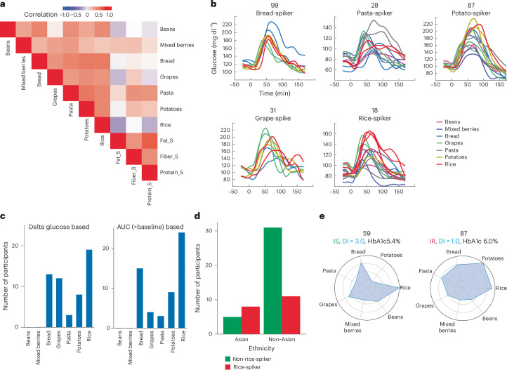
Elevated postprandial glycemic responses (PPGRs) are associated with type 2 diabetes and cardiovascular disease. PPGRs to the same foods have been shown to vary between individuals, but systematic characterization of the underlying physiologic and molecular basis is lacking. We measured PPGRs using continuous glucose monitoring in 55 well-phenotyped participants challenged with seven different standard carbohydrate meals administered in replicate. We also examined whether preloading a rice meal with fiber, protein or fat ('mitigators') altered PPGRs. We performed gold-standard metabolic tests and multi-omics profiling to examine the physiologic and molecular basis for interindividual PPGR differences. Overall, rice was the most glucose-elevating carbohydrate meal, but there was considerable interindividual variability. Individuals with the highest PPGR to potatoes (potato-spikers) were more insulin resistant and had lower beta cell function, whereas grape-spikers were more insulin sensitive. Rice-spikers were more likely to be Asian individuals, and bread-spikers had higher blood pressure. Mitigators were less effective in reducing PPGRs in insulin-resistant as compared to insulin-sensitive participants. Multi-omics signatures of PPGR and metabolic phenotypes were discovered, including insulin-resistance-associated triglycerides, hypertension-associated metabolites and PPGR-associated microbiome pathways. These results demonstrate interindividual variability in PPGRs to carbohydrate meals and mitigators and their association with metabolic and molecular profiles.


Conflict of interest statement

Competing interests: M.P.S. is a cofounder, scientific advisor and shareholder of Filtricine, Iollo, January AI, Marble Therapeutics, Next Thought AI, Personalis, Protos Biologics, Qbio, RTHM, SensOmics. M.P.S. is a scientific advisor and equity holder of Abbratech, Applied Cognition, Enovone, M3 Helium, Onza. M.P.S. is a scientific advisor and stock option holder of Jupiter Therapeutics, Mitrix, Neuvivo, Sigil Biosciences, WndrHLTH, Yuvan Research. M.P.S. is a cofounder and stock option holder of Crosshair Therapeutics. M.P.S. is an investor in and scientific advisor of R42 and Swaza. M.P.S. is an investor in Repair Biotechnologies. M.P.S. is a cofounder, shareholder and director of Exposomics, Fodsel, InVu Health. M.P.S. is a cofounder and equity holder of Mirvie, NiMo Therapeutics, Orange Street Ventures. A.A.M. is currently an employee of Google. D.P. and T.M. are members of the scientific advisory board of January AI. The other authors declare no competing interests.

Figures

Fig. 1
Fig. 1. Quantifying postprandial response through CGM.
a, Overview of study design and data types. Left, at the baseline, the data on omics and clinical tests were collected. Mid-bottom, each individual ate seven different carbohydrate meals and three different mitigator foods with rice with CGM data and food log collected. Mid-top, an example CGM curve of a day is presented. Right, participants were then stratified into carb-response types based on which meal produced the highest spike and into metabolic traits results. b, Mean CGM curves of PPGR after different meals. c, Glucose AUC above baseline and time from baseline to peak for different meals. CGM curves are extracted into different features (and presented with mean and standard errors (error bar indicates 2 standard errors). Bars of standardized carbohydrate meals were ordered by mean value. The number of CGM curves (each dot) is as follows: rice 115, potatoes 92, bread 99, pasta 65, grapes 98, beans 46 and mixed berries 53. Extracted CGM features are compared between different carbohydrate meals. Each participant was instructed to eat each meal at least twice on two different days. d, Heatmap of extracted CGM PPGR features. Each element is the mean value of extracted CGM features. Each column (feature) is then centered and scaled. e, Association between different extracted features and nutrient contents of the standardized carbohydrate meal. For fiber, proteins and fat in study meals, it’s the Spearman correlation with statistics calculated from the R package ‘correlation’ under default settings with asymptotic t approximation with a two-sided test. The last column is treated as binary (starch versus non-starch food) with correlation (R) obtained from a simple linear model and P value obtained from a two-sided t-test of the coefficient. Asterisks indicate significance (pFDR < 0.05). P values were FDR-corrected for the whole matrix. Illustration in a created with BioRender.com. Source data
Fig. 2
Fig. 2. PPGRs to carbohydrate meals can be stratified into groups.
a, The Spearman correlation between PPGRs to all different meals, including both the delta glucose peak of standardized carbohydrate meals and the suppression effect of mitigator foods. The delta glucose peak was calculated as the difference between the peak and baseline. The suppression mitigator effects were defined by subtracting the delta glucose peak of rice + mitigator from that of rice and then normalizing it by that of rice. b, Examples of CGM curves of participants with different carbohydrate meals with the highest PPGR (carb-response type). c, Number of participants assigned to each carb-response type. The carb-response types are defined by both delta glucose peak and AUC(>baseline). The x axis indicates the standardized carbohydrate meal that produced the highest glucose spike, and the y axis is the number of participants for whom a given meal caused the highest spike. d, The Asian group was enriched with individuals with rice as the carbohydrate meal with the highest peak. e, Radar plot of delta glucose to different carbohydrate meals in an IS (SSPG 61 mg dl−1) and an IR (SSPG 239 mg dl−1) participant. Delta glucose values were averaged between replicates and scaled by the carbohydrate with the highest value. Insulin resistance, disposition index (DI) and HbA1c were also presented. Source data
Fig. 3
Fig. 3. PPGRs to carbohydrate meals were associated with clinical and metabolic features.
a, Mean CGM curves between IR and IS groups measured by SSPG (i), and groups with normal and dysfunctional beta cells measured by disposition index (ii). b, Delta glucose peaks after eating potatoes and pasta are compared between groups with IR and IS, and delta glucose peaks after eating potatoes are compared beween groups with normal and dysfunctional (dys) beta cell functions. *, based on Holm corrected P value of the Mann–Whitney test (default, two-sided): *PH ≤ 0.05; **PH ≤ 0.01; ***PH ≤ 0.001. PH from left to right is 3.4 × 10−4, 0.02 and 9.4 × 10−3. Number of participants: IS potatoes 14, IR potatoes 16, IS pasta 12, IR pasta 16, normal beta cell potatoes 5, dysfunctional beta cell potatoes 12. Extracted CGM features for each participant are compared between different metabolic subtypes. c, Clinical and metabolic characteristics according to carb-response types. Statistical comparisons utilized Holm corrected P value of the Mann–Whitney test (default, two-sided) of the selected pairs: *PH ≤ 0.05; **PH ≤ 0.01; ***PH ≤ 0.001; ****PH ≤ 0.0001. PH: grapes versus potatoes (i) 7.8 × 10−3; grapes versus potatoes (ii) 2.5 × 10−4; rice versus potatoes (ii) 0.022, bread versus potatoes (ii) 0.016, grapes versus bread (iii) 0.019. Number of participants for (i) ((ii), (iii)): rice-spiker 18 (13, 19), grape-spiker 12 (10, 12), pasta-spiker 2 (1, 2), bread-spiker 13 (13, 13), potato-spiker 8 (6, 8). Clinical measurements were compared between carb-response-types. The boxplots in b and c show the center line as the median and the hinges as the 25th and 75th percentiles. The upper whisker extends from the hinge to the largest value not bigger than 1.5 times the distance between the hinges. Data beyond the whiskers are outliers. d, Average delta glucose peak and AUC(>baseline) between participants with IR and IS. e, Average delta glucose and AUC(>baseline) between participants with different beta cell functions (normal and dysfunctional). The solid line is the average value, and the shade is one s.d. bp, blood pressure. Source data
Fig. 4
Fig. 4. Mitigation effects were associated with metabolic traits and differed between subgroups.
a, Mean CGM curves of PPGRs to rice and rice preceded by three different mitigators (fiber, protein, fat). b: Delta glucose and time for rice and rice + mitigators. *, based on the P value of the t-test (two-sided, paired): *P ≤ 0.05; **P ≤ 0.01. The P values by comparing rice and rice + fiber, protein and fat are 0.014, 0.004 and 0.017. Each dot is a CGM curve. c, Mean CGM curves of mitigator test between individuals who are IR and IS. d, Delta glucose for rice and rice + mitigators in IS, IR, normal beta cell and dysfunctional beta cell groups. The P value is from the t-test (two-sided, paired). The number of participants for the statistic test for (i) ((ii), (iii), (iv)) is rice 13 (16, 5, 12), rice + fiber 6 (7, 2, 6), rice + protein 6 (7, 2, 6), rice + fat 6 (7, 2, 6). The plotting is based on each CGM curve (each dot) with the number of samples ((i)–(iv)): rice (24, 35, 8, 28), rice + fiber (10, 12, 3, 10), rice + protein (13, 10, 3, 8), rice + fat (12, 11, 2, 9). e, Examples of participants with different mitigation effects. f, Frequency of different directions of effects of mitigator foods on delta glucose. Positive (negative) values indicate increasing (decreasing) delta glucose in the combination meal compared with rice. g, Mitigator foods and their relative mitigation effects. The P value of the t-test (default, two-sided) between rice-spiker and non-rice-spiker is FDR-adjusted. Number of participants for rice-spiker (non-rice-spiker): rice + fiber 12 (20), rice + protein 12 (20), rice + fat 11 (20). CGM features are presented with mean and two standard errors in b and d. Boxplots in g show the center line as the median and the hinges as the 25th and 75th percentiles. The upper whisker extends from the hinge to the largest value not bigger than 1.5 times the distance between the hinges. Data beyond the whiskers are outliers. Source data
Fig. 5
Fig. 5. Multi-omics measurements are associated with carb-response type and metabolic traits.
a, Metabolites and lipids that are distinguished between carb-response types. For the carb-response types, ‘Others’ include all other participants. *, based on Holm corrected P value of the Mann–Whitney test (default, two-sided) of the selected pairs: *PH ≤ 0.05; **PH ≤ 0.01. N1-Methyladenosine was selected as it had the lowest P value when comparing bread-spikers with others. The TAGs and fatty acids were selected as lipid-related features with pFDR < 0.2. More results can be found in Supplementary Table 3 and Supplementary Fig. 21. PH: bread versus potatoes (i) 0.021, bread versus rice (i) 2.5 × 10−3, others versus grapes (ii) 0.033, grapes versus potatoes (ii) 0.035, other versus potatoes (iii) 0.016, others versus grapes (iii) 0.043, potatoes versus grapes (iii) 1.2 × 10−3, others versus potatoes (iv) 1.1 × 10−3, potatoes versus grapes (iv) 8.2 × 10−3, others versus potatoes (v) 1.9 × 10−3, potatoes versus grapes (v) 8.2 × 10−3. The boxplots show the center line as the median and the hinges as the 25th and 75th percentiles. The upper whisker extends from the hinge to the largest value not bigger than 1.5 times the distance between the hinges. Data beyond the whiskers are outliers. Number of participants in each carb-response type: rice-spiker (15), grape-spiker (6), pasta-spiker (3), bread-spiker (8), potato-spiker (7). Omics measurements were compared between carb-response types. b, Spearman correlation between T2D-related clinical features and microbiome levels (Genus). Red indicates positive correlation, blue indicates negative correlation, and asterisks indicate P value < 0.05 and pFDR < 0.2. Genera with more than one P value < 0.05 association were selected. Sample weight was controlled by partial correlation. FDR correction was implemented for the whole matrix. c, Mediation effect through the same metabolite. The mediation effect was calculated from microbiome to metabolites (mediator) and then to clinical measurements. Asterisks indicate pFDR < 0.01, and others are selected based on pFDR < 0.2. The listed microbe functions were dominated by the species Bacteroides thetaiotaomicron with the highest levels. Ca., Candidatus. Illustration in c created with BioRender.com. Source data
Extended Data Fig. 1
Extended Data Fig. 1. Mean curve with confidence interval for each meal.
The x axis is time (minute), and the y axis is glucose level (mg/dL). The blue line is the mean curve of the meal, computed from all participants and replicates. The pink area is the confidence interval calculated by 2 standard errors. Source data
Extended Data Fig. 2
Extended Data Fig. 2. Separation of PPGRs to meals by engineered features.
a: Delta glucose peak (relative peak value to baseline) (mg/dL) and return time (min) for different food combinations. CGM curves are extracted into different features and presented with mean and standard errors (the error bar indicates 2 standard errors). The x axis is different food combinations, and the y axis is the feature value. Bars are ordered by mean value. The number of CGM curves (each dot) is: rice 115, potatoes 92, bread 99, pasta 65, grapes 98, beans 46, mixed berries 53, rice+fiber 64, rice+protein 61, and rice+fat 60. Extracted CGM features are compared between different carbohydrate meals. Each participant was instructed to eat each meal at least twice on two different days. b: the scatter plot for three exemplar meals visualized with 2 relatively independent features. The x axis is time to peak (the slope from baseline to peak, mg/(dL*min)), and the y axis is delta glucose peak. Different colors indicate different meals. Each point is one CGM curve. Source data
Extended Data Fig. 3
Extended Data Fig. 3. Delta glucose of each meal in each participant.
The value was averaged among replicates and normalized by the maximum for that participant. Insulin resistance (insulin resistant IR vs insulin sensitive IS), SSPG, disposition index (DI), and HbA1c were also presented.
Extended Data Fig. 4
Extended Data Fig. 4. Reproducibility of carb-response-type classification for each replicate.
Carb-response-type in this paper was classified based on the average of PPGRs (delta glucose peak) of replicates. Here, we also classified each individual into different carb-response-type based on each single meal replicate (1 and 2) and compared it with the classification based on averaged PPGRs. The x axis is different carb-response-types from the averaged PPGR classification. The y axis indicates the percent of average-based classification to be assigned to the same group based on single replicates. Green indicates that the meal with the highest PPGR corresponding to the carb-response-type is still classified as the highest and red indicates that the original highest meal is classified as the second highest. For example, in participants classified to be bread-spiker by the averaged PPGR, most meal replicates still hold the same classification (bread as the highest PPGR meal) (62%), and a small chunk of meal replicates (15%) classified bread as the second highest meal. Source data
Extended Data Fig. 5
Extended Data Fig. 5. Starch composition of standardized carbohydrate meals.
The starch composition was measured, and the amount of rapidly digestible starch, slowly digestible starch, and resistant starch were quantified (detail in Methods). The boxplot presents the ratio between resistant starch and total starch and the ratio between slow digestible starch and total starch. Asterisks indicate Holm corrected p-value of the t-test (default, two-sided) of the selected pairs, *: pFDR < =0.05, **: pFDR < =0.01. The number of replicates is 3 for each food. The boxplots show the center line as the median and the hinges as the 25th and 75th percentiles. The upper whisker extends from the hinge to the largest value not bigger than 1.5 times the distance between the hinges. Data beyond the whiskers are outliers. pFDR is: potatoes vs rice (left) 0.0014, potatoes vs bread (left) 0.019, pasta vs rice (right) 0.047, and pasta vs bread (right) 0.021. Source data
Extended Data Fig. 6
Extended Data Fig. 6. PCA scatter plot of metabolomics and lipidomics.
Omics samples are colored according to sex (row 1) and hepatic insulin resistant (hepatic IR) states (row 2). The x axis is principal component 1 (PC1), and the y axis is PC2. Color distinguishes different groups, and each point is one sample. Each column is a different omics. Source data
Extended Data Fig. 7
Extended Data Fig. 7. Spearman correlation of microbiome functional unit with PPGRs to standardized meals (delta glucose peak).
Strong microbiome features are selected (pFDR<0.1) from features of GO, KEGG, metacyc pathway, pfam, and reactions. Red indicates positive and blue indicates negative correlation. Asterisks indicate correlation original p-value < 0.05. The partial Spearman correlation was run with additional covariates, sample weight, and two-sided t-tests were run. Source data
Extended Data Fig. 8
Extended Data Fig. 8. Spearman correlation between clinical measurement and metabolomics.
Metabolic features that are significantly associated (pFDR<0.05) with selected T2D-related clinical measurements (A1C, FBG, OGTT @120 mins, SSPG, disposition index (DI), Incretin effect, hepatic insulin resistance (hepatic IR), HOMA IR, adipose IR) are listed in the row. All clinical features are listed in columns. Red indicates positive and blue indicates negative correlation. Asterisks indicate p-value < 0.05 and double asterisks indicate pFDR<0.05. FDR corrections were implemented for each clinical feature. P-values were calculated with asymptotic t approximation with a two-sided test. Source data
Extended Data Fig. 9
Extended Data Fig. 9. Spearman correlation between clinical measurement and lipidomics.
Lipidomics features that are significantly associated (pFDR<0.05) with selected T2D-related clinical measurements (A1C, FBG, OGTT @120 mins, SSPG, DI, Incretin effect, hepatic IR, HOMA IR, adipose IR) are listed in the row. All clinical features are listed in columns. Red indicates positive and blue indicates negative correlation. Asterisks indicate p-value < 0.05 and double asterisks indicate pFDR<0.05. FDR corrections were implemented for each clinical feature. P-values were calculated with asymptotic t approximation with a two-sided test. Source data
Extended Data Fig. 10
Extended Data Fig. 10. Model estimation of SSPG and PG ratio.
a: SSPG estimation model. Left: Root mean squared error (RMSE) of SSPG estimation. The x axis indicates different tested models. Right: Coefficient values of the top predictive features of the cooperative model for SSPG estimation. Coefficients with more than 30% of the absolute value of the maximum features are presented. Positive value contributed to higher SSPG. The Null model used mean as the estimation. b: Model performance and coefficient of the PG (Potatoes/Grapes) ratio estimation model. Each of these models was built 100 times with different train/test splits. The model performance is presented with mean and standard errors (the error bar indicates 2 standard errors). Source data

Similar articles

Cited by

  • CGM Data Analysis 2.0: Functional Data Pattern Recognition and Artificial Intelligence Applications.
    Klonoff DC, Bergenstal RM, Cengiz E, Clements MA, Espes D, Espinoza J, Kerr D, Kovatchev B, Maahs DM, Mader JK, Mathioudakis N, Metwally AA, Shah SN, Sheng B, Snyder MP, Umpierrez G, Shao MM, Scheideman AF, Ayers AT, Ho CN, Healey E. Klonoff DC, et al. J Diabetes Sci Technol. 2025 Aug 14:19322968251353228. doi: 10.1177/19322968251353228. Online ahead of print. J Diabetes Sci Technol. 2025. PMID: 40814224 Free PMC article.

References

    1. Bansal, N. Prediabetes diagnosis and treatment: a review. World J. Diab.6, 296–303 (2015). - PMC - PubMed
    1. Klil-Drori, A. J., Azoulay, L. & Pollak, M. N. Cancer, obesity, diabetes, and antidiabetic drugs: is the fog clearing? Nat. Rev. Clin. Oncol.14, 85–99 (2017). - PubMed
    1. Coles, B. et al. Cardiovascular events and mortality in people with and without type 2 diabetes: an observational study in a contemporary multi-ethnic population. J. Diab. Investig.12, 1175–1182 (2021). - PMC - PubMed
    1. Retnakaran, R. et al. Risk factors for renal dysfunction in type 2 diabetes: U.K. Prospective Diabetes Study 74. Diabetes55, 1832–1839 (2006). - PubMed
    1. Klein, R., Klein, B. E., Moss, S. E., Davis, M. D. & DeMets, D. L. The Wisconsin epidemiologic study of diabetic retinopathy. III. Prevalence and risk of diabetic retinopathy when age at diagnosis is 30 or more years. Arch. Ophthalmol.102, 527–532 (1984). - PubMed

LinkOut - more resources