[Preprint]. 2025 May 31:2025.05.27.656447.
doi: 10.1101/2025.05.27.656447.

Analysis of isobaric quantitative proteomic data using TMT-Integrator and FragPipe computational platform

Affiliations

Analysis of isobaric quantitative proteomic data using TMT-Integrator and FragPipe computational platform

Hui-Yin Chang et al. bioRxiv. .

Abstract

Isobaric mass tags, such as iTRAQ and TMT, are widely utilized for peptide and protein quantification in multiplex quantitative proteomics. We present TMT-Integrator, a bioinformatics tool for processing quantitation results from TMT and iTRAQ experiments, offering integrative reports at the gene, protein, peptide, and post-translational modification site levels. We demonstrate the versatility of TMT-Integrator using five publicly available TMT datasets: an E. coli dataset with 13 spike-in proteins, the clear cell renal cell carcinoma (ccRCC) whole proteome and phosphopeptide-enriched datasets from the Clinical Proteomic Tumor Analysis Consortium, and two human cell lysate datasets showcasing the latest advances with the Astral instrument and TMT 35-plex reagents. Integrated into the widely used FragPipe computational platform (https://fragpipe.nesvilab.org/), TMT-Integrator is a core component of TMT and iTRAQ data analysis workflows. We evaluate the FragPipe/TMT-Integrator analysis pipeline's performance against MaxQuant and Proteome Discoverer with multiple benchmarks, facilitated by the bioinformatics tool OmicsEV. Our results show that FragPipe/TMT-Integrator quantifies more proteins in the E. coli and ccRCC whole proteome datasets, identifies more phosphorylated sites in the ccRCC phosphoproteome dataset, and delivers overall more robust quantification performance compared to other tools.


Conflict of interest statement

CONFLICT OF INTEREST A.I.N. is the Founder of Fragmatics and serves on the scientific advisory boards of Protai Bio, Infinitopes, and Mobilion Systems. A.I.N. is also a paid consultant for Novartis. A.I.N. and F.Y. have a financial interest due to the licensing of MSFragger and IonQuant to commercial entities. Other authors have no conflict of interest.

Figures

Figure 1.
Figure 1.. Overview of isobaric labeling data analysis with TMT-Integrator in FragPipe.
(a) FragPipe workflow for isobaric labeling data analysis in both global proteomic data and post-translational modification (PTM)-enriched proteomic data, with PTMProphet used specifically in PTM data analysis. (b) Seven major steps included in TMT-Integrator. (c) Summary of TMT-Integrator report files and the breakdown of index formats across report levels, illustrated with an example.
Figure 2.
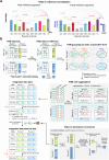
Figure 2.. Illustrations of PSM ratio integration in TMT-Integrator across multiple plex sets.
(a) Two approaches for PSM ratio-to-reference normalization in Normalization I. Using the TMT 10-plex for illustration, each bar represents a channel, and its height represents the measured intensity. (b) Schematic diagram illustrating how TMT-Integrator processes a multi-plex dataset in three main steps: (1) transforming the PSM intensity table to a PSM ratio-to-reference table through normalization, (2) integrating PSM ratio tables from multiple plex sets into a single ratio matrix at a specific level, and (3) converting the ratio matrix into an abundance matrix by incorporating absolute intensities.
Figure 3.
Figure 3.. Performance evaluations on ccRCC whole proteome dataset.
(a) Venn diagram showing the number of genes identified by FragPipe/TMT-Integrator and MaxQuant. (b) PCA plot of TMT-Integrator median-centered gene report from tumor and normal samples. (c) Boxplots showing the R-squared value distributions for protein abundance correlation between replicate runs of the NCI and QC samples. FP represents FragPipe, MQ represents MaxQuant, RefRatio represents ratio-to-reference normalization with a real reference, non-norm represents absolute intensity data without ratio-to-reference normalization and MD represents the use of median-centering normalization. (d) Violin plots illustrating gene-wise and sample-wise protein-RNA correlations from OmicsEV results across different methods, with median correlation coefficients labeled for each method. VirtualRatio represents ratio-to-reference normalization with a virtual reference. (e) Boxplots comparing the noise to signal ratio (NSR) levels between protein and peptide levels in both NCI and QC channels for TMT-Integrator reports. abundance correlation between replicate runs of the same QC sample
Figure 4.
Figure 4.. Performance evaluations on the spiked-in dataset.
(a) Impact of median-centering normalization on E. coli protein quantification accuracy. Density plots show the observed ratio distribution of E. coli proteins across FragPipe, MaxQuant, and Proteome Discoverer using MS2 and MS3 data. Line colors indicate whether the median-centering normalization was used. (b) Evaluation of protein quantification accuracy using the 12 spiked-in proteins. Boxplots show the observed ratio distribution of 12 spiked-in proteins compared to theoretical ratios (grey dashed lines) in MS2 data across different methods. Box colors represent the respective methods, with MQ stands for MaxQuant, MQ-w for the weighted method in MaxQuant, PD for Proteome Discovery, FP for FragPipe, and FP-w for the weighted method in FragPipe. (c) Same as (b) for MS3 data. (d) Line charts showing the agreement of median observed ratios with theoretical ratios. Each dot represents a median value of observed ratios. (e) Comparison of the observed ratio distributions for E. coli proteins between FragPipe’s conventional median ratio method and weighted ratio method.
Figure 5.
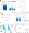
Figure 5.. Performance evaluations on the ccRCC phosphorylation-enriched dataset.
(a) Identification performance across all report levels and all samples. The number of IDs with varying data completeness is represented by different color shades, with darker blue indicating higher completeness. IDs detected in all samples are marked as 100%, and IDs detected in less than 25% of samples are marked as <25%, with the similar logic applied to other groups. (b) PCA plot of TMT-Integrator median-centered single-site data from tumor and normal samples. (c) The number of single-sites identified by FragPipe and MaxQuant. (d) Data completeness comparison between FragPipe and MaxQuant for commonly and uniquely identified single-sites. (e) Comparison of single-site variation (CV) distributions in NCI channels between FragPipe and MaxQuant, with bars representing the number of single-sites in each CV group. (f) Evaluation of quantification consistency across FragPipe abundance and ratio single-site reports and MaxQuant single-site ratio data in NCI and QC channels. Boxplots show the distribution of R-squared values from linear model fitting of single-site quantifications for each sample pair in NCI and QC channels. The labeled text shows the total number of single-sites and the median R-squared value.
Figure 6.
Figure 6.. Performance evaluations on the Astral and TMT 35-plex datasets.
(a)-(c) for Astral datasets and (d)-(f) for TMT 35-plex dataset. (a) Bar plot showing the number of quantified genes in Astral TMT and DIA datasets across all 18 samples. Proteins are divided into three categories: those quantified in all samples, in more than half of samples, and in less than half of samples. The number of proteins in each category is represented by a different color shade. (b) Scatter plot showing the correlation between TMT and DIA measurements for each protein across samples. Each dot represents a protein in a specific sample and is color-coded based on the number of overlapping dots. The black dashed line indicates the overall linear fit. (c) Boxplots comparing the combined CV distributions for TMT and DIA, calculated from triplicates for each cell line. The box in each plot captures the IQR with the bottom and top edges representing the Q1 and Q3, respectively. The median (Q2) is indicated by a horizontal line within the box. The whiskers extend to the minima and maxima within 1.5 times the IQR below Q1 or above Q3. (d) Density plots displaying the intensity distribution of all samples labeled with both deuterated and non-deuterated reagents, using the raito_gene_MD.tsv report. (e) PCA plot presenting sample clustering according to cell type and labeling reagent. TMTproD represents sample labeling with deuterated reagents and TMTpro represents non-deuterated reagents. The common reference samples are denoted as Bridge. (f) Scatter plot illustrating the correlation of log2 ratios of HEK to HCT between deuterated and non-deuterated labeling types.

References

    1. Aebersold R. and Mann M., Mass-spectrometric exploration of proteome structure and function. Nature, 2016. 537(7620): p. 347–355. - PubMed
    1. Yates J.R. 3rd, Recent technical advances in proteomics. F1000Res, 2019. 8. - PMC - PubMed
    1. Pappireddi N., Martin L., and Wühr M., A Review on Quantitative Multiplexed Proteomics. Chembiochem, 2019. 20(10): p. 1210–1224. - PMC - PubMed
    1. Paulo J.A. and Schweppe D.K., Advances in quantitative high-throughput phosphoproteomics with sample multiplexing. Proteomics, 2021. 21(9): p. e2000140. - PMC - PubMed
    1. Ross P.L., et al. , Multiplexed Protein Quantitation in Saccharomyces cerevisiae Using Amine-reactive Isobaric Tagging Reagents. Molecular & Cellular Proteomics, 2004. 3(12): p. 1154–1169. - PubMed

Publication types

LinkOut - more resources