. 2025 Jun 19;15(6):105889.
doi: 10.5498/wjp.v15.i6.105889.

Clinical manifestations of anxiety and depression in sepsis-associated encephalopathy and multi-omics identification of cluster of differentiation 38 as an early biomarker

Affiliations

Clinical manifestations of anxiety and depression in sepsis-associated encephalopathy and multi-omics identification of cluster of differentiation 38 as an early biomarker

Chun-Rong Wu et al. World J Psychiatry. .

Abstract

Background: Sepsis-associated encephalopathy (SAE) is a common complication of sepsis, characterized by cognitive impairment, altered consciousness, and psychiatric symptoms, including anxiety and depression. These psychiatric symptoms often exacerbate the overall prognosis and quality of life of affected patients. However, the underlying metabolic and proteomic features associated with SAE-induced psychiatric symptoms remain poorly understood.

Aim: To investigate the clinical manifestations of anxiety and depression in patients with sepsis and SAE and to explore their associated metabolic and proteomic characteristics.

Methods: A total of 88 patients were enrolled, comprising 30 healthy controls, 29 patients with sepsis, and 29 with SAE. Anxiety and depression symptoms were evaluated using the Hamilton anxiety rating scale (HAM-A) and Hamilton depression rating scale (HAM-D) in sepsis and SAE. Cognitive function was assessed using the Montreal Cognitive Assessment (MoCA), and quality of life was measured using the 36-Item Short Form Health Survey. Plasma samples were analyzed for metabolomic and proteomic profiling. Metabolic alterations were identified through liquid chromatography-mass spectrometry, while protein expression was assessed using Olink targeted proteomics.

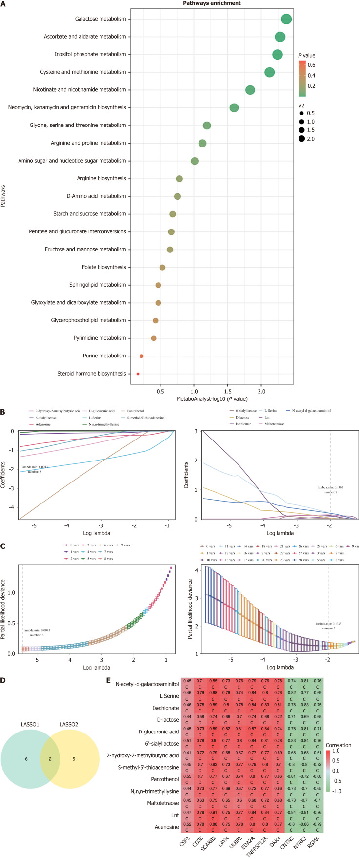
Results: Compared to the sepsis group, patients with SAE exhibited significantly higher levels of anxiety (HAM-A: 15.2 ± 4.0 vs 10.4 ± 3.0, P = 0.012) and depression (HAM-D: 16.0 ± 3.5 vs 9.1 ± 2.3, P = 0.003). Cognitive function, as measured by MoCA, was notably impaired in the SAE group (MoCA: 18.5 ± 4.0 vs 24.5 ± 3.2, P = 0.007). Quality of life scores, particularly in physical functioning, emotional well-being, and mental health, were significantly lower in patients with SAE. Metabolomic and proteomic analyses revealed substantial alterations in oxidative stress and nicotinamide adenine dinucleotide (NAD+) metabolism pathways, with cluster of differentiation (CD) 38 emerging as a potential biomarker associated with psychiatric symptoms in SAE. Further validation in an independent cohort confirmed the diagnostic relevance of CD38.

Conclusion: This study highlights the significant psychological burden of SAE, manifested as anxiety and depression. Multi-omics analysis identified distinct metabolic alterations, particularly in NAD+ metabolism, that may contribute to psychiatric symptom development and progression. Furthermore, CD38 was identified as a promising biomarker for the early detection of SAE, providing potential avenues for early intervention and therapeutic targeting.

Keywords: Anxiety; Cluster of differentiation 38; Depression; Metabolomics; Proteomics; Sepsis-associated encephalopathy.


Conflict of interest statement

Conflict-of-interest statement: The authors declare that they have no conflict of interest.

Figures

Figure 1
Figure 1
Key protein analysis. A: Principal component analysis plot, where each point represents a sample, and different colors indicate different groups. The closer the samples are, the more similar their expression patterns; the farther the samples are, the greater the differences in their expression patterns; B: Differential protein volcano plot, with the X-axis representing log2 fold change values and the Y-axis representing log10 (adjusted P value). Red dots represent upregulated proteins, blue dots represent downregulated proteins, and gray dots represent proteins with no significant expression differences. The left plot shows the data for sepsis vs control, and the right plot shows the data for sepsis-associated encephalopathy (SAE) vs sepsis; C: Differential protein heatmap, where the color represents the relative expression levels of proteins, with red indicating relatively high expression and blue indicating relatively low expression. The left plot shows the data for sepsis vs control, and the right plot shows the data for SAE vs sepsis; D: Intersection proteins; E: Intersection protein heatmap, where the color represents the relative expression levels of proteins, with red indicating relatively high expression and blue indicating relatively low expression. Control refers to the control group, Case 1 refers to the sepsis group, and Case 2 refers to the SAE group. PCA: Principal component analysis; FC: Fold change; DEP: Differentially expressed proteins; SAE: Sepsis-associated encephalopathy; CD: Cluster of differentiation.
Figure 2
Figure 2
Gene Ontology and Kyoto Encyclopedia of Genes and Genomes analysis of proteins, and protein interaction network analysis. A: Gene Ontology (GO) functional analysis of proteins. The X-axis represents the number of proteins enriched in the corresponding pathways, and the Y-axis represents the enriched GO terms; B: Kyoto Encyclopedia of Genes and Genomes pathway enrichment bubble plot for proteins; C: GeneMANIA protein interaction prediction results. GO: Gene Ontology; KEGG: Kyoto Encyclopedia of Genes and Genomes; IL-17: Interleukin-17; TGF: Transforming growth factor; COVID-19: Coronavirus disease 2019; PI3K/AKT: Phosphatidylinositol 3-kinase/protein kinase B.
Figure 3
Figure 3
Metabolite analysis. A: Principal component analysis plot. Each point represents a sample, with different colors indicating different groups. The closer the points are, the more similar the expression patterns of the samples; the farther apart the points are, the greater the difference in their expression patterns; B: Partial least squares discriminant analysis score plot. Each point represents a sample, with different colors indicating different groups. The closer the points are, the more similar the expression patterns of the samples; the farther apart the points are, the greater the difference in their expression patterns. The left plot represents the sepsis vs control data, and the right plot represents the sepsis-associated encephalopathy (SAE) vs sepsis data; C: Volcano plot. The X-axis represents the log2 fold change value, and the Y-axis represents −log10 (adjusted P value). Red points represent upregulated metabolites, blue points represent downregulated metabolites, and gray points represent metabolites with no significant expression. The left plot represents the sepsis vs control data, and the right plot represents the SAE vs sepsis data; D: Heatmap. The color represents the relative abundance of metabolites, with red indicating relatively high abundance and blue indicating relatively low abundance. Control refers to the control group, Case 1 refers to the sepsis group, and Case 2 refers to the SAE group. PCA: Principal component analysis; OPLS-DA: Partial least squares discriminant analysis; FC: Fold change.
Figure 4
Figure 4
Weighted gene co-expression network analysis. A: Outlier sample detection and clustering tree of all samples, with the vertical axis representing the spatial distance between samples; B: Scale-free fitting index and average connectivity for the analysis threshold. The horizontal axis in both graphs represents the weight parameter β. The vertical axis in the left graph represents the square of the correlation coefficient between log (k) and log [p(k)] in the network. The higher the square of the correlation coefficient, the closer the network is to a scale-free distribution. The vertical axis in the right graph represents the average adjacency function of all metabolites in the corresponding module; C: Metabolite modules identified by Weighted gene co-expression network analysis. Different colors represent the various modules, with gray indicating metabolites that could not be classified into any module; D: Correlation between metabolite modules and traits. The horizontal axis represents the grouping information, and the vertical axis represents the different modules. The first row within the module represents the correlation coefficient, with P values in parentheses; E: Overlap metabolites. The left graph represents the overlap of upregulated metabolites, while the right graph represents the overlap of downregulated metabolites. WGCNA: Weighted gene co-expression network analysis.
Figure 5
Figure 5
Metabolite enrichment analysis and identification of key metabolites. A: Pathway analysis. The horizontal axis represents significance, and the vertical axis represents pathway names; B: Metabolite coefficient plot. The horizontal axis represents the logarithmic value of λ; the vertical axis represents the regression coefficient. The curve illustrates the relationship between the regression coefficient of the variable (metabolite) and λ; C: Cross-validation error plot. The horizontal axis represents log (λ) values, and the vertical axis represents degrees of freedom. The dashed line represents the λ corresponding to the minimum error mean. The numbers above the graph represent the number of metabolites corresponding to different λ values; D: Union of results from two machine learning algorithms; E: Correlation heatmap between key metabolites and key proteins. The horizontal axis represents proteins, the vertical axis represents metabolites, and the numbers in the figure represent the correlation coefficients between them. cP < 0.001. LASSO: Least absolute shrinkage and selection operator.
Figure 6
Figure 6
Receiver operating characteristic curves and Data Integration Analysis for Biomarker discovery using Latent cOmponents (DIABLO) model. A: Receiver operating characteristic (ROC) curves for the modeling set. The left panel shows the protein ROC curve for sepsis vs control data. The right panel shows the metabolite biomarker ROC curve for sepsis vs control data; B: ROC curves for the validation set. The left panel shows the protein ROC curve for sepsis-associated encephalopathy (SAE) vs sepsis data. The right panel shows the metabolite biomarker ROC curve for SAE vs sepsis data. The horizontal axis represents the false positive rate, which is the proportion of true negatives incorrectly predicted as positives, also called specificity. The vertical axis represents the true positive rate, which is the proportion of true positives that are correctly predicted, also called sensitivity; C: In the DIABLO model, there is a significant difference between sepsis vs control in proteomics (left panel) and untargeted metabolomics (right panel) data; D: Pearson correlation between proteomics and the first component of untargeted metabolomics data in the DIABLO model for sepsis vs control; E: In the DIABLO model, there is a significant difference between SAE vs sepsis in proteomics (left panel) and untargeted metabolomics (right panel) data; F: Pearson correlation between proteomics and the first component of untargeted metabolomics data in the DIABLO model for SAE vs sepsis. AUC: Area under the curve; DIABLO: Data Integration Analysis for Biomarker discovery using Latent cOmponents.

Similar articles

References

    1. Gofton TE, Young GB. Sepsis-associated encephalopathy. Nat Rev Neurol. 2012;8:557–566. - PubMed
    1. Sonneville R, Benghanem S, Jeantin L, de Montmollin E, Doman M, Gaudemer A, Thy M, Timsit JF. The spectrum of sepsis-associated encephalopathy: a clinical perspective. Crit Care. 2023;27:386. - PMC - PubMed
    1. Li D, Zhang X, Lu Y, Jing L, Hu H, Song Y, Wu S, Zhu W. Post-sepsis psychiatric disorder: Pathophysiology, prevention, and treatment. Neurol Sci. 2024;45:3093–3105. - PMC - PubMed
    1. Hong Y, Chen P, Gao J, Lin Y, Chen L, Shang X. Sepsis-associated encephalopathy: From pathophysiology to clinical management. Int Immunopharmacol. 2023;124:110800. - PubMed
    1. Barichello T, Generoso JS, Singer M, Dal-Pizzol F. Biomarkers for sepsis: more than just fever and leukocytosis-a narrative review. Crit Care. 2022;26:14. - PMC - PubMed