. 2025 Jul 1;12(1):1087.
doi: 10.1038/s41597-025-05257-5.

An Africa-wide agricultural production database to support policy and satellite-based measurement systems

Affiliations

An Africa-wide agricultural production database to support policy and satellite-based measurement systems

Emily C Geyman et al. Sci Data. .

Abstract

Agriculture remains a backbone of the African economy, contributing up to 70% of household income in rural areas. Yet crop yields across Africa are rising at a slower rate than the global average. Currently, strategies to improve agricultural productivity are limited by the availability of granular, accurate, and spatially-extensive data. These disaggregated statistics are required to understand how crop yields respond to climate variability, climate extremes, and agronomic practices. Here, we present GROW-Africa, a database that includes n = 535,844 georeferenced observations of crop yields across Africa focusing on 25 key crops including maize, sorghum, cassava, groundnuts, cowpeas, rice, yams, and millet. The database assimilates observations from a range of spatial scales, from regional government statistics, to household farmer surveys, to plot-level crop cuts. We use co-located observations to identify sources of bias and error in these varied data types. Finally, we demonstrate how the GROW-Africa database can be used to train remote sensing algorithms to produce continuous maps of crop yields across Africa.


Conflict of interest statement

Competing interests: The authors declare no competing interests.

Figures

Fig. 1
Fig. 1
(a,b) Global trends in crop yields over the period 1990-2022 for maize and rice. Data are sourced from the Food and Agriculture Organization. (c) Frequency of agricultural censuses, from ref. . Many African nations have not had a major census in the last decade.
Fig. 2
Fig. 2
An overview of the composition of the GROW-Africa database. In total, GROW-Africa contains n = 535,844 geo-referenced observations of historical crop yields in Africa, spanning 25 crops: banana, barley, beans, cassava, coffee, cotton, cowpea, fonio, groundnut, maize, millet, okra, pigeon pea, potato, rice, sesame, sorghum, soyabean, sugar cane, sweet potato, taro, teff, tobacco, wheat, and yam. National (country-level) data from the Food and Agriculture Organization (FAO) represent a small fraction (2.2%) of the database. Most of the database represents sub-national government statistics (34.6%), farmer survey data from the World Bank’s Living Standards Measurement Study (LSMS) (36.4%), and other local (farm-scale) data (26.7%), principally from the One Acre Fund.
Fig. 3
Fig. 3
Distributions of yield values (metric tons per hectare) for the 25 crops in the GROW-Africa database. The data are color-coded in terms of the data type and level of spatial disaggregation: national-level government data are shown in blue, regional-level government data are shown in green, and local (point) data are shown in brown. Maps of the distribution of national, regional, and local data are shown in Figure S3, Figure S4, and Figure S5 of the Supporting Information, respectively. The total number of observations in the GROW-Africa database is shown in the title of each panel, and the mean (μ) and standard deviation (1σ) of the yield values from the national, regional, and local datasets are listed in each subplot.
Fig. 4
Fig. 4
A comparison between government-reported and farmer-reported crop yields for three countries with extensive sub-national and local datasets: (a) Ethiopia, (b) Malawi, and (c) Nigeria. The local (farmer-reported) yield data are aggregated to sub-national (administrative level-1 and level-2) boundaries in order to facilitate comparison with the regional government statistics. The circle size denotes the number of farmer observations that were aggregated to produce the regional estimate. Data points are colored by crop, and the legend shows the correlation coefficient (ρ) between the government-reported and farmer-reported yield estimates. In calculating the correlation coefficients, each data point is weighted by the square root of the number of farmer observations that were averaged together to produce that regional yield estimate. All of the farmer survey data shown here are from the World Bank’s Living Standards Measurement Study (LSMS) (see Table 1). Similar plots for other countries with paired LSMS and government statistics are shown in Figure S11 of the Supporting Information. Note that, in order to fit on the same axes, the yields for cassava, potatoes, sweet potatoes, and yams are scaled by a factor of 20%.
Fig. 5
Fig. 5
A comparison of farmer-reported vs. government-reported crop yields. In (a), the co-located yield estimates from farmer surveys and regional government statistics are aggregated across all countries and are arranged by crop. In (b), the co-located yield data are aggregated across all crops and instead are split by country. The ‘yield bias’ (y-axis) denotes whether the government-reported yield statistics are systematically higher or lower than the farmer-reported yields. Negative values indicate that farmer-reported yields are lower than government statistics. The mean yield bias (averaged across all countries with available co-located government and farmer survey data) is 11 ± 4.0% (μ ± s.e., where μ is the mean and s.e. is the standard error), indicating that farmer-based estimates are slightly lower than government statistics. In (a,b), the triangles denote the mean yield bias and the boxes denote the 25–75th percentiles of the estimated yield bias. Note that the yield bias is calculated in a total least squares sense. That is, rather than treating either the government-based or the farmer-based yield estimates as a ‘gold-standard’ representation of the true yield, we instead acknowledge that both estimates are flawed representations of the true value. We perform an orthogonal projection of each data point in the government-based yield vs. farmer-based yield crossplots (e.g., see Fig. 4) onto the 1:1 line. Next, we evaluate whether the data cloud tends to sit above or below the 1:1 line, weighting each point observation by it’s orthogonal distance to the 1:1 line and it’s sample size (n, where n is the number of farmer observations that were aggregated to generate the regional estimate). See Figures S9–S10 in the Supporting Information for the data underlying these yield bias estimates.
Fig. 6
Fig. 6
A comparison between the yield estimates derived from field-scale crop cuts and regional government statistics in Ethiopia. The locations of the crop cut observations are shown in (a). (b) A summary of the biases between yield estimates derived from official government statistics vs. crop-cuts; positive values indicate that the government statistics overestimate yield relative to crop-cuts. There are ten crops with sufficient data to make the comparison: (c) barley, (d) beans, (e) groundnuts, (f) maize, (g) millet, (h) sesame, (i) sorghum, (j) soybean, (k) teff, and (l) wheat. All crops show a positive yield bias, indicating that the official government figures overestimate crop yields compared with the ground-truth crop cut data. The mean bias value across all crops is +32% (b). The crossplots in (c)-(k) show the data used to produce the yield bias estimates in (b). Individual data points represent co-located government statistics and field-scale crop-cuts for an individual year. The symbol size denotes the number of crop-cut observations that were aggregated to produce the regional estimate. Circles denote administrative level-2 boundaries and squares denote administrative level-1 boundaries. The inset histograms in (c)-(k) show the data distributions indicating the extent to which the government-based yield estimates are underestimates (negative) or overestimates (positive) of the crop cut data. The histograms are shown from  − 100% to +100%.
Fig. 7
Fig. 7
A similar analysis as in Fig. 6, except the crop-cut data are compared to farmer surveys rather than to regional government statistics. The locations of the crop cut and farmer survey data are shown in (a). (b) A summary of the yield biases for the ten crops with sufficient data to make comparisons between the crop cuts and farmer surveys. The positive yield biases across all crops indicate that the yield estimates based on farmer surveys are overestimates relative to the crop cut data. However, the mean bias of +20% is smaller than the yield bias in Fig. 5.
Fig. 8
Fig. 8
An evaluation of different sources of variability and error in the yield statistics extracted from farmer surveys. We explore four questions: (1) How does the number of farmer observations within a regional administrative boundary affect the quality of the aggregated regional yield estimate? (2) How does the plot area affect the yield estimate? (3) How does the method for estimating the plot area (GPS measurement vs. farmer interview) affect the yield estimate? (4) How does the method for quantifying production (crop cuts vs. farmer interview) affect the yield estimate? To answer each question, we sub-divide the dataset into different groups based on the farmer survey sample size, the field areas, the area measurement methodology, and the crop production measurement methodology (see below for details). We then compare each sub-divided dataset of farmer survey data to the co-located regional government statistics. The top row (a-d) shows the correlation coefficient (ρ) between the farmer survey and government data. The bottom row (e-h) shows the average yield bias between the farmer survey and government data. We define the yield bias the same way as in Fig. 5; negative values indicate that the farmer survey data produce lower yields than the government figures. In (a,d), we divide the dataset of co-located farmer surveys and regional government statistics (e.g., Fig. 4) into four groups based on the number of farmer surveys (n) within the administrative boundary: n≤5, n = 5–20, n = 20–200, and n > 200. In (b,f), we divide the dataset of co-located farmer surveys and regional government statistics according to the plot area (A): A≤0.1 ha, A = 0.1–0.4 ha, A = 0.4–2.0 ha, and A > 2.0 ha. In (c,g), we split the dataset based on whether the farmer surveys used GPS-measured field areas vs. farmer-queried estimates of field areas. In (d,h), we split the dataset between yield estimates based on farmer recall of total production (kg) vs. crop cuts. Note that only Ethiopia has an extensive network of crop cuts (Fig. 6). Cross-plots showing the data underlying this figure are shown in Figure S21 of the Supporting Information.
Fig. 9
Fig. 9
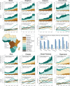
Regional decomposition of 50 years of production, area, and yield patterns for eight key crops in Africa: (a) maize, (b) sorghum, (c) cassava, (d) groundnuts, (e) rice, (f) cowpea, (g) sweet potatoes, and (h) sugarcane. The data span the period 1973-2022. Note that the yield values (production divided by harvested area) are smoothed with a 10-year moving mean. The yield panels also exclude northern Africa, which appears off-scale (significantly higher yield) with respect to the other regions. The central panel (i) summarizes the 5-decade-long trends in production, area, and yield. Although the total production of most crops has increased at rates of approximately 20–30% per decade, these production gains are accomplished principally through increases in harvested area (i.e., crop extensification) rather than through increases in crop yields. Typical increases in crop yields over the past 50 years are approximately 10% per decade or lower.
Fig. 10
Fig. 10
An illustration of spatial heterogeneity and spatial scale for three different agricultural regions: (a) Illinois, USA (40.31489N, 88.41142W), (b) Senegal (13.246984N, 15.569503W), and (c) Ethiopia (9.783614N, 37.533314E). The top row shows a 5 km × 5 km footprint, which is representative of the size of a single pixel in the GOSIF dataset used in Fig. 13. The middle row shows example tiles that each are 250 m × 250 m, which is representative of the size of a single pixel in Moderate Resolution Imaging Spectroradiometer (MODIS) imagery. The bottom row zooms in on the central 250 m x 250 m tile from the middle row and illustrates the size of a 30 m × 30 m Landsat pixel (see the white boxes in the lower-left corners).
Fig. 11
Fig. 11
An illustration of the ground-truth dataset (a subset of the GROW-Africa database) used to train the neural network in Fig. 14. Here, we show just the sub-national government yield statistics for maize over the period 2000-2022. In (a)-(c), the sub-national administrative boundaries (level 1 and level 2) are color-coded according to: (a) the number of years for which we have observations during the period 2000-2022, (b) the average yield value (metric tons (megagram, Mg) per hectare), and (c) the estimated fraction of the total administrative boundary that is cultivated with maize. In (c), the area fraction is determined by calculating the ratio between the reported region-total harvested area (hectares) by the total land area within the administrative boundary. Gray regions denote no data.
Fig. 12
Fig. 12
Constructing country-specific agricultural calendars using annual timeseries of solar-induced fluorescence (SIF) over croplands. The plotted timeseries show two sequential annual cycles (January–December). All sub-Saharan African countries with data in the ground-truth dataset in Fig. 11 are shown. The timeseries are calculated by averaging the GOSIF observations (8-day repeat interval) over the period 2000-2022. To compute the weighted average SIF value (y-axis), the GOSIF pixels (0.05  × 0.05 degree) are weighted by the estimated fraction cropland within that pixel, based on the cropland mask from Digital Earth Africa (Figure S23). Note that the timing (phase) of the annual SIF cycles varies from country to country, in accordance with changes in latitude and rainfall regime. Many countries in eastern Africa have two distinct SIF cycles each year denoting separate agricultural seasons. In order to harmonize and facilitate comparison between the different country-level datasets, we define a country-specific agricultural calendar that is defined as starting and ending at the time of year with the minimum average SIF value. That is, the period of peak SIF (and therefore inferred crop growth) is located in the middle of each 12-month agricultural calendar. The country-specific calendars are denoted with gray rectangles, and the subplot titles report the day of year (DOY) when the calendar starts. Shifting each country’s average SIF curve by the calendar start date makes the country-level datasets collapse onto a similar, standardized shape (Figure S25).
Fig. 13
Fig. 13
An illustration of a workflow for aggregating remote sensing data (in this case, timeseries of 0.05  × 0.05 degree GOSIF observations) to a scale that can be compared with region-level crop yields (for which there are available ground-truth data in the form of sub-national government statistics— see Fig. 11). (a) Each region (e.g., sub-national administrative boundary) covers a zone of n pixels in a satellite dataset. (b) The satellite dataset may have m repeat observations throughout the growing season or year. In this case, we use the 0.05  × 0.05 degree GOSIF observations as an example remote sensing dataset. GOSIF has a repeat interval of 8 days (corresponding to m = 45 observations for a full annual cycle). (c) For each of the m time slices, the n pixel-level observations within the region of interest can be binned into a histogram of l bins (where bin #1 represents the lowest pixel values and bin #l represents the highest pixel values). This binning step allows for regions with different areas (and therefore different numbers n of enclosed pixels) to be standardized to produce a remote sensing timeseries with common dimensions of l × m. The matrices in (c) are normalized such that the sum of each column is 1. These matrices are used as the input for neural network shown in Fig. 14. Note that the l × m × 1 matrices shown in (c) could instead be l × m × c matrices, where c is the number of channels (i.e., multiple remote sensing datasets representing different color bands in a multispectral satellite image or climate data such as temperature, precipitation, soil moisture, etc.).
Fig. 14
Fig. 14
Results of the simple feed-forward neural network used to estimate maize yields based on annual timeseries of GOSIF observations (Fig. 13). The neural network is trained and tested on the Africa-wide ground-truth dataset shown in Fig. 11. The testing data represents a random 20% of the dataset not used to train the model. The value ρ(xy) denotes the correlation coefficient between the predicted yield from the neural network and the government-reported yield. Due to the large number of data points, the data are grouped into equally-spaced bins and are represented based on their binned mean values (squares), 25-75th percentiles (thick lines), and 10-90th percentiles (thin lines).
Fig. 15
Fig. 15
Maps of estimated maize yields in Nigeria over the period 2002-2021 based on applying the neural network in Fig. 14. Equivalent estimates could be created for any other country (or for all of Africa) using the same neural network approach. The maps are displayed with a transparency layer that represents the estimated cropland area fraction, such that regions with no croplands appear transparent and regions with abundant croplands appear opaque. See Figure S24 in the Supporting Information for the cropland area estimates.

References

    1. Davis, B., Di Giuseppe, S. & Zezza, A. Are African households (not) leaving agriculture? Patterns of households’ income sources in rural Sub-Saharan Africa. Food Policy67, 153–174 (2017). - PMC - PubMed
    1. Carletto, C., Jolliffe, D. & Banerjee, R. The Emperor has no data! Agricultural statistics in sub-Saharan Africa. World Bank Working Paper565 (2013).
    1. Ligon, E. A. & Sadoulet, E. Estimating the effects of aggregate agricultural growth on the distribution of expenditures. CUDARE Working Papers (2011).
    1. Liu, J., Wennberg, P. O., Parazoo, N. C., Yin, Y. & Frankenberg, C. Observational constraints on the response of high-latitude northern forests to warming. AGU Advances1, e2020AV000228 (2020).
    1. Wang, Y. et al. Elucidating climatic drivers of photosynthesis by tropical forests. Global Change Biology (2023). - PubMed

LinkOut - more resources