[Preprint]. 2025 Jun 5:2025.06.02.656870.
doi: 10.1101/2025.06.02.656870.

Replaying germinal center evolution on a quantified affinity landscape

Affiliations

Replaying germinal center evolution on a quantified affinity landscape

William S DeWitt et al. bioRxiv. .

Abstract

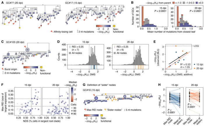
Darwinian evolution of immunoglobulin genes within germinal centers (GC) underlies the progressive increase in antibody affinity following antigen exposure. Whereas the mechanics of how competition between GC B cells drives increased affinity are well established, the dynamical evolutionary features of this process remain poorly characterized. We devised an experimental evolution model in which we "replay" over one hundred instances of a clonally homogenous GC reaction and follow the selective process by assigning affinities to all cells using deep mutational scanning. Our data reveal how GCs achieve predictable evolutionary outcomes through the cumulative effects of many rounds of imperfect selection, acting on a landscape shaped heavily by somatic hypermutation (SHM) targeting biases. Using time-calibrated models, we show that apparent features of GC evolution such as permissiveness to low-affinity lineages and early plateauing of affinity are best explained by survivorship biases that distort our view of how affinity progresses over time.


Conflict of interest statement

Competing interests: G.D.V. and J.D.B. are advisors for and hold stock of the Vaccine Company. J.D.B. consults or has recently consulted for Apriori Bio, Pfizer, and Invivyd on topics related to viruses, vaccines and viral evolution. T.Ara. is currently an employee of Pfizer Inc.

Figures

Figure 1.
Figure 1.. Parallel replay of germinal center evolution.
(A) Experimental design. Monoclonal germinal centers were generated by transfer of IgY-specific B cells into GC-deficient (CD23-Cre.Bcl6flox/flox) mice, which are then immunized with IgY to generate GCs. At 20 dpi, one or more individual GCs per LN were photoactivated under a multiphoton microscope. LNs were then dissected into fragments containing a single photoactivated GC, and photoactivated GC B cells were sorted into 96-well plates for Ig sequencing. (B) Example of GC photoactivation. Left, tiled multiphoton images showing photoactivation of four individual GCs in one node. Image is one Z-plane. Right, fluorescent stereoscope images of LNs prior to and after dissection into fragments. Dotted lines and roman numerals indicate photoactivated GCs. Scale bar, 0.5 mm. (C,D) Examples of phylogenetic trees for GCs sequenced at 15 and 20 dpi. (E,F) Distribution of NDS and REI scores for GCs from 15 and 20 dpi; each symbol represents one GC scaled according to the number of B cells sequenced. (G-J) Comparison of phylogenetic features of GCs obtained at 15 and 20 dpi. Bar is median, boxes are 25-75%, whiskers are range. Units are GCs (H-J), and root clades (K). Data are for 52 GCs (3,758 cells; 413 root clades) from 18 mice, 2 independent experiments for 15 dpi and 67 GCs (4,986 cells; 271 root clades) from 6 mice in 2 independent experiments for 20 dpi. P-values are for Mann-Whitney U test.
Figure 2.
Figure 2.. Deep mutational scanning and structure of clone 2.1.
(A) Heatmaps showing the effects of individual amino-acid replacements on binding of 2.1 scFv to chicken IgY by yeast display. Each square represents a different replacement. Squares marked with “X” indicate the original amino acid in clone 2.1. Squares with slashes indicate amino acid replacements distant more than one nucleotide mutation from the naive sequence. Yellow squares were not detected in the DMS experiments. Antigen-antibody contact residues (intermolecular distance ≤ 5.0 Å as determined by cryo-EM) are shown as black boxes in the upper bar. See Fig. S2C for the equivalent heatmap for scFv expression. An interactive version of this heatmap is available at https://matsengrp.github.io/gcreplay/interactive-figures/mutation-heatmaps/naive_reversions_first.html; replacements can be visualized on the Fab structure at https://matsen.group/gcreplay-viz/. Data are the mean of two independent experiments. (B) Effects of all (left) and accessible (requiring a single nucleotide mutation) amino acid replacements on 2.1 affinity and surface expression. The number and fraction of amino acid replacements in each category (impairment, red; neutral, gray; improvement, blue) are indicated. (C) 4.0 Å cryo-EM reconstruction of the 2.1hi Fab (D28HA, K49HR, S64HG, A40LG, Y42LF, A52LS, Q105LH, N108LY) complexed to IgY following local refinement using a mask around the IgY CH2 and 2.1hi Fab regions. (D) Cryo-EM-derived structure of the interaction of the 2.1hi V-domain with IgY CH2 with CDRs indicated. (E) Structure of the 2.1hi V-domain showing the footprint (black outline) of CH2, defined as residues with intermolecular distance ≥ 5.0 Å. The antibody-antigen interface spans 851 Å2 (341 Å2 for VH and 510 Å2 for Vκ). (F) As in (E), colored by mean Δaffinity (−Δlog10(KD) for all replacements (left), or maximum Δaffinity for the best possible replacement at each position (right)). Color scale as in (A). (G) Structure of the 2.1hi V-domain heavy (left) and light (right) chains colored by maximum Δaffinity. The approximate footprint of the opposite antibody chain (residues with ≥ 5 Å2 buried surface area contribution) is indicated by a black outline. IgY CH2 is shown as a gray ribbon. Color scale as in (A). (H-I) Comparison of Δaffinities predicted using the additive DMS model and BLI measurements of Fabs produced recombinantly using the same sequences. Solid black line is the linear trend; dotted red line is x = y. (H) 2.1 variants found frequently in prior studies of clone 2.1; (I) Affinity ladder spanning 8 orders of magnitude. LOD, limit of detection, below which BLI curve fitting was unreliable; LOQ, limit of quantitation, when Fab off-rate is too long to be determined. R2 and slope (m) calculations exclude Fabs <LOD and >LOQ. (J) Example GC phylogeny from the 20 dpi replay dataset (see Fig. 1), colored based on the additive DMS model.
Figure 3.
Figure 3.. Both mutability and affinity drive accumulation of individual replacements across germinal centers.
(A) Relative mutation rate measured for each base pair of the passenger IghchIgY* and IgkchIgY* alleles. Each symbol represents one nucleotide position, the sum of the relative rate of mutation for each of the three non-native nucleotides is given. Each symbol represents one nucleotide position, the sum of the relative rate of mutation for each of the three non-native nucleotides is given. Data are pooled from 3 mice for Igh and 2 mice for Igk. (B) Correlation between relative mutation rate, calculated for each of 1,275 codon-accessible amino acid replacements based on the data in (A), and the prevalence of each of these replacements in the replay dataset. Each symbol represents one replacement, colored by the Δaffinity determined for that replacement by DMS. Black line is a Poisson regression with no link function. (C) Correlation between Δaffinity and the prevalence of each of these replacements in the replay dataset. Each symbol represents one replacement, colored by relative mutation rate. (D,E) Correlation between Δaffinity (D) and Δexpression (E) and replacement enrichment (defined as the log10 of the number of observed events over the number of predicted events according to a Poisson regression shown here as a line). The orange line shows a LOWESS regression with 95% confidence intervals. ρ values are for Spearman correlation. (F) Accumulation of affinity-enhancing replacements among the highest-affinity B cells at various time points post-immunization. Each row represents the Ig sequences of one cell (the highest-affinity B cell in its host GC). Each column represents the set (curly brackets) of affinity-enhancing replacements (affinity > 0.4 according to the DMS) available at each position, grouped into those accessible by a single nucleotide mutation (left) and those that are not (right). Grey squares indicate that a B cell has the WT amino acid at that position; blue squares indicate replacements, and the identity of the replacement made by the B cell is given in white font. Bars above the graph indicate the summed intrinsic mutability for the listed replacements calculated from the passenger allele. Bars to the right indicate the DMS-estimated Δaffinity of each B cell. (G) Classification of accessible amino acid replacements into categories of Δaffinity (DMS) and relative mutation rate (passenger allele), defined by the dashed lines. (H) Accumulation over time of replacements from the 9 categories in (F) among GC B cells sequenced at various time points after immunization as detailed in Figure S4G. Each line represents the average normalized frequency per mutation category calculated as each mutation’s total frequency divided by the total number of cells captured at each time point. The shaded area represents the 95% CI. Data are pooled from 4 mice per time point and 9 mice for the 70-day time point. (I) As in G, but showing accumulation over time of selected individual replacements.
Figure 4.
Figure 4.. Quantifying germinal center selection for affinity and for maintenance of Ig expression.
(A) Distribution of 119 replicated GCs by median affinity and Ig expression, as quantified using the additive DMS model. Each symbol represents one GC, symbol sizes are proportional to the number of cells sequenced. Densities on the top and right show the distribution of GCs according to Δaffinity and Δexpression, respectively. (B) Example trajectory plots in which phylogenetic trees are plotted in 2D space according to their number of somatic mutations and Δaffinity (top) or Δexpression (bottom). For the experimentally observed trees, circles representing individual nodes, colored by REI and scaled by number of identical sequences, are connected by black lines. Simulated trees with the same phylogenetic structure but in which mutations are assigned based on mutability alone are shown as light blue lines, which represent the median values for each node in 10 simulated trees. Plots for all GCs available at https://github.com/matsengrp/gcreplay/tree/main/results/notebooks/phenotype-trajectories/naive_reversions_first. (C) Distribution of 119 replicated GCs by median affinity and Ig expression as in (A) (filled symbols), paired to the medians of 10 simulated GCs as in (B) (open symbols). P-values are for the Wilcoxon signed-rank test. (D) Example trajectories as in (B), but simulations are constrained by affinity—i.e., replacements are assigned based on nucleotide mutability but must match the Δaffinity of the observed node within 0.05 log10(ΔKD). (E) Comparison of median Δexpression between experimental GCs and affinity-constrained simulations as in (D). Each symbol represents one experimental GC (“observed”) or the median of 10 simulated GCs (“simulated”).
Figure 5.
Figure 5.. Drivers of affinity maturation as determined by phylogenetic analysis.
(A) Example phylogenies colored by Δaffinity, indicating cells that lost substantial affinity and are located at terminal nodes (red arrowheads). (B) Observed and inferred nodes from each replay GC phylogeny were divided into those that lost (<−1.0), maintained, (−1.0 to 0.3) or gained (>0.3) affinity with respect to their parent node. For each GC, the mean distance between the nodes in each category and the nearest leaf was then recorded (a distance of 0 indicates that the node is itself a leaf). The plot shows the distribution of mean values for each category in each GC. (C) Example of a clonal burst phylogeny colored by Δaffinity. The burst point is indicated by a red arrowhead. (D) Distribution of Δaffinities for clonal burst nodes (REI >0.25; blue lines for 15 dpi and orange lines for 20 dpi) compared to the distribution of Δaffinities for all nodes (observed and inferred) from the same time point (grey bars). (E) Comparison of Δaffinities predicted using the additive DMS model and BLI measurements of Fabs produced recombinantly based on the Ig sequences of each of the bursting nodes in (D). LOQ, limit of quantitation. Solid black line is the linear trend (excluding the Fab above the LOQ); dotted red line is x = y. (F) Distribution of NDS and max REI scores for GCs from 15 and 20 dpi as in Fig. 1E and F but colored by median Δaffinity; each symbol represents one GC scaled according to the number of B cells sequenced. (G) Schematic explaining the definition of “sister” nodes used in (H) and Fig. S5D. (H) Comparison of the affinity of the max REI node in each replay GC and the mean affinity of its “sister” nodes, as defined in Fig. 5G. P-values are for the Wilcoxon signed-rank test.
Figure 6.
Figure 6.. The reconstructed evolutionary process and affinity-fitness landscape.
(A) Example time-resolved tree for one GC showing nodes (birth events) and mutations (affinity jumps) in time (dpi), with all leaves at the sampling time (20 dpi for this GC). 100 such candidate trees were sampled for each GC. Taking a time slice from one such tree (e.g., at the red dotted line) yields a collection of ancestral cells and their associated affinities. (B) Heatmaps showing the evolution of affinities over time resulting from aggregating all candidate time-resolved trees for 15 and 20 dpi GCs. Dotted lines given for reference. The push of the past and pull of the present are seen as excess densities in the upper-left and lower-right quadrants, respectively, compared to (F). (C) Grey trendline shows median and interquartile range (IQR) affinity in the time-course experiment at 5, 8, 11, 14, 17, and 20 dpi. The blue and orange trend lines show median and IQR affinity through time derived from time-resolved trees for 15 dpi and 20 dpi GCs, respectively. (D) Distributions of affinity at 5, 8, 11, 14, 17, and 20 dpi in the time-course experiment (grey) compared to time-slice fits using the fitness landscape model (red). (E) Key parameters driving the fitness landscape model: the distribution of affinity mutations specified by DMS effects and mutation propensities (upper panel), and the fitness landscape (lower panel). (F) Solution of the fitness landscape model showing the affinity distribution evolving in continuous time up to day 20 for comparison with (B) and (C). Dotted lines given for reference. (G) Probabilities of survival until 20 dpi for cells of different affinity at various previous times, given the fitted fitness landscape model. These curves are interpreted as the distortions that elevate or suppress different affinities in the reconstructed process. (H) The solution p(x, t) of the fitness landscape model (grey) summarized as median and IQR affinity evolving in continuous time. Orange and blue show predicted median and IQR affinity for ancestral population histories sampled at 15 dpi and 20 dpi, respectively, by reweighting the solution with survival probabilities as shown in (G).

References

    1. Cyster J.G., and Allen C.D.C. (2019). B Cell Responses: Cell Interaction Dynamics and Decisions. Cell 177, 524–540. 10.1016/j.cell.2019.03.016. - DOI - PMC - PubMed
    1. Victora G.D., and Nussenzweig M.C. (2022). Germinal Centers. Annu Rev Immunol. 10.1146/annurev-immunol-120419-022408. - DOI - PubMed
    1. MacLennan I.C. (1994). Germinal centers. Annu Rev Immunol 12, 117–139. - PubMed
    1. Rajewsky K. (1996). Clonal selection and learning in the antibody system. Nature 381, 751–758. 10.1038/381751a0. - DOI - PubMed
    1. Burton D.R., Ahmed R., Barouch D.H., Butera S.T., Crotty S., Godzik A., Kaufmann D.E., McElrath M.J., Nussenzweig M.C., Pulendran B., et al. (2012). A Blueprint for HIV Vaccine Discovery. Cell host & microbe 12, 396–407. 10.1016/j.chom.2012.09.008. - DOI - PMC - PubMed

Publication types

LinkOut - more resources