. 2025 Aug;31(8):2567-2577.
doi: 10.1038/s41591-025-03833-1. Epub 2025 Jul 15.

Shared and disease-specific pathways in frontotemporal dementia and Alzheimer's and Parkinson's diseases

Affiliations

Shared and disease-specific pathways in frontotemporal dementia and Alzheimer's and Parkinson's diseases

Muhammad Ali et al. Nat Med. 2025 Aug.

Erratum in

Abstract

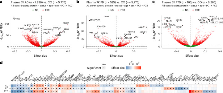
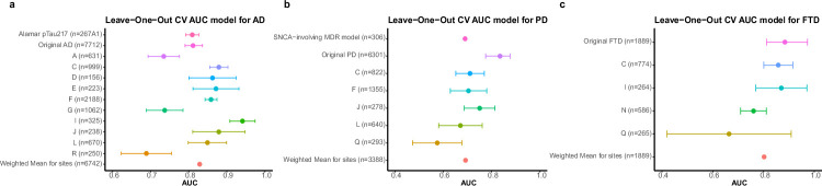
Neurodegenerative diseases (NDs), such as Alzheimer's disease (AD), Parkinson's disease (PD) and frontotemporal dementia (FTD), exhibit distinct yet overlapping pathological mechanisms. Leveraging large-scale plasma proteomics data from the Global Neurodegeneration Proteomics Consortium, we analyzed 10,527 plasma samples (1,936 AD, 525 PD, 163 FTD, 1,638 dementia and 6,265 controls) to identify disease-specific and shared proteins across NDs. We identified 5,187 proteins significantly associated with AD, 3,748 with PD and 2,380 with FTD that revealed both common and divergent proteomic signatures, which were confirmed by multiple analytical approaches and orthogonal validation. PD and FTD showed the highest overlap (r2 = 0.44) and AD and PD the least (r2 = 0.04). Immune system, glycolysis, and matrisome-related pathways were enriched across all NDs, while disease-specific pathways included apoptotic processes in AD, endoplasmic reticulum-phagosome impairment in PD and platelet dysregulation in FTD. Network analysis identified key upstream regulators (RPS27A in AD, IRAK4 in PD and MAPK1 in FTD) potentially driving these proteomic changes. These findings reveal distinct and shared mechanisms across NDs, highlighting potential regulatory proteins and pathways for diagnostic and therapeutic strategies in neurodegeneration.


Conflict of interest statement

Competing interests: C.C. has received research support from GlaxoSmithKline and EISAI. C.C. is a member of the scientific advisory board of Circular Genomics and owns stocks. C.C. is a member of the scientific advisory board of ADmit. There is an invention disclosure for the prediction models, including protein IDs, alternative proteins and weights, cutoff and algorithms. O.H. is an employee of Eli Lilly and Lund University. M.A., B.E., Y.C., Y.X., K.G., M.L., A.P.B., J.T., D.W., C.Y., G.H., J.W.V., B.M.T., V.K., F.I. and L.W. declare no competing interests.

Figures

Fig. 1
Fig. 1. A framework for mapping human plasma proteome in neurodegeneration.
Plasma samples were collected from 1,936 AD, 525 PD, 163 FTD and 6,265 cognitively normal control participants and profiled using the SomaScan 7K platform. These proteomic data are available in the GNPC from 16 independent contributor sites. The Site E (marked by red boundary) collected blood in sodium citrate tubes, whereas all remaining sites collected plasma samples in EDTA tubes. Stringent quality control and z-score normalization were performed to harmonize these datasets and remove the batch effects (σ in the IQR boxplot denotes standard deviation from the mean). Differential protein abundance analysis was performed to identify proteins associated with each disease, and pairwise comparisons of protein effect size across disease pairs were assessed to map the proteomic landscape of neurodegeneration. Machine learning approaches were leveraged to identify disease-specific prediction models. Pathway, cell type enrichment and network analyses were conducted to understand underlying disease biology. CO, controls; PC, principal component; PCA, principal component analysis.
Fig. 2
Fig. 2. Plasma proteomic alterations in AD, PD and FTD compared to controls.
Volcano plots displaying proteins with significantly increased and decreased abundance in AD (a), PD (b) and FTD (c) compared to controls (CO). Each point represents a protein, with the x axis showing the effect size and the y axis showing the FDR from the linear regression model. The red points indicate proteins with significant differential abundance (FDR < 0.05); the green points represent non-significant proteins. Key proteins with notable changes are labeled with the protein name. The dashed lines on the x axis denote the significance threshold, where proteins to the right indicate increased abundance and those to the left indicate decreased abundance in diseased samples in comparison to CO. d, Heatmap displaying the effect size of key significantly altered proteins across AD, PD and FTD. The proteins are ordered based on their significant associations with all three diseases, AD and PD, AD and FTD, PD and FTD and the proteins uniquely associated with AD, PD and FTD, respectively. Blue and red colors in the heatmap indicate decreased and increased abundance, respectively. Black dots inside the squares indicate statistically significant associations (FDR < 0.05). NS, not significant.
Fig. 3
Fig. 3. Overlap and effect size correlation of proteins associated with AD, PD and FTD.
a, An upset plot visualizing the overlap between proteins associated with each ND. b, Pairwise correlation matrix of effect sizes for differentially abundant proteins across AD, PD and FTD. The color gradient represents the strength of correlation from low (white) to high (dark blue). ce, Scatter plots display pairwise comparisons of effect sizes for proteins in AD versus PD (c), AD versus FTD (d) and PD versus FTD (e). Each point represents a protein, with the x axis and y axis representing the effect sizes in the respective diseases. Proteins significantly associated with both diseases are shown in blue; proteins uniquely significant in the first and second diseases are represented in orange and teal colors, respectively. The dark gray dashed line in the middle represents the regression line; the light gray outer dashed lines represent the 95% confidence interval bounds. Key proteins with notable effect size changes are labeled with the protein name.
Fig. 4
Fig. 4. Pathway enrichment and network analyses for AD, PD and FTD.
a, The dot plot displays selected pathways across NDs enriched in proteins overlapping across AD, PD and FTD as well as those proteins unique to each disease. Pathway clusters are indicated by the labels on the left. Dot size represents the number of identified genes, and the color gradient reflects FDR-adjusted significance. The tile plot on the right side highlights differentially expressed proteins within each pathway, with color coding corresponding to the associated disease. bd, Graph-based representations of the disease-specific PPI networks for AD (b), PD (c) and FTD (d). In each network, green edges indicate activating interactions, and red edges represent inhibitory interactions. Node color reflects the direction of disease-associated change: proteins with increased expression levels in disease are shown in red, and those having decreased expression levels are shown in blue. Key upstream regulators, predicted through network perturbation analysis, are depicted as diamond-shaped nodes; all other proteins are shown as circles, with node size representing the out-degree (regulatory edges going out of the node). Both key upstream regulators and other important proteins in the network are highlighted by a pink boundary. NA, not applicable.
Fig. 5
Fig. 5. Disease-specific predictive models for AD, PD and FTD.
a, The pipeline for identifying disease-specific biomarker panels. b, AUC values with 95% confidence intervals from the testing dataset for each disease-specific model tested against all three ND groups: AD (n = 1,162), PD (n = 314) and FTD (n = 98). Each row corresponds to a prediction model trained for one disease and applied to all disease groups (color coded: AD in blue, PD in orange and FTD in pink). The bars and error bars represent bootstrapped (n = 100) means and 95% confidence intervals. ce, ROC curves showing average performance of the AD (c), PD (d) and FTD (e) models in distinguishing their respective target disease (same color line as the legend) from the remaining groups.
Extended Data Fig. 1
Extended Data Fig. 1. Overlap and cell type enrichment of disease-associated proteins.
a, Heatmap representing the enrichment of disease-associated proteins from each disease (AD, PD, and FTD) in five different human brain cell types (oligodendrocytes, neurons, microglia/macrophages, mature astrocytes, and endothelial cells). The significance of enrichment (hypergeometric p-value) was computed using hypergeometric test. The significant enrichment (p < 0.05) of disease-associated proteins with a particular cell type is denoted by * in the heatmap square. b, Overlap of significant (FDR < 0.05) disease-associated proteins across AD, PD, and FTD. c, Enrichment of AD-, PD-, and FTD-associated proteins in human blood cell types. No cell type reached statistical significance for enrichment, the top-ranked cell type varied by disease, with natural killer (NK) cells ranking highest in AD, endothelial cells in PD, and fibroblasts in FTD.
Extended Data Fig. 2
Extended Data Fig. 2. Sensitivity analyses.
To rule out the possibility that the large number of differentially abundant proteins in AD is an artifact of the analyses, due to data harmonization across sites, bias due to site or any other hidden problem, we conducted several additional analyses (e.g. analyses using raw proteomic values, inclusion of site in regression model, and joint vs. meta-analysis) to demonstrate the robustness of our analyses. We demonstrate that different QC approaches, either doing QC by site or all samples together do not lead to considerably different results. Additionally, the inclusion or exclusion of sodium citrate samples does not change the findings. Furthermore, the joint analyses do not lead to any batch or artifactual results as the effect sizes of the joint analyses are highly correlated with those of the meta-analyses. Moreover, the joint analyses that show similar effect sizes to that of the meta-analyses provide more statistical power by reducing the confidence interval of the estimates. a-b, Sensitivity analysis performed using extended AD and dementia patients. a, Volcano plot visualizing proteins significantly increased (right side of dashed vertical line on x-axis) or decreased (left side of dashed vertical line on x-axis) in AD and dementia patients in comparison to cognitively normal controls. The dotted line on the y-axis represents the significance threshold (FDR < 0.05). In the GNPC version 1.3, 1,638 individuals have been diagnosed with dementia, based on a Clinical Dementia Rating (CDR) greater than 0.5 or a Mini-Mental State Examination (MMSE) score below 19, but do not have a confirmed final diagnosis. b, A scatterplot of correlation in effect size from the AD vs. CO analysis (included in the main results) and AD and Dementia vs. CO analysis (sensitivity analysis). Red and blue dots and regression lines represent proteins that passed FDR (FDR < 0.05) and nominal (p < 0.05) significance in the main AD vs. CO analysis, and green dots represent proteins that are non-significant (p > 0.05). We observed a strong correlation (Pearson r2 = 0.93) in effect size between the main and sensitivity analyses. c-e, Pairwise comparisons of effect size estimates from three models. c, Joint analysis using study-wide Z-scores (All). d, Joint analysis using z-score calculated by site (By Site). e, Meta-analyses using z-score by site (Meta). Each point represents protein, with effect estimates shown for the corresponding models. Points are color-coded based on significance in the respective models: grey indicates not significant in either model, green indicates significance in the x-axis model only, blue in the y-axis model only, and red indicates significance in both models. Dashed lines indicate linear regression fits with shaded 95% confidence intervals. Spearman correlation coefficients (r) and associated P values are displayed in each panel. f, Effect size correlation of the analyses with and without the site with Citrate. Effect size estimates were highly consistent, with 100% directional concordance and a Pearson correlation coefficient of r2 = 1. Scatter plot of effect size EDTA joint analysis (x-axis) for differentially expressed proteins versus EDTA + Citrate joint analysis effect sizes (y-axis) across AD. The number of differentially expressed proteins is 5,187. Each dot represents a protein, with blue indicating concordant direction and grey indicating discordant direction between the two analyses. The red line indicates linear regression fit. g-h, Correlation of effect sizes between by-site meta-analysis and joint analysis. To perform a head-to-head comparison of the meta-analyses vs the joint analyses, we initially compare the results of a joint analyses with those of the meta-analyses where only the sites with cases and controls for a specific disease are included. In this way the same samples are included in both the meta-analyses and the joint analyses. When doing these analyses, we found high correlation (r2 > 0.88) in the effect size, and even higher concordance rate in direction of effect sizes across both analyses (>95%). This correlation further increases if we focus only on the proteins that passed FDR correction in the joint analysis. Scatter plots of effect size joint analysis (x-axis) for differentially expressed proteins vs. by-site meta-analysis effect sizes (y-axis) across three diseases: AD, PD, (FTD. Each dot represents a protein, with blue indicating concordant direction and grey indicating discordant direction between the two analyses. The red line indicates linear regression fit. g, Represents all proteins. h, Only proteins that pass FDR significance. i, Correlation of effect sizes between joint analysis (Fixed effect) and joint analysis (Random effect). Scatter plots of effect size joint analysis fixed effect (x-axis) for differentially expressed proteins vs. joint analysis random effect (y-axis) across three diseases: AD, PD, and FTD. Each dot represents a protein, with blue indicating concordant direction and grey indicating discordant direction between the two analyses. The red line indicates linear regression fit. The results from the two approaches were highly consistent. Specifically, the correlation of effect sizes is quite high (r2 > 0.98), and there is minimal changes in the proteins that pass FDR, suggesting that the random vs fixed effect has low impact on the overall associations.
Extended Data Fig. 3
Extended Data Fig. 3. Assessment of heterogeneity (I2) and histograms of odds ratios for FDR < 0.05 proteins.
a-c, The scatter plot examines the relationship between heterogeneity, as measured by I2, and the transformed heterogeneity p-value -log10(phetero). Points above the dashed line are colored and represent significant heterogeneity (p < 0.05), while grey points below the line are not significant. The x-axis shows the percentage of variance caused by real differences, not random error. d-f, These histograms display the distribution of site-level variances for proteins in each disease dataset. The x-axis shows the variance of effect sizes across sites, and the y-axis indicates how many proteins fall within each variance range. g–i, panels show the distribution of ORs for g, AD, h, PD, and i, FTD. Red dashed lines indicate the mean symmetric OR in each disease group.
Extended Data Fig. 4
Extended Data Fig. 4. Comparison of significant protein concordance across orthogonal platforms and external datasets.
a, Of the shared aptamers, we selected the top 15 and bottom 15 significant proteins of selected by GNPC, out of the 30 proteins, 19(63.3%) of them are of the same direction in Alamar, colored by the blue point. b, Same strategy was also applied to the FTD comparison. Due to the sample size limitation, we selected top 5 and bottom 5 significant proteins in GNPC, 8 out of 10 (80%) are of same direction of effect size in Alamar, colored by pink. c, Comparison with the work by Yi-Han et al.: Their work was conducted on the Olink platform, we analyzed the top 10 and bottom 10 significant shared proteins in GNPC based on FDR values. It demonstrated concordance rates of 55% in Discovery (UK Biobank). d, Comparison with the work by Rutledge et al. (SomaScan Stanford-5x): Among the shared top 10 and bottom 10 proteins in GNPC, a concordance rate of 55% was observed. In summary, these analyses underscore the overlap and consistency of protein directional effects across platforms and diseases, offering valuable insights into the reproducibility and cross-platform validation of our findings.
Extended Data Fig. 5
Extended Data Fig. 5. Pathway enrichment analysis of proteins commonly associated with multiple neurodegenerative disorders.
(Left) The dot plot displays top 10 pathways enriched in proteins overlapping across multiple disease. Pathway clusters are indicated by the labels on the left. Dot size represents the number of proteins associated with a particular pathway, and the color gradient reflects significance of pathway. (Right) The tile plot highlights differentially expressed proteins within each pathway. a, We identified 44 Reactome pathways to be significantly (FDR < 0.05) enriched in 1,664 proteins commonly associated with both AD and PD. b, 10 pathways revealed significant enrichment (FDR < 0.05) in 691 AD- and FTD-associated proteins. c, A total of 115 pathways showed nominal enrichment (p < 0.05) with 415 protein commonly shared between PD and FTD.
Extended Data Fig. 6
Extended Data Fig. 6. Protein-protein interaction networks.
a, Proteins commonly associated with AD, PD, and FTD. The network shows up (red) and down (blue) regulation of commonly associated proteins in AD, PD, and FTD with FDR < 0.05. Colors of the node (AD), label (PD), and node border (FTD) reflect the dysregulation direction, i.e. upregulation and downregulation, for each disease. b, Commonly associated proteins that are enriched in pathways. The network consists of proteins significantly associated with the disease (FDR < 0.05) that overlap across AD, PD, and FTD. The width of node borders reflects the number of pathways enriched by each protein. The bar graphs inside each protein node depict relative effect sizes of AD (blue), PD (orange), and FTD (pink). c-i, Significantly disease-associated proteins that are involved in known protein families. Subnetwork of proteins from c, complement system, d, interleukin, e, enolase, f, caspase, g, integrin, h, ubiquitin, and i, proteasome families. Colors of the node (AD), label (PD), and node border (FTD) reflect the dysregulation direction, i.e. upregulation (red) and downregulation (blue), for each disease. Grey/black colors imply absence of significant (FDR < 0.05) association between the disease and the protein. Nodes that are part of the protein family and not significantly associated with a disease of interest are shown in green, where applicable.
Extended Data Fig. 7
Extended Data Fig. 7. Leave-One-Site-Out Cross-Validation (CV) of Disease-Specific Prediction Models for AD, PD, and FTD.
We applied LASSO logistic regression with leave-one-site-out cross validation (LOOCV), which includes 6,742 participants in AD model, 3,388 participants for PD model, and 1,889 participants for FTD model. a–c, Area under the receiver operating characteristic curve (AUC) with 95% confidence intervals (CIs) for models predicting a, Alzheimer’s disease (AD), b, Parkinson’s disease (PD), and c, frontotemporal dementia (FTD). Each point represents model performance on a single held-out site. The ‘Original’ model in each panel refers to performance on the full dataset without site-level CV (Fig. 5 in main manuscript). In A and B, top rows show AUCs from previously published reference models. Site-specific rows correspond to leave-one-site-out CV results, in which data from one site is held out for testing while the model is trained on all others. The red dot indicates the weighted mean AUC across all sites, weighted by sample size. For the AD cohort, site-specific Area Under the Curve (AUC) values ranged from 0.689 to 0.941. The sample size-weighted mean AUC was 0.829, indicating strong discrimination between AD and control samples across independent sites. The original model, trained using data from all sites, achieved an AUC of 0.811. Additionally, we included a model utilizing ptau-217 to predict AD using internal dataset, the largest site (site F), which yielded an AUC of 0.809 as a reference. Overall, these results demonstrate robust performance in distinguishing AD and the initial model. The PD models resulted in a slightly lower overall mean AUC of 0.692, with the original model achieving a higher AUC of 0.835. This suggests that while the PD models are generally effective, there is variability in discrimination performance across different sites. For FTD, the sample size-weighted mean AUC across contributors was 0.802, indicating stable performance across sites. The original FTD model showed an impressive AUC of 0.884. These findings highlight the model’s reliability and strong predictive capability for FTD across different contributors.
Extended Data Fig. 8
Extended Data Fig. 8. Proteomics data quality control (QC) check pipeline.
The QC pipeline was applied separately to both citrate and Ethylenediaminetetraacetic acid (EDTA) plasma samples. The two main filters include interquartile range (IQR) outlier detection and call rate. Aptamers with a median coefficient of variation (CV) greater than 0.15 or those with values falling outside 1.5 times the IQR in more than 85% of the samples were removed. After implementing all QC steps, a total of 10,527 samples and 7,289 aptamers passed the quality assessment.
Extended Data Fig. 9
Extended Data Fig. 9. Principal component analysis (PCA) of proteomic data before and after z-score based normalization.
a, The PCA plot of ethylenediaminetetraacetic acid (EDTA) plasma samples from each contributor in GNPC version 1. The red dots represent first two proteomic principal components (PCs) of samples from an individual contributor against the grey dot representing proteomic PCs of all sample from every contributor. b, The PCA plot of sodium citrate plasma samples from a single contributor ‘K’. c-d, The PCA plots of z-score normalized proteomic data from the c, EDTA and d, Citrate samples across all contributors.

References

    1. Rajmohan, R. & Reddy, P. H. Amyloid-beta and phosphorylated tau accumulations cause abnormalities at synapses of Alzheimer’s disease neurons. J. Alzheimers Dis.57, 975–999 (2017). - PMC - PubMed
    1. Stefanis, L. α-Synuclein in Parkinson’s disease. Cold Spring Harb. Perspect. Med.2, a009399 (2012). - PMC - PubMed
    1. Urwin, H. et al. FUS pathology defines the majority of tau- and TDP-43-negative frontotemporal lobar degeneration. Acta Neuropathol.120, 33–41 (2010). - PMC - PubMed
    1. Josephs, K. A. et al. Staging TDP-43 pathology in Alzheimer’s disease. Acta Neuropathol.127, 441–450 (2014). - PMC - PubMed
    1. Bellomo, G. et al. Investigating alpha-synuclein co-pathology in Alzheimer’s disease by means of cerebrospinal fluid alpha-synuclein seed amplification assay. Alzheimers Dement.20, 2444–2452 (2024). - PMC - PubMed