. 2025 Jul 3:16:1622959.
doi: 10.3389/fimmu.2025.1622959. eCollection 2025.

Identification of prognosis and therapy related intratumoral microbiome and immune signatures in gastric cancer

Affiliations

Identification of prognosis and therapy related intratumoral microbiome and immune signatures in gastric cancer

Peng Jin et al. Front Immunol. .

Abstract

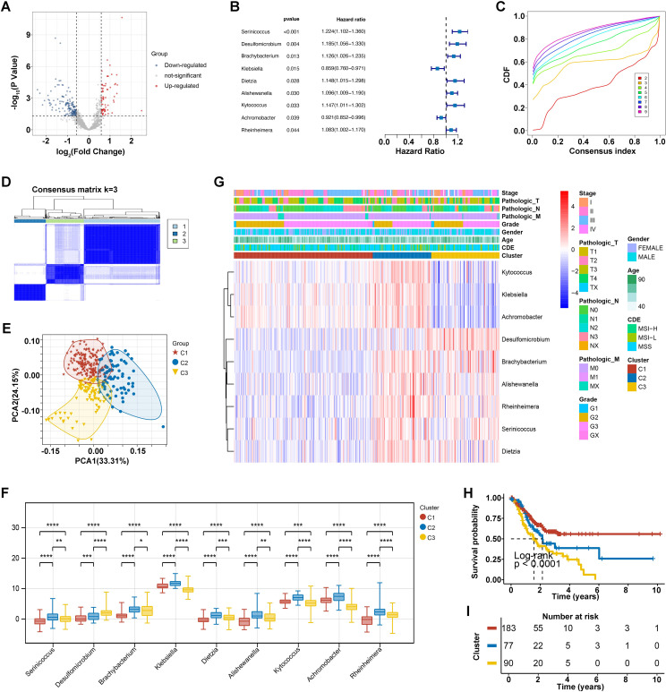
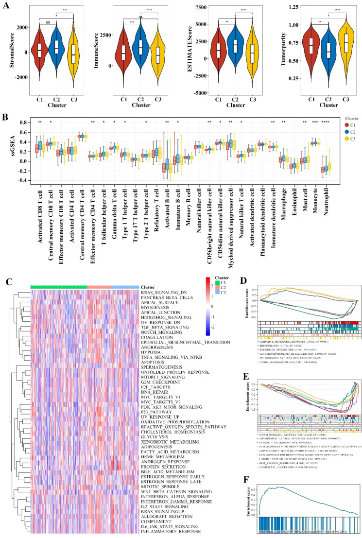
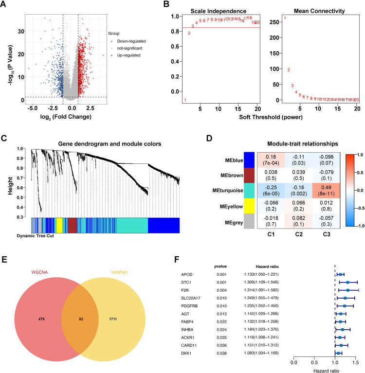
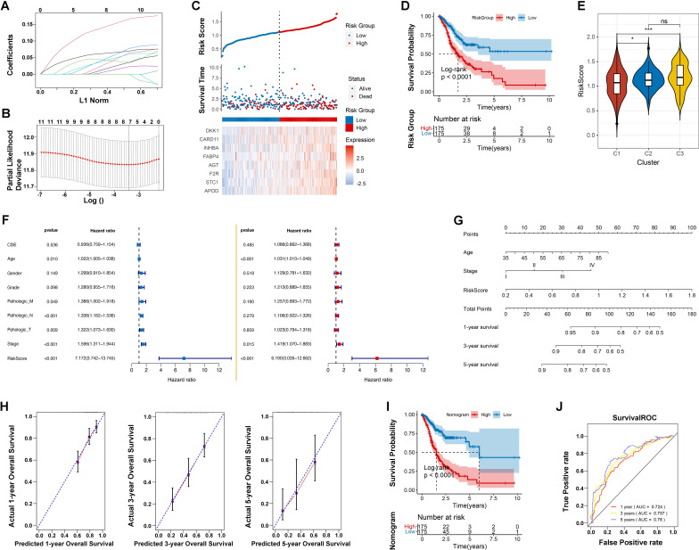
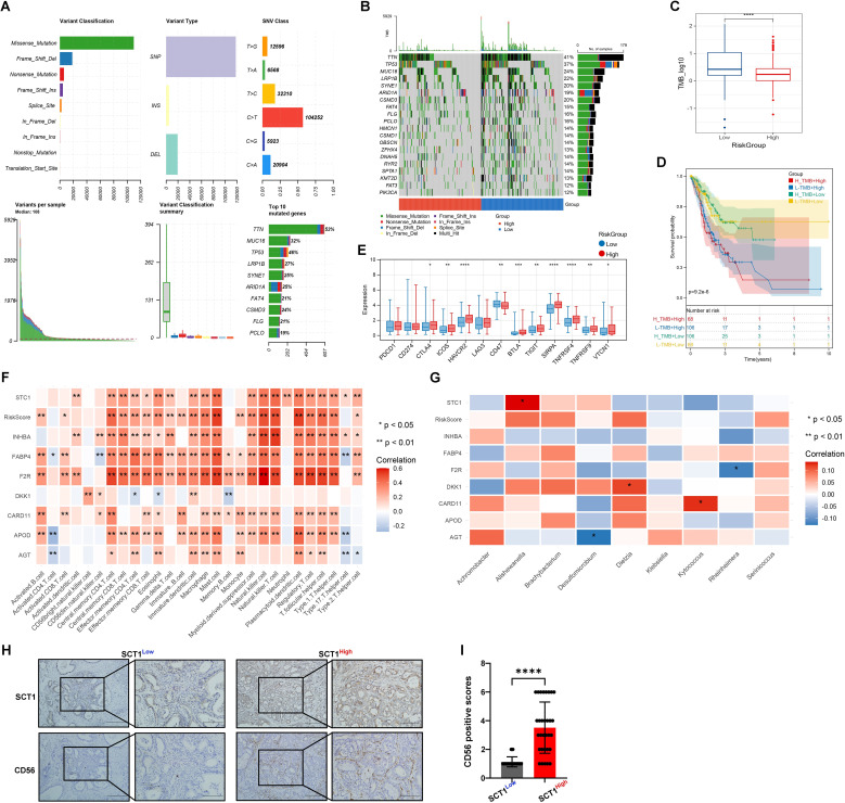
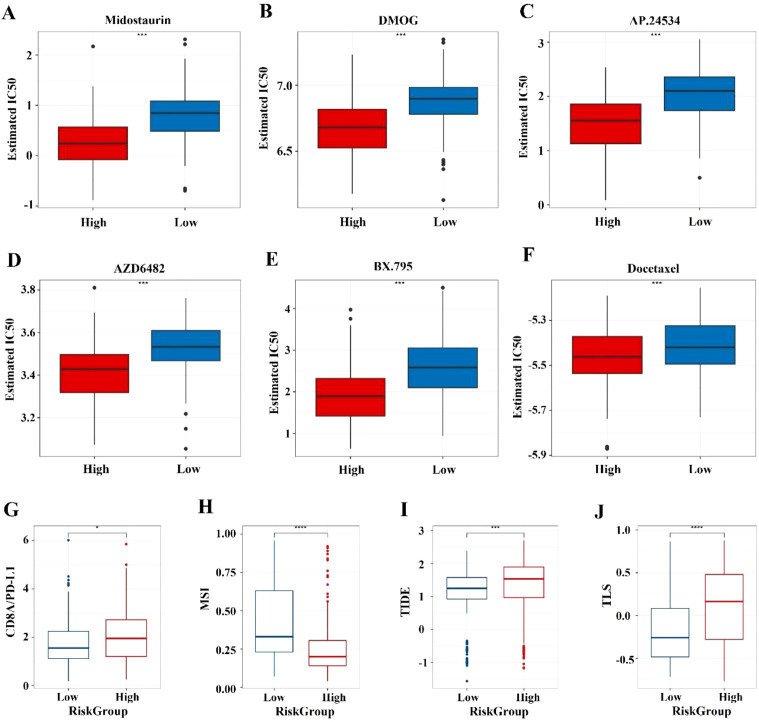
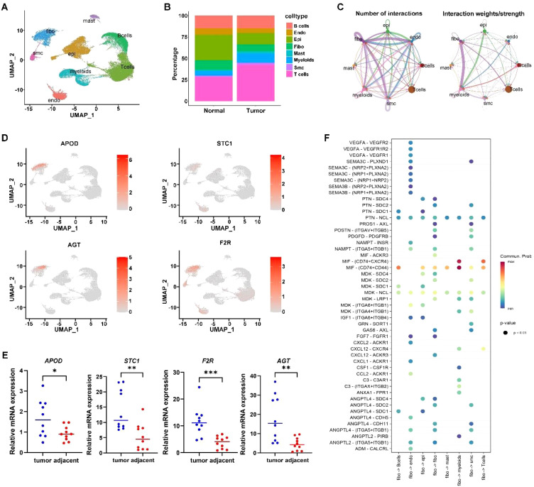
The impact of the intratumoral microbiome (ITM) on the treatment and prognosis of gastric cancer (GC) remains controversial. Our study analyzed the differential ITM in GC tissues and identified nine bacterial genera significantly associated with overall survival (OS), with seven as risk factors and two as protective factors. Three distinct clusters with varying survival outcomes were defined, demonstrating correlations with pathological stage and immune features. An immune-related gene-based RiskScore model incorporating genes such as Apolipoprotein D (APOD), Stanniocalcin 1 (STC1), Coagulation Factor II Thrombin Receptor (F2R), Angiotensinogen (AGT), Fatty Acid Binding Protein 4 (FABP4), Inhibin Subunit Beta A (INHBA), Caspase Recruitment Domain Family Member 11 (CARD11), and Dickkopf WNT Signaling Pathway Inhibitor 1 (DKK1) was established and validated in The Cancer Genome Atlas (TCGA) and Gene Expression Omnibus (GEO) datasets. When combined with clinical factors, this RiskScore model formed a Nomogram model achieving Areas Under the Curve (AUCs) of 0.72, 0.76, and 0.79 for 1, 3, and 5-year OS predictions, respectively. This model exhibited robust predictive accuracy over time and correlated with mutation frequency, drug sensitivity, and immunotherapy response. Furthermore, single-cell analysis revealed that tumor-associated fibroblasts may play a pivotal role in immune-microbial interactions. The results were confirmed using quantitative real-time polymerase chain reaction (qPCR) and immunohistochemistry (IHC). In conclusion, the prognostic model incorporating ITM and immune-related genes aids in risk stratification and provides valuable insights and targets for GC treatment.

Keywords: comprehensive analysis; drug sensitivity; gastric cancer; intratumoral microbiome; prognostic biomarkers; therapeutic responses.


Conflict of interest statement

The authors declare that the research was conducted in the absence of any commercial or financial relationships that could be construed as a potential conflict of interest.

Figures

Figure 1
Figure 1
Intratumoral microorganisms and microbial clustering analysis. (A) Differential microbial volcano plot, where blue represents downregulated microbes and red represents upregulated microbes. (B) Forest plot of prognostic microbes. (C) Cumulative distribution function (CDF) of consensus clustering for k = 2-9. (D) Consensus clustering matrix for the optimal k = 3. (E) PCA curve analysis. (F) Clinical correlation heatmap of 9 prognostic bacterial genera, where red represents high expression and blue represents low expression. *p<0.05, **p<0.01, ***p<0.001, ****p<0.0001. (G) Differential levels of the 9 prognostic bacterial genera across different clusters. (H, I) KM survival curves for different clusters.
Figure 2
Figure 2
Immune infiltration and pathway enrichment analysis. (A) Violin plot comparing immune scores and stromal scores across different Cluster groups. ** indicates p < 0.01; *** indicates p < 0.001; **** indicates p < 0.0001; ns indicates no significance. (B) Comparison of immune cell types with significant differences between different Cluster groups using the ssGSEA algorithm. * indicates p < 0.05; ** indicates p < 0.01; *** indicates p < 0.001; **** indicates p < 0.0001. (C) Heatmap of enrichment differences for hallmark gene sets. (D-F) Significantly different KEGG pathways between different Cluster groups with a threshold of p < 0.05 and an absolute NES value greater than 1.
Figure 3
Figure 3
Identification of microbiome-associated immune genes with prognostic value. (A) Differential gene volcano plot, where blue represents downregulated genes and red represents upregulated genes. (B) Left: Plot for selecting the weight parameter “power” in the adjacency matrix. The x-axis represents the weight parameter “power,” and the y-axis represents the square of the correlation coefficient between log(k) and log(p(k)) in the corresponding network. A higher value of the square of the correlation coefficient indicates that the network is closer to a scale-free distribution. The red line indicates the standard line where the square of the correlation coefficient reaches 0.85. Right: Schematic diagram of the average gene connectivity under different “power” parameters in the adjacency matrix. The red line indicates the average connectivity of network nodes at the “power” parameter value selected in the left plot. (C) Dendrogram of module partitioning. Each color represents a different module. (D) Heatmap showing the correlation between each module and phenotypic traits. (E) Venn diagram of intersections. (F) Univariate Cox forest plot.
Figure 4
Figure 4
Prognostic model development and validation. (A) Distribution of LASSO coefficients. (B) Likelihood deviation of the LASSO coefficient distribution, with two vertical dashed lines representing lambda.min (left black line) and lambda.1se (right black line), respectively. (C) Distribution of RiskScore (top), survival time status (middle), and gene expression pattern of the model (bottom) in the TCGA training set. (D) KM curve for prognosis prediction based on the RiskScore model. (E) Differences in RiskScore distribution between different Clusters. * indicates p < 0.05; *** indicates p < 0.001; ns indicates no significance. (F) Forest plot of univariate and multivariate Cox regression analysis for clinical information. (G) Nomogram for predicting survival rates using independent prognostic factors. (H) Calibration plot for 1-year, 3-year, and 5-year survival predictions from the nomogram, with the x-axis representing predicted survival rates and the y-axis representing actual survival rates. (I) KM curve for prognosis prediction based on the nomogram model. (J) ROC curves for 1-year, 3-year, and 5-year predictions based on the nomogram.
Figure 5
Figure 5
Mutation status and immune-microbial interactions analysis. (A, B) Mutation waterfall plots of Top20 genes in different risk groups. (C) Box plot of TMB differences. (D) Combined KM curve. (E) Box plot of differences in immune checkpoint expression. (F) and (G) Heatmaps of correlation between RiskScore and immune cells. (H, I) IHC validation shows colocalization and positive correlation of STC1 and CD56 expression in tumor tissues (* indicates p < 0.05; ** indicates p < 0.01; *** indicates p < 0.001); **** indicates p < 0.0001.
Figure 6
Figure 6
Prediction of chemotherapy sensitivity and immunotherapy response. (A-E) Comparison of IC50 level differences for six chemotherapy drugs across different risk groups. (F-I) Comparison of TIDE and immune marker scores across different risk groups. * indicates p < 0.05; *** indicates p < 0.001; **** indicates p < 0.0001.
Figure 7
Figure 7
Single cell analysis. (A) Cell annotation plot. (B) Cell distribution ratio plot. (C) shows the number of ligand-receptor pairs and communication probability among all cell populations across samples; different colors in the outer circle represent different cell populations, and the size indicates the number of ligand-receptor pairs in the population. A larger circle indicates a higher ratio of ligand-receptor pairs between cells. (D) Expression of signature genes in single cells. (E) qPCR confirmation of signature gene expression in tumor tissues. (F) In the bubble plot, the x-axis represents cell pairs, with colors distinguishing samples; the y-axis represents ligands and receptors. The size of the bubble indicates the p-value, with smaller p-values corresponding to larger bubbles. The color represents the magnitude of communication probability. * indicates p < 0.05; ** indicates p < 0.01; *** indicates p < 0.001.

Similar articles

References

    1. Sung H, Ferlay J, Siegel RL, Laversanne M, Soerjomataram I, Jemal A, et al. Global cancer statistics 2020: GLOBOCAN estimates of incidence and mortality worldwide for 36 cancers in 185 countries. Ca-Cancer J Clin. (2021) 71:209–49. doi: 10.3322/caac.21660 - DOI - PubMed
    1. Rawla P, Barsouk A. Epidemiology of gastric cancer: global trends, risk factors and prevention. Prz Gastroenterol. (2019) 14:26–38. doi: 10.5114/pg.2018.80001 - DOI - PMC - PubMed
    1. Smyth EC, Nilsson M, Grabsch HI, van Grieken NCT, Lordick F. Gastric cancer. Lancet. (2020) 396:635–48. doi: 10.1016/S0140-6736(20)31288-5 - DOI - PubMed
    1. Quail DF, Joyce JA. Microenvironmental regulation of tumor progression and metastasis. Nat Med. (2013) 19:1423–37. doi: 10.1038/nm.3394 - DOI - PMC - PubMed
    1. Honda K, Littman DR. The microbiome in infectious disease and inflammation. Annu Rev Immunol. (2012) 30:759–95. doi: 10.1146/annurev-immunol-020711-074937 - DOI - PMC - PubMed

Substances