. 2025 Jul 4:16:1591123.
doi: 10.3389/fimmu.2025.1591123. eCollection 2025.

Integrative single-cell and spatial transcriptomics uncover ELK4-mediated mechanisms in NDUFAB1+ tumor cells driving gastric cancer progression, metabolic reprogramming, and immune evasion

Affiliations

Integrative single-cell and spatial transcriptomics uncover ELK4-mediated mechanisms in NDUFAB1+ tumor cells driving gastric cancer progression, metabolic reprogramming, and immune evasion

Yuwei Sun et al. Front Immunol. .

Abstract

Background: Globally, gastric cancer (GC) stands as the fifth most prevalent form of malignant neoplasm and represents a significant contributor to mortality associated with oncological conditions. Despite advancements in therapeutic strategies for GC, the outcomes for patients with advanced stages of the disease continue to be unfavorable, largely due to tumor heterogeneity and the challenges posed by resistance to therapeutic agents. Metabolic reprogramming is pivotal in driving the advancement of GC, contributing to the development of resistance to pharmacological treatments and facilitating the cancer's ability to evade immune surveillance. Developing multi-target comprehensive treatment strategies by integrating tumor microenvironment (TME) modulation holds promise for significantly improving therapeutic efficacy.

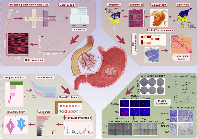
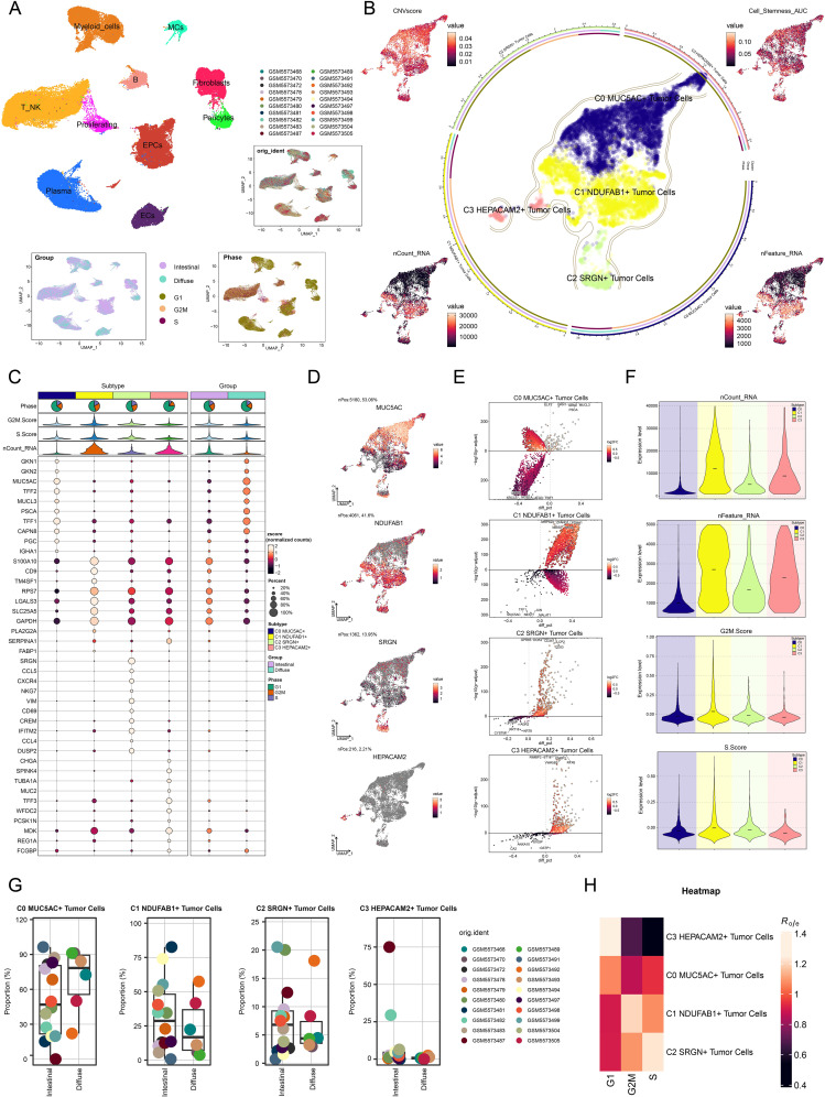
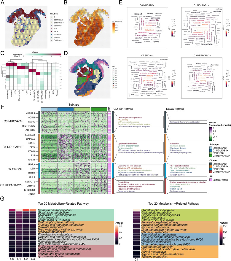
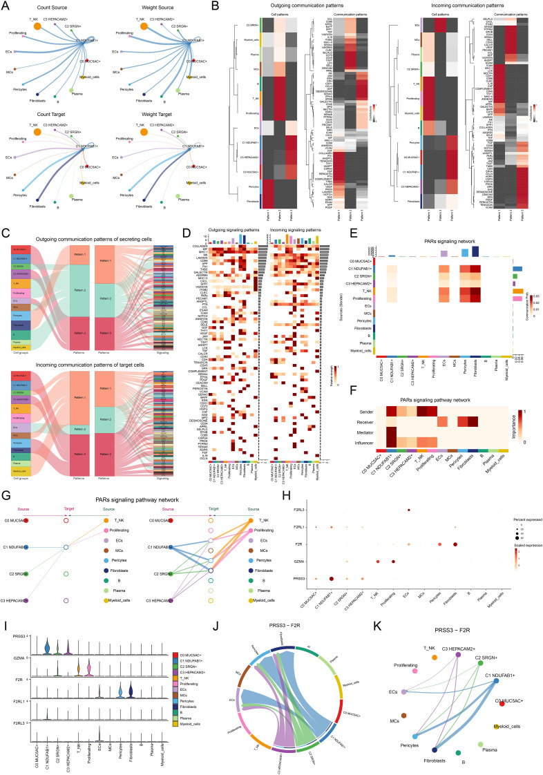
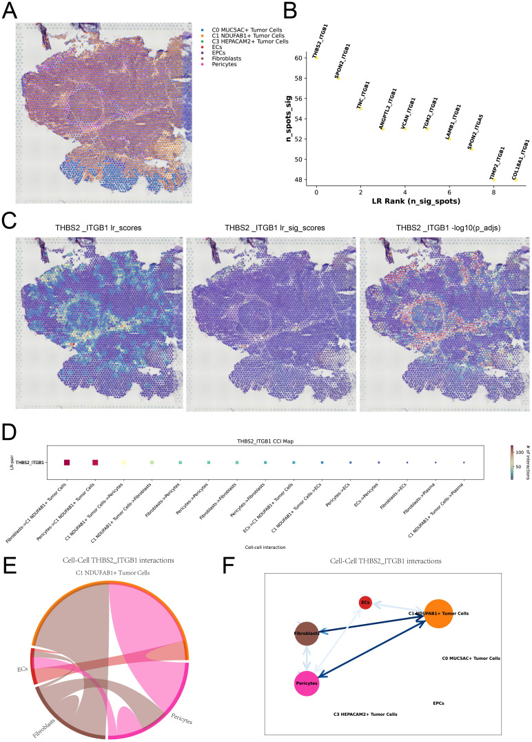
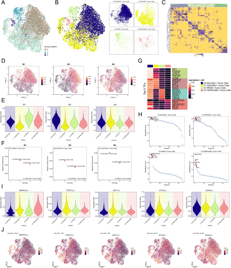
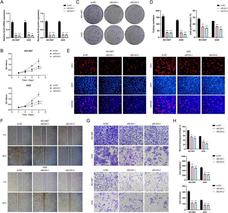
Methods: The study analyzed GC and identified key cell subtypes by integrating data derived from single-cell RNA-sequencing (scRNA-seq) alongside spatial transcriptomics information. Cell type identification was accomplished using the tool of Seurat, and the spatial distribution of cell types was revealed through the Robust Cell Type Decomposition technique. CellChat was used to analyze the interactions between key cell subtypes and other cells, and the "StLearn" package was employed to investigate spatial cell communication in depth. Additionally, the functional role of the key molecule ELK4 was validated through in vitro experiments.

Results: This research utilized scRNA-seq combined with spatial transcriptomics to comprehensively analyze GC, identifying the C1 NDUFAB1+ subtype, which exhibited high proliferative activity, metabolic reprogramming capabilities, and immune evasion properties. It was found that the C1 NDUFAB1+ subtype closely interacted with fibroblasts and pericytes via the PARs signaling pathway. Additionally, in vitro experiments confirmed that knockdown of ELK4 substantially curbed tumor cell proliferation, migration, and invasion.

Conclusion: This study revealed the main significance of the C1 NDUFAB1+ subtype in GC, elucidating its core mechanisms in tumor progression, metabolic reprogramming, and immune evasion. ELK4 was identified as a key regulatory factor that markedly enhanced the proliferation, migratory capacity, and invasive potential of tumor cells, while changes in the TME were a driving force behind immune suppression and drug resistance. The findings underscored the importance of developing specific therapeutic targets, targeting metabolic reprogramming, and overcoming immune evasion, providing new theoretical foundations.

Keywords: gastric cancer; immune evasion; metabolic reprogramming; scRNA-seq; spatial transcriptomics; tumor microenvironment.


Conflict of interest statement

The authors declare that the research was conducted in the absence of any commercial or financial relationships that could be construed as a potential conflict of interest.

Figures

Figure 1
Figure 1
GC scRNA-seq: analysis workflow. The analysis process of GC scRNA-seq data covered data normalization, identification of key cell subtypes, and functional interpretation.
Figure 2
Figure 2
Detailed single-cell profiling of GC. (A) UMAP plot in the upper left corner displayed the distribution of 10 different cell types, while the UMAP plots in the lower right corner displayed the distribution of 20 different samples, cell cycle phases, and groups, respectively. (B) The circular plot showed the clustering of four tumor cell subtypes identified in GC, outlined by contour curves. The outer, middle, and inner axes represented the logarithmic scale of the clusters for each tumor cell subtype, along with group and phase. UMAP plots were arranged in a clockwise direction starting from the top left corner, displaying the expression distributions of CNVscore, Cell-Stemness-AUC, nFeature-RNA, and nCount-RNA across all tumor cells. (C) Bubble plot displayed the differential expression of the top 10 marker genes across the four tumor cell subtypes and two groups. The pie charts displayed the proportions of G1, G2/M, and S phases, while the violin plots presented the expression levels of G2/M.Score, S.Score, and nCount-RNA. The size of the bubbles indicated the percentage of gene expression, and the color intensity represented the level of gene expression. (D) UMAP plots showcased the distribution of named genes for each tumor cell subtype. (E) Volcano plots highlighted the differentially upregulated and downregulated genes in each tumor cell subtype. (F) Violin plots illustrated the expression levels of nCount-RNA, nFeature-RNA, G2/M.Score, and S.Score across different tumor cell subtypes. (G) Box plots described the proportion of different samples in each subtype across the two groups. (H) Heatmap assessed phase preference for each subtype using the Ro/e score.
Figure 3
Figure 3
Spatial distribution features and enrichment analysis of tumor cell subtypes in GC. (A) The ST feature map demonstrated the first cell types inferred at selected points on ST 1 slide. Each point represented the cell type with the highest probability within that location. (B) The ST feature map revealed the spatial expression pattern of the C1 NDUFAB1+ subtype. The intensity of the color indicated the relative strength of expression. (C) MIA analysis assessed the enrichment degree of spatial clusters associated with various cell types on ST 1 slide. (D) The results of spatial spot clustering on ST 1 slide were visualized. (E) The word cloud diagrams depicted the main biological processes of each tumor cell subtype. (F) Heatmap illustrated the top 5 enriched GOBP and KEGG terms in tumor cell subtype. (G) Heatmaps respectively showed the top 20 enriched metabolism-related pathways across all tumor cell subtypes and C1 NDUFAB1+ subtype.
Figure 4
Figure 4
Developmental and differentiation features of tumor cell subtypes in GC. (A) The two-dimensional graphs depicted the CytoTRACE results of the predicted order (left) and distribution characteristics (right) for the four tumor cell subtypes. (B) Box plot described the stemness ranking of the tumor cell subtypes predicted by CytoTRACE. (C) Bubble plot displayed the differential expression of the top stemness genes for each tumor cell subtype. (D) UMAP plots visualized the distribution of significantly expressed stemness genes in C1 NDUFAB1+ subtype. (E) UMAP plot utilized Slingshot analysis to display two cellular differentiation lineages of the four tumor cell subtypes over time. Solid lines and arrows represented the differentiation trajectories and the direction of cell differentiation from naive to mature, respectively. (F) UMAP plots illustrated the distribution of lineage 1 and lineage 2 fitted by Slingshot, showing their progression along the inferred pseudotime order. (G) Dynamic trend plots depicted the pseudotime trajectories of named genes across four tumor cell subtypes in lineage 1 and lineage 2. (H) Heatmap demonstrated the key biological processes related to the two lineages in tumor cell differentiation, as presented in the GO enrichment analysis results. The ridge plots displayed the pseudotime density changes of the four tumor cell subtypes. The trajectory plots showed the pseudotime score changes of S.Score and G2/M.Score across the two lineages.
Figure 5
Figure 5
Cell communication in single-cell transcriptomics. (A) Circle diagrams represented the interactions between C1 NDUFAB1+ subtype as both the source (upper) and the target (lower) with other cell types in terms of the number (left) and intensity (right). (B) Heatmaps showed the outcoming (left) and ingoing (right) communication patterns of the four tumor cell subtypes and nine other cell types across three cell communication patterns, along with the contributions of different proteins in each communication pattern. (C) Sankey diagrams predicted the outgoing communication patterns (upper) of the four tumor cell subtypes and nine other cell types as secreting cells, and the incoming communication patterns (lower) as target cells, along with the signaling pathways under the three cell communication patterns. (D) Heatmaps displayed the relative intensity of various signaling pathways in the four tumor cell subtypes and nine other cell types under the outgoing and incoming signaling patterns, while the bar charts illustrated the relative signal intensity of different cell types. (E) Heatmap showed the communication probability of the four tumor cell subtypes and nine other cell types under the PARs signaling network. (F) Heatmap depicted the centrality scores within the PARs signaling pathway network. (G) Hierarchical diagram portrayed the interactions between four tumor cell subtypes and nine other cell types in the PARs signaling pathways network. (H, I) Bubble plot and violin plot compared the expression of significant ligands and receptors in the PARs signaling pathways across four tumor cell subtypes and nine other cell types. (J, K) Chord plot and circle diagram displayed the communication network in the PRSS3-F2R ligand-receptor pair.
Figure 6
Figure 6
Spatial cell communication. (A) RCTD analysis predicted the cell types at each spatial spot on ST 2 slide. (B) The ranking plot displayed the top 10 significant ligand-receptor pairs within the spots. (C) The interaction strength of the THBS2-ITGB1 ligand-receptor pair was represented across all spots (left), in significant spots (middle), and its statistical value was shown for each spot (right). (D) The interaction heatmap visualized the intensity of intercellular interactions mediated by the THBS2-ITGB1 ligand-receptor pair. (E, F) Chord plot and network diagram depicted the spatial interactions among different cell types in the THBS2-ITGB1 ligand-receptor pair.
Figure 7
Figure 7
Characterization of TF activity and regulatory modules in tumor cell subtypes. (A) UMAP plot revealed the clustering patterns of tumor cells, which were determined by gene expression levels. (B) UMAP plots colored and visualized distinct clustering patterns among tumor cells based on the regulon activity scores. (C) Heatmap demonstrated the identification of three regulatory modules through hierarchical clustering of TFs within tumor cell subtypes. (D) UMAP plots presented the distribution of expression levels of TFs in each module. (E) Violin plots illustrated the expression levels of four tumor cell subtypes within each module. (F) Scatter plots demonstrated the ranking of regulon activity scores of TFs across four tumor cell subtypes within each module. (G) Heatmap exhibited the expression of the top 5 TFs in each tumor cell subtype. (H) Scatter plots demonstrated the ranking of specificity scores for the top 5 TFs in each tumor cell subtype. (I) Violin plots illustrated the expression levels of the top 5 TFs in C1 NDUFAB1+ subtype across each tumor cell subtype. (J) UMAP plots visualized the expression distribution of the top 5 TFs in C1 NDUFAB1+ subtype within the M3 module.
Figure 8
Figure 8
In vitro experimental validation. (A) Bar plots displayed the relative expression levels of ELK4 mRNA and ELK4 protein in the NCI-N87 and AGS GC cell lines for si-NC, siELK4-1, and siELK4-2. (B) The CCK-8 assay demonstrated the OD values of si-NC, siELK4-1, and siELK4–2 in the two GC cell lines. (C) The colony formation assays compared the results of cell colony formation among si-NC, siELK4-1, and siELK4–2 in the two GC cell lines. (D) Bar plots visually showed the colony numbers and cell proliferation rates of si-NC, siELK4-1, and siELK4–2 in the two GC cell lines. (E) The EDU staining assays exhibited the results of cell proliferation among si-NC, siELK4-1, and siELK4–2 in the two GC cell lines. (F) The cell wound healing assays evaluated the ability of cell wound healing at 0 h and 48 h among si-NC, siELK4-1, and siELK4–2 in the two GC cell lines. (G) Transwell assays evaluated the cell migration and invasion abilities among si-NC, siELK4-1, and siELK4–2 in the two GC cell lines. (H) Bar plots compared the results of cell wound healing, migration, and invasion among si-NC, siELK4-1, and siELK4–2 in the two GC cell lines. **P < 0.01, ***P < 0.001.
Figure 9
Figure 9
Creation and validation of a prognostic risk scoring model. (A) Forest plot demonstrated the results of univariate Cox regression analysis, where HR < 1 represented protective factors and HR > 1 indicated risk factors. (B) LASSO regression analysis identified prognostic genes by determining the optimal parameters through cross-validation (upper) and generating the coefficient profile based on the optimal lambda (lower). (C) Forest plot illustrated the results of multivariate Cox regression analysis. (D) Bar plot exhibited the coefficients of the genes in the constructed model. (E) The risk curve and scatter plot contrasted the risk scores (upper) and survival outcomes (lower) over time in the high and low NTRS groups, respectively. (F) Heatmap compared the differences in expression levels of prognostic genes in the constructed model between the high and low NTRS groups. (G) Kaplan-Meier curves compared the OS rates between the high and low NTRS groups. (H) ROC curves analysis for survival prediction showed sensitivity and specificity for 1-year, 3-year, and 5-year survival. (I) Scatter plot utilized PCA to demonstrate the differences in gene distribution between the high and low NTRS groups. (J) Scatter plot combined with a linear regression line showed the relationship between risk scores and OS. (K) Heatmap and scatter plots for correlation analysis, showing the correlation coefficients among prognostic genes, OS, and risk. (L) Pie chart compared the proportional distribution of clinical characteristics, including status, age, gender, race, stage, and TNM classification, between the high and low NTRS groups. (M) Nomogram predicted 1-year, 3-year, and 5-year OS using various clinical characteristics, including age, gender, race, stage, risk score, and TNM classification. *P < 0.05, **P < 0.01, ***P < 0.001. (N) Violin plot demonstrated the C-index for 1-year, 3-year, and 5-year predictions, measured by AUC through cross-validation. (O) ROC curves illustrated the predictive performance of the model through AUC values for 1-year, 3-year, and 5-year predictions.
Figure 10
Figure 10
Analysis of immune profiling, enrichment, and drug sensitivity in the prognostic model. (A) Box plot displayed the estimated proportions of 22 immune cell types. (B) Box plot showcased significant differences in the estimated proportions of nine immune cell types between the high and low NTRS groups. (C) Lollipop plot revealed the results of the correlation analysis between different immune cell types and the risk score. (D) Heatmap manifested the correlation between different immune cell types and prognostic genes, OS, and risk scores. (E) Box plot compared the differences in signature scores (stromal, immune, and ESTIMATE) between the high and low NTRS groups. (F) Violin plot exhibited the comparison of TIDE score between the high and low NTRS groups. (G) Bubble plot presented the results of Spearman correlation analysis between different immune checkpoint-related genes and prognostic genes, OS, and risk scores. (H) Box plot showed significant differences in the expression of various immune checkpoint-related genes between the high and low NTRS groups. (I) Volcano plot exhibited the DEGs between the high and low NTRS groups. (J) Heatmap revealed significant differences in gene expression between the high and low NTRS groups. (K) Bar plot displayed the top 20 enriched pathways of DEGs in the KEGG enrichment analysis. (L) GSEA enrichment analysis of DEGs revealed the enrichment results of major biological processes. (M) GSVA enrichment analysis showed the main biological pathways and gene sets enriched in the high and low NTRS groups. (N) Violin plots combined with box plots illustrated the drug sensitivity differences between the high and low NTRS groups by comparing the IC50 values assessed using different therapeutic drugs. *P < 0.05, **P < 0.01, ***P < 0.001, and ****P < 0.0001.

Similar articles

References

    1. Smyth EC, Nilsson M, Grabsch HI, van Grieken NC, Lordick F. Gastric cancer. Lancet. (2020) 396:635–48. doi: 10.1016/S0140-6736(20)31288-5 - DOI - PubMed
    1. Liu R, Liu J, Cao Q, Chu Y, Chi H, Zhang J, et al. Identification of crucial genes through WGCNA in the progression of gastric cancer. J Cancer. (2024) 15:3284–96. doi: 10.7150/jca.95757 - DOI - PMC - PubMed
    1. Bray F, Laversanne M, Sung H, Ferlay J, Siegel RL, Soerjomataram I, et al. Global cancer statistics 2022: GLOBOCAN estimates of incidence and mortality worldwide for 36 cancers in 185 countries. CA Cancer J Clin. (2024) 74:229–63. doi: 10.3322/caac.21834 - DOI - PubMed
    1. Qiu MZ, Cai MY, Zhang DS, Wang ZQ, Wang DS, Li YH, et al. Clinicopathological characteristics and prognostic analysis of Lauren classification in gastric adenocarcinoma in China. J Transl Med. (2013) 11:58. doi: 10.1186/1479-5876-11-58 - DOI - PMC - PubMed
    1. Chia NY, Tan P. Molecular classification of gastric cancer. Ann Oncol. (2016) 27:763–69. doi: 10.1093/annonc/mdw040 - DOI - PubMed

LinkOut - more resources