. 2025 Aug;12(29):e17528.
doi: 10.1002/advs.202417528. Epub 2025 Jul 22.

Integrative Single-Cell Analysis Reveals Iron Overload-Induced Senescence and Metabolic Reprogramming in Ovarian Endometriosis-Associated Infertility

Affiliations

Integrative Single-Cell Analysis Reveals Iron Overload-Induced Senescence and Metabolic Reprogramming in Ovarian Endometriosis-Associated Infertility

Yangshuo Li et al. Adv Sci (Weinh). 2025 Aug.

Abstract

Endometriosis, particularly ovarian endometriosis (OE), is a major cause of infertility, often associated with reduced oocyte quality and impaired ovarian function. Iron overload plays a key role in OE progression. This study investigates the effects of iron overload on follicular function in OE-associated infertility (OEI). A single-cell atlas of pre-ovulatory follicular fluid from OEI patients reveals dynamic changes in iron metabolism and iron-induced senescence phenotypes. Spatial transcriptomics using Stereo-seq in iron-overloaded mouse ovaries further identifies localized senescence features. Additional analysis of aging human ovaries highlights conserved patterns of iron dysregulation. These findings provide mechanistic insight into iron overload-related ovarian pathology and suggest potential therapeutic targets for improving oocyte quality in OEI.

Keywords: endometriosis; infertility; iron; multi‐omics; senescence.


Conflict of interest statement

The authors declare no conflict of interest.

Figures

Figure 1
Figure 1
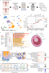
Aberrant follicular development and transcriptional alterations in oocytes and granulosa cells from OEI patients. A–D) Retrospective analysis of 924 IVF/ICSI cycles, categorized into three groups: male factor infertility, ovarian endometriosis (OE), and tubal factor infertility, with 308 patients in each group. (A) Baseline antral follicle count in the three groups prior to IVF/ICSI treatment. Number of mature oocytes (B) and high‐quality embryos (C) retrieved during the treatment. (D) Clinical pregnancy rates post‐IVF/ICSI treatment in each group. Statistical significance for (A‐C) using two‐sided Wilcoxon rank‐sum test and for (D) using Fisher's exact test. E) Distribution of oocytes from the OE group (n = 17) and healthy donors (n = 16, CON) on a t‐distributed stochastic neighbor embedding (t‐SNE) plot using Smart‐seq2 single‐cell RNA sequencing. F) Principal component analysis (PCA) of granulosa cells from endometriosis‐associated infertility (EMS, n = 8) and infertility due to other factors (CON, n = 8), based on bulk RNA sequencing data. G,H) Gene set scoring of DNA damage (G) and repair (H) pathways in oocytes from the OE and CON groups. Two‐sided Wilcoxon rank‐sum test. I) Gene set enrichment analysis (GSEA) of oocytes from the OE and CON groups on significant differential pathways. Each point represents a gene within the pathway, with its vertical position indicating its contribution to pathway enrichment. NES > 0 indicates upregulation in the OE group; NES < 0 indicates downregulation. NES, normalized enrichment score; FDR, false discovery rate. () Kyoto Encyclopedia of Genes and Genomes (KEGG) enrichment analysis of granulosa cells from EMS and CON groups. Red (blue) indicates pathways enriched with upregulated (downregulated) genes in the EMS group.
Figure 2
Figure 2
Single‐cell landscape in follicular fluid of patients with OEI. A) Schematic diagram of experimental design. Follicular fluid collected by follicle puncture during IVF/ICSI is subjected to single‐cell RNA sequencing (scRNA‐seq) using the Microwell assay of BD Rhapsody. B) Uniform manifold approximation and projection (UMAP) of scRNA‐seq data from follicular fluid of patients with OEI (n = 3, OE) and patients with male factor infertility (n = 3, CON) (left), and UMAP plot of scRNA‐seq data of the two groups, respectively (right). Colors indicate the major cell types identified in scRNA‐seq. C) Dot plot annotates the average expression level and frequency of representative markers of nine major cell types in scRNA‐seq. D) Expression levels of top markers of three different granulosa cell subpopulations (left) and representative Gene Ontology (GO) terms of different subpopulations (right). E) Schematic diagram shows the simulated niche of major cell types in preovulatory follicular fluid. F) Proportional composition of major cell types in each sample. (G) Heatmap shows the ratio estimate of observed to expected cell numbers with the chi‐square test (R o/e) for each cell types in different samples. H) Differentially expressed genes (DEGs, |Log2(Fold change) |>0.25 and adjusted p value <0.05) in each cell type between the OE and CON groups. Above the dashed line represents up‐regulation in the OE group, and below the dashed line represents down‐regulation in the OE group. The top three upregulated and downregulated genes in each cell type are labeled. I) Representative KEGG pathways of upregulated DEGs (upper) and downregulated DEGs (lower) are compared between the OE and CON groups in seven cell types. P values are calculated by Fisher's exact test.
Figure 3
Figure 3
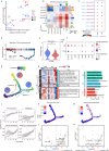
Single‐cell dynamics of iron accumulation in follicular fluid. A) Iron ion levels in follicular fluid of patients with endometriosis (EMS) and non‐endometriosis (CON). Two‐sided Wilcoxon rank‐sum test. B) Pearson correlation analysis between iron ion levels in follicular fluid and the number of retrieved oocytes in corresponding patients. Points are colored by different groups. C) Dot plot shows the average expression and percentage of all cell types expressing genes regulating iron homeostasis. D) Schematic diagram of iron homeostasis pathway (KEGG has 04216), in which genes are colored according to Log2(Fold Change) of Granulosa1 in the OE group compared to the CON group. E) Gene set score analysis of cellular senescence pathways of different cell types between the two groups. ****, p value < 0.0001; ns, no significance. F) Pearson correlation analysis between TFRC and CDKN1A gene expression levels of all cell types in follicular fluid scRNA‐seq data. Gene expression matrix is imputed by MAGIC. Each color represents a different type of cell. G) Pearson correlation between iron accumulation score and cell senescence score of different cell types. Each color represents a different group.
Figure 4
Figure 4
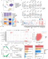
Metabolic reprogramming of Granulosa1 in follicular fluid of patients with OEI. A) Potential outgoing and incoming interaction intensities of each cell type analyzed by CellChat. Different groups are colored differently. B) Heatmap depicts the differentially expressed intensity of the inferred cell communication network. Red (or blue) indicates increased (or decreased) signaling in the OE group compared to the CON group. The colored bars at the top and right indicate the sum of columns (incoming signaling) and rows (outgoing signaling), respectively. C) Bubble heatmap shows cell‐cell communication of selected ligand‐receptor pairs. Dot size indicates p value and is colored by communication probability. (D) GSEA of WNT signaling pathway regulation on the OE and CON groups in Granulosa1 cluster. E) Comparison of CTNNB1 gene expression levels between the two groups in Granulosa1 cluster. Two‐sided Wilcoxon rank sum test. ****p < 0.0001. F) Dot plot shows the average expression and percentage of genes expressing hormone regulation and follicle maturation within Granulosa1 cluster between the two groups. G) Monocle trajectory inference of Granulosa1 cluster cells, colored by their corresponding pseudotime. Pie charts represent the proportion of cells of the two groups in different branches. H) Heatmap shows gene expression along the differentiation trajectory of Granulosa1 of the two groups. Transcription factors (TF) expressed in each branch are listed on the right. I) Bar graph shows the enriched representative GO terms of clustered genes in (H). p values are calculated by one‐sided hypergeometric test. J) Expression dynamics of representative gene sets along the pseudotime axis in different groups. K,M) Distribution of metabolic fluxes of glycolysis TCA cycle (K) and steroid hormone synthesis (M) on Monocle pseudotime trajectory. L,N) Volcano plots of representative differential metabolic fluxes in glycolysis (L) and steroid hormone synthesis (N). The abscissa is the Cohen's D effect size. P values are determined by Likelihood Ratio test.
Figure 5
Figure 5
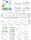
Relationship between iron metabolism and M1/M2 phenotype in myeloid cell subsets of follicular fluid. A) UMAP view of myeloid cell clusters in follicular fluid. B) Proportional composition of myeloid cell subsets in OE group and CON group. The macrophage subcluster is marked by a black box. C) Expression levels of M1‐like, M2‐like, angiogenic, and phagocytic signature genes across myeloid cell clusters. D) Expression levels and frequencies of genes in the iron homeostasis across the myeloid cell cluster. E) Expression levels of iron homeostasis (top) and iron accumulation (bottom) gene signatures in myeloid cell clusters. F) Pearson correlation between iron accumulation signature and M1‐like, M2‐like, angiogenic, and phagocytic signature genes in myeloid cell subclusters in samples. Points represent each cell subcluster in each sample and are colored by different myeloid cell subclusters. G) Monocle trajectory inference of myeloid cells (top), colored by their corresponding pseudotime (bottom). H,J) Expression dynamics of iron homeostasis (H), M1‐like (J, left) and M2‐like (J, right) signature along the pseudotime axis. I) Expression dynamics of iron homeostasis representative genes along the pseudotime. Each point represents the gene expression level in each cell and is colored by different subpopulations. K) Pearson correlation between iron homeostasis score and M2 gene signature in two follicular fluid bulk RNA sequencing data.
Figure 6
Figure 6
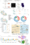
Construction of high‐resolution spatial transcriptome atlas of iron‐overloaded mouse ovaries. A) Schematic diagram of the construction of a mouse iron‐overloaded ovary model and the Stereo‐seq spatial transcriptome analysis. B) Spatial visualization of cell type distribution by RCTD deconvolution in Stereo‐seq data. Scale bars, 500 µm. C) Visualization of the spatial distribution of six major cell types. Colored by subdivided cell types. Scale bars, 1mm. D) Sector diagram shows the proportion of cell types in iron‐overloaded ovaries (Iron) and negative control (NC) ovaries. The outer circle represents the proportion of six major cell types, and the inner circle represents the proportion of all cell types. E) Number of DEGs of all cell types in Iron and NC ovaries in Stereo‐seq data. F) Network visualization of representative GO terms and pathways of DEGs of different cell types. Nodes represent GO terms. Pie charts show the proportion of the number of genes reaching a certain term in spot types. oxidoreductase activity[ 1 ]: acting on paired donors, with incorporation or reduction of molecular oxygen, reduced iron‐sulfur protein as one donor, and incorporation of one atom of oxygen. oxidoreductase activity,[ 2 ] acting on CH−OH group of donors. oxidoreductase activity,[ 3 ] acting on NAD(P)H. oxidoreductase activity,[ 4 ] acting on peroxide as acceptor. oxidoreductase activity,[ 5 ] acting on a heme group of donors. G) Expression levels of Ftl1 gene in six major cell types compared in the two groups. Two‐sided Wilcoxon rank sum test. ****p < 0.0001; *p < 0.05. H) Visualization of iron accumulation gene signature zoning layer in the spatial transcriptome of Iron ovaries. Enlarged antral follicle area of iron accumulation signature zoning layer (upper right), and spatial distribution of cell subpopulations (down right).
Figure 7
Figure 7
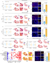
Transcriptional changes of typical senescence markers in iron‐overloaded ovaries. A, C, E, G, H) Box plots (left) and spatial visualizations (right) show the global distribution density of gene signatures of cellular senescence (A), inflammatory response (C), negative regulation of response to DNA damage stimulus (E), lipid storage (G), and response to unfolded protein (H) in iron‐overloaded ovaries (Iron) and negative control ovaries (NC). Scale bars, 1mm. B, D, F) Immunofluorescence staining of p21 (B), NK‐κB p65 (D), and γH2AX (F) in Iron and NC ovaries (left). Scale bars, 20µm. Relative intensities are quantified as fold changes and are represented on the right as mean ± SEM. n = 3 for each group. Two‐tailed Student's t‐test. I) Heatmap shows genes that are upregulated and downregulated DEGs identified in at least three cell types overlapping with the aging atlas database. J) Spatial visualization of Apoe gene expression level. Scale bars, 1 mm. K) Immunofluorescence staining of Apoe in Iron and NC ovaries (left). Scale bars, 20µm. Relative intensities are quantified as fold changes and are represented on the right as mean ± SEM. n = 3 for each group.
Figure 8
Figure 8
Iron homeostasis profiling in human aging ovarian scRNA‐seq atlas. A) UMAP plots of scRNA‐seq data from ovarian tissues of young (n = 3), middle‐aged (n = 3), and elderly individuals (n = 3), colored by major ovarian cell types. B) Heatmap showing the enrichment of different cell types across age groups, estimated by the ratio of observed to expected cell counts (Ro/e) and analyzed using a chi‐squared test. The top bar chart represents cell type composition, and the right bar chart displays the composition across different age groups. C,D) Gene signature scoring for cellular senescence (C) and iron accumulation (D) across ovarian cell types in the three age groups. Two‐sided Wilcoxon rank‐sum test. ****p < 0.0001; ***p < 0.001; **p < 0.01; *p < 0.05; ns, no significance. E) Heatmap of DEGs related to ferroptosis between the Old and Young groups. Red indicates upregulation in the Old group, while blue indicates downregulation. F) Average expression levels and percentages of cells expressing genes regulating iron homeostasis. G) Pearson correlation between iron accumulation scores and cellular senescence scores across different groups, with each color representing a different group. H) Line plots depicting the age‐related dynamics of standardized gene expression in theca & stromal cells, derived from fuzzy clustering analysis. Green lines indicate the expression trajectories of individual genes. I) Ranking of genes in Cluster 1 and Cluster 5 from (H) based on gene weight (contribution), highlighting genes related to iron homeostasis. J) GO enrichment analysis of Cluster 1 and Cluster 5. p values were calculated using the hypergeometric test and corrected for multiple comparisons using the Benjamini‐Hochberg method.

Similar articles

References

    1. Bulun S. E., Yilmaz B. D., Sison C., Miyazaki K., Bernardi L., Liu S., Kohlmeier A., Yin P., Milad M., Wei J. J., Endocrinol. Rev. 2019, 40, 1048. - PMC - PubMed
    1. Chapron C., Marcellin L., Borghese B., Santulli P., Nat. Rev. Endocrinol. 2019, 15, 666. - PubMed
    1. Taylor H. S., Kotlyar A. M., Flores V. A., Lancet 2021, 397, 839. - PubMed
    1. Giudice L. C., Kao L. C. E., Lancet 2004, 364, 1789. - PubMed
    1. Hamdan M., Dunselman G., Li T. C., Cheong Y., Hum. Reprod. Update 2015, 21, 809. - PubMed

LinkOut - more resources