. 2025 Jul 22;21(7):e1011769.
doi: 10.1371/journal.pgen.1011769. eCollection 2025 Jul.

A novel expectation-maximization approach to infer general diploid selection from time-series genetic data

Affiliations

A novel expectation-maximization approach to infer general diploid selection from time-series genetic data

Adam G Fine et al. PLoS Genet. .

Abstract

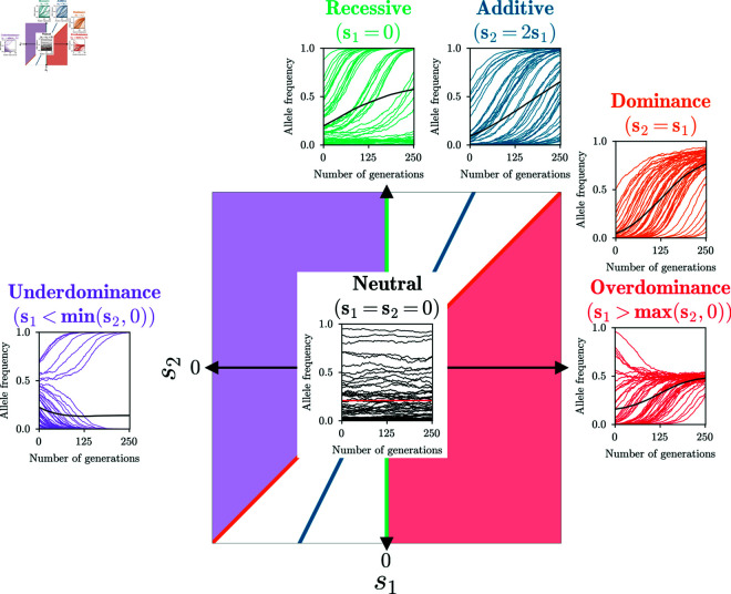
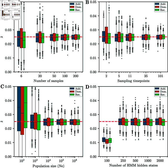
Detecting and quantifying the strength of selection is a major objective in population genetics. Since selection acts over multiple generations, many approaches have been developed to detect and quantify selection using genetic data sampled at multiple points in time. Such time-series genetic data is commonly analyzed using Hidden Markov Models, but in most cases, under the assumption of additive selection. However, many examples of genetic variation exhibiting non-additive mechanisms exist, making it critical to develop methods that can characterize selection in more general scenarios. Here, we extend a previously introduced expectation-maximization algorithm for the inference of additive selection coefficients to the case of general diploid selection, in which the heterozygote and homozygote fitness are parameterized independently. We furthermore introduce a framework to identify bespoke modes of diploid selection from given data, a heuristic to account for variable population size, and a procedure for aggregating data across linked loci to increase power and robustness. Using extensive simulation studies, we find that our method accurately and efficiently estimates selection coefficients for different modes of diploid selection across a wide range of scenarios; however, power to classify the mode of selection is low unless selection is very strong. We apply our method to ancient DNA samples from Great Britain in the last 4,450 years and detect evidence for selection in six genomic regions, including the well-characterized LCT locus. Our work is the first genome-wide scan characterizing signals of general diploid selection.


Conflict of interest statement

The authors have declared that no competing interests exist.

Figures

Fig 1
Fig 1. Two-dimensional space of general diploid selection.
The five bespoke selection modes we consider are: Additive, dominant, recessive, over- and underdominance. Colors indicate the sub-space of the respective mode. 50 replicates simulated under each mode, as well as their mean, are plotted to illustrate the characteristic shapes of the trajectories in each mode.
Fig 2
Fig 2. HMM to infer selection.
A) Schematic of an HMM. Each “stoplight” represents a haploid sample at the given time, with a certain number of focal alleles. Also plotted are three possible population allele frequency trajectories through the hidden state space. Trajectories with population frequencies closer to the frequencies in the samples are given more weight when computing the expected values in the E-step of the algorithm. B) Log-likelihood surface and path of the EM-HMM optimization under each mode for a given replicate simulated under additive selection.
Fig 3
Fig 3. Accuracy of inference from simulated data.
A) Boxplot of s^ for 1,000 replicates simulated under each selection mode. Whiskers extend to 2.5% and 97.5%-tiles. Number of estimates outside plotting range indicated above the plot. Estimates are generally unbiased and have low variance, with the exception of overdominance. B) Q-Q plot of log10(p) against 𝔼[log10(p)] of single-alternative tests for neutral replicates. Inset shows same plot for raw values. The p-values are well-calibrated under all modes of selection. C) Table of AUC values based on likelihood-ratios for each selection mode and selection strength simulated. For s>0.01, AUC values are near 1, indicating perfect discrimination between neutral and non-neutral replicates. D) Q-Q plot of log10(p) against 𝔼[log10(p)] for the δ statistic under the χ2(1) and χ2(2) distributions. The χ2(1) distribution is better calibrated, although it is slightly anti-conservative in the tail. For all simulations, the number of generations is T = 251 and the initial condition is fixed at frequency p = 0.25.
Fig 4
Fig 4. Confusion matrix when inferring the mode of selection.
A p-value threshold of 0.05 is used to reject neutrality. Cells with an orange border represent correct classification. The correct model is inferred for the majority of replicates for s = 0.05 for all modes of selection. For all simulations, the number of generations is T = 251 and the initial condition is fixed at frequency p = 0.25.
Fig 5
Fig 5. Strip plots of inferred s^ against true s.
Conditioned on the correct model being chosen among multiple alternatives. In the neutral case, the plot shows the neutral replicates classified into certain modes. For neutrality, the strip plot is for 1,000 replicates randomly chosen from 10,000 simulated. The number over each strip indicates the number of replicates correctly classified out of the 1,000. For s = 0.005 and neutrality, the inferred values are strongly biased, due to a “winner’s curse” effect. For all simulations, the number of generations is T = 251 and the initial condition is fixed at frequency p = 0.25.
Fig 6
Fig 6. Boxplots for different parameter ranges.
Whiskers extend to 2.5% and 97.5%-tiles. We vary: A) Number of samples taken at each timepoint, B) Number of timepoints sampled, C) Effective population size, D) Number of hidden states in the HMM. Except for the lowest parameters, estimates of the selection coefficient are unbiased. Width of boxplots decreases as the number of samples and sampling timepoints increases. For all simulations, the number of generations is T = 251 and the initial condition is fixed at frequency p = 0.25. When not varied, parameters used are K = 11 sampling times, ntk=50 samples at each timepoint, Ne = 10,000, and M = 500 hidden states.
Fig 7
Fig 7. Inference using incorrect selection mode.
A) Boxplots of s^ for 1,000 replicates simulated under each selection mode and analyzed using additive selection. The estimates are mostly inaccurate. B) Boxplots of s^ for 1,000 replicates simulated under additive selection and analyzed under each selection mode. Again, the estimates are not accurate if the mode is incorrect. For both sets of boxplots, whiskers extend to 2.5% and 97.5%-tiles. C) Table of AUC values for data simulated under each selection mode using likelihood-ratios obtained assuming additive selection. Values are lower compared to analyzing under the correct mode of selection, but still show substantial power to reject neutrality. D) Table of AUC values for data simulated under additive selection using likelihood-ratios obtained assuming each possible selection mode. The values are very similar across selection modes. For all simulations, the number of generations is T = 251 and the initial condition is fixed at frequency p = 0.25.
Fig 8
Fig 8. Estimating the effective population size Ne.
Boxplots of Ne estimated using the grid-based HMM procedure, for data simulated under neutrality for Ne{2,500,10,000,40,000}. For each simulated value Ne, each of the 25 estimates shown are based on the composite likelihood of a batch of 10,000 replicates. Ne estimates are slightly biased upward with low variance. For all simulations, the number of generations is T = 251 and the initial condition is fixed at frequency p = 0.25. Whiskers extend to 2.5% and 97.5%-tiles.
Fig 9
Fig 9. Accuracy of inference from data-matched simulations.
A) Boxplots of MLEs s^ for all one-parameter selection modes. Each boxplot shows 1,000 random replicates of the 10,000 simulated. Whiskers extend to 2.5% and 97.5%-tiles. Estimates are largely unbiased for small s, and slightly biased downward for large s. B) Q-Q plot of log10(p-value) against 𝔼[log10(p-value)] for single-alternative tests obtained using the χ2(1) distribution. Inset shows raw p-value against expected p-value. As for the simulated datasets, p-values are well calibrated. C) Table of AUC values for data-matched simulations using likelihood-ratios for each one-parameter selection mode. D) Q-Q plot of log10(p-value) against 𝔼[log10(p-value)] for multiple-alternative likelihood ratio statistic δ using the χ2(1) and χ2(2) distributions. The χ2(1) distribution provides a good fit that is slightly anti-conservative in the tail. For all simulated replicates, the number of generations is T = 125, the value of Ne in each generation is derived from [44], and the initial frequencies match the GB aDNA dataset.
Fig 10
Fig 10. Confusion matrix for the procedure to infer selection mode applied to data-matched simulations.
A p-value threshold of 0.05 was used. Each cell represents the fraction of replicates that were classified as a particular mode. Performance is worse than for the simulations in simulation-study – the correct model is only inferred for the plurality of replicates for s = 0.05. For all simulations, 10,000 replicates are simulated under a given selection mode and strength, the number of generations is T = 125, the value of Ne in each generation is derived from [44], and the initial frequencies match the GB aDNA dataset.
Fig 11
Fig 11. Strip plots of inferred s^ against true s for data-matched simulations.
Conditioned on inferring non-neutrality for the neutral replicates and on inferring the correct selection mode among multiple alternatives for non-neutral replicates. Each strip plot is for 1,000 replicates randomly chosen from the 10,000 simulated. Number above each strip indicates the number of replicates correctly classified. For s = 0.005 and s = 0.01, the inferred values are biased upward, due to the “winner’s curse". For all simulations, the number of generations is T = 125, the value of Ne in each generation is derived from [44], and the initial frequencies match the GB aDNA dataset.
Fig 12
Fig 12. Manhattan plot of additive p-values.
Manhattan plot of p-values obtained from the likelihood-ratio test under the additive mode of selection at all SNPs in the GB aDNA dataset. The significance threshold is obtained via the Benjamini–Hochberg procedure with an FDR of α=0.05. We observe clusters of significant p-values on chromosomes 2, 5, and 6, as well as several isolated signals.
Fig 13
Fig 13. P-values and frequency trajectories around significant SNPs.
A) Manhattan plot of p-values in genomic region on chromosome 5, centered around SNPs with p-value exceeding BH threshold. Surrounding SNPs exhibit low p-values, as expected under genetic hitchhiking. Post-processed p-values exceed the respective BH threshold. B) Manhattan plot of p-values in genomic region on chromosome 7, centered around SNP with p-value exceeding BH threshold. Surrounding SNPs do not show evidence of selection. Post-processed p-values do not show any significant signal. C) Binned allele frequency trajectories for 20 SNPs centered around SNP with lowest p-value in Fig 13A. Nearby SNPs show correlated allele frequency change, indicative of genetic hitchhiking and true signal. Size of points indicates the number of samples; color hue indicates genomic position: red smaller, blue larger. D) Binned allele frequency trajectories for 20 SNPs centered around SNP with lowest p-value in Fig 13B. Nearby SNPs do not exhibit correlated allele frequency change, suggesting spurious signal at lead SNP.
Fig 14
Fig 14. Manhattan plot of raw p-values at the LCT locus.
P-values are computed using the procedure to identify the mode of selection described in Multiple alternatives, and significant SNPs are colored by inferred mode. The lead SNP is indicated by a larger star-shaped marker. The majority of SNPs in this region are classified as additive, although the lead SNP is classified as dominant.
Fig 15
Fig 15. Frequency trajectory and evidence for non-neutrality at the ASIP locus.
A) Derived allele frequency over time at the ASIP locus. The size of the points indicates the number of samples. B) & C) Histograms of δ statistic for 1,000 simulated neutral replicates matching the ASIP locus, using B) initial frequency estimated under neutrality or C) initial frequency estimated using the heterozygote difference mode. In both cases, the original dataset has a higher δ statistic (indicated by red dashed line) than any simulated replicate, providing strong evidence against neutrality.

Update of

Similar articles

References

    1. Bustamante CD, Fledel-Alon A, Williamson S, Nielsen R, Hubisz MT, Glanowski S, et al. Natural selection on protein-coding genes in the human genome. Nature. 2005;437(7062):1153–7. doi: 10.1038/nature04240 - DOI - PubMed
    1. Bignell GR, Greenman CD, Davies H, Butler AP, Edkins S, Andrews JM, et al. Signatures of mutation and selection in the cancer genome. Nature. 2010;463(7283):893–8. doi: 10.1038/nature08768 - DOI - PMC - PubMed
    1. Nielsen R. Molecular signatures of natural selection. Annu Rev Genet. 2005;39:197–218. doi: 10.1146/annurev.genet.39.073003.112420 - DOI - PubMed
    1. Vitti JJ, Grossman SR, Sabeti PC. Detecting natural selection in genomic data. Annu Rev Genet. 2013;47:97–120. doi: 10.1146/annurev-genet-111212-133526 - DOI - PubMed
    1. Lachance J, Tishkoff SA. Population genomics of human adaptation. Annu Rev Ecol Evol Syst. 2013;44:123–43. doi: 10.1146/annurev-ecolsys-110512-135833 - DOI - PMC - PubMed

LinkOut - more resources