

EpiGeoPop: a tool for developing spatially accurate country-level epidemiological models
- PMID: 40696036
- PMCID: PMC12284068
- DOI: 10.1038/s41598-025-11999-4
EpiGeoPop: a tool for developing spatially accurate country-level epidemiological models
Abstract
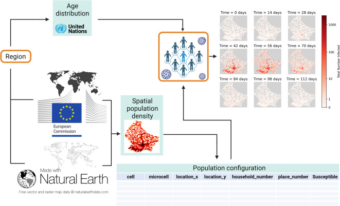
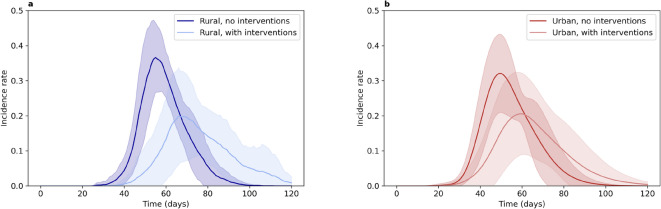
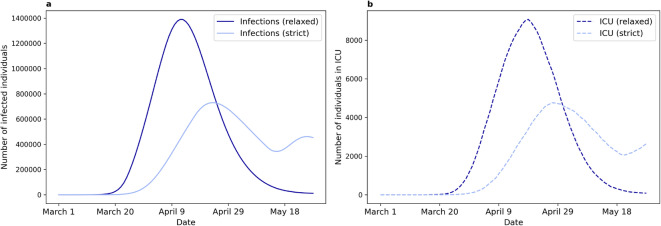
Mathematical models play a crucial role in understanding the spread of infectious disease outbreaks and influencing policy decisions. These models have aided pandemic preparedness by predicting outcomes under hypothetical scenarios and identifying weaknesses in existing frameworks; however, their accuracy, utility, and comparability are being scrutinised. Agent-based models (ABMs) have emerged as a valuable tool, capturing population heterogeneity and spatial effects, particularly when assessing potential intervention strategies. Here we present EpiGeoPop, a user-friendly tool for rapidly preparing spatially accurate population configurations of entire countries. EpiGeoPop helps to address the problem of complex and time-consuming model set-up in ABMs, specifically improving the integration of real-world spatial detail. We subsequently demonstrate the importance of accurate spatial detail in ABM simulations of disease outbreaks using Epiabm, an ABM based on Imperial College London's CovidSim with improved modularity, documentation and testing. Our simulations present a number of possible applications of ABMs where including spatially accurate data is crucial, highlighting the potential impact of EpiGeoPop in facilitating this process using multiple international data sources.
© 2025. The Author(s).
Conflict of interest statement
Competing interests: All authors acknowledge funding from the EPSRC CDT in Sustainable Approaches to Biomedical Science: Responsible and Reproducible Research - SABS:R3 (EP/S024093/1). The authors declare that they have no competing interests.
Figures
Similar articles
-
Measures implemented in the school setting to contain the COVID-19 pandemic.Cochrane Database Syst Rev. 2022 Jan 17;1(1):CD015029. doi: 10.1002/14651858.CD015029. Cochrane Database Syst Rev. 2022. Update in: Cochrane Database Syst Rev. 2024 May 2;5:CD015029. doi: 10.1002/14651858.CD015029.pub2. PMID: 35037252 Free PMC article. Updated.
-
Rapid, point-of-care antigen tests for diagnosis of SARS-CoV-2 infection.Cochrane Database Syst Rev. 2022 Jul 22;7(7):CD013705. doi: 10.1002/14651858.CD013705.pub3. Cochrane Database Syst Rev. 2022. PMID: 35866452 Free PMC article.
-
Non-pharmacological measures implemented in the setting of long-term care facilities to prevent SARS-CoV-2 infections and their consequences: a rapid review.Cochrane Database Syst Rev. 2021 Sep 15;9(9):CD015085. doi: 10.1002/14651858.CD015085.pub2. Cochrane Database Syst Rev. 2021. PMID: 34523727 Free PMC article.
-
Signs and symptoms to determine if a patient presenting in primary care or hospital outpatient settings has COVID-19.Cochrane Database Syst Rev. 2022 May 20;5(5):CD013665. doi: 10.1002/14651858.CD013665.pub3. Cochrane Database Syst Rev. 2022. PMID: 35593186 Free PMC article.
-
Laboratory-based molecular test alternatives to RT-PCR for the diagnosis of SARS-CoV-2 infection.Cochrane Database Syst Rev. 2024 Oct 14;10(10):CD015618. doi: 10.1002/14651858.CD015618. Cochrane Database Syst Rev. 2024. PMID: 39400904
References
-
- Pagel, C. & Yates, C. A. Role of mathematical modelling in future pandemic response policy. BMJ378, 145. 10.1136/bmj-2022-070615 (2022). - PubMed
MeSH terms
LinkOut - more resources
Full Text Sources
Medical
