. 2025 Jul;55(7):e70001.
doi: 10.1002/eji.70001.

Machine Learning Reassessment of Serum Immune Factors Shows No Unique Immune Profiles Linked to Disease Outcomes in SARS-CoV-2-infected Patients at Hospital Admittance

Affiliations

Machine Learning Reassessment of Serum Immune Factors Shows No Unique Immune Profiles Linked to Disease Outcomes in SARS-CoV-2-infected Patients at Hospital Admittance

Stefania Rossi et al. Eur J Immunol. 2025 Jul.

Abstract

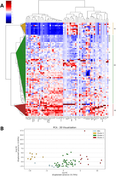
The complex pathophysiology of severe acute respiratory syndrome coronavirus 2 (SARS-CoV-2) involves a hyperinflammatory state with excessive cytokine production, leading to an influenza-like syndrome that may need emergency care. The severity of SARS-CoV-2 varies widely, and collective serum immune factors, evaluated in emergency care patients, have not been shown to correlate with disease progression. We applied a machine learning approach to reassess and define serum immune profiles that could align with clinical laboratory parameters and predict disease outcomes in patients with respiratory virus infections, including those with SARS-CoV-2, seeking emergency care. Sixty-two plasma immune molecules, in a cohort of 67 symptomatic SARS-CoV-2, were analyzed for correlation with antibodies (Abs) to spike (S) and nucleocapsid (N) proteins, as well as with clinical laboratory parameters, to identify early indicators of disease prognosis at hospital admission. This approach allowed us to analyze and cluster unlabeled datasets, delineating three distinct serum immune signatures. Two showed significant and opposite modulations, correlating with poorer disease outcomes, while most patients with moderate disease displayed modest immune factor dysregulation. This highlights the complexity of immune responses in the severity of diseases caused by highly respiratory pathogenic virus like SARS-CoV-2, emphasizing the importance of evaluating overall immune imbalance rather than focusing on a few dysregulated factors.

Keywords: COVID‐19; cytokines; infection; inflammation; machine learning.


Conflict of interest statement

The authors declare no conflicts of interest.

Figures

FIGURE 1
FIGURE 1
Unsupervised analysis of serum immune factors of SARS‐CoV‐2 patients at study entry versus HDs. (A) Combined heatmap and dendrogram of unsupervised hierarchical clustering (Ward method and Euclidean metric) for SARS‐CoV‐2 patients and healthy donors (HDs), based on immune factor profiles normalized to z‐scores. Each horizontal line represents an individual subject, grouped into clusters: DIR‐cluster‐1 (Cluster 1), BIR‐cluster‐2 (Cluster 2), and UIR‐cluster‐3 (Cluster 3). HDs are indicated on the right of the heatmap. (B) Scatterplot displaying the first and second components derived from principal component analysis (PCA). Each point represents a patient, with colors indicating the hierarchical clusters from panel A. HDs are highlighted in a distinct color.
FIGURE 2
FIGURE 2
Serum immune factors in SARS‐CoV‐2 patient clusters compared to HDs. Among 62 cytokines studied, 58 showed significant changes across the three SARS‐CoV‐2 clusters and to HDs (Kruskal–Wallis H tests). Factors are categorized by functional families, displaying median and range: (A) IFN signaling; (B) B‐regulatory factors; (C) anti‐inflammatory factors; (D) soluble receptors; (E) vascular regulation factors; (F) inflammatory molecules; (G) Th2/Th17 cytokines. Only a selection of the 58 plots is shown here; the remaining are shown in Figure S2. The boxplot displays the distribution of data through a five‐number summary: minimum, first quartile (Q1), median (Q2), third quartile (Q3), and maximum. The central box represents the IQR (Q1 to Q3), with a line for the median, while whiskers extend to the range of the data; outliers are not shown. *p < 0.05, **p < 0.01, ***p < 0.001 (Mann–Whitney U test with Benjamini–Hochberg adjustment (FDR) for multiple testing across the three clusters). Statistically significant comparisons with HDs are not indicated in figure and are reported in Table S5.
FIGURE 3
FIGURE 3
Serum immune factors as clustering markers of SARS‐CoV‐2 patients. (A) Bar plot displaying the cytokines ranked by their importance in cluster identification. Importance is computed by the ratio of variance between clusters to variance within clusters. Cytokines with the highest “variance between” and the lowest “variance within” are those that most effectively differentiate the clusters. (B–H) Bar plots displaying the specific contribution of single immune factors to each cluster. The bars represent the mean z‐score normalized immune factor concentrations across the three clusters. The immune factors are grouped into the same categories as shown in Figure 2: (B) IFN signaling; (C) B‐regulatory factors; (D) anti‐inflammatory factors; (E) soluble receptors; (F) vascular regulation factors; (G) inflammatory molecules; (H) Th2/Th17 cytokines.
FIGURE 4
FIGURE 4
Correlation pattern between immune factors and clinical laboratory parameters. (A) Bar plot ranking serum clinical laboratory variables based on their importance as features in a RF model for predicting the clusters of SARS‐CoV‐2 patients (see Model 1, Table S6). For each clinical laboratory variable, the average absolute value of SHAP is displayed for each cluster (class of the target variables). (B) Boxplots of LDH, D‐dimer, and CRP serum levels, which are the highest ranked features in the SHAP plot. Asterisks denote the significance of the differences in patient clusters compared to the normal ranges (binomial test): *p < 0.05, **p < 0.01, ***p < 0.001. The Mann–Whitney test revealed no significant differences among the clusters. (C) The comparison of serum anti‐S and anti‐N Abs among the three patient clusters versus HDs; the statistical analysis included the Kruskal–Wallis test, followed by Mann–Whitney U tests for pairwise comparisons. (D) Bar plots displaying the percentages of death events associated with Ab production, including both anti‐N and anti‐S Abs. Ab positivity (+Ab) is defined as having anti‐N IgG levels greater than 1.4 AU (antibody units) or anti‐S IgG levels exceeding 50 AU. (E) Spearman rank correlation analysis among immune factors, anti‐S/N Abs, and the clinical parameters LDH, CRP, and D‐Dimer in patient clusters, with color‐coded correlations indicating strength (red for positive and blue for inverse). Spearman coefficients and p‐values are detailed in Table S8.
FIGURE 5
FIGURE 5
Patient characteristics and outcome in the three different clusters. (A) Bar plot ranking serum clinical variables by their importance as features in an RF model for predicting the clusters of SARS‐CoV‐2 patients (see Model 2 description in Table S6). For each clinical variable, the plot shows the average absolute value of SHAP for each cluster (classes of the target variable). (B) Top panels: Bar plots showing the percentages of patients in the three clusters based on severity status (left) and outcome (center) for all patients, and outcome for moderate patients (right); bottom panels: each top bar plot is associated with a correlation plot displaying the correlation of the residuals from a chi‐squared test of disease status or clinical outcome in each cluster; p‐values from Fisher's exact tests are 0.0988, 0.0134, and 0.0628, respectively. (C) Bar plots showing the percentages of patients in the three clusters by sex, age, and number of comorbidities, respectively (patients with missing comorbidity information are considered as having none; specifically, Cluster 1 has one patient with missing comorbidity data, Cluster 2 has 12 patients, and Cluster 3 has six patients with missing information). p‐values from Fisher's exact tests are 0.228, 0.148, and 0,133 for sex, age, and comorbidities (presence/absence), respectively.
FIGURE 6
FIGURE 6
T‐ and B‐cell flow cytometry analysis in SARS‐CoV‐2 patients and HDs. (A) CD3+ and CD4+ T‐cell subsets analyzed in 13 SARS‐CoV‐2 patients (six with moderate illness and seven with severe illness), including 11 from Cluster 2 and 2 from Cluster 3, as well as in four HDs. (B) Th2 analysis in the cohort of patients described in (A). (C) Th17 and TIM3+Th17 stratified based on disease severity (moderate vs. severe) and by Cluster 2 and Cluster 3, and compared to four HDs. (D) B cells analyzed in 11 SARS‐CoV‐2 patients, stratified as in (C). (E) B regulatory cells analyzed in the same cohort as in (D). Each dot represents a single patient (horizontal line: mean ± SEM). p‐values were calculated using the Kruskal–Wallis test. M = moderate; S = severe.

References

    1. Altmann D. M. and Boyton R. J., “COVID‐19 Vaccination: The Road Ahead,” Science 375, no. 6585 (2022): 1127–1132. - PubMed
    1. Qin R., He L., Yang Z., et al., “Identification of Parameters Representative of Immune Dysfunction in Patients With Severe and Fatal COVID‐19 Infection: A Systematic Review and Meta‐analysis,” Clinical Reviews in Allergy & Immunology 64, no. 1 (2023): 33–65. - PMC - PubMed
    1. Merad M., Blish C. A., Sallusto F., and Iwasaki A., “The Immunology and Immunopathology of COVID‐19,” Science 375, no. 6585 (2022): 1122–1127. - PubMed
    1. Minkoff J. M. and tenOever B., “Innate Immune Evasion Strategies of SARS‐CoV‐2,” Nature Reviews Microbiology 21, no. 3 (2023): 178–194. - PMC - PubMed
    1. Bonaventura A., Vecchie A., Dagna L., et al., “Endothelial Dysfunction and Immunothrombosis as Key Pathogenic Mechanisms in COVID‐19,” Nature Reviews Immunology 21, no. 5 (2021): 319–329. - PMC - PubMed

Substances