. 2025 Oct;31(10):3380-3387.
doi: 10.1038/s41591-025-03847-9. Epub 2025 Aug 7.

Geographical shifting of cholera burden in Africa and its implications for disease control

Affiliations

Geographical shifting of cholera burden in Africa and its implications for disease control

Javier Perez-Saez et al. Nat Med. 2025 Oct.

Abstract

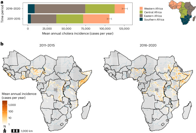
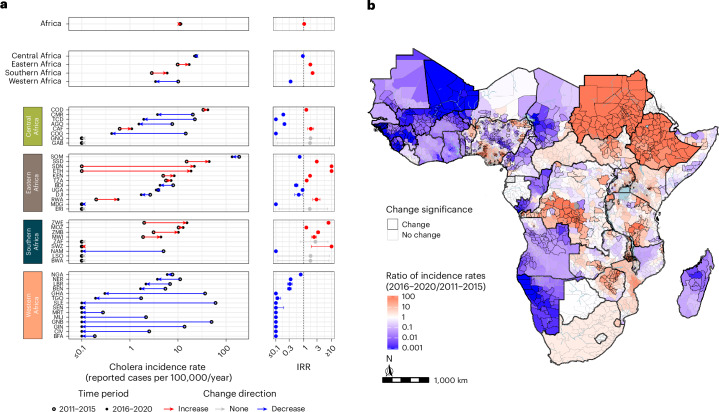
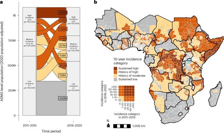
Cholera outbreaks cause substantial morbidity and mortality in Africa, yet changes in the geographic distribution of cholera burden over time remain uncharacterized. We used surveillance data and spatial statistical models to estimate the mean annual incidence of reported suspected cholera for 2011-2015 and 2016-2020 on a 20-km grid across Africa. Across 43 countries, mean annual incidence rates remained at 11 cases per 100,000 population, with 125,701 cases estimated annually (95% credible interval (CrI): 124,737-126,717) from 2016 to 2020. Cholera incidence shifted from western to eastern Africa. There were 296 million people (95% CrI: 282-312 million) in high-incidence second-level administrative (ADM2) units (≥10 cases per 100,000 per year) in 2020, 135 million of whom experienced low incidence (<1 per 100,000) in 2011-2015. ADM2 units with high incidence in central and eastern Africa from 2011 to 2020 were more likely to report cholera in 2022-2023. In hypothetical scenarios of preventive disease control planning, targeting the 100 million highest-burden populations had potential to reach up to 63% of 2016-2020 mean annual cases but only 37% when targeting by past incidence. This retrospective analysis highlights spatiotemporal instability in cholera burden and can be used as a benchmark for tracking future progress in disease control.


Conflict of interest statement

Competing interests: Several authors participate regularly in meetings or are members of the Global Task Force on Cholera Control Surveillance and Oral Cholera Vaccine Working Groups, which provide technical expertise on cholera surveillance and oral cholera vaccine use. A.S.A. is a member of the Gavi Independent Review Committee.

Figures

Fig. 1
Fig. 1. Mean annual suspected cholera incidence (cases per year) in Africa from 2011 to 2020.
a, Mean annual suspected cholera incidence colored by region in Africa for two time periods (2011–2015 and 2016–2020). Error bars represent the 95% CrI for 4,000 posterior predictive samples of the continent-wide mean annual incidence. The colored map on the right is a legend depicting regions within Africa. b, Gridded 20-km × 20-km estimates of mean annual suspected cholera incidence in Africa from 2011–2015 (left) and 2016–2020 (right). Grid cells in light gray had a mean of <1 case per year, whereas those in dark gray were unmodeled due to zero population in the underlying population grid. Blue shaded areas represent major lakes and rivers in Africa.
Fig. 2
Fig. 2. Changes in mean annual suspected cholera incidence rate (cases per population per year) in Africa from 2011 to 2020.
a, The dot plots (left column) display changes in the posterior mean of the mean annual incidence rate from 2011–2015 (open circle) to 2016–2020 (filled circle) at the continent level (top panel), region level (second panel) and country level listed by 3-letter International Organization for Standardization (ISO3) code (four bottom panels). Arrows indicate the direction of change from 2011–2015 to 2016–2020, with red indicating increases and blue indicating decreases. Countries are ordered by decreasing 2016–2020 mean annual incidence rate within region-level panels. All changes shown in the figure were statistically significant except those in Botswana, Eritrea, Gabon, Equatorial Guinea, Lesotho and South Africa. The IRR plots (right column) display the mean (point) and 95% CrI (bars) across 4,0002 pairwise comparisons of 4,000 samples from the posterior distributions of the mean annual incidence rates in 2016–2020 relative to those in 2011–2015. b, Posterior mean ratio of the mean annual incidence rates in 2016–2020 relative to 2011–2015 by ADM2 units. Units filled with red had higher mean rates and areas filled with blue had lower mean rates in the 2016–2020 period. ADM2 units outlined in dark gray had 95% CrIs completely above or below 1, respectively. ADM2 units outlined in light gray represent statistically non-significant differences. The following countries were not eligible to have statistically significant ADM2 changes due to limited subnational data in at least one of the two periods: Côte d’Ivoire, Djibouti, Ghana, Liberia, Rwanda, Senegal, Eswatini and South Africa. Areas in light blue represent large water bodies. All areas displayed were modeled.
Fig. 3
Fig. 3. Population living in areas according to incidence category in 2016–2020.
a, Mean (black point) and 95% CrI (black bars) for district populations living in a given incidence category (per 100,000 population) across Africa across 4,000 samples from the posterior distribution (see Methods for incidence category definitions). Regional population contributions are indicated by fill colors, and categories ≥10 per 100,000 population are labeled as ‘high incidence’ categories. b, Continent-wide map showing assignment of incidence categories to ADM2 units by color. ADM2 units were assigned to an incidence category if 50% of posterior draws classified the ADM2 unit to the assigned color of incidence category or above. ADM2 units in gray had an incidence category of <1 per 100,000 population. Only modeled countries are displayed in the map. pop, population.
Fig. 4
Fig. 4. Ten-year incidence category of cholera burden in Africa across 2011–2020.
a, Alluvial plot depicting changes in the number of people living in ADM2 units according to their 5-year incidence categories in 2011–2015 (left) and 2016–2020 (right), adjusted for 2020 population size. The flow colors indicate the 10-year (2011–2020) incidence category. The flow-specific labels indicate the number of people in ADM2 units according to their 2020 population size. b, Continent-wide map showing assignment of 10-year incidence categories to ADM2 units by color (see Methods for definition of 10-year incidence categories). The inset is a visual legend that translates the cross of two 5-year incidence categories into the 10-year incidence category. Gray represents ADM2 units with sustained low incidence. Only modeled countries are displayed in the map. B, billion; M, million.
Fig. 5
Fig. 5. Associations between cholera occurrence in 2022–2023 and 10-year (2011–2020) cholera incidence categories in Africa.
a, 2022–2023 cholera occurrence locations (purple borders with dots at location centroids) at the reported ADM scale overlaid on the 10-year incidence category map. b, Continent-wide distribution of 10-year incidence categories (colors) among ADM2 locations with reported cholera occurrence in 2022–2023. Locations with occurrence reported below ADM2 level were assigned to the corresponding ADM2 location. c, Pooled modeled estimates of the baseline probability of cholera occurrence in the sustained low-incidence reference category (bottom panel) and odds ratios of reporting by 10-year incidence category relative to the reference (top panel; x axis ticks are on the log scale, but labels are on the natural scale), at the continent level (black) and by region (colors). Points indicate mean estimates and bars indicate 95% CrIs from 4,000 samples from the posterior distribution. ADM, administrative.
Fig. 6
Fig. 6. Potential reach of interventions as defined by two cholera burden metrics when prioritizing by past cholera incidence categories.
Proportion of 2016–2020 cases (left panel, y axis) or population living in ADM2 units with cholera occurrence in 2022–2023 (right panel, y axis) reached when prioritizing people living in ADM2 units (x axis) by past incidence categories (‘prospective’ targeting, full bars) or burden in the concurrent period (‘oracle’ targeting, hashed bars). There is only one past incidence category (2011–2015) for the 2016–2020 period. There were three past incidence categories (2011–2015, 2016–2020 and 2011–2020) for the 2022–2023 period. The horizontal dashed line marks 100% of cases or population reached. The diagonal dotted line indicates unit yield in population targeted (for example, targeting 10% of the population in Africa reaches 10% of cases in 2016–2020 or cholera-affected population in 2022–2023). Bar heights represent the mean and error bars represent the 95% CrI of the mean estimate across 4,000 samples from the posterior distribution. M, million.
Extended Data Fig. 1
Extended Data Fig. 1. Mean annual suspected cholera incidence rate per 100,000 people at the second-level administrative units in Africa across 2011-2015.
Color fill represents the mean of the posterior distribution of mean annual incidence by ADM2 unit.
Extended Data Fig. 2
Extended Data Fig. 2. Mean annual suspected cholera incidence rate per 100,000 people at the second-level administrative units in Africa across 2016-2020.
Color fill represents the mean of the posterior distribution of mean annual incidence by ADM2 unit.
Extended Data Fig. 3
Extended Data Fig. 3. Number of calendar years exceeding 5000 suspected cholera cases in 2011-2015 and 2016-2020 by country.
Countries with no years exceeding 5000 suspected cholera cases were colored in grey.
Extended Data Fig. 4
Extended Data Fig. 4. Annual country-level modeled cases by country, grouped by countries with or without more than 5000 cases in at least one year.
Bar heights represent the mean and error bars represent the 95% CrI across 4000 samples from the posterior distribution. The top panel displays countries that did not have any years exceeding 5000 mean estimated cases, while the bottom panel displays countries that had at least one year exceeding 5000 mean estimated cases. Red bars and grey bars indicate years when the annual country-level modeled cases did or did not exceed 5000 cases, respectively. An absence of a bar indicates a year with less than 1 mean estimated modeled case. The following countries had less than 1 estimated modeled case in all years: Botswana, Eritrea, Equatorial Guinea, Gabon, Lesotho.
Extended Data Fig. 5
Extended Data Fig. 5. Population living in areas by incidence category and region in 2011-2015.
Bar widths represent mean and error bars represent the 95% CrI of the continent-wide estimate across 4000 samples from the posterior distribution for ADM2 populations living in a given incidence category per 100,000 population. Regional population contributions are indicated by fill colors.
Extended Data Fig. 6
Extended Data Fig. 6. Continent-wide map showing assignment of incidence categories to second-level administrative units for 2011-2015.
ADM2 units were assigned to an incidence category if 50% of posterior draws classified the ADM2 unit to the assigned color of incidence category or above. ADM2 units in gray had an incidence category of <1 per 100,000 population. Only modeled countries are displayed in the map.
Extended Data Fig. 7
Extended Data Fig. 7. Distribution of population living in ADM2 units in each 10-year incidence category by country.
Countries are grouped by region and displayed in descending order by the sum of the population fraction in the sustained and history of high-incidence categories.
Extended Data Fig. 8
Extended Data Fig. 8. Log-odds ratios of reporting cholera occurrence in the post-2020 period by 10-year incidence category relative to the baseline probability of cholera occurrence in the sustained low incidence reference category by country.
Countries are grouped by region in facets and by color. Points indicate mean log-odds ratios and error bars indicate the 95% CrIs across 4000 samples from the posterior distribution.
Extended Data Fig. 9
Extended Data Fig. 9. Proportion of 2011-2015 cases reached when prioritizing people living in ADM2 units by 2011-2015 incidence categories.
The y-axis indicates the proportion of 2011-2015 cases reached at different number of people targeted with hypothetical interventions across the continent (x-axis) according to “oracle” targeting. Bar heights represent the mean and error bars represent the 95% CrI of the mean estimate across 4000 samples from the posterior distribution.

References

    1. Multi-Country Outbreak of Cholera, External Situation Report #1 - 28 March 2023 (World Health Organization, 2023); https://www.who.int/publications/m/item/multi-country-outbreak-of-choler...
    1. Multi-Country Outbreak of Cholera, External Situation Report #13 - 17 April 2024 (World Health Organization, 2024); https://www.who.int/publications/m/item/multi-country-outbreak-of-choler...
    1. Shortage of cholera vaccines leads to temporary suspension of two-dose strategy, as cases rise worldwide. World Health Organizationhttps://www.who.int/news/item/19-10-2022-shortage-of-cholera-vaccines-le... (2022).
    1. Lessler, J. et al. Mapping the burden of cholera in sub-Saharan Africa and implications for control: an analysis of data across geographical scales. Lancet391, 1908–1915 (2018). - DOI - PMC - PubMed
    1. World Health Organization. Cholera, 2022. Wkly Epidemiol. Rec.98, 431–443 (2023).