. 2025 Sep;22(9):1887-1899.
doi: 10.1038/s41592-025-02744-w. Epub 2025 Aug 7.

Ultra-high-scale cytometry-based cellular interaction mapping

Affiliations

Ultra-high-scale cytometry-based cellular interaction mapping

Dominik Vonficht et al. Nat Methods. 2025 Sep.

Abstract

Cellular interactions are of fundamental importance, orchestrating organismal development, tissue homeostasis and immunity. Recently, powerful methods that use single-cell genomic technologies to dissect physically interacting cells have been developed. However, these approaches are characterized by low cellular throughput, long processing times and high costs and are typically restricted to predefined cell types. Here we introduce Interact-omics, a cytometry-based framework to accurately map cellular landscapes and cellular interactions across all immune cell types at ultra-high resolution and scale. We demonstrate the utility of our approach to study kinetics, mode of action and personalized response prediction of immunotherapies, and organism-wide shifts in cellular composition and cellular interaction dynamics following infection in vivo. Our scalable framework can be applied a posteriori to existing cytometry datasets or incorporated into newly designed cytometry-based studies to map cellular interactions with a broad range of applications from fundamental biology to applied biomedicine.


Conflict of interest statement

Competing interests: The authors declare the following competing interests: S.H., S.Y., V. Flore, I.S.V., C.E., R.T., D.H., D.V., L.J.-S. and A.T. are listed as inventors for the European Patent Application no. 24181153.8 from the Charité – Universitätsmedizin Berlin and Deutsches Krebsforschungszentrum Stiftung des öffentlichen Rechts (priority application filed). The patent covers the core technology and applications of the Interact-omics framework. S.K. has received honoraria from Cymab, Plectonic, TCR2 Inc., Novartis, BMS, Miltenyi and GSK. S.K. is inventor of several patents in the field of immuno-oncology. S.K. received license fees from TCR2 Inc. and Carina Biotech. D.H. owns stock from Platomics GmbH. The other authors declare no competing interests.

Figures

Fig. 1
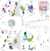
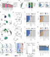
Fig. 1. A cytometry-based framework for the accurate identification of physical cellular interactions.
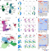
a, Schematic overview of the experimental approach and exemplary ground-truth image data. PBMCs were incubated with the T cell crosslinker CytoStim, followed by manual classification of 1,000 living cells into singlets or multiples across 4 technical replicates. b, Importance of features obtained from a decision tree model to classify the data into singlets and multiplets. Features from imaging flow cytometry are written in italic. n = 4, horizontal bars indicate the median. c, Heatmap of most important features, colored by mean z-score of features across replicates grouped into singlets, doublets, triplets and multiplets. d, FSC ratio histogram, colored by the ground-truth annotation. The classification into singlets and multiplets by Otsu thresholding is shown. e, Performance of different classification methods as measured by the F1 score. In all methods displayed, cells were categorized by Otsu thresholding of the FSC ratio. The first method (dark blue) relies on Otsu thresholding of the FSC ratio only, and all others (light blue) involve Louvain clustering based on different feature sets as indicated below the x axis, followed by assertion of clusters to either singlets or multiplets based on the proportion of cells exceeding the FSC ratio threshold. The third bar represents the Interact-omics workflow. Louvain clustering was performed for n = 100 iterations, and the results for each technical replicate (n = 4) are shown in the point plot. Bars indicate the mean F1 score. X* shows only the most important scatter parameters were used (c). f, Left: UMAP embedding of classified cells (n = 3,865) based on conventional flow cytometry parameters, including cell type markers, scatter parameters and the FSC ratio. Right: UMAP embeddings with cells exceeding the Otsu threshold of the FSC ratio highlighted in blue (top) or cells colored by their ground-truth annotation (bottom). g, Relative frequency of cells classified according to the FSC ratio. n = 4, error bars indicate the standard deviation. h, Relative frequency of singlets and interacting cells based on the ground-truth annotation. n = 4, error bars indicate the standard deviation. i, Adjusted rand index (ARI) of consensus clustering solutions obtained for (1) the important features shown in c and cell type markers versus (2) only conventional cytometry features as used in f for different resolutions in Louvain clustering. Clustering was performed for n = 100 iterations at each resolution. A, area; H, height; max., maximum; min., minimum; my., myeloid; SSC, side scatter; W, width. Interactions between cell types are encoded by a red asterisk between the two cell type labels. Panel a created with BioRender.com. Source data
Fig. 2
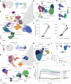
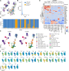
Fig. 2. Ultra-high-scale cellular interaction mapping across complex immune landscapes.
a, UMAP display of a 25-plex cytometry dataset of PBMCs cultured in the presence or absence of the crosslinking agent CytoStim, n = 4 replicates from a single donor. Recorded cells were processed with PICtR; out of 226,301 cells, 50,000 sketched cells are displayed. Interacting cells are depicted in orange. b, UMAP of interacting cells (n = 9,988). c, Heatmap colored by marker enrichment modeling score of cell type defining markers across the clusters of cellular interactions. d, Circos plot displaying the relative enrichment between T and antigen-presenting cells. Colors of the contributing singlets (highlighted on the circumference) are analogous to a. e, Point plots depicting log2 fold changes (FC) of normalized interactions between the CytoStim treated and untreated conditions. Interaction frequencies were adjusted for the singlet frequencies of the contributing cells (harmonic mean; Methods). P values were determined with a two-sided Wilcoxon rank sum test and adjusted for multiple testing according to Benjamini–Hochberg. Error bars indicate mean and standard deviation. n = 4 replicates from a single donor. f, Schematic overview of the experimental setup of cocultures of chicken OVA-specific OT-II CD4 T cells with murine splenocytes. g, UMAP of the overall cellular landscape; n = 125,554 events. h, UMAP of the interacting cell landscape; n = 6,399. i, Point density UMAP of H split into the treatment conditions. j, The log2FC of frequencies of interacting cells in the presence versus absence of OVA. OVA_CD4+T*CD8+T interactions are not depicted, as they appeared exclusively upon OVA treatment. The P values were calculated using least squared means (two-sided) and were Bonferroni corrected. Error bars indicate mean and standard deviation. n = 3 technical replicates. class., classical; DCs, dendritic cells; EoBaso, eosinophils and basophils; granulo., granulocytes; MEM, marker enrichment modeling; mono., monocytes; nonclass., nonclassical; pDCs, plasmacytoid dendritic cells; prog., progenitors. Red asterisks in cell type labels indicate interactions between the respective cell types. Panel f created with BioRender.com. Source data
Fig. 3
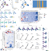
Fig. 3. Cellular interaction mapping reveals mechanisms and kinetics of immunotherapies.
a, Schematic overview of the experimental setup of cultures from murine splenocytes and anti-CD19 CAR-T cells. b, UMAP of the overall cellular landscape. Recorded cells were processed with PICtR; out of 849,845 cells, 96,988 sketched cells are displayed. c, UMAP of the interacting cell landscape, n = 9,974. d, Point density UMAP of c in the absence of CAR-T cells (top) and 1 h after adding CAR-T cells (bottom). e, Paired analysis of interactions between B cells and CAR-T cells or B cells and endogenous T cells. Interaction frequencies were normalized by the harmonic mean of the singlet frequencies of the contributing cells (Methods). Paired two-sided Welch’s t-test, n = 4 technical replicates, error bars indicate the mean and standard deviation. f, Schematic overview of the experimental setup for investigating cellular interactions upon treatment with blinatumomab. n = 4 replicates from a single donor. g, UMAP of the overall cellular landscape. Recorded cells were processed with PICtR; out of 985,735 cells, 49,210 sketched cells are displayed. h, UMAP of the interacting cell landscape, n = 34,362. i, Point density UMAP of h, in the absence of blinatumomab (left) and 1 h after blinatumomab treatment (right). j, Comparison of the B cell frequencies and frequencies of cellular interactions involving B cells over time. n = 4 technical replicates, error bars indicate the standard deviation. k, Time-resolved log2FC of distinct cellular interaction frequencies. Interaction frequencies were normalized by the harmonic mean of the singlet frequencies of the contributing cells (Methods). n = 4 technical replicates, the shaded area shows the standard deviation. gdT, gamma–delta T cells; macro-like, macrophage-like; Treg, regulatory T cells. Panels a and f created with BioRender.com. Source data
Fig. 4
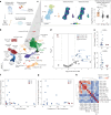
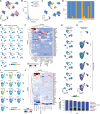
Fig. 4. Interact-omics reveals features underlying therapy response to blinatumomab.
a, Schematic overview of the experimental setup of ex vivo treated B-ALL BM aspirates with blinatumomab. b, UMAP of the overall cellular landscape. Recorded cells were processed with PICtR; out of 4,292,770 cells, 70,000 sketched cells are displayed. Patient-specific leukemic clusters were merged into a common meta-cluster. c, UMAP of interacting cells (n = 29,232). Point density UMAP of interacting cells split into the treatment conditions (middle). Bar graph illustrating the log2 mean fold change of cellular interactions (interact.) (blinatumomab-treated versus control) (right). Error bars indicate the standard deviation. B and T cell interactions (B*T), n = 10; B–T–myeloid (B*T*My.) interactions, n = 42; T*My., n = 41 biological replicates (patients). P values were determined with a two-sided Welch’s t-test. Bonferroni-adjusted P values are displayed. d, Volcano plot representing enrichment and depletion for good responders versus nonresponders for both singlets and cellular interactions. A two-sample t-test (two-sided) was applied. e, Top: point plot showing the comparison of the fold change of B*T(*My.) interactions after ex vivo blinatumomab treatment in GR and NR. Interaction frequencies (freq.) were adjusted for singlet frequencies of the contributing cells (harmonic mean; Methods). Bottom: point plot showing the frequency of singlet CD8+ T cells in GR and NR. P values were determined with a t-test (two-sided). Error bars indicate the mean and standard deviation. GR, n = 18; NR, n = 4 biological replicates (patients). f, Scatter plots displaying the fold change of B*T(*My.) interactions on blinatumomab treatment against the singlet T/B cell ratio at baseline. g, Scatter plot displaying the fold change of B*T(*My.) interactions against the frequency of T*My. interactions at baseline. h, Heatmap of Pearson correlation coefficients between various features, including frequencies of singlets and cellular interactions as well as fold change induction of cellular interactions after blinatumomab treatment. GR, good responder; NR, nonresponder; TEMRA, terminally differentiated effector memory T cells. Red asterisks in cell type labels indicate interactions between the respective cell types. Panel a created with BioRender.com. Source data
Fig. 5
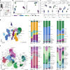
Fig. 5. Virus-induced alterations of cellular landscapes and interaction networks.
a, Schematic overview of the experimental design. n = 4 biological replicates at each time point. b, Left: UMAP display of the cellular landscape. Recorded cells were processed with PICtR; out of 34,369,995 cells, 262,628 sketched single cells are displayed. Right: alluvial plots depicting the change of single-cell frequencies over time and across organs. c, Left: UMAP displaying the interacting cell landscape (n = 414,564). Right: alluvial plots depicting the change of interacting cell frequencies over time and across organs. d, PCA of single-cell and interacting cell frequencies across organs and time points, encoded by color and shape, respectively. e, Scaled Euclidean distances from the mean naive state to all samples in PCA space, representing global similarities or differences in single-cell and interaction landscapes. P values were calculated with a two-sided t-test and adjusted according to Benjamini–Hochberg. Error bars indicate the mean and standard deviation. n = 16, box plots display the median, and first and third quartiles and whiskers are defined as 1.5 times interquartile range. D3, day 3; D7, day 7; Ag, LCMV antigen-specific; IgD, immunoglobulin D; i.p., intraperitoneal; i.v., intravenous; macro., macrophages; PCs, plasma cells; PC1 or PC2, principal component 1 or 2; Plb., plasmablast; spec, specific. Source data
Fig. 6
Fig. 6. Cellular interaction dynamics underlying immune response to LCMV infection.
a, Line plots depicting the frequency of cell types across time points and organs; obtained from k-means clustering (k = 7). Clusters with no change in dynamics are not shown. Horizontal bar plots at the top indicate the percentage of interactions contributing to each organ and LCMV-specific cells for each cluster (clst.). n = 4 biological replicates. b, Alluvial plots showing the fraction of LCMV-specific CD4+ and CD8+ T cells. c, Alluvial plots showing the fraction of cellular interactions comprising LCMV-specific CD4+ and CD8+ T cells. d, Point plots displaying the log2OR enrichment or depletion of LCMV-specific T cell interaction against nonantigen-specific T cell interactions relative to corresponding singlet population on day seven across the organs. P values were calculated using Fisher’s exact test (two-sided) on the sums of the interacting and single cells, aggregated across replicates per condition (n = 4), for antigen-specific and nonantigen-specific cells. Error bars indicate mean and standard deviation. P values: BM, 6.88 × 10−37; LN, 0; spleen, 0. e, Line plots showing the scaled fraction of HSPCs and of NK–myeloid cellular interactions in the BM. Error bars depict the standard error of the mean. f, Point plots depicting the log2FC of monocytes on each day versus naive. g, Point plots showing the log2FC monocyte–B cell interactions monocytes on each day versus naive. h, Point plot showing the frequency of single plasma cells. i, Point plot showing the interacting cell frequency (adjusted for the respective single-cell frequencies) between plasmablasts and LCMV-specific CD4+ T cells. In fi, P values were calculated using a two-sided least squared means test and corrected according to Benjamini–Hochberg. Error bars indicate mean and standard deviation and n = 4 biological replicates. Red asterisks in cell type labels indicate interactions between the respective cell types. Source data
Extended Data Fig. 1
Extended Data Fig. 1. Technical aspects of cytometry-based cellular interaction mapping.
a. Performance of different classification methods based on the FSC ratio as measured by the F1 score. Manual image annotation served as the ground truth; see Methods for details. n = 4 technical replicates are shown in the scatter plot; bars indicate the mean F1 score. Error bars indicate the standard deviation. b. Dot plot displaying the forward scatter area (FSC-A) and forward scatter height (FSC-H) properties of ground truth singlets; the Otsu threshold of the FSC ratio is shown as a diagonal line. The bar plots show all ground truth singlets split into correctly classified and misclassified events according to the FSC ratio threshold and are colored by marker expression. n = 4 technical replicates; error bars indicate the standard deviation. c. Gating strategy to select Lymphocytes and live cells using scatter properties and a live-dead (LD) marker. This gating strategy was employed throughout the manuscript. d-g. Louvain clustering performed on the top important features from the feature importance analysis (see Fig. 1c) and cell type markers. d. Annotated UMAP representation. e. UMAP embedding from panel d with cells exceeding the Otsu threshold of the FSC ratio highlighted in blue (top) or cells colored by their ground truth annotation (bottom). f. Relative frequency of singlets and interacting cells in each population classified according to the FSC-ratio. Error bars indicate the standard deviation. g. Relative frequency of cells in each population based on the ground truth annotation. Error bars indicate the standard deviation. h-k. Louvain clustering performed on cell type markers only. h. Annotated UMAP representation. i. UMAP embedding from panel h with cells exceeding the Otsu threshold of the FSC ratio highlighted in blue (top) or cells colored by their ground truth annotation (bottom). j. Relative frequency of singlets and interacting cells in each population classified according to the FSC-ratio. Error bars indicate the standard deviation. k. Relative frequency of cells in each population based on the ground truth annotation. Error bars indicate the standard deviation. l. Feature plots showcasing cell type marker expression in the UMAP embedding from Fig. 1f. m. Heatmap depicting normalized mean feature expression (rows) within merged clusters derived from Louvain clustering (columns, on conventional flow parameters) across replicates. Populations are the same as in Fig. 1f. n. Histogram colored by the ground truth annotation and split by the identified singlet and multiplet clusters in Fig. 1f. The Otsu threshold is shown. o. Performance of different clustering methods evaluated regarding their ability to resolve singlet and interacting populations. All algorithms were used for n = 100 iterations on conventional flow parameters including forward scatter parameters, side scatter parameters, cell type markers and the FSC ratio, see Methods for details. n = 4 technical replicates are shown in the point plot; bars indicate the mean F1 score. Error bars indicate the standard deviation. Abbreviations: UMAP: uniform manifold approximation and projection, CD33: myeloid marker, CD19: B cell marker, CD3: T cell marker. Source data
Extended Data Fig. 2
Extended Data Fig. 2. Interact-omics resolves complex cellular interactions induced by CytoStim.
a. UMAP embedding of Fig. 2a, depicting human PBMCs treated with or without CytoStim. Merged UMAP of n = 4 replicates from a single donor per condition. b. Histogram of the FSC ratio. Cells exceeding Otsu’s threshold are highlighted in orange. c. Stacked bar plot displaying the fraction of PICs (orange) in each cluster obtained from Louvain clustering. d. Heatmap showing scores of marker enrichment modeling (MEM) on clusters shown in Fig. 2a. Interacting cells have an enrichment of the FSC ratio (bar plots on top) and co-express various cell type specific markers, like CD3, CD33 and CD19, and HLA-DR. e. Split UMAP display based on CytoStim treatment. Interacting cells show specific enrichment upon co-incubation with CytoStim. f. Feature plots, showing UMAP embeddings from Fig. 2b color-coded by expression levels of selected markers. Source data
Extended Data Fig. 3
Extended Data Fig. 3. Interact-omics resolves antigen-specific interactions in the ovalbumin (OVA)-OT-II model.
a. UMAP of the overall cellular landscape (numeric cluster labels instead of the annotation in Fig. 2g); the numeric cluster labels correspond to panel d. b. Histogram of the FSC ratio. Cells exceeding Otsu’s threshold are highlighted in orange. c. UMAP of the overall cellular landscape with cells with an FSC ratio above Otsu’s threshold highlighted in orange. d. Proportions for singlets and interacting cells in each cluster. Clusters 6 and 8 were selected as interacting cell clusters (85th percentile). e. Selected feature plots for the overall cellular landscape. f. Marker Enrichment Modelling (MEM) heatmap for the overall cellular landscape. g. Singlet point density UMAPs in the presence or absence of ovalbumin. h. UMAP of the interacting landscape from Fig. 2h with selected features highlighted. i. Marker Enrichment Modelling (MEM) heatmap for the interacting cell landscape. Abbreviations: UMAP: uniform manifold approximation and projection, OVA: ovalbumin. Source data
Extended Data Fig. 4
Extended Data Fig. 4. Interact-omics maps cellular interaction dynamics of CAR-T cells.
a. UMAP of the overall cellular landscape, corresponding to the UMAP in Fig. 3b; labels correspond to panel d. Decimal points indicate subclustered populations. b. Histogram of the FSC ratio. Cells exceeding Otsu’s threshold are highlighted in orange. c. UMAP of the overall cellular landscape with cells above Otsu’s threshold highlighted in orange. d. Proportions for singlets and doublets in each cluster. Clusters 8.1, 11, 13, 18, and 19 were selected as interacting cell clusters. e. Selected feature plots for the overall cellular landscape. f. Marker Enrichment Modelling (MEM) heatmap for the overall cellular landscape. g. Overall point density UMAPs for the control condition and CAR-T cell-treated samples at each timepoint. h. Interacting cell landscape corresponding to the UMAP of Fig. 3c, highlighting selected features. i. Marker Enrichment Modelling (MEM) heatmap for the interacting cell landscape. j. Paired analysis of interactions between B cells and CD4+ CAR-T cells or B cells and endogenous CD4+ T cells. Interaction frequencies were adjusted for the singlet frequencies of the contributing cells at each timepoint (harmonic mean, see Methods), n = 4 technical replicates, error bars indicate the mean and standard deviation. Paired two-sided Welch’s t-test. k. Paired analysis of interactions between B cells and CD8+ CAR-T cells or B cells and endogenous CD8+ T cells. Interaction frequencies were adjusted for the singlet frequencies of the contributing cells at each timepoint (harmonic mean, see Methods), n = 4 technical replicates, error bars indicate the mean and standard deviation. Paired two-sided Welch’s t-test. l. Interacting cell point density UMAPs of the control condition and after adding CAR-T cells for the indicated time points. Source data
Extended Data Fig. 5
Extended Data Fig. 5. Cellular interaction dynamics upon blinatumomab treatment.
a. UMAP of the overall cellular landscape, corresponding to the UMAP in Fig. 3g; labels correspond to panel d. Decimal points indicate subclustered populations. b. Histogram of the FSC ratio. Cells exceeding Otsu’s threshold are highlighted in orange. c. UMAP of the overall cellular landscape with cells exceeding Otsu’s threshold highlighted in orange. d. Proportions for singlets and interacting cells for each cluster. Clusters 9, 15, 16, 19, and 20 were selected as interacting cell clusters. e. Selected feature plots for the overall cellular landscape. f. Marker Enrichment Modelling (MEM) heatmap for the overall cellular landscape. g. Overall point density UMAPs for the control condition and blinatumomab-treated samples at each timepoint. h. Point density UMAPs of the cellular interaction landscape for the control condition and blinatumomab-treated samples at each timepoint, corresponding to Fig. 3h. i. UMAP corresponding to Fig. 3h, displaying selected features of the interacting cell landscape. j. Marker Enrichment Modelling (MEM) heatmap for the interacting cell landscape. k. Composition of all B cell events across time, including single B cells and cellular interactions that involve B cells. n = 4 replicates from a single donor, error bars indicate the mean and standard deviation. Source data
Extended Data Fig. 6
Extended Data Fig. 6. Interact-omics identifies independent and additive features of blinatumomab response.
a. GGally plot displaying pairwise scatter plots for the top features identified in the univariate analysis. Histograms and distributions of all features are shown on the diagonal. The Pearson correlation coefficients (Corr) are shown for all samples together and separately for the response groups (NR: nonresponder or GR: good responder), respectively. Box plots in the column on the right show comparisons of good responders (blue) vs. nonresponders (red) for all features. b. The Receiver Operating Characteristic (ROC) curves showing the accuracy of three logistic regression models with either the T cell/B cell ratio (light blue line), the fold change of B*T(*My) interactions between good responders and nonresponders upon blinatumomab treatment (red line) and a combined model with both features (purple line). The Area Under the Curve (AUC) metrics are indicated above the plot. Abbreviations: GR = good responder, NR = nonresponder, FC = fold change. Red asterisks in cell type labels indicate interactions between the respective cell types. Source data
Extended Data Fig. 7
Extended Data Fig. 7. Characterization of functional interactions by assessment of phosphorylated CD247.
a. Schematic overview of the experimental approach. PBMCs from 4 healthy donors were incubated in the presence or absence of blinatumomab (Blina) or Cytostim (CS). b. UMAP of the overall cellular landscape. Recorded cells were processed with PICtR, out of 1,204,382 cells, 70,954 sketched cells are displayed. c. UMAP of interacting cells (n = 52,239) d. Point density UMAP of interacting cells split into the conditions. e. Histograms of scaled fluorescence intensity of pCD247 for each interacting cell population from panel c. Left panel: T*B interactions. Middle panel: T*My interactions. Right panel: T*B*My. f. Mean fluorescence intensity of pCD247 per donor and condition. P values were determined with a two-sample paired t-test (two-sided). Left panel: T*B interactions. Middle panel: T*My interactions. Right panel: T*B*My.Abbreviations: UMAP = uniform manifold approximation and projection, Ctrl. = control, Blina = blinatumomab, CS = Cytostim. Red asterisks in cell type labels indicate interactions between the respective cell types Source data. Panel a created using BioRender.com. Source data
Extended Data Fig. 8
Extended Data Fig. 8. Interacting cell clusters used for annotation of LCMV-infected mice.
a. Cellular interactions sampled for CD45.1+ and CD90.1+ cells and based on Otsu’s thresholding method, clustered, annotated and visualized in a UMAP. b. UMAP as in panel a colored by three exemplary markers c. UMAP as in panel a split by time and organ. d. Marker Enrichment Modelling (MEM) heatmap for LCMV-specific interactions. e. Cellular interactions sampled for CD19+ cells and based on Otsu’s thresholding method, clustered, annotated and visualized in a UMAP. f. UMAP as in panel e colored by three exemplary markers g. UMAP as in panel e split by time and organ. h. Marker Enrichment Modelling (MEM) heatmap for cellular interactions involving B cells. i. Cellular interactions sampled for CD3+ cells and based on Otsu’s thresholding method, clustered, annotated and visualized in a UMAP. j. UMAP as in panel i colored by three exemplary markers. k. UMAP as in panel i split by time and organ. l. Marker Enrichment Modelling (MEM) heatmap for T and NK interactions. Abbreviations: D3 = day 3, D7 = day 7, BM = bone marrow, LN = lymph node, Ag = LCMV antigen-specific, Plb = plasmablast, HSPC = hematopoietic stem and progenitor cells, Eosino = eosinophil/basophil, PC = plasma cells, Granulo = granulocytes, Macro = macrophages, IgD = immunoglobulin D, Prog = progenitor cells, cDC = classical dendritic cells, pDC = plasmacytoid dendritic cells, My = myeloid, NK = natural killer, Mono = monocytes. Source data
Extended Data Fig. 9
Extended Data Fig. 9. Cluster frequencies of single and interacting cell landscapes of LCMV-infected mice.
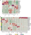
a. Heatmap of single cell cluster frequencies across organs, time points and replicates. b. Cellular interaction cluster frequencies across the organs, time points and replicates. Samples and clusters are ordered based on hierarchical clustering (for reasons of readability, the dendrograms are not shown). Abbreviations: D3 = day 3, D7 = day 7, BM = bone marrow, LN = lymph node, Ag = LCMV antigen-specific, Plb = plasmablast, HSPC = hematopoietic stem and progenitor cells, Eosino = eosinophil/basophil, PC = plasma cells, Granulo = granulocytes, Macro-like = macrophage-like, IgD = immunoglobulin D, Prog = progenitor cells, cDC = classical dendritic cells, pDC = plasmacytoid dendritic cells, My = myeloid, NK = natural killer, Mono = monocytes. Source data

References

    1. Armingol, E., Officer, A., Harismendy, O. & Lewis, N. E. Deciphering cell-cell interactions and communication from gene expression. Nat. Rev. Genet.22, 71–88 (2021). - PMC - PubMed
    1. Armingol, E., Baghdassarian, H. M. & Lewis, N. E. The diversification of methods for studying cell-cell interactions and communication. Nat. Rev. Genet.25, 381–400 (2024). - PMC - PubMed
    1. Cooper, G. M. in The Cell: A Molecular Approach (ed. Cooper, G. M.) 2nd edn, Ch. 12 (Sinauer Associates, 2000).
    1. Bechtel, T. J., Reyes-Robles, T., Fadeyi, O. O. & Oslund, R. C. Strategies for monitoring cell-cell interactions. Nat. Chem. Biol.17, 641–652 (2021). - PubMed
    1. Yu, J., Peng, J. & Chi, H. Systems immunology: integrating multi-omics data to infer regulatory networks and hidden drivers of immunity. Curr. Opin. Syst. Biol.15, 19–29 (2019). - PMC - PubMed

LinkOut - more resources