. 2025 Aug;57(8):1922-1934.
doi: 10.1038/s41588-025-02285-0. Epub 2025 Aug 7.

Analysis of individual patient pathway coordination in a cross-species single-cell kidney atlas

Affiliations

Analysis of individual patient pathway coordination in a cross-species single-cell kidney atlas

Konstantin A Klötzer et al. Nat Genet. 2025 Aug.

Abstract

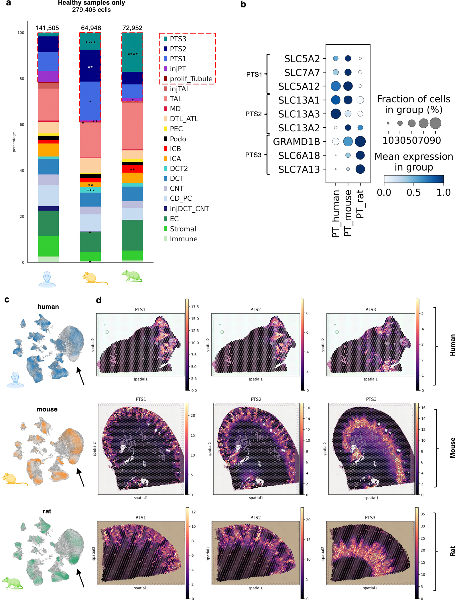
The use of single-cell RNA sequencing in clinical and translational research is limited by the challenge of identifying cell-type-specific, targetable molecular changes in individual patients and cross-species differences. Here we created an integrated single-cell kidney atlas including over 1 million cells from 140 samples, defining more than 70 conserved cell states in human and rodent models. We developed CellSpectra, a computational tool that quantifies changes in gene expression coordination across cellular functions, which we applied to kidney and lung cancer data. This tool powers our patient-level single-cell functional profiling report, which highlights cell-type-specific changes in the coordination of pathway gene expression in individuals. Our cross-species atlas facilitates the selection of a rodent model that closely reflects the cellular and pathway-level signatures observed in patient samples, advancing the application of single-cell methodologies in clinical precision medicine. Finally, using experimental models, we demonstrate how our informatics approach can be applied for the potential selection of suitable therapeutics.


Conflict of interest statement

Competing interests: The Susztak lab is supported by Gilead, Novo Nordisk, Novartis, GSK, BIPI, Regeneron, Genentech, ONO and Calico. K.S. is on the scientific advisory boards of Pfizer and Otsuka. The other authors declare no competing interests.

Figures

Extended Data Figure 1:
Extended Data Figure 1:. Data summary of the multi-species kidney atlas (SISKA1.0) after QC.
Table displays sample and cell numbers included in our unified kidney atlas (SISKA1.0) from control and diseased samples across species. The parenthesis indicates the number of individual samples. Respective disease states and rodent models are summarized in the “Diseases and Models” column. Chronic kidney disease (CKD), Acute kidney injury (AKI), Ischemia reperfusion injury (IRI) mouse model, Diabetic kidney disease (DKD), Folic acid mouse model (FA), Zucker fatty and spontaneously hypertensive (ZSF1) rat model of diabetes, deoxycorticosterone acetate (DOCA) rat model of hypertension, Hypertension associated kidney disease (H-CKD).
Extended Data Figure 2:
Extended Data Figure 2:. Relative frequencies of species across cell types in SISKA1.0.
(a) UMAP of the integrated multi-species atlas (SISKA1.0) colored by species human (blue), mouse (orange), and rat (green). (b) UMAP of the integrated multi-species atlas colored based on the input datasets. (c) UMAP of the integrated multi-species atlas individually colored by species human (blue), mouse (orange), and rat (green). (d) Bar graphs of the cell type compositions of each cluster (x-axis) across species (rat, human, mouse from top to bottom) for the 21 major annotated cell types. The y-axis is the percent of cells within each cluster (each normalized to 100%) (e) Bar graphs of the cell type compositions (x-axis) across input datasets for the 21 major annotated cell types. The y-axis is the percent of cells within each cluster (each normalized to 100%) The color legend corresponds to datasets in panel b.
Extended Data Figure 3:
Extended Data Figure 3:. MetaNeighbor-based cell type similarity analysis across species and datasets.
The x and y axis plots the cell types across 7 processed datasets in an unsupervised dendrogram. The color indicates the mean area under the receiver operator characteristic curve (AUROC) of cell types. Red indicates higher AUROC, while blue indicates a lower AUROC.
Extended Data Figure 4:
Extended Data Figure 4:. Differences in the proximal tubule composition of human and rodent datasets.
(a) Cell type fractions of the healthy human (n = 20), mouse (n = 10), and rat (n = 8) kidney data. Asterisks indicating significant differences. PT subtypes are highlighted in red boxes. Two-sided Student t-test between human and rodent percentages per sample. * p < 0.05, ** p < 0.01, *** p < 0.001, **** p < 0.0001. (b) Dot plot of PT subsegment marker genes within the human, mouse, and rat PT clusters. Dot colors indicate the scaled mean expression per cell type, the size of the dot indicates the percentage of cells expressing the respective gene. (c) Feature plots of healthy human, mice, and rat cells within SISKA 1.0. Arrows point towards the PTS3 segment. (d) Cell2location cell type abundance analysis on Visium spatial transcriptomics data of human, mouse, and rat (yellow indicates a higher estimated abundance). Plots are shown for the estimated PTS1, PTS2, and PTS3 abundance.
Extended Data Figure 5:
Extended Data Figure 5:. Conserved cell types and states in our integrated kidney atlas (SISKA 1.0).
Fine resolution (126) clusters of SISKA1.0 ordered in a hierarchical dendrogram. The cell types with multispecies conserved gene expression are labelled in green while those without are labelled black. Columns visualize the composition of each cluster based on additional metadata information: Disease state (blue disease, pink healthy), species (mouse, rat and human), sex (human only, male orange, female purple), sample identity, KPMP annotation (KPMP only), global annotation. The right UMAP is colored by cell type labels. Principal cells of the collecting duct (CD_PC), connective tubule (CNT), distal convoluted tubule (DCT and DCT2), intercalated cells (ICA and ICB), podocytes (Podo), parietal epithelial cells (PEC), proximal tubule (PTS1, PTS2, PTS3), injured proximal tubule (injPT), proliferating tubule (prolif_Tubule), macula densa (MD), thick ascending limb (TAL), descending and ascending thin limb (DTL_ATL), immune cells, endothelial cells (EC), stromal cells, injured TAL, and thick ascending and distal injured tubule (injTAL and injDCT_CNT).
Extended Data Figure 6:
Extended Data Figure 6:. Hallmark features of frequent coordination changes across species.
(a) Top significant cellular functions identified in diabetic kidney disease (DKD) and hypertensive chronic kidney disease (H-CKD) rat models. The x-axis shows −log10(padj) values for top-ranked functions, with each bar color-coded by cell type. Functions in the DKD model were predominantly associated with podocytes, while those in the H-CKD model were linked to TAL cells, including “ligand-gated cation channel activity” and inflammation-related gene sets. (b) Frequently significant cellular functions (padj < 0.05 in at least 10% of samples across any species) were defined as conserved hallmark features. A pie chart displays the cell type distribution of these 595 hallmark features, with TAL and PT cells accounting for the majority. (c) Bar plot illustrating the dyscoordination prevalence of hallmark functions (percentage of significant samples) for human (blue), mouse (orange), and rat (green) samples. Functions such as “Positive regulation of signaling receptor activity” and “Collagen catabolic process” were frequently dyscoordinated across species. (d) R2 values and significance of coordination changes for selected hallmark features. Scatter plots show individual sample R2 values (y-axis) grouped by condition (x-axis) for TAL (“Positive regulation of signaling receptor activity”) and PT (“Collagen catabolic process”). Blue dots represent non-significant samples (padj > 0.05), while red dots indicate significant coordination changes (padj < 0.05). Separate panels are shown for human, mouse, and rat samples, emphasizing cross-species differences in hallmark functions.
Extended Data Figure 7:
Extended Data Figure 7:. CellSpectra analysis of folic acid (FA) mouse models reveals consistent cell type involvement and pathway enrichment.
(a) Radar plots display the percentage of significant gene sets per cell type for individual FA mice using the cross-species atlas. The radar plots highlight analysis results for different databases (KEGG, Gene Ontology) and indicate cell types such as PT, TAL, and Podo on the axes. (b) Similar radar plots are shown for mouse-specific data (mouse-only references), emphasizing cell type-specific coordination changes comparable to the cross-species analysis. (c) Heatmaps compare GSEA-based (upper panel) and CellSpectra-based (lower panel) analyses for the KEGG pathways “mTOR Signaling” and “TNF Signaling.” Enrichment scores (NES) were set to 0 and R2 values to 1 for non-significant samples (padj > 0.05). Columns represent FA samples (FA1–FA4), while rows correspond to pathways. Color scales reflect NES (upper) and R2 (lower) values. These analyses demonstrate consistency in cell type involvement and pathway enrichment, highlighting the effectiveness of CellSpectra in identifying key pathways in FA-induced kidney injury.
Extended Data Figure 8:
Extended Data Figure 8:. CellSpectra analysis of a lung cancer single-cell atlas.
(a) Non-small cell lung cancer (NSCLC) single-cell atlas: adenocarcinoma (LUAD) and squamous cell carcinoma (LUSC) and non-tumor tissue was analyzed. (b) The percentage of pathways (y-axis) showing significant coordination changes in epithelial cells and cancer cells (x-axis) in total of 45 cancer samples (n = 43 for epithelial cells). Non-tumor tissue epithelial cells were used as the reference. (c) Heatmap of gene coordination changes (R2 values) in MSigDB C2 pathways in individual cases (cancer cells compared to a non-tumor epithelial reference). Red indicates lower R2 values (dyscoordination). Samples with padj > 0.05 or those below the cell/gene number threshold are left white. LUSC, n = 6. LUAD, n = 30. (d) Percentage of pathways (y-axis) showing significant coordination changes in LUAD and LUSC samples (x-axis). Cancer cells were compared to a non-tumor epithelial reference. LUSC, n = 6. LUAD, n = 30. (e) Density plots of gene expression in selected genes from “Pyrimidine Metabolism” (UMPS, TK1) and “Glutathione Conjugation” (GSTM3, GGT5) in two cancer samples. Blue = “on-the-fly” reference distribution; red arrow = query sample. Y-axis = density estimate; x-axis = gene expression. Lower R2 and higher NES in red. (f) Heatmap of gene coordination changes (R2) in LUAD Stage II–IV (n = 15) and LUSC (n = 6) compared to LUAD Stage I reference. Red = lower R2 or higher NES. GSEA results shown on the right. Samples with padj > 0.05 or insufficient data are white. (g) Density plot of gene expression distributions for FOS and NFE2L2 (“Oxidative Stress Response”) in a LUSC sample (red arrow) and the LUAD I reference distribution (blue line). Density (y-axis) and the normalized sample gene expression (x-axis) are shown. (h) Boxplots of normalized sample FOS and NFE2L2 gene expression (y-axis) in all LUSC samples (red, n = 6) and the pooled LUAD I reference (blue, 288 randomly permuted values equally derived from n = 16 biological replicates). All Boxplots show the median (center line), quartiles (box limits), and whiskers, which extend to the minimum and maximum values within 1.5×IQR. Data points outside this range are plotted as outliers.
Extended Data Figure 9:
Extended Data Figure 9:. Sample number and disease summary of the extended human kidney atlas.
Table summarizing the input data of the extended human atlas. Number of samples for 5 different diseases or groups (Controls, CKD, AKI, CKD-ADPKD, and Penn Medicine biopsy samples) and the respective datasets. Subgroups are shown for CKD and Penn Medicine biopsies. The right column indicates numbers of female and male patients per disease / condition.
Extended Data Figure 10:
Extended Data Figure 10:. CellSpectra functional profiling of ADPKD samples.
(a) Single-cell functional profiling report of a patient with diagnoses ADPKD (autosomal dominant polycystic kidney disease). The radar plot indicates the total number of significant pathways (padj < 0.05) per cell type (circles). Cell types below the cell number threshold are highlighted in red. Top significant gene sets based on the −log10(p-value) are highlighted for selected cell types (right panel). Color of the dot indicates the severity of coordination changes based on the R2 values (scaled for each gene set across all diseased samples). Size of the dot indicates the frequency of significant coordination changes for this specific cellular function among all diseased samples above the cell number cut-off. (b) Diseased-reference analysis overview. 8 ADPKD samples were compared to a CKD reference. Highly repetitive (prevalence > 75%; total of 185 features) cellular functions were enriched in PT cells, visualized in a pie chart (lower panel). (c) Two cellular functions identified in the CKD-reference analysis are shown in the healthy-reference setting. Dots show individual samples, with R2 indicated on the y-axis. The x-axis groups individual samples into groups (CKD and ADPKD, PT: n = 68 and n = 7; DCT_CNT_CD: n = 72 and n = 8). The y-axis represents the R2 value, while red dots indicate padj < 0.05. Bars display the mean R2 per group. (d) Boxplots visualizing the normalized sample gene expression of underlying genes (y-axis) for the non-PKD reference (orange) and the PKD query samples (red, n = 8). Reference expression was pooled from the “on the fly” references of all query samples (2,232 perturbated values equally derived from n = 93 patients). All boxplots show the median (center line), quartiles (box limits), and whiskers, which extend to the minimum and maximum values within 1.5×IQR. Data points outside this range are plotted as outliers.
Figure 1:
Figure 1:. Species Integrated Single cell Kidney Atlas (SISKA 1.0).
(a) Project Overview: Single-nucleus RNA-sequencing (snRNA-seq) datasets from human, mouse, and rat kidneys, encompassing healthy and diseased conditions, were processed and integrated using scVI to build a unified atlas. (b) Integrated UMAP and Cell Type Annotation: A UMAP embedding represents over one million integrated cells annotated into 21 major cell types across species. Each color corresponds to a specific cell type. A conceptual nephron schematic highlights the anatomical location of epithelial subtypes. Cell type abbreviations: Principal cells of the collecting duct (CD_PC), connecting tubule (CNT), distal convoluted tubule (DCT and DCT2), intercalated cells (ICA and ICB), podocytes (Podo), parietal epithelial cells (PEC), proximal tubule (PTS1, PTS2, PTS3), injured proximal tubule (injPT), proliferating tubule (prolif_Tubule), macula densa (MD), thick ascending limb (TAL), descending and ascending thin limb (DTL_ATL), immune cells, endothelial cells (EC), stromal cells, injured TAL (injTAL), and injured distal tubule (injDCT_CNT). (c) Conserved Marker Genes Across Species: A dot plot shows conserved marker genes identified by MetaMarker. Dot size indicates the fraction of cells expressing each gene, while dot color reflects the scaled mean expression level. The Venn diagram highlights overlaps of marker genes across species, with 906 conserved across cell types (852 unique genes). (d) High-resolution Clustering and Conserved States: Leiden clustering identifies fine-grained subclusters, with colors indicating conserved marker genes present in at least two species. This analysis highlights conserved cellular states across species. (e) Conserved Stromal Subclusters: Examples of conserved stromal cell subclusters include pericytes expressing NOTCH3, vascular smooth muscle cells expressing MYH11, and mesangial cells/juxtaglomerular cells expressing PIEZO2. A dot plot visualizes the conserved expression of these genes across species (human, mouse, rat), with dot size and color indicating fraction and scaled mean expression, respectively. A glomerulus schematic shows the anatomical localization of these cell types.
Figure 2:
Figure 2:. CellSpectra: Exploration of single-cell atlases by estimating gene expression coordination of cellular functions across samples, conditions, and species.
(a) Simplified schematic. Gene expression coordination within a cell type is assessed using Pearson correlation. Example gene set 1 shows weak correlation (uncoordinated), while gene set 2 shows strong correlation (coordinated). (b) Coordination within gene sets across samples is quantified using CellSpectra. Singular value decomposition (SVD) is applied to the sample expression matrix, and the first eigenvector (V1) captures maximal variance. High pairwise sample correlations indicate that V1 effectively represents the dataset’s coordination. (c) Cross-species comparison. V1 derived from human data for a specific gene set and cell type is used as a reference. Query rodent samples are regressed onto the human V1, and R2 values quantify gene expression similarity. Density plot illustrates uncoordinated versus coordinated gene expression patterns. The y-axis represents a smoothed density estimate, reflecting the relative number of samples for each R2 value (x-axis). Matrix plots show the sample-wise scaled gene expression for two different cell types. (d) Density (y-axis) for R2 values (x-axis) for the gene set “Regulation of glomerular filtration” comparing rodent samples to a healthy human reference. For this pathway rodent podocytes (grey) exhibit significantly higher R2 values (high similarity/coordination) compared to other cell types. R2 distributions are plotted for distal tubule cells (DCT_CNT_CD), podocytes (Podo), parietal epithelial cells (PEC), proximal tubule (PT), thick ascending limb with macula densa (TAL_MD), descending and ascending thin limb (DTL_ATL), immune cells, endothelial cells (EC), stromal cells. (e) Heatmap of average R2 values between healthy humans (reference) and rodent samples (mouse and rat) for selected biological functions. Each row is one significant pathway (Wilcoxon rank-sum test, cell type specificity), each column is a cell type. Red indicates higher average R2 values, blue lower values. (f) Density (y-axis) for R2 values (x-axis, coordination) for the gene set “Regulation of glomerular filtration” of rodent podocytes (grey) compared to other cell types (blue).
Figure 3:
Figure 3:. Functional similarities and differences of rodent and human kidney cells in disease states.
(a) Gene pathway similarity in cellular functions of rodents was compared to human patients (diseased reference). (b) Box plots of the average R2 values (y-axis) of marker gene sets per sample across species (human-healthy, mouse, rat) and cell type (x-axis). Higher R2 values indicate higher coordination with the diseased human reference. For each cell type three separate box plots show R2 sample averages of healthy humans (blue), healthy and diseased mice (orange), and healthy and diseased rats (green). Values were calculated for individual samples (biological replicates) above the cell number threshold (human n = 11–20, mouse n = 42–61, rat n = 17–34 depending on the respective cell type). Box plots show the median (center line), quartiles (box limits), and whiskers, which extend to the minimum and maximum values within 1.5×IQR. Data points outside this range are plotted as outliers. (c) Example of R2 distributions of human (blue), mouse (orange), and rat (green) samples of “Regulation of protein kinase C signaling” in PEC. The y-axis represents a smoothed density estimate, reflecting the relative number of samples for each R2 value (x-axis). (d) Density plots of R2 distributions relative to the diseased human reference of diseased rats and rat controls for Stromal “glutamate metabolic process”. R2 distributions of rat controls are plotted in both density plots. (e) Density plots of R2 distributions of rodent models and human controls in injPT “Positive regulation of steroid biosynthetic process”. The y-axis represents a smoothed density estimate, reflecting the relative number of samples for each R2 value (x-axis). (f) Heatmap of average R2 values of selected functions in injPT cells across rodent models. Each column is a model: mouse FA (folic acid injury), diabetes, AKI (acute kidney injury, ischemia-reperfusion), rat DOCA (deoxycorticosterone acetate, hypertension) and rat ZSF1 (diabetes), each row is specific gene set. Yellow indicates higher R2 values.
Figure 4:
Figure 4:. Gene expression changes of cellular functions at the sample level across species and disease states.
(a) CellSpectra p-values as an estimation of functional gene expression coordination changes in individual samples compared to a reference. Diseased humans and rodents were compared to a cross-species refence. (b) Gene expression coordination changes (R2, y-axis) in PT cells in “Response to ischemia” pathway. Diabetic mice (DKD, n = 26) and mouse acute ischemia injury (AKI) samples over time were plotted (x-axis). Red dots indicate padj < 0.05, blue dots > 0.05. (c) Boxplots showing the number of significantly changed gene sets (padj < 0.05) in PT cells, per samples over the AKI time course (n = 3 biological replicates per time point, with some having two libraries from the same sample). (d) Radar plots: the axes represent cell types, the data points represent the number of pathways with significant coordination changes (padj < 0.05), the max scale is 1200 gene sets, left: db/db; right: db/db + Renin AAV mouse. Cell types with less than 10 cells are not included into the analysis (highlighted in red). (e) Boxplots showing the number of significant gene sets with coordination changes (padj < 0.05) per sample in diabetic rats (DKD) and diabetic rats treated with soluble guanyl cyclase activator (sGCact) or stimulator (sGCstim) in each cell type (n = 3 biological replicates per group). (f) Scatter plots with group comparison. Experimental groups or conditions (x-axis) including diabetic rats (DKD), treated with soluble guanyl cyclase activator (sGCact) or stimulator (sGCstim). Change in coordination as R2 (y-axis). Examples include Podocyte “SMAD protein signal transduction” and PT “Smooth muscle cell differentiation”. Dots show individual samples (n = 3 biological replicates per group), red dots indicate padj < 0.05. Bars indicate the mean R2 per group. Statistics in (b)–(f) were obtained from the CellSpectra sample-level analysis and FDR-corrected for multiple pathway testing. Box plots in (c) and (e) show the median (center line), quartiles (box limits), and whiskers, which extend to the minimum and maximum values within 1.5×IQR. Data points outside this range are plotted as outliers.
Figure 5:
Figure 5:. Validation of targetable pathways in mouse kidney disease models
(a) Experimental scheme of the folic acid (FA)-induced kidney disease model and representative PAS-stained kidney section. Representative histological image from one folic acid-treated mouse. Similar results were observed in four independent mice. Scale bar: 20 μm. (b) Radar plots visualizing cell-type-specific coordination changes (CellSpectra, cross-species reference) in individual FA mice (biological replicates 1–3) using the KEGG pathway database. Axes represent cell types, plots scaled as noted. (c) Heatmaps of “TNF − and mTOR signaling pathway coordination (upper, R2 values, CellSpectra) and normalized enrichment scores (lower, NES, GSEA-based). Each column represents one FA mouse (FA1–4). Red indicates lower R2 (coordination changes) or higher NES; ns = not significant. Non-significant samples are assigned R2 = 1 or NES = 0. (d) Density plots of Tsc2 and Akt3 expression (“mTOR signaling”) in PT cells of one FA mouse vs. healthy reference. The blue arrow indicates the reference gene expression distribution. Red arrow represents the individual FA mouse gene expression. Density (y-axis) and normalized gene expression of samples (x-axis). (e) Boxplots visualizing underlying gene expression coordination changes of “TNF signaling” in PT cells of the FA-induced kidney disease model (FA, n = 4 biological replicates) or the pooled on-the-fly reference (120 randomly permuted values equally derived from n = 10 biological replicates). Normalized gene expression of individual samples (y-axis). Box plots show the median (center line), quartiles (box limits), and whiskers, which extend to the minimum and maximum values within 1.5×IQR. Data points outside this range are plotted as outliers. Vascular Cell Adhesion Molecule 1 (Vcam1), C-X-C Motif Chemokine Ligand 1 (Cxcl1), C-X-C Motif Chemokine Ligand 2 (Cxcl2), cAMP Responsive Element Binding Protein 5 (Creb5), Conserved Helix-Loop-Helix Ubiquitous Kinase (Chuk, also known as IKK-α), Baculoviral IAP Repeat Containing 3 (Birc3). (f) Schematic of TNF pathway targeting (etanercept) followed by FA injection in mice. (g) Blood urea nitrogen (BUN) levels (y-axis) in FA and FA plus etanercept injected animals (x-axis). N = 5 biological replicates per group. Mean (bars) +/− SEM are shown. Statistical analysis was performed using an unpaired two-tailed Student’s t-test.
Figure 6:
Figure 6:. Single-cell Functional Profiling Report for patient samples.
(a) Overview: Extended human kidney reference atlas. Single-cell Functional Profiling compares gene expression coordination of an individual patient to a refence. Representative results from a biopsy of a patient with IgA Nephropathy (right). Radar plots indicate the cell type (listed outside) and the number of gene sets with significant changes in coordination (padj < 0.05). Top dyscoordinated gene sets are highlighted for podocytes and proximal tubule cells. Dot color represents scaled R2 values. Dot size indicates the frequency of significant changes for the specific cellular function among all diseased samples. X-axis shows the significance of the change (−log10(padj)). (b) Functional Profiling Report for a biopsy from a patient with hypertensive kidney disease. (c) Underlying genes of “Sodium Ion Transport” coordination changes (DCT_CNT_CD) from the individual H-CKD biopsy. Gene expression distributions are shown in density plots (reference = blue). Smoothed density estimate (y-axis), reflecting the relative number of samples for each normalized sample gene expression value (x-axis). The red arrow indicates the respective normalized gene expression of the H-CKD biopsy query. (d) Gene expression coordination changes of “Sodium ion transport” in DCT_CNT_CD cells in CKD samples without hypertension (HT−, n = 9), hypertension without diabetes (HT+ DM−, n = 15), and patients with hypertension and diabetes (HT+ DM+, n = 41). Coordination (R2, y-axis) with bars representing the mean. Red dots indicate padj < 0.05 for the respective sample. (e) Gene expression coordination changes (R2, y-axis) of “TNF −” and “mTOR signaling” pathways (PT) in AKI (acute kidney injury, n = 21), CKD (chronic kidney disease, n = 69), or PKD (polycystic kidney disease, n = 7). (f) Heatmap of coordination changes (R2 values) in the “mTOR Signaling” pathway in individual samples (rows) and cell types (columns). R2 values are plotted, darker red indicating lower values (coordination changes). Only samples with significant changes in at least one cell type are shown. Non-significant samples are assigned a R2 = 1. Statistics in (a), (b), and (d)–(f) were obtained from the CellSpectra sample-level analysis and FDR-corrected for multiple pathway testing.

References

    1. Global, regional, and national burden of chronic kidney disease, 1990–2017: a systematic analysis for the Global Burden of Disease Study 2017. Lancet (London, England) 395, 709–733 (2020). - PMC - PubMed
    1. Kidney disease: a global health priority. Nature Reviews Nephrology (2024).
    1. Kalantar-Zadeh K, Jafar TH, Nitsch D, Neuen BL & Perkovic V Chronic kidney disease. The Lancet 398, 786–802 (2021).
    1. Muntner P Longitudinal measurements of renal function. Seminars in nephrology 29, 650–657 (2009). - PubMed
    1. Zuk A & Bonventre JV Acute Kidney Injury. Annu Rev Med 67, 293–307 (2016). - PMC - PubMed

Grants and funding

LinkOut - more resources