. 2025 Aug 11;16(1):7412.
doi: 10.1038/s41467-025-62463-w.

European and African ancestry-specific plasma protein-QTL and metabolite-QTL analyses identify ancestry-specific T2D effector proteins and metabolites

Affiliations

European and African ancestry-specific plasma protein-QTL and metabolite-QTL analyses identify ancestry-specific T2D effector proteins and metabolites

Chengran Yang et al. Nat Commun. .

Abstract

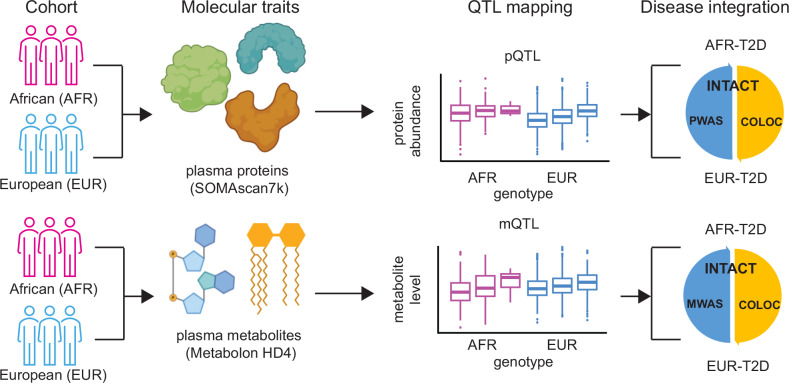
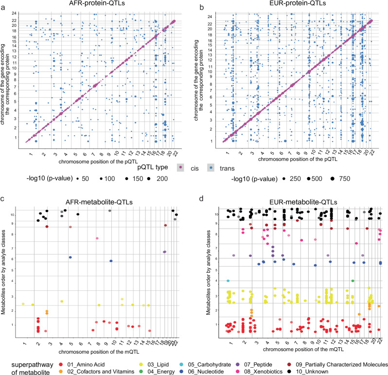
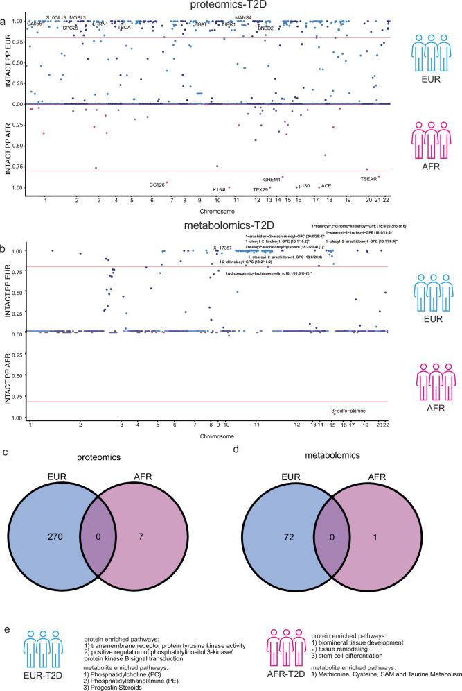
In this study, we generated and integrated plasma proteomics and metabolomics with the genotype datasets of over 2300 European (EUR) and 400 African (AFR) ancestries to identify ancestry-specific multi-omics quantitative trait loci (QTLs). In total, we mapped 954 AFR pQTLs, 2848 EUR pQTLs, 65 AFR mQTLs, and 490 EUR mQTLs. We further applied these QTLs to ancestry-stratified type-2 diabetes (T2D) risk to pinpoint key proteins and metabolites underlying the disease-associated genetic loci. Using INTACT that combined trait-imputation and colocalization results, we nominated 270 proteins and 72 metabolites from the EUR set; seven proteins and one metabolite from the AFR set as molecular effectors of T2D risk in an ancestry-stratified manner. Here, we show that the integration of genetic and omic studies of different ancestries can be used to identify distinct effector molecular traits underlying the same disease across diverse ancestral groups.


Conflict of interest statement

Competing interests: CC has received research support from GSK and EISAI. The funders of the study had no role in the collection, analysis, or interpretation of data; in the writing of the report; or in the decision to submit the paper for publication. CC is a member of the advisory board of Circular Genomics and owns stocks. The remaining authors declare no competing interests.

Figures

Fig. 1
Fig. 1. Schematics of the study design on genetic architecture of the plasma proteome and metabolome in participants with African and European ancestry.
Top: The plasma proteins in participants of African (AFR, in magenta) and European (EUR, in blue) ancestries were profiled together with the SomaScan 7k platform. Integrating the abundance of each protein with the array-based genotype data, we identified protein quantitative trait loci (pQTLs) in both ancestries. We further used these pQTLs to prioritize proteins in the ancestry-matched type-2 diabetes (T2D) risk via INtegration of Transcriptome-wide association study And ColocalizaTion (INTACT), with proteome-wide association study (PWAS) and colocalization (COLOC) as input. Bottom: The plasma metabolites in participants of African and European ancestries were profiled together with the Metabolon HD4 platform. Integrating the level of each metabolite with the array-based genotype data, we identified metabolite quantitative trait loci (mQTLs) in both ancestries. We further used these mQTLs to prioritize metabolites in the ancestry-matched T2D risk via INTACT, with metabolome-wide association study (MWAS) and COLOC as input. Schematics were created with icon library from the Microsoft PowerPoint and BioRender (https://BioRender.com/ephif2e) in Affinity Designer.
Fig. 2
Fig. 2. Four genetic maps of the plasma proteome and metabolome in participants with African and European ancestry.
a Map of 954 AFR pQTLs. The X-axis is the chromosome position of the pQTL; the Y-axis is the chromosome of the gene encoding the corresponding protein. The color code is magenta as cis-pQTLs and blue as trans-pQTLs. The point size represents the negative-log10-p value, the scales are from 0 to 200. P values are unadjusted, two-sided, and determined via linear regression analysis. The p value threshold is after multiple testing correction. The value threshold for cis-pQTL is 5 × 10−8 and for trans-pQTL is 1.49 × 10-10 (5 × 10-8/336). b Map of 2848 EUR pQTLs. Same X, Y, and color code as panel-A. The point size represents the negative-log10-p value, the scales are from 0 to 750. The p value threshold for cis-pQTL is 5 × 10−8 and for trans-pQTL is 3.40 × 10-11 (5 × 10−8/1472). c Map of 65 AFR mQTLs. The X-axis is the chromosome position of the mQTL; the Y-axis is the metabolite order (based on the super pathway). The color code is red as 01_Amino Acid; orange as 02_Cofactors and Vitamins; yellow as 03_Lipid; limegreen as 04_Energy; cyan as 05_Carbohydrate; blue as 06_Nuleotide; purple as 07_Peptide; deepplink1 as 08_Xenobiotics; brown as 09_Partially Characterized Molecules; black as 10_Unknown categories. P values are unadjusted, two-sided, and determined via linear regression analysis. The p value threshold is after multiple testing correction, and it is 1.78 × 10−10 (5 × 10−8/281). d Map of 490 EUR mQTLs. Same X, Y, and color code as panel-C. The p value threshold is after multiple testing correction and it is 6.53 × 10−11 (5 × 10−8/766).
Fig. 3
Fig. 3. Ancestry-specific pQTL and mQTL hits.
a AFR-specific pQTL vs queried EUR. The correlation coefficients (Pearson’s r) of the standardized effect sizes in the pseudo-log10-scale between the two ancestries are 0.923 and -0.147 for the shared (green) and AFR-specific (red) pQTLs. The lines are based on a linear regression model. b One AFR-specific pQTL example as HSF2B visualized by boxplots (AFR in purple: 0/0 n = 325, 0/1 n = 36, 1/1 n = 1; EUR in cyan: 0/0 n = 1727, 0/1 n = 384, 1/1 n = 19, all biologically independent samples) and locus zoom plots (P values are unadjusted, two-sided, and determined via linear regression analysis). c EUR-specific pQTL vs queried AFR. The correlation coefficients (Pearson’s r) of the standardized effect sizes in the pseudo-log10-scale between the two ancestries are 0.935 and 0.234 for the shared (green) and EUR-specific (red) pQTLs. The lines are based on a linear regression model. d One EUR-specific pQTL example as Apo A-V visualized by boxplots (AFR in purple: 0/0 n = 220, 0/1 n = 156, 1/1 n = 28; EUR in cyan: 0/0 n = 1441, 0/1 n = 764, 1/1 n = 98) and locus zoom plots (P values are unadjusted, two-sided, and determined via linear regression analysis). e) AFR-specific mQTL vs queried EUR. The correlation coefficients (Pearson’s r) of the standardized effect sizes in the pseudo-log10-scale between the two ancestries are 0.927 and -0.51 for the shared (green) and AFR-specific (red) mQTLs. The lines are based on a linear regression model. f One AFR-specific mQTL example as X-23447 visualized by boxplots (AFR in purple: 0/0 n = 404, 0/1 n = 8; EUR in cyan: 0/0 n = 2243, 0/1 n = 63, all biologically independent samples) and locus zoom plots (P values are unadjusted, two-sided, and determined via linear regression analysis). g EUR-specific mQTL vs queried AFR. The correlation coefficients (Pearson’s r) of the standardized effect sizes in the pseudo-log10-scale between the two ancestries are 0.927 and -0.51 for the shared (green) and AFR-specific (red) mQTLs. The lines are based on a linear regression model. h One EUR-specific mQTL example as myristoyl dihydrosphingomyelin (d18:0/14:0) visualized by boxplots (AFR in purple: 0/0 n = 70, 0/1 n = 192, 1/1 n = 143; EUR in cyan: 0/0 n = 906, 0/1 n = 1105, 1/1 n = 349, all biologically independent samples) and locus zoom plots (P values are unadjusted, two-sided, and determined via linear regression analysis). For all boxplots, the box represents the interquartile range, 25th percentile (lower quartile) and 75th percentile (upper quartile), the line within the box represents the median, and the whiskers extend to the minimum and maximum. For locus zoom plots, the SNPs for each regional plot are denoted as a purple diamond. Each dot represents individual SNPs, and dot colors in the regional plots represent R-squared value on linkage disequilibrium (LD) with the named SNP at the center. Blue vertical lines in the regional plots show recombination rates as marked on the right of the Y axis.
Fig. 4
Fig. 4. Integration of proteins and metabolites with the ancestry-matched risk of type-2 diabetes.
a Miami plot highlighting the INTACT nominated proteins associated with T2D between two ancestries (AFR in magenta and EUR in blue). Due to the size limit, we only show the top-10 EUR proteins (top). We show all seven AFR proteins (bottom). The Y-axis is the INTACT posterior probability, with a threshold of 0.8 (The horizontal red line represents the threshold). The X-axis is the protein associated genetic variant location across chromosomes. b Miami plot highlighting the INTACT nominated metabolites associated with T2D between two ancestries. Due to the size limit, we only show the top-10 EUR metabolites (top). We show the one AFR metabolite (bottom). The Y-axis is the INTACT posterior probability, with a threshold of 0.8. The X-axis is the metabolite associated genetic variant location across chromosomes. The metabolites were labeled with an anchor by their associated genetic variants. This was based on the chromosome of the variant with the strongest association with a given metabolite. c Venn diagram of findings per ancestry-matched protein-disease associations after INTACT jointly integrating the PWAS and colocalization results. d Venn diagram of findings per ancestry-matched metabolite-disease associations after INTACT jointly integrating the MWAS and colocalization results. e Schematic summary of the top enriched pathways using ancestry-stratified proteins or metabolites underlying T2D risk. (P values for the pathway enrichment analyses are unadjusted, two-sided, and determined via Fisher’s exact test for metabolomic findings. The significance threshold of the pathway being enriched was q-value < 0.1 after multiple testing correction.) Schematics were created with icon library from the Microsoft PowerPoint in Affinity Designer.

Update of

Similar articles

References

    1. Sirugo, G., Williams, S. M. & Tishkoff, S. A. The missing diversity in human genetic studies. Cell177, 26–31 (2019). - PMC - PubMed
    1. Claussnitzer, M. et al. A brief history of human disease genetics. Nature577, 179–189 (2020). - PMC - PubMed
    1. Taliun, D. et al. Sequencing of 53,831 diverse genomes from the NHLBI TOPMed Program. Nature590, 290–299 (2021). - PMC - PubMed
    1. Zhou, W. et al. Global Biobank Meta-analysis Initiative: powering genetic discovery across human disease. Cell Genomics2, 100192 (2022). - PMC - PubMed
    1. Mahajan, A. et al. Multi-ancestry genetic study of type 2 diabetes highlights the power of diverse populations for discovery and translation. Nat. Genet54, 560–572 (2022). - PMC - PubMed

LinkOut - more resources