. 2025 Jul 30:16:1546315.
doi: 10.3389/fgene.2025.1546315. eCollection 2025.

Exploration of potential biomarkers and immune cell infiltration characteristics for peripheral atherosclerosis in sjögren's syndrome based on comprehensive bioinformatics analysis and machine learning

Affiliations

Exploration of potential biomarkers and immune cell infiltration characteristics for peripheral atherosclerosis in sjögren's syndrome based on comprehensive bioinformatics analysis and machine learning

Chunjiang Liu et al. Front Genet. .

Abstract

Background: Sjögren's syndrome (SS) is an autoimmune disorder impacting exocrine glands, while peripheral atherosclerosis (PA) demonstrates a close link to inflammation. Despite a notable rise in atherosclerosis risk among SS patients in prior investigations, the precise mechanisms remain elusive.

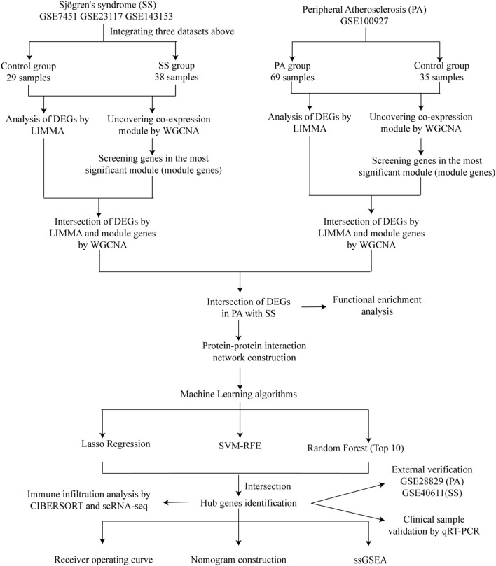
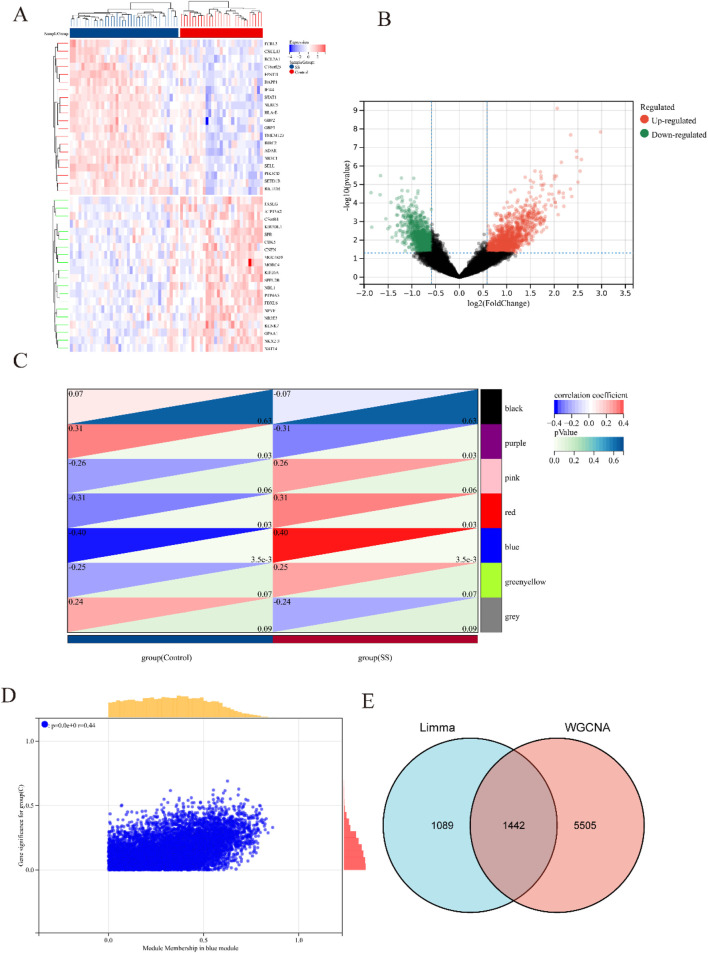
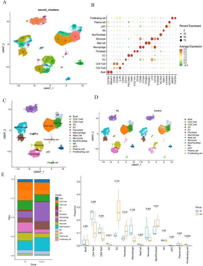
Methods: A comprehensive analysis was conducted on seven microarray datasets (GSE7451, GSE23117, GSE143153, GSE28829, GSE100927, GSE159677, and GSE40611). The LIMMA package, in conjunction with weighted gene co-expression network analysis (WGCNA), provides a robust method for identifying differentially expressed genes (DEGs) associated with peripheral atherosclerosis (PA) in Sjögren's syndrome (SS). Subsequently, machine learning algorithms and protein-protein interaction (PPI) network analysis were employed to further investigate potential predictive genes. These findings were utilized to construct a nomogram and a receiver operating characteristic (ROC) curve, which assessed the predictive accuracy of these genes in PA patients with SS. Additionally, extensive analyses of immune cell infiltration and single-sample gene set enrichment analysis (ssGSEA) were conducted to elucidate the underlying biological mechanisms.

Results: Using the LIMMA package and WGCNA, 135 DEGs associated with PA in SS were identified. PPI network analysis revealed 17 candidate hub genes. The intersection of gene sets identified by three distinct machine learning algorithms highlighted CCL4, CSF1R, and MX1 as key DEGs. ROC analysis and nomogram construction demonstrated their high predictive accuracy (AUC: 0.971, 95% CI: 0.941-1.000). Analysis of immune cell infiltration showed a significant positive correlation between these hub genes and dysregulated immune cells. Additionally, ssGSEA provided critical biological insights into the progression of PA in SS.

Conclusion: This study systematically identified three promising hub genes (CCL4, CSF1R, and MX1) and developed a nomogram for predicting PA in SS. Analysis of immune cell infiltration demonstrated that dysregulated immune cells significantly contribute to the progression of PA. Additionally, ssGSEA analysis offered important insights into the mechanisms by which SS leads to PA.

Keywords: Sjögren’s syndrome; bioinformatics analysis; biomarkers; immune infiltration; machine learning; peripheral atherosclerosis.


Conflict of interest statement

The authors declare that the research was conducted in the absence of any commercial or financial relationships that could be construed as a potential conflict of interest.

Figures

FIGURE 1
FIGURE 1
Study flowchart.
FIGURE 2
FIGURE 2
Heatmap and volcano plot of DEGs between SS and control group, and identification of module genes in SS via WGCNA. (A) Heatmap showing the top 20 DEGs between SS and control groups, emphasizing the most upregulated and downregulated genes. Blue blocks indicate downregulated expression, while red blocks indicate upregulated expression. (B) Volcano plot depicting the DEGs between SS and control groups. Red and green points represent significantly upregulated and downregulated DEGs, respectively. (C) Heatmap of SS-related modules. The number in the upper left corner indicates the correlation between the module and SS, and the P value in the lower right corner signifies the significance of this correlation. In SS, the blue module exhibits the strongest correlation. (D) Correlation between gene significance and module membership in the blue module. (E) Venn diagram illustrating that the intersection of DEGs and significantly expressed module genes in SS results in 1,442 DEGs.
FIGURE 3
FIGURE 3
Heatmap and volcano plot of DEGs between PA and control group, and identification of module genes in PA via WGCNA. (A) Heatmap showing the top 20 DEGs between PA and control groups, emphasizing the most upregulated and downregulated genes. Blue blocks indicate downregulated expression, while red blocks indicate upregulated expression. (B) Volcano plot depicting the DEGs between PA and control groups. Red and green points represent significantly upregulated and downregulated DEGs, respectively. (C) Heatmap of PA-related modules. The number in the upper left corner indicates the correlation between the module and PA, and the P value in the lower right corner signifies the significance of this correlation. In PA, the turquoise module exhibits the strongest correlation. (D) Correlation between gene significance and module membership in the turquoise module. (E) Venn diagram illustrating that the intersection of DEGs and significantly expressed module genes in PA results in 1,577 DEGs.
FIGURE 4
FIGURE 4
Functional enrichment analysis of DEGs associated with SS in PA. (A) The Venn diagram illustrates that the overlap of DEGs between PA and SS resulted in 135 SS-related differentially expressed genes in PA. (B–D) GO analysis of DEGs associated with SS in PA, covering biological process, cellular component, and molecular function. The X-axis indicates the gene ratio, while the Y-axis denotes various ontologies. The size and color of the circles reflect the number and significance of the genes. (E) KEGG pathway analysis highlights the primary signaling pathways implicated in SS-related DEGs in PA.
FIGURE 5
FIGURE 5
Construction of PPI network and selection of key Genes. (A) The PPI network of 77 PA and SS-related DEGs was visualized using Cytoscape software. Due to the lack of interactions among some genes, 58 DEGs were excluded from the network, resulting in a PPI network consisting of 77 nodes (representing genes) and multiple edges (indicating gene interactions). (B–D) The CytoHubba plugin in Cytoscape was employed to identify key genes from the 77 genes using three distinct algorithms. By analyzing these genes from three different perspectives, the top 30 genes were selected for each algorithm. (B–D) depict the Betweenness, Closeness and Degree algorithms, respectively. Deeper colors indicate a more significant role in the algorithm. (E) The intersection of the results from the three algorithms was determined, and ultimately, 17 DEGs were selected for further in-depth analysis.
FIGURE 6
FIGURE 6
Identification of candidate predictive biomarkers using machine learning algorithms. (A) Lasso regression analysis was performed to screen a series of gene variables, using binomial deviation as an evaluation metric, and identified 5 genes with the lowest binomial deviation. (B) The SVM-RFE algorithm was applied to minimize error and maximize accuracy by iteratively eliminating less important genes from the gene set, ultimately selecting 9 genes with the lowest error and highest accuracy. (C) The random forest algorithm ranked genes based on their importance scores, resulting in the selection of the top 10 genes. (D) A venn diagram was used to visually illustrate the intersection of the three machine learning algorithms, identifying 3 hub genes: CCL4, CSF1R, and MX1.
FIGURE 7
FIGURE 7
Assessment of the predictive value and construction of nomogram for candidate biomarkers in PA. (A) Significant differences in the expression levels of three candidate genes between PA patients and controls, with increased expression (****, P < 0.0001). (B) ROC curve analysis was conducted to assess the predictive value of these three genes for PA. Each panel clearly displays the area under the curve (AUC) value and its corresponding 95% confidence interval. A higher AUC value indicates that the diagnostic model has better discriminatory power and can more accurately distinguish PA patients from healthy controls. (C,D) A nomogram, a visual predictive model that integrates multiple predictive factors (CCL4, CSF1R, and MX1), was constructed for PA. Panels C and D show the process and results of constructing the nomogram based on these three genes. (E) Through qRT-PCR, differential expression of three genes was detected when comparing the SS patients with PA against those without PA (*, p < 0.05; **, p < 0.01).
FIGURE 8
FIGURE 8
Comparison of immunological changes between the control group and the PA group, along with the association between three key hub DEGs and immune-related characteristics in PA. (A) A bar plot visually illustrates the relative abundances of 22 different immune cell types across all samples. (B) A boxplot illustrates the intergroup differences in immune cell expression levels between the PA and control groups (*p < 0.05, **p < 0.01, ***p < 0.001, ****p < 0.0001). (C) A heatmap illustrates the relationships between different immune cell types. Rows and columns correspond to distinct immune cell types, with color intensity denoting correlation strength. Red signifies a positive correlation and blue denotes a negative correlation. (D) A correlation analysis diagram evaluates the link between immune cell infiltration and the three hub DEGs. Similar to the prior depiction, red signifies a positive correlation and blue denotes a negative correlation, with color intensity denoting correlation strength.
FIGURE 9
FIGURE 9
Single-cell RNA sequencing of human atherosclerotic plaque tissues. (A) The single-cell atlas of carotid atherosclerotic plaques was visualized through UMAP. (B) Dot plot illustrating the proportion of cells expressing specific genes (dot size) and the mean expression levels in expressing cells (dot color) across distinct clusters. (C) This representation delineated 14 distinct cell types. (D) An overview comparing the 14 cell types between the AC and Control groups was conducted and categorized by cell type. (E) The proportions of cell types in each group were compared using bar charts and box plots.

Similar articles

References

    1. Ackers-Johnson M., Talasila A., Sage A. P., Long X., Bot I., Morrell N. W., et al. (2015). Myocardin regulates vascular smooth muscle cell inflammatory activation and disease. Arteriosclerosis, thrombosis, Vasc. Biol. 35, 817–828. 10.1161/ATVBAHA.114.305218 - DOI - PMC - PubMed
    1. Alsaigh T., Evans D., Frankel D., Torkamani A. (2022). Decoding the transcriptome of calcified atherosclerotic plaque at single-cell resolution. Commun. Biol. 5, 1084. 10.1038/s42003-022-04056-7 - DOI - PMC - PubMed
    1. Bartoloni E., Baldini C., Schillaci G., Quartuccio L., Priori R., Carubbi F., et al. (2015). Cardiovascular disease risk burden in primary sjögren's syndrome: results of a population‐based multicentre cohort study. J. Intern. Med. 278, 185–192. 10.1111/joim.12346 - DOI - PubMed
    1. Becht E., McInnes L., Healy J., Dutertre C. A., Kwok I. W. H., Ng L. G., et al. (2018). Dimensionality reduction for visualizing single-cell data using UMAP. Nat. Biotechnol. 37, 38–44. 10.1038/nbt.4314 - DOI - PubMed
    1. Blanchet L., Vitale R., van Vorstenbosch R., Stavropoulos G., Pender J., Jonkers D., et al. (2020). Constructing bi-plots for random forest: tutorial. Anal. Chim. acta 1131, 146–155. 10.1016/j.aca.2020.06.043 - DOI - PubMed

LinkOut - more resources