. 2025 Aug 31;26(1):264.
doi: 10.1186/s12931-025-03331-5.

Divergent biological pathways distinguish community-acquired pneumonia from COVID-19 despite similar plasma cytokine profiles

Collaborators, Affiliations

Divergent biological pathways distinguish community-acquired pneumonia from COVID-19 despite similar plasma cytokine profiles

Douglas D Fraser et al. Respir Res. .

Abstract

Background: Pulmonary infections, ranging from mild respiratory issues to severe multiorgan failure, pose a major global health threat. The immune response in community-acquired pneumonia (CAP) and COVID-19 influences disease severity and outcomes, but molecular pathogenesis differs across pathogens. Comparisons of plasma cytokine profiles between CAP and COVID-19 are limited. Analyzing these profiles with machine learning and bioinformatics could reveal subtle patterns and improve our understanding of immune responses in both conditions.

Methods: We conducted a novel case-control study to profile cytokine levels in patients with CAP and COVID-19. Age- and sex-matched cohorts included 39 patients with CAP, 39 with COVID-19, and 20 healthy controls. We measured 384 plasma cytokine levels using proximity extension assays and analyzed differences between cohorts with conventional statistical methods, bioinformatics and machine learning.

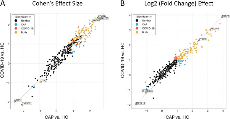
Results: Median ages of the cohorts were comparable (P = 0.797). COVID-19 patients exhibited a higher prevalence of hematologic disease (P = 0.047), increased corticosteroid use (P = 0.040), and reduced antibiotic use (P = 0.012). Clinical outcomes, including mortality, ICU admission, invasive mechanical ventilation, renal replacement therapy, acute respiratory distress syndrome, and acute kidney injury, were similar between groups. Both cohorts showed comparable absolute circulating cytokine profiles but distinct profiles relative to healthy controls. Machine learning identified a model of twelve cytokines that distinguished CAP from COVID-19 with a classification accuracy of 0.71 (SD 0.20). Gene ontology and enrichment analysis revealed differences in cytosolic and nuclear functions, intracellular signaling, stress responses, and cell cycle processes between patient cohorts and healthy controls. Enriched GO pathways showed that CAP pathways were positively associated with leukocyte counts and ARDS development, while COVID-19 pathways were negatively associated with ARDS and positively with platelet counts.

Conclusions: This case-control study provides insights into cytokine profiles related to CAP and COVID-19 pathogenesis. Although absolute circulating cytokine levels showed no significant differences between the groups, machine learning identified a model of twelve proteins that effectively distinguished the cohorts. Gene ontology and enrichment analyses also revealed distinct dysregulated pathways with differing associations with clinical variables in each cohort. These findings underscore the complexity and variability of cytokine responses in pulmonary infections.

Keywords: ARDS; Biomarkers; COVID-19; Community acquired pneumonia (CAP); Cytokines; Gene ontology; Machine learning; Proteomics.


Conflict of interest statement

Declarations. Ethics approval and consent to participate: This study was approved by the Western University, Human Research Ethics Board (REB #s 6970; #100036; # 6963). Our experimental methods are performed in accordance with ethical standards of the responsible committee on human experimentation with the Helsinki Declaration of 1975. Informed written consent was obtained from either participants or their legal guardians. Consent for publication: Not applicable. Competing interests: Dr. Russell reports patents owned by the University of British Columbia (UBC) that are related to (1) the use of PCSK9 inhibitor(s) in sepsis, (2) the use of vasopressin in septic shock and (3) a patent owned by Ferring for use of selepressin in septic shock. Dr. Russell is an inventor on these patents. Dr. Russell is a shareholder in Molecular You Corp. Dr. Russell was a co-founder, Director and shareholder of Cyon Therapeutics Inc. (now closed) and Dr. Russell is currently a Cofounder, Director, and shareholder of Resolve Nanotherapeutics. Dr. Russell is the Senior Research Advisor of the British Columbia, Canada Post COVID – Interdisciplinary Clinical Care Network (PC-ICCN). Dr. Russell is no longer consulting for any industry. Dr. Russell reports receiving consulting fees in the last 3 years as a funded member of the Data and Safety Monitoring Board (DSMB) of an NIH-sponsored trial of plasma in COVID-19 (PASS-IT-ON) (2020–2021). Dr. Russell is the non-funded Chair of the Data and Safety Monitoring Board (DSMB) of a trial UC CISS II of stem cells in sepsis. Dr. Russell was a non-funded Science Advisor and member, Government of Canada COVID-19 Therapeutics Task Force (June 2020–2021). Dr. Russell has received grants for COVID-19 and for pneumonia research: 6 from the Canadian Institutes of Health Research (CIHR) and 3 from the St. Paul’s Foundation (SPF).

Figures

Fig. 1
Fig. 1
Plasma proteome comparison among CAP, COVID-19, and Healthy Control subjects. A Violin plots display the distribution of NPX values for each group. Box plots are overlaid within the violins to show quartile ranges. B Scatterplot illustrates the first two principal components from the normalized dataset. Colors represent different groups in the dataset. C Heatmap showing pairwise Pearson correlations between samples in the normalized dataset. Samples are displayed on both X and Y axes, with color intensity indicating correlation levels (yellow: higher correlation, purple: lower correlation). Dendrograms above the heatmap show hierarchical clustering based on Euclidean distance
Fig. 2
Fig. 2
Comparative proteomics between patient groups and Healthy Control subjects. A Volcano plot comparing CAP patients to healthy controls. The plot shows significance (-log10 transformed p-values) versus magnitude (log2 fold change). Proteins with significant differential levels are highlighted as red (up-regulated) or blue (down-regulated) dots. Vertical green and horizontal orange lines denote the fold change and p-value thresholds. B Heatmap of protein intensity for CAP patients relative to healthy controls. Protein intensities are normalized to the average level across all samples. Proteins are listed on the Y axis, and samples are shown on the X axis. Red cells indicate higher protein levels, while blue cells indicate lower levels. C Volcano plot comparing COVID-19 patients to healthy controls. Significance (-log10 transformed p-values) versus magnitude (log2 fold change) is depicted. Proteins with significant differential levels are marked as red (up-regulated) or blue (down-regulated) dots. Vertical green and horizontal orange lines indicate fold change and p-value thresholds. D Heatmap of protein intensity for COVID-19 patients relative to healthy controls. Protein intensities are normalized to the average level across all samples. Proteins are listed on the Y axis, and samples are shown on the X axis. Red cells represent higher protein levels, and blue cells represent lower levels
Fig. 3
Fig. 3
Scatterplots demonstrating Cohen’s Effect Size and Log2 (Fold Change) effect for both CAP vs. Healthy Control subjects and COVID-19 vs. Healthy Control subjects. A Cohen’s d effect sizes and B log₂ fold change effects for each protein in CAP vs. Healthy Control subjects (HC; x-axis) and COVID-19 vs. Healthy Control subjects (HC; y-axis). Each point represents a protein, colored by statistical significance: gold (significant in both), blue (CAP only), red (COVID-19 only), and black (neither). Proteins near the diagonal line exhibit similar direction and magnitude of change across both infections
Fig. 4
Fig. 4
Functional analyses and enrichment results across comparisons. A Heatmap displaying significantly enriched Gene Ontology (GO) terms across different comparisons. The y-axis shows the union of significant GO terms, while the x-axis represents each comparison. Significance is determined with an adjusted p-value < 0.05 and at least one feature per set. Only the top 25 terms per enrichment are shown for clarity. B Interactive bubble plot of significantly enriched GO terms for CAP patients versus healthy controls. Enrichment results are plotted with -log10(adjusted p-value) on the y-axis and enrichment Z-score on the x-axis. The Z-score is calculated as formula image​, where N is the total number of proteins in the term, and Su and Sd are the counts of significant up-regulated and down-regulated proteins, respectively. Bubble size represents term size, and color indicates the fraction of significant features within each term. C Interactive bubble plot of significantly enriched GO terms for COVID-19 patients versus healthy controls. Enrichment results are presented with -log10(adjusted p-value) on the y-axis and enrichment Z-score on the x-axis, calculated as formula image​, where N is the total number of proteins in the term, and Su and Sd are the counts of significant up-regulated and down-regulated proteins, respectively. Bubble size denotes term size, and color represents the fraction of significant features within each term
Fig. 5
Fig. 5
Heatmap and Chord diagram displaying statistically significant associations. A1 In the heatmap, the rows represent clinical variables for the CAP patients, while the columns represent the top 10 proteins for determining differences between patient cohorts (random forest and lasso; bright pink represents positive associations, dark blue represents negative associations, and the gray color reflects non-significant association between pairs). A2 In the Chord diagram, the enriched pathways are primarily positioned on the left, while the CAP patient clinical features are primarily positioned on the top right. Each edge represents the sum of the weights for implicated proteins in an enriched pathway, where the Pearson correlation coefficient formula image between the protein and a clinical feature is non-zero and significant (Pearson’s correlation P-value < 0.05). The edge colour indicates the direction of the correlation (dark blue for negative correlation, bright pink for positive correlation), mapped to the range [−1, 1] for convenience. Only associations < −0.25 and > 0.25 (those with higher impact) are shown on the Chord diagram for greater clarity. B1 In the heatmap, the rows represent clinical variables for the COVID-19 patients, while the columns represent the top 10 proteins for determining differences between patient cohorts (random forest and lasso; bright pink represents positive associations, dark blue represents negative associations, and the gray color reflects non-significant association between pairs). A2 In the Chord diagram, the enriched pathways are primarily positioned on the left, while the COVID-19 patient clinical features are primarily positioned on the top right. Each edge represents the sum of the weights for implicated proteins in an enriched pathway, where the Pearson correlation coefficient formula image between the protein and a clinical feature is non-zero and significant (Pearson’s correlation p-value < 0.05). The edge colour indicates the direction of the correlation (dark blue for negative correlation, bright pink for positive correlation), mapped to the range [−1, 1] for convenience. Only associations < −0.25 and > 0.25 (those with higher impact) are shown on the Chord diagram for greater clarity
Fig. 6
Fig. 6
Time comparison of ICU days for CAP patients. A Volcano plot comparing protein levels at day 7 versus day 0 in CAP patients. The plot shows significance (-log10 transformed P-values) versus magnitude (log2 fold change). Proteins with significant changes are highlighted as red (up-regulated) or blue (down-regulated) dots. Vertical green and horizontal orange lines indicate the fold change and p-value thresholds. B Heatmap of significant proteins comparing day 7 to day 0 in CAP patients. Protein intensities are normalized to the average level across all samples. Proteins are listed on the Y-axis and samples on the X-axis. Red cells indicate higher protein levels, while blue cells indicate lower levels. C String diagram illustrating known protein interactions for CSF3 (GCS-F), with CSF3 represented as the red node. D String diagram illustrating known protein interactions for IL6, with IL6 represented as the red node.

References

    1. Metlay JP, Waterer GW, Long AC, Anzueto A, Brozek J, Crothers K, Cooley LA, Dean NC, Fine MJ, Flanders SA. Diagnosis and treatment of adults with community-acquired pneumonia. An official clinical practice guideline of the American Thoracic Society and Infectious Diseases Society of America. Am J Respir Crit Care Med. 2019;200(7):e45–67. - PMC - PubMed
    1. Torres A, Cilloniz C, Niederman MS, Menendez R, Chalmers JD, Wunderink RG, van der Poll T. Pneumonia. Nat Rev Dis Primers. 2021;7(1):1–28. - PubMed
    1. Vos T, Lim SS, Abbafati C, Abbas KM, Abbasi M, Abbasifard M, Abbasi-Kangevari M, Abbastabar H, Abd-Allah F, Abdelalim A. Global burden of 369 diseases and injuries in 204 countries and territories, 1990–2019: a systematic analysis for the Global Burden of Disease Study 2019. Lancet. 2020;396(10258):1204–22. - PMC - PubMed
    1. Jeganathan N, Yau S, Ahuja N, Otu D, Stein B, Fogg L, Balk R. The characteristics and impact of source of infection on sepsis-related ICU outcomes. J Crit Care. 2017;41:170–6. - PubMed
    1. Sligl WI, Marrie TJ. Severe community-acquired pneumonia. Crit Care Clin. 2013;29(3):563–601. - PMC - PubMed

MeSH terms

LinkOut - more resources