. 2025 Sep 1;16(1):8161.
doi: 10.1038/s41467-025-63538-4.

Longitudinal liquid biopsy identifies an early predictive biomarker of immune checkpoint blockade response in head and neck squamous cell carcinoma

Affiliations

Longitudinal liquid biopsy identifies an early predictive biomarker of immune checkpoint blockade response in head and neck squamous cell carcinoma

Binbin Wang et al. Nat Commun. .

Abstract

Immune checkpoint blockade (ICB) has improved outcomes for patients with head and neck squamous cell carcinoma (HNSCC), but predictive biomarkers remain limited. Here, we use a time-resolved, multi-omic approach in a murine HNSCC model to characterize peripheral immune responses to ICB. Single-cell transcriptomics and T/B cell receptor analyses reveal early on-treatment expansion of effector memory T and B cell repertoires in responders, preceding tumor regression. These dynamic immune features inform a composite transcriptional signature that accurately predicts ICB response in independent human HNSCC cohorts. LiBIO outperforms existing biomarkers and generalizes to melanoma, non-small cell lung cancer, and breast cancer without retraining. These findings suggest that early treatment-induced changes in circulating immune repertoires reflect the host's capacity to mount an effective antitumor response. This work provides a framework for leveraging transient peripheral immune dynamics to develop non-invasive, high-fidelity biomarkers for response to immunotherapy across cancer types.


Conflict of interest statement

Competing interests: E.R. is a co-founder of Medaware Ltd. ( https://www.medaware.com/ ), Metabomed ( https://www.metabomed.com/ ), and Pangea Biomed ( https://pangeamedicine.com/ ). He has divested and serves as an unpaid scientific consultant to the latter company. J.S.G. is a consultant/advisory board member for Pangea Biomed, Radionetics, and io9, and founder of Kadima Pharmaceuticals. The rest of the authors declare no conflicts of interest.

Figures
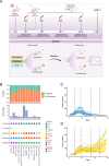
Fig. 1
Fig. 1. Overview of experimental design and data.
A Schematic of the experimental design. Blood was collected at four time points: one pre-treatment time point (four days after cancer cell transplantation) and three on-treatment time points (days 9, 17, and 24). Anti-PD-1 treatment was initiated on day 4 following the first blood collection. The response to ICB treatment for each mouse was assessed based on RECIST criteria. This graphical abstract was created with BioRender.com. B Summary of in-house and publicly available HNSCC datasets used in this study. Three in-house datasets were generated, including an RNA-seq dataset from 45 mice across four time points, consisting of 15 ICB responders and 30 non-responders. Additionally, single-cell RNA-seq and TCR sequencing were performed on an independent cohort of 16 mice, comprising 7 responders and 9 non-responders. Another in-house dataset includes a single-cell RNA-seq dataset from ICB-treated HNSCC patients, containing 20 patients (9 responders and 11 non-responders). Furthermore, two publicly available single-cell ICB-treated datasets and four publicly available bulk RNA-seq ICB datasets were incorporated into the analysis. C Dynamic changes in tumor volume across time points in responders. The dashed line indicates the four time points at which whole blood were collected. D Dynamic changes in tumor volume across time points in non-responders. The dashed line indicates the four time points at which PBMCs were collected. Source data are provided as a Source Data file.
Fig. 2
Fig. 2. Temporal changes in cell abundance in blood following ICB treatment.
A Dynamic changes in the abundance of major cell types in blood. B Box plots showing the abundance changes of four cell types significantly influenced by ICB treatment (n = 16 biological replicates; each dot represents one mouse). C Abundance changes of effector memory CD8+ T cells in responders (n = 7) and non-responders (n = 9) across four time points. Each dot represents an individual mouse. D Abundance differences of effector memory CD8+ T cells between responders and non-responders. E Abundance changes of B cells in responders (n = 7) and non-responders (n = 9) across four time points. Each dot represents an individual mouse. F Abundance differences of B cells between responders (n = 7) and non-responders (n = 9). In box plots (B, C, and E), the center line indicates the median; the box spans the interquartile range (IQR, 25th to 75th percentile); whiskers extend to values within 1.5× IQR from the quartiles; and each dot represents one biological replicate (a single mouse). In (D and F), dots represent the mean, and error bars indicate the standard error of the mean (± SEM). The unit of study is the individual mouse. Statistical significance was assessed using a one-tailed Wilcoxon rank-sum test unless otherwise noted. The Mann–Kendall test was used to evaluate monotonic changes across time points. For all panels, the X-axis represents time points, and the Y-axis represents the fraction of cells out of the total measured. Source data are provided as a Source Data file.
Fig. 3
Fig. 3. ICB treatment induces T cell and B cell clonal expansion.
A UMAP of CD8+ T cells, with each dot representing a single-cell and colored by clone size. B Distribution of expanded clones (clone size ≥2, represented by red bars) and non-expanded clones (clone size = 1, represented by green bars) between effector memory CD8+ T cells and other CD8+ T cells. P-value and odds ratio were calculated using Fisher’s exact test. C Distribution of CD8+ T cell clone sizes between responders and non-responders across four time points. Statistical significance was determined using Fisher’s exact test. D Comparison of effector memory cell (Tem) clonal expansion estimated using single-cell TCR-seq data, between responders (n = 7) and non-responders (n = 9). The y-axis represents the average size of Tem clones, where higher values indicate greater clonal expansion. Each dot represents an individual sample. Statistical significance was determined using a one-tailed Wilcoxon rank-sum test. E Comparison of T cell clonal expansion estimated using bulk RNA-seq data, between responders (n = 15) and non-responders (n = 30). The y-axis represents the scaled Simpson index, where higher values indicate greater clonal expansion. Each dot represents an individual mouse. Statistical significance was determined using a one-tailed Wilcoxon rank-sum test. F Comparison of B cell clonal expansion estimated using bulk RNA-seq data, between responders (n = 15) and non-responders (n = 30). The y-axis represents the scaled Simpson index, where higher values indicate greater clonal expansion. Each dot represents an individual mouse. Statistical significance was determined using a one-tailed Wilcoxon rank-sum test. G AUC (Area Under the Curve) values for predicting ICB response based on the bulk B cell clonal expansion index, bulk T cell clonal expansion index, and single-cell Tem cell clonal expansion index at Day 9. In box plots (DF), the center line indicates the median; the box spans the interquartile range (IQR, 25th to 75th percentile); whiskers extend to values within 1.5× IQR from the quartiles; and each dot represents one biological replicate (a single mouse). Source data are provided as a Source Data file.
Fig. 4
Fig. 4. Dynamic changes in gene expression following ICB treatment in blood.
A Clusters of gene expression in responders. Each row of the heatmap represents one gene, and each column represents one time point. Colors indicate scaled gene expression levels. The line plot to the left of the heatmap shows the expression change pattern of each cluster. On the right side of the heatmap are the pathways enriched based on the genes within each corresponding cluster. B Clusters of gene expression in non-responders, with the same representation as in (A). C Machine learning models were trained for each time point using bulk RNA-seq data. The ICB response prediction performance of these time point-specific models was validated using five-fold cross validation. D Dynamic changes in gene expression between different time points were used to train a machine learning model. The ICB response prediction performance of this model was validated using five-fold cross validation. Source data are provided as a Source Data file.
Fig. 5
Fig. 5. Tem and B cell signatures predict ICB response in human patients.
A, B AUC (Area Under the Curve) values for ICB response prediction based on Tem and B cell signature scores, as well as the combined score (calculated as the mean of Tem and B cell signature scores) in both blood (A) and tumor (B) HNSCC cohorts. C AUC values for the combined score compared to previously published transcriptomic signatures across 10 HNSCC cohorts. Each dot represents one HNSCC cohort, displayed using different colors and shapes. The box plot displays the median (center line), interquartile range (IQR; box limits: 25th to 75th percentile), and whiskers extending to 1.5× IQR from the quartiles. Two-tailed P-values were calculated using the Wilcoxon rank-sum test to compare the LiBIO score against other signatures. D Hazard ratios (HRs) for overall survival per 1-unit increase in the combined Tem and B cell score (LiBIO score), adjusted for age and sex, in three independent HNSCC cohorts: TCGA (n = 516), Foy et al. (n = 102), and INSPIRE (n = 12). Dots represent HR estimates; error bars indicate the 95% confidence interval (CI). Statistical significance was assessed using the Wald test. E, F Identification of fixed thresholds for the LIBIO score in single-cell (E) and bulk (F) cohorts. The X-axis represents the cohorts, while the Y-axis indicates the odds ratio (OR) of responders versus non-responders (see “Methods”). Orange bars correspond to training cohorts, and green bars represent independent validation cohorts. Source data are provided as a Source Data file.
Fig. 6
Fig. 6. Prediction of immune checkpoint blockade (ICB) response using the LiBIO score across multiple cancer types.
A Area under the curve (AUC) values for LiBIO score-based prediction of ICB response across 11 patient groups. The x-axis labels indicate both the dataset source and the timing of sample collection relative to anti-PD-1 therapy, where “Pre” denotes samples collected before treatment initiation and “Post” denotes samples collected after treatment had begun. B Odds ratio (OR) for distinguishing responders from non-responders using fixed LiBIO thresholds specific to melanoma, NSCLC, and breast cancer (see “Methods”). Orange bars represent training cohorts used to determine the optimal threshold, and green bars correspond to independent validation cohorts. Source data are provided as a Source Data file.

References

    1. Topalian, S. L., Taube, J. M., Anders, R. A. & Pardoll, D. M. Mechanism-driven biomarkers to guide immune checkpoint blockade in cancer therapy. Nat. Rev. Cancer16, 275–287 (2016). - PMC - PubMed
    1. Wang, Y. et al. FDA-approved and emerging next generation predictive biomarkers for immune checkpoint inhibitors in cancer patients. Front. Oncol.11, 683419 (2021). - PMC - PubMed
    1. Rizvi, N. A. et al. Mutational landscape determines sensitivity to PD-1 blockade in non–small cell lung cancer. Science348, 124–128 (2015). - PMC - PubMed
    1. Riaz, N. et al. Tumor and microenvironment evolution during immunotherapy with nivolumab. Cell171, 934–949.e16 (2017). - PMC - PubMed
    1. Patel, S. P. & Kurzrock, R. PD-L1 expression as a predictive biomarker in cancer immunotherapy. Mol. Cancer Ther.14, 847–856 (2015). - PubMed

MeSH terms

Substances

LinkOut - more resources