. 2025 Sep;645(8079):177-191.
doi: 10.1038/s41586-025-09235-0. Epub 2025 Sep 3.

A brain-wide map of neural activity during complex behaviour

Collaborators, Affiliations

A brain-wide map of neural activity during complex behaviour

International Brain Laboratory et al. Nature. 2025 Sep.

Abstract

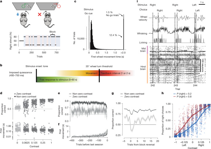
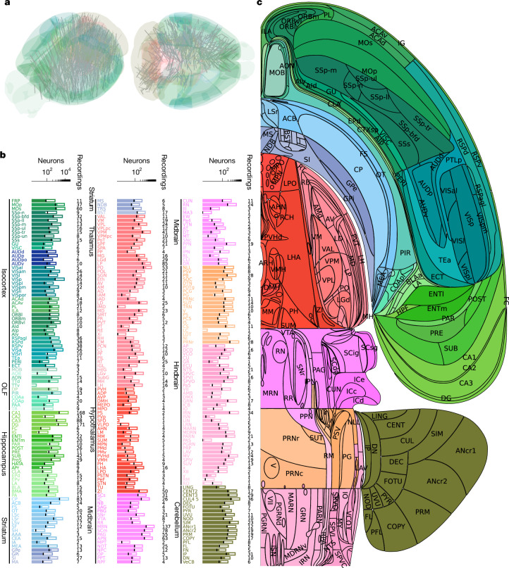
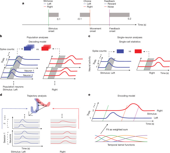
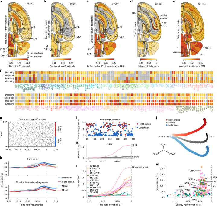
A key challenge in neuroscience is understanding how neurons in hundreds of interconnected brain regions integrate sensory inputs with previous expectations to initiate movements and make decisions1. It is difficult to meet this challenge if different laboratories apply different analyses to different recordings in different regions during different behaviours. Here we report a comprehensive set of recordings from 621,733 neurons recorded with 699 Neuropixels probes across 139 mice in 12 laboratories. The data were obtained from mice performing a decision-making task with sensory, motor and cognitive components. The probes covered 279 brain areas in the left forebrain and midbrain and the right hindbrain and cerebellum. We provide an initial appraisal of this brain-wide map and assess how neural activity encodes key task variables. Representations of visual stimuli transiently appeared in classical visual areas after stimulus onset and then spread to ramp-like activity in a collection of midbrain and hindbrain regions that also encoded choices. Neural responses correlated with impending motor action almost everywhere in the brain. Responses to reward delivery and consumption were also widespread. This publicly available dataset represents a resource for understanding how computations distributed across and within brain areas drive behaviour.


Conflict of interest statement

Competing interests: The authors declare no competing interests.

Figures

Fig. 1
Fig. 1. The IBL task, data types and behaviour.
a, Schematic of the IBL task and the block structure of an example session. b, Timeline of the events and analysed variables. Colours are used in other figures. c, Distribution of the times between stimulus onset and first wheel-movement time (interpreted as a reaction time) from 459 sessions. The distribution is truncated at 80 ms and 2 s. A total of 22.8% first wheel-movement times occurred under 80 ms (not shown). d, Proportions of correct choices (top) and first wheel-movement time (bottom) given a stimulus contrast (one point per mouse per contrast). Performance on 0% contrast trials (grey) was 58.7 ± 0.4% correct (mean ± s.e.m. across mice). Data are for 139 mice and 454 sessions. e, Proportions of correct choices given the number of trials before the end of the session for 0% (grey) and non-0% (black) contrast trials (mean ± s.e.m. across mice). f, The same analysis for first wheel-movement times. g, Reversal curves. Proportions of correct choices around a block change for trials with 0% contrast and  >0% contrast (mean ± s.e.m. across mice; excluding the first 90 unbiased trials). h, Psychometric curves. Fraction of correct choices given a signed contrast (positive or negative for right or left stimuli, respectively) for all mice (one dot per contrast per mouse). Right choices were more or less common in right (red) or left (blue) blocks, with Pright = 0.8 and Pright = 0.2, respectively. i, Time series and trial information for three example trials: rotary encoder output of the wheel, video analysis and spike-time rasters across multiple brain regions. Figures are organized according to the IBL style (https://github.com/int-brain-lab/ibl-style/tree/main). Schematic in a was adapted from ref. , eLife, under a Creative Commons licence, CC BY 4.0.
Fig. 2
Fig. 2. Brain-wide recordings during behaviour.
a, Neuropixels probe trajectories shown in a 3D brain schematic. A total of 699 insertions were performed across 139 mice. b, For each region, the number of neurons recorded (full bar length) and the number of well-isolated neurons used for analysis (filled portion; for reference, the black line on each bar shows 10% of the number of recorded neurons, which is the average number of neurons that were well-isolated) are shown. Additional information and definitions for brain regions are provided in a table on GitHub (https://github.com/int-brain-lab/paper-brain-wide-map/blob/main/brainwidemap/meta/region_info.csv). The same table reports the so-called Cosmos hierarchical grouping of the regions, which distinguishes the isocortex, the olfactory areas (OLF), the hippocampal formation (HPF), the cortical subplate (CTXsp), the cerebral nuclei (CNU), the thalamus (TH), the (hypothalamus (HY), the midbrain (MB), the hindbrain (HB) and the cerebellum (CB). The coloured text labels of brain regions are used in other figures. c, Flatmap of one hemisphere showing the acronyms used for the regions.
Fig. 3
Fig. 3. Illustration of neural analyses.
See also Supplementary Fig. 2. a, Schematic of the task structure, with the time windows used for analysis in grey. In bd, left (blue) and right (red) stimuli are used as example task variables, and the neural traces are coloured accordingly. b, Schematic of the decoding model, which quantifies neural population correlates with task variables. Regularized logistic or linear regression is used to map spike counts in the relevant time windows (grey zone) from cells in each area into predictions of the values of the variables. c, Schematic of the single-cell analysis, which quantifies single-cell neural correlates with task variables. A conditioned combined Mann-Whitney U statistic is used to compute how sensitive the activities (in the grey zone) of single cells are to individual task variables, controlling for the values of other variables. d, Schematic of the population trajectory analysis, which describes the time evolution of the across-session neural population response, pooling cells across all recordings per region. The mean activities of every cell across their entire session for the different values of task variables are segmented into short bins, and used to define trajectories in a high-dimensional state space (projected, purely for visualization, into 3D). The distances between the trajectories for the different values of the task variables (arrows) define the separation. e, Schematic of the encoding model, which uses multiple linear regression of task-defined and behaviourally defined temporal kernels (the multicoloured traces) to fit the activity of single neurons.
Fig. 4
Fig. 4. Representation of the visual stimulus.
See also Extended Data Figs. 5–7 and data in the IBL Brain Atlas (https://atlas.internationalbrainlab.org/?alias=bwm_stimulus). For ae, colour indicates the effect size; grey not significant at FDR0.01; ratios on the upper right indicate significant/total regions; white, regions not analysed. The analysed stimulus interval is 0 ms to 100 ms following stimulus onset. a, Decoding. Null-corrected median balanced accuracy. b, Single-cell statistics. Fraction of neurons significantly modulated by stimulus side. Mann–Whitney and condition combined Mann–Whitney tests at P < 0.001 and P < 0.05, respectively. Significance was based on the binomial distribution of false-positive events and FDR0.01. c, Population trajectory distance. Time-resolved maximum Euclidean distance (in spikes per s, for dimension = number of cells per region, log10) between trajectories following left versus right stimuli. Significance was relative to a shuffle control and FDR0.01. d, Population trajectory latency. First time crossing 70% of the dmax for significant regions. e, Encoding. Mean absolute difference ∣ΔR2∣ in improvements over 400 ms after stimulus-onset from causal right or left stimulus kernels for all neurons. Extended Data Figure 9 shows the median split by first wheel-movement time. f, Effect significance (grey, not significant; ac) and size (by darkness; ac,e) by region. g, Spike raster for an example VISp neuron (Supplementary Table 3). Trials per condition are shown in temporal order, with every third trial shown. h, Top, peri-event time histogram (PETH; shading indicates  ±1 s.e.m.) and full encoding model prediction for left or right stimuli aligned to stimulus onset for the neuron in g. Bottom, same PETHs, but for predictions from a model that omitted stimulus kernels. i, Decoded probability (with 95% confidence intervals across 474 trials) of a stimulus side given contrast from 40 VISp neurons (Supplementary Table 3). j, Trial-averaged population trajectories from left and right stimulus trial-averaged activity across the VISp (all sessions), in three principal component analysis (PCA) dimensions. Dots, single time bins; darker colours are later times. Grey, pseudo-trajectories (control) from randomly selected trials matched for block and choice but not stimuli. k, Trajectory distance for VISp neurons. Grey, pseudo-trajectory distances. l, Trajectory distances across regions (with neuron numbers indicated). Early responses are observed across visual areas, with ramping modulation in others. m, Maximal population trajectory distance and modulation latency (diamonds, significant regions; dots, not significant regions). Extended Data Figure 10a,d,g shows a longer time window and more neurons.
Fig. 5
Fig. 5. Representation of choice.
See also Extended Data Figs. 5, 7 and 11 and data in the IBL Brain Atlas (https://atlas.internationalbrainlab.org/?alias=bwm_choice). Figure parts and statistics are as for Fig. 4. The analysed choice interval is −100 ms to 0 ms relative to the first wheel-movement time. a, Decoding. Null-corrected median balanced accuracy. b, Single-cell statistics. Fraction of neurons significantly modulated by choice side in −100 to 0 ms relative to the first wheel-movement time. Mann–Whitney and condition combined Mann-Whitney tests at P < 0.001 and P < 0.05, respectively. Significance was based on the binomial distribution of false-positive events and FDR0.01. c, Population trajectory distance. Time-resolved maximum Euclidean distance (dmax in spikes per s, for dimension = number of cells per region, log10) between trajectories for left versus right choices. Significance is relative to a shuffle control and FDR0.01. d, Population trajectory latency. First time crossing 70% of the dmax for significant regions relative to movement onset. e, Encoding. Mean absolute difference ∣ΔR2∣ in improvements from 200-ms anticausal kernels aligned to the right and left first-movement times. See Extended Data Fig. 9 for separation by the median first wheel-movement time. f, Effect significance (grey, not significant; ac) and size (by darkness; ac,e) by region. g, Spike raster of an example GRN neuron (Supplementary Table 3). Trials per condition are shown in temporal order, with every third trial shown. h, Top, PETHs (shading indicates  ±1 s.e.m.) aligned to the first wheel-movement time on left (blue) and right (red) choice trials and full encoding model prediction for an example neuron in g. Bottom, the same PETHs but with predictions from a model that omitted left and right first-movement regressors. i, Decoded choice probability from 68 neurons in the GRN (Supplementary Table 3). j, Trial-averaged population trajectories in GRN neurons from left and right choice trials in three PCA dimensions. Dots, single time bins; darker colours indicate times closer to the first wheel-movement time. Grey (control), pseudo-trajectories from trials with a randomized choice, controlling for correlations with stimulus and block. k, Trajectory distance between left and right choice for GRN neurons, showing ramping activity. Grey, pseudo-trajectory distances. l, Trajectory distances across regions (with neuron numbers indicated) showing ramping choice-modulation with time. m, Maximal population trajectory distance and modulation latency (diamonds, significant regions; dots, not significant regions). Extended Data Figure 10b,e,h shows a longer time window and more neurons.
Fig. 6
Fig. 6. Representation of feedback.
See also Extended Data Figs. 5, 7 and 14 and data in the IBL Brain Atlas (https://atlas.internationalbrainlab.org/?alias=bwm_feedback). Figure parts and statistics are as described in Fig. 4. The analysed feedback interval is 0–200 ms following feedback onset. a, Decoding. Null-corrected median balanced accuracy. b, Single-cell statistics. Fraction of neurons modulated by feedback compared with activity during baseline (−200 to 0 ms aligned to the stimulus onset). Mann–Whitney and condition combined Mann–Whitney tests at P < 0.001 and P < 0.05, respectively. Significance was based on the binomial distribution of false positive-events and FDR0.01. c, Population trajectory distance. Time-resolved maximum Euclidean distance (dmax in spikes per s for dimension = number of cells per region, log10) between trajectories for correct versus incorrect choices. Significance is relative to a shuffle control and FDR0.01. d, Population trajectory latency. First time crossing 70% of the dmax for significant regions. e, Encoding. Mean absolute difference ∣ΔR2∣ in improvements from 400-ms causal kernels for correct and incorrect feedback aligned to the feedback time. f, Effect significance (grey, not significant; ac) and size (by darkness; ac,e). g, Spike raster for an example IRN neuron (Supplementary Table 3). Trials per condition are shown in temporal order, with every third trial shown. h, Top, PETHs (shading indicates  ±1 s.e.m.) aligned to first wheel-movement time on correct (blue) and incorrect (red) trials and the full encoding model prediction for an example neuron in g. Bottom, the same PETHs but for predictions from a model that omitted correct and incorrect feedback regressors. i, Decoded probability of reward receipt coloured by true feedback from 39 neurons in the IRN (Supplementary Table 3). j, Trial-averaged population trajectories from incorrect and correct trial-averaged activity across the IRN in three PCA dimensions. Dots, single time bins; darker colours indicate later times. The oscillation of the blue trajectory correlated with licking. Grey (control) pseudo-trajectories from averaging randomized trials, with shuffling choice types within classes of stimulus side and block. k, Trajectory distance between correct and incorrect trials in the IRN. Grey, pseudo-trajectory distances. l, Trajectory distances across (with neuron numbers indicated) regions showing early response in, for example, auditory areas and prolonged feedback type modulation with time in others. The IC relays auditory signals, which explains the peaks at onset (0.5 s), when the noise burst starts and ends on incorrect trials. m, Maximal population trajectory distance and modulation latency (diamonds, significant regions; dots, not significant regions). Extended Data Figure 10c,f,i shows a longer time window and more neurons.
Fig. 7
Fig. 7. Representation of wheel movement.
See also Extended Data Fig. 5, Supplementary Fig. 7 and the IBL Brain Atlas website for speed data (https://atlas.internationalbrainlab.org/?alias=bwm_wheel_speed) and velocity data (https://atlas.internationalbrainlab.org/?alias=bwm_wheel_velocity). For ad, colour indicates the effect size; grey not significant at FDR0.01; ratios on the upper right indicate significant/total regions; white, regions not analysed. Wheel movement was decoded based on 20-ms bins from 200 ms before, until 1,000 ms after, first wheel-movement onset. a, Wheel speed decoding. Null-corrected median balanced accuracy. b, Wheel speed encoding. Mean improvement (ΔR2) per region from including, as the regressor, 200-ms anticausal temporal kernels convolved with the trace of wheel speed. c,d, As for a and b but for velocity. Encoding results were based on a completely separate model fit. e, Effect significance (grey, not significant; white, not analysed; a,c) and size (by darkness; ad) by region. f, Actual and decoded wheel speed for an example trial from 68 GRN neurons in the GRN (Supplementary Table 3). g, Same as f but for velocity. h, Truncated distributions of additional variance ΔRwheel2 explained across all neurons for speed or velocity as base signals.
Extended Data Fig. 1
Extended Data Fig. 1. 2d-brain slices maps annotated with region acronyms.
a) Region acronyms for sagittal slices with coordinates: ML=−1.8 mm, b) ML=−0.8 mm, c) ML=−0.2 mm. d) Region acronyms for the top view of the dorsal cortex.
Extended Data Fig. 2
Extended Data Fig. 2. Comparison of effect sizes across task variables.
Each column corresponds to a particular neural analysis and each row a task variable. For each analysis, the colour scale is fixed across all variables to enable comparison of effects between variables. For most analyses, the feedback variable has the largest effect amongst all task variables. The numbers at the top right indicate the fraction of significant regions across all analysed regions.
Extended Data Fig. 3
Extended Data Fig. 3. Amplitudes of analysis pairs for the three main variables.
For a given analysis pair, say encoding and population trajectory, and a variable, say stimulus, all regions for which both analyses were significant are shown as dots in a scatter plot with the amplitudes as coordinates, colored using our canonical region coloring. There are 6 possible analysis pair combinations (rows) and 3 main variables (columns).
Extended Data Fig. 4
Extended Data Fig. 4. Granger scores for simultaneously recorded region pairs.
a) Firing rates in two regions (CP and MOp) for an example session (eid = af55d16f-0e31-4073-bdb5-26da54914aa2); first 10 sec of recording. b) Directed spectral Granger prediction for an example region pair from this example session as a function of frequency. This is the average across consecutive 10 sec windows of the whole recording, irrespective of trial-structure. The mean Granger prediction across frequencies is the Granger score, used in all other panels. c) Binarised significant Granger score adjacency matrix, canonical region ordering (as in circular graph plot). Note the near-symmetry. d) Symmetry of Granger scores for all significant region pairs, log scale. Correlation scores in panel title. e) Granger scores for region pairs as averages across recordings, edge width proportional to Granger score, black if significant. Only region pairs with at least 2 recordings are shown. f) Graph of e) restricted to incoming/outgoing Granger scores for subsets of regions (Cosmos hierarchical level). g) Significant Granger scores for all region pairs, black dots are individual recordings, gray bars are mean across recordings, ordered by mean. Only region pairs with at least 3 recordings are shown. h) Granger scores in relation to two other connectivity metrics: axonal (axonal projection tracing, Fig. 3 in) and cartesian (inverse Euclidean distance between centroids of region pairs). Weak but significant correlations (Pearson, Spearman, on top of panels, together with number of directed region pairs for the plot) are found for cartesian/Granger (.25, .33), cartesian/axonal (.14, .35) and Granger/axonal (.12, .23). All results are further listed in this online table.
Extended Data Fig. 5
Extended Data Fig. 5. Decoding performance per region with per session results.
Decoding analysis as performed for stimulus in Fig. 4, choice in Fig. 5, feedback in Fig. 6, and wheel-speed and wheel-velocity in Fig. 7. No FDR correction has been applied in the bar plots, but the bold ticks indicate those regions that survive FDR0.01 (and are shown in the main figures). Black dots and x’s indicate decoding performance on individual sessions; dots are significant at α = 0.05 and x’s are insignificant. The bar height is the median of all sessions within that region, and the white dot is the across-session median of the null distribution medians.
Extended Data Fig. 6
Extended Data Fig. 6. Representation of the stimulus variable.
a) Fraction of sessions with significant decoding performance for the stimulus variable relative to the null. b) 2d-brain slices of analysis results for the stimulus variable in Fig. 4a–e. Instead of Swanson flat map, here we use 3 sagittal slices with coordinates ML=−1.8 mm, −0.8mm, −0.2mm, and the top view of the dorsal cortex to visualize the representation of task variables across the brain. The locations of sagittal brain slices are optimised to display 252 brain regions. The region acronyms for these slices are listed in Extended Data Fig. 1.
Extended Data Fig. 7
Extended Data Fig. 7. Fraction of significant cells per region in single-cell analysis.
Summary of single-cell analysis for stimulus in Fig. 4, b) choice in Fig. 5, c) feedback in Fig. 6. No FDR correction has been applied in the bar plots; but the red colour labels indicate those regions that survive FDR0.01 (and are shown in the figures in the main paper). Black dots and x’s indicate single-cell analysis is done on individual sessions where dots are significant at α = 0.05 and x’s are insignificant. The bar height is the mean of all sessions within that region.
Extended Data Fig. 8
Extended Data Fig. 8. Example of significant receptive fields of single neurons in auditory areas, hindbrain, and midbrain.
a) Example of receptive fields in auditory cortex (AUDv) and auditory thalamus (MG) (d.v.a. stands for degrees of visual angle). Each pixel in the receptive field denotes 8 × 8 d.v.a. The receptive field is computed by averaging spike rate aligned with On and Off stimulus onset for each pixel, from 0 to 100 ms (Methods). b) Example of receptive fields of single neurons in hindbrain. c) Example of receptive fields of single neurons in midbrain.
Extended Data Fig. 9
Extended Data Fig. 9. Variance explained by stimulus and choice kernels in GLMs fit to early (below median), late (above median), and all RT trials.
a) Mean ΔR2 from the right stimulus onset kernel per region in trials with response time below median (left), above median (middle), and all trials (right). b) Mean ΔR2 from the right first wheel movement time kernel per region in trials with response time below median (left), above median (middle), and all trials (right).
Extended Data Fig. 10
Extended Data Fig. 10. Population trajectories across the brain on the full dataset.
Using all well-isolated units and considering regions with at least 20 neurons after pooling across sessions, results in about 446 more neurons (in 9 more regions) than in the canonical set of cells that are used across analyses and shown in the main figures. a-c) Visualizations (through low-dimensional PCA-embedding) of whole-brain population dynamics (combined across all cells, all sessions, all regions) for three task variables (left versus right stimulus, left versus right choice, correct versus wrong feedback. Blue/red dots represent one time-bin of the population response for left/right (or correct/wrong) trials; colour gradient indicates temporal evolution (darker is later). Grey dots: pseudo-trials. d-f) Quantification of the time-resolved distance between opposite trajectories for each variable, based on Euclidean distance (in spikes/second) in the full-dimensional space (dimension = number of cells) for example brain regions, selected based on response magnitude and to illustrate different response profiles. Curves are annotated by region name and number of cells. Scalebars in all panels represent spikes/s/cell. g-i) Summary of variable discriminability for stimulus side, choice side, and feedback type, respectively, by magnitude and latency of response across all recorded brain regions. Diamonds indicate all regions that have statistically significant discrimination (p < 0.01 relative to pseudo-trial controls), and line plot examples are labelled by region name. Dots indicate responses of non-significant regions.
Extended Data Fig. 11
Extended Data Fig. 11. Representation of the choice variable.
Analysis of the choice variable, with conventions as in Extended Data Fig. 6.
Extended Data Fig. 12
Extended Data Fig. 12. Neural correlates of licking.
a) Example lick activity for a single session, top trial-averaged, bottom per trial. Animals lick more for correct trials (blue) with a clear rhythm around 10 Hz. Licks were detected using tongue tracking via DLC from side videos. b) Population trajectory distance between correct and incorrect trials for example regions selected manually for visible oscillations, with the number of cells (pooled across sessions) next to the region acronym in the title, aligned to feedback. Right to each panel is the power spectral density of the distance curve, all having a peak around 10 Hz, correlating with licking. c) One example neuron’s activity (pid = ‘3b729602-20d5-4be8-a10e-24bde8fc3092’, region VPL) to show activity is physiological and not an artefact. Left panel, raster per trial with rhythmic 10 Hz activity, also shown in the middle panel by the power spectral density of the raster, averaged across trials. Right panel, waveforms of this neuron across adjacent traces, illustrating that the spikes we counted are physiological rather than being caused by an electrical artefact. Artefacts could arise, for example, from current flowing through the drinking spout into the Neuropixels probe, which would result in all traces having a strong waveform. We exclude saturated segments prior to analysis and after this found no evidence for such artefacts when sampling various neurons and inspecting the waveforms. d) Single-session population trajectory distance for select regions with trial-averaged lick activity in blue on top. E.g. in MRN a clear correlation with licking was found when restricting the analysis to a single session, while much less so when considering the session-averaged results (not shown).
Extended Data Fig. 13
Extended Data Fig. 13. Regressor windows and variance explained in linear encoding model and neural correlates of the task across the brain.
a) Schematic of within-trial windows in which different regressors in the encoding model apply to firing predictions. b) Additional variance explained in a leave-one-out paradigm by each regressor for the full distribution (left) and zoomed-in to the medians of the distributions (right). Note that the range on the right panel is depicted on the left via dotted lines. c) Statistical tests to measure responsiveness in different task windows. The schematics show the summary of all tests, superimposed on the task timeline. Each row represents a separate Wilcoxon rank-sum test comparing firing rates in two different periods over which firing rates were estimated. d) The flat brain map of the fraction of neurons that show significant task response during at least one of the task epochs (test of responsiveness: c), using FDR0.01 to correct for multiple comparisons.
Extended Data Fig. 14
Extended Data Fig. 14. Representation of the feedback variable.
Analysis of the feedback variable, with conventions as in Extended Data Fig. 6.
Extended Data Fig. 15
Extended Data Fig. 15. The behavioural correlates of single-neuron activity across the brain.
a) Statistical tests to measure the behavioural correlates of single neurons across all sessions. We compute the Pearson correlation coefficient between the time series of neural activity and five behavioural variables (nose position, pupil diameter, paw position, and licks, extracted from behaviour video by using DLC; see Methods). The significance of correlation is estimated by a time-shift test (Methods), using FDR0.01 to correct for multiple comparisons. b) The flat brain map of the fraction of neurons significantly correlates with at least one of the movement variables. c) The flat brain map of the fraction of neurons that significantly correlate with one of the movement variables: nose, pupil, paw, tongue.

References

    1. Steinmetz, N. A., Zatka-Haas, P., Carandini, M. & Harris, K. D. Distributed coding of choice, action and engagement across the mouse brain. Nature576, 266–273 (2019). - PMC - PubMed
    1. Broca, P. Remarques sur le siège de la faculté du langage articulé, suivies d’une observation d’aphémie (perte de la parole) [in French]. Bull. Mem. Soc. Anatom. de Paris6, 330–357 (1861).
    1. Lashley, K. S. Brain Mechanisms and Intelligence: A Quantitative Study of Injuries to the Brain (Univ. Chicago Press, 1929).
    1. Tizard, B. Theories of brain localization from Flourens to Lashley. Med. Hist.3, 132–145 (1959). - PMC - PubMed
    1. Alivisatos, A. P. et al. The brain activity map project and the challenge of functional connectomics. Neuron74, 970–974 (2012). - PMC - PubMed