. 2025 Oct;57(10):2546-2561.
doi: 10.1038/s41588-025-02329-5. Epub 2025 Sep 5.

A multi-tissue single-cell expression atlas in cattle

Affiliations

A multi-tissue single-cell expression atlas in cattle

Bo Han et al. Nat Genet. 2025 Oct.

Abstract

Systematic characterization of the molecular states of cells in livestock tissues is essential for understanding the cellular and genetic mechanisms underlying economically and ecologically important physiological traits. Here, as part of the Farm Animal Genotype-Tissue Expression (FarmGTEx) project, we describe a comprehensive reference map including 1,793,854 cells from 59 bovine tissues in calves and adult cattle, spanning both sexes, which reveals intra-tissue and inter-tissue cellular heterogeneity in gene expression, transcription factor regulation and intercellular communication. Integrative analysis with genetic variants that underpin bovine monogenic and complex traits uncovers cell types of relevance, such as spermatocytes, responsible for sperm motility and excitatory neurons for milk fat yield. Comparative analysis reveals similarities in gene expression between cattle and humans, allowing for the detection of relevant cell types to study human complex phenotypes. This Cattle Cell Atlas will serve as a key resource for cattle genetics and genomics, selective breeding and comparative biology.


Conflict of interest statement

Competing interests: The authors declare no competing interests.

Figures

Fig. 1
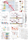
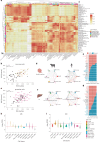
Fig. 1. CattleCA.
a, Overview of the CattleCA data, analysis and its application. b, Schematic diagram of 59 cattle tissues collected in this study. The numbers of samples and cells/nuclei per tissue are shown in parentheses. c, Uniform manifold approximation and projection (UMAP) visualization of CattleCA colored according to the different cell types. All cell types are categorized into seven cell lineages; cell type annotation and the corresponding cell number are provided in the legend on the right. The figure was created in BioRender.
Fig. 2
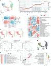
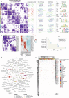
Fig. 2. Heterogeneity of mammary epithelial cells and the relationship with lactation in dairy cows.
a, UMAP plot displaying the subtypes of mammary epithelial cells. b, Expression heatmap for the top 120 DEGs in eight mammary epithelial subtypes, with cell count (top), selected marker genes (left) and significantly enriched Gene Ontology (GO) terms for the clustered module (right). c, Heatmap showing the odds ratios (ORs) of mammary epithelial cell subtypes in each anatomical structure of the mammary gland. d, Box plot showing the lactation gene signature scores for the epithelial cell subtypes in the mammary gland (n = 4). The y axis represents the module score derived from genes associated with lactation-related processes; the x axis represents cell subtypes. The central band in the box plot represents the median, the box boundaries represent the 25% to 75% percentiles, and the whiskers extend 1.5 times the interquartile range (IQR). The red dashed line indicates the baseline lactation score (0). e, Expression levels of immune genes in different mammary epithelial cell subtypes. Dot size represents the expressed percentage; the color represents the average expression of genes in each subtype. f, Heatmap showing the mammary epithelial cell subtypes significantly associated with MY, FY and PY. *FDR < 0.05, **FDR < 0.01. g, Outgoing signaling pathways in mammary epithelial cell subtypes. Dot size represents the percentage contribution. h, Specific outgoing communication signaling patterns in ME6. Dot size represents the percentage contribution. i, Specific ligand–receptor pairs in ME6-specific outgoing communication pathways. Dot size represents the P significance level; dot color represents the maximum communication probability. j, Expression levels of genes in the oxytocin signaling pathway in different mammary epithelial cell subtypes. Dot size represents the expressed percentage; dot color represents the average expression of genes in each subtype.
Fig. 3
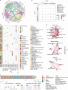
Fig. 3. Heterogeneity of immune cells across cattle tissues.
a, Bar chart displaying the number and proportion of 29 immune cell types in 58 tissues. The scatter plot represents the Shannon entropy values of immune cells in each tissue, with higher values indicating higher diversity. b, Heatmap showing the Pearson correlation of gene expression levels for each immune cell type, calculated based on the top 1,000 genes with the largest s.d. c, t-distributed stochastic neighbor embedding (t-SNE) visualization of annotated cell subtypes of myeloid cells, with cells color-coded according to subtype. d, Heatmap highlighting the average regulatory activity z-score of key TFs in 247 TFs that regulate the differentiation and maintenance of APC subtypes. e, Pseudotime trajectory analysis of monocyte and macrophage subtypes, with cell states colored on the trajectory tree. f, Statistical analysis of monocyte and macrophage subtype composition in each state. g, Heatmap showing the changes in gene expression of representative DEGs (q < 1 × 10−4) in pseudotime series, and GO enrichment analysis of DEGs reclustered into four clusters (bottom left). h, Representative pseudotime trajectory of marker genes in microglia across different states. Source data
Fig. 4
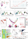
Fig. 4. Epithelial cell heterogeneity and the interaction with immune cells.
a, Expression heatmap for the top 50 upregulated DEGs in 24 epithelial cells of 15 selected gastrointestinal tissues, showing significant Kyoto Encyclopedia of Genes and Genomes (KEGG) pathways for the clustering module (left), specific TFs (middle) and corresponding tissue anatomical structures and cellular composition (right). b, Volcano plot illustrating the DEGs between paratuberculosis-seropositive and healthy cattle. DEGs were identified based on FDR < 0.05 and log2(fold change) > 1 using edgeR’s two-sided exactTest. c, Box plot showing the module scores of 17 disease-associated and 56 health-associated upregulated genes in epithelial cells of the intestine (n = 5), calculated using the AddModuleScore of Seurat. The central band in the box plot represents the median, the box boundaries represent the 25% to 75% percentiles, and the whiskers extend 1.5 times the IQR. A two-sided Wilcoxon rank-sum test was used. d, Bubble plot showing ligand–receptor pairs between GCs and immune cells, which were shared in at least four intestinal segments. e, t-SNE visualization of seven GC subtypes. Cells are color-coded according to cell subtype. f, Heatmap showing the top 20 upregulated DEGs and their markers for each GC subtype. The bar chart displays their GO terms and KEGG pathways using single-sample gene set enrichment analysis (GSEA). g, Heatmap representing the tissue distribution of GC subtypes; ORs were calculated and used to indicate preferences. **OR > 1.5 and FDR < 0.01. h, Heatmap displaying the signature scores of tuberculosis and paratuberculosis candidate genes from the Animal Quantitative Trait Loci (QTL) and KEGG databases across GC subtypes. i, Scatter plot highlighting tissues and GC subtypes associated with human IBD and CD using GWAS enrichment analysis with LDSC. j, Violin plot representing the expression of key ligand–receptor genes in GC subtypes and immune cells.
Fig. 5
Fig. 5. Heterogeneity of hepatocytes and its role in lactation.
a, UMAP plot of ten hepatocytes subtypes (HPE0–9), with cells color-coded according to subtype. b, Bubble plot displaying the standardized expression of the marker genes of each cell subtype. c, Pearson correlation of hepatocyte subtypes between cattle, humans and mice, calculated based on 92 spatial localization marker genes in human and mouse hepatocytes. A two-sided Wilcoxon rank-sum test was used. *Padj < 0.05, **Padj < 0.01, ***Padj < 0.001. d, Heatmap showing the GO terms and KEGG pathways of upregulated DEGs from each hepatocyte subtype using single-sample gene set variation analysis. e, UMAP plot displaying key cell types identified using GWAS enrichment analysis with scPagwas, integrating GWAS data with MY, FY and PY. The P value was calculated using a two-sided hypergeometric test, adjusted using multiple comparisons (FDR). f, GSEA of GO terms was performed using the fgsea package. Genes were ranked according to the log2(fold change) of DEGs in HPE2; a one-sided permutation test with 10,000 iterations was used to calculate the P values. g, UMAP plot depicting the developmental trajectory of hepatocyte subtypes over a pseudotime series. h, Heatmap showing the changes in gene expression of representative DEGs (q < 1 × 10−4) in the pseudotime series, and GO enrichment analysis of DEGs reclustered into two clusters (bottom left). i, Volcano plot illustrating the DEGs between cattle and human hepatocytes. j, GO terms of DEGs between cattle and human hepatocytes. The P value was calculated using a one-sided hypergeometric test and adjusted for multiple comparisons (FDR). ECM, extracellular matrix; NES, normalized enrichment score; TGFβ, transforming growth factor beta.
Fig. 6
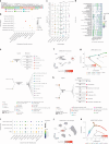
Fig. 6. Monogenic disorders related to cell types.
a, Cell type correlation based on the expression levels of highly expressed genes (z-score > 0.75) specific to each of the 129 cell types using Euclidean distance. b, Correlations between seven cell lineages and ten disorder domains. Dot size represents log2(OR) values; the color represents the significant levels of a two-sided Fisher’s test. c, Expression level of nine epithelium-specific skin disorder genes in different cell lineages. The star above the violin represents a significant expression difference between this cell lineage and epithelial cells based on a two-sided Wilcoxon rank-sum test. The central band in the box plot represents the median, the box boundaries represent the 25% to 75% percentiles, and the whiskers extend 1.5 times the IQR. d, Expression levels of nine epithelium-specific skin disorder genes in different epithelial cell types. Dot size represents log10 counts per million (CPM) values and the color represents the z-score of genes in each cell type. e, Putative cellular communication between epithelial cells and other cell types implicating skin disorder genes. Cell types (inner color) in different tissues (outer color) are connected by putative interactions (dotted lines) between a ligand (left square) expressed in one epithelial cell and a receptor (right square) expressed in the other cell types. Bold italic indicates a skin-disorder-related gene. f, The expression distribution of LAMA3 in the placenta primarily occurs in UTCs; it is associated with the skin disorder EB. g, Reclustering and trajectory analysis of UTCs in the placenta. The distribution of LAMA3 expression (log10(CPM)) in different cell subtypes through the trajectory line is shown. h, Putative cellular communication between UTC subtypes and other cell types in the placenta. i, Expression levels of muscle disorder genes in different muscle cell types. j, Expression distribution of MYBPC1 in the esophagus. k, Reclustering and trajectory analysis of SMCs in the esophagus. The distribution of MYBPC1 expression (log10(CPM)) in different cell subtypes through the trajectory line is shown. Source data
Fig. 7
Fig. 7. Enrichment between cell types and complex traits.
a, Correlations between cell lineages and complex traits. The heatmap represents the significant level of each cell lineage with traits. Top, The gray squares represent trait groups. b,c, Correlations between milk production (b) and male fertility (c) traits and cell types. Each circle represents a cell type–trait association. The x axis represents cell lineages sorted alphabetically. df, Correlation between cell types and traits in tissues. d, Cerebral cortex. e, Esophagus. f, Testis. The violin plot presents the TRS for each cell type with the corresponding trait. The red line represents the significance level (−log10(P)) for each cell type with the corresponding trait under a two-sided hypergeometric test. g, Active KEGG pathways in the top significant trait-relevant cell types. Dot size represents the significance level (−log10(P)) of pathway activity; the dot color represents the significance level (FDR) after multiple comparisons of the enrichment between active pathway genes and top trait-relevant genes in the given cell type. Source data
Fig. 8
Fig. 8. Cross-species comparisons and disease associations.
a, MetaNeighbor area under the receiver operating characteristic (AUROC) values calculated using shared genes of the same cell types in cattle and humans. b,c, Regulon specificity score (RSS) of TFs in immune (b) and epithelial (c) cells. The scatter plot represents TFs that were identified in both cattle and humans; the x axis shows the RSS of each TF in cattle and the y axis shows the RSS in humans. Representative TFs were considered significant (RSS > 0.25) and are color-labeled. The r represents the Pearson correlation coefficient (PCC) measuring the linear association of RSS values between the two species. The corresponding P value was calculated based on a two-sided t-test and adjusted for multiple comparisons (FDR). dg, Cellular communication in the small intestine (d,e) and liver (f,g) between cattle and humans. The network diagram shows the analysis of cellular communication between cattle and humans; the column stacking diagram represents the proportion of the two species in the signaling pathway. Red represents pathways significantly upregulated in cattle, while blue represents pathways significantly upregulated in humans; black represents pathways that are not significant in either cattle or humans. h,i, Heritability enrichment of cell types for orthologous marker genes with MS (h) and IBD (i). The y axis represents the significance level (−log10(P)) of heritability enrichment and the x axis represents all cell types identified in the corresponding cattle tissue. P values were derived from the heritability enrichment analysis and adjusted for multiple comparisons (FDR). The red dashed line represents the significance threshold of FDR = 0.05. The figure was created with BioRender.com. Source data
Extended Data Fig. 1
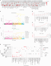
Extended Data Fig. 1. Transcriptional regulatory landscape across tissues and cell types in cattle.
(a) The connection specific index (CSI) matrix consisting of 156 regulons is divided into 6 modules (left). UMAPs illustrate the average AUCell score distribution in different regulon modules (in different colors). Wordcloud plots highlight the top 10 cell lineages and tissues exhibiting the highest average regulatory activity for each submodule, where color intensity and font size reflect the regulatory activity levels. Representative TFs and their corresponding binding motifs are also displayed (right). (b) Zoomed-in view of module 5 (including 23 regulons) identifies sub-module structures and their average regulatory activity in different cell types. (c) Bar plot shows the number of TFs regulating each cell lineage. The x-axis indicates TF counts, color-coded by category: cell-type specific TFs (active in a single cell type), lineage-specific TFs (active across multiple cell types within the same lineage), multi-lineage TFs (active across multiple lineages), and broadly active TFs (tau ≤ 0.85). (d) The TF regulatory network containing 123 highly specific TFs (tau > 0.85) exhibits tissue-specific, cell-type-specific, single-lineage-specific, and multi-lineage-regulated TFs. (e) Heatmap illustrates regulatory activity differences of 682 TFs between males and females. The color gradient indicates the difference in average regulon activity, highlighting a portion of the 45 regulons with an absolute difference greater than 0.15. To ensure unbiasedness, we retained 61 cell types with counts exceeding 50 in both males and females across 19 tissues, where at least one sex exhibited regulatory activity ( > 25% of cells showing regulatory activity).
Extended Data Fig. 2
Extended Data Fig. 2. Dynamics of cell-cell communication networks in cattle.
(a) Chordal diagram of the integrated cell lineage–cell lineage interaction network. (b) Scatter plot shows the interaction intensity and number of cellular interactomes among major cell lineages, clustered by the number of interactions. (c) Scatter plot shows 19 highly reliable secreted ligand-receptor pairs (probability > 0.2, p-value < 0.05, permutation test) between cell types in different tissues. Colors represent the probability of cellular communication. Red boxes represent tissue-specific ligand-receptor pairs. (d) Comparative analysis of cellular communication strength between cell types in the cerebral cortex, medulla oblongata, and cerebellum of males and females. To ensure unbiased comparison, we retained cell types with more than 50 cells in both sexes for each tissue and downsampled to ensure equal numbers of males and females for each cell type. The red line indicates increased communication in females, while the blue line indicates increased communication in males. (e) Scatter plot shows 6 highly reliable ligand-receptor pairs (probability > 0.2 and p-value < 0.05 after permutation test in males or females) involving excitatory neurons as receptors or ligands in the nervous system.
Extended Data Fig. 3
Extended Data Fig. 3. Single-cell atlas of spermatogenic cells in Holstein cattle.
(a) UMAP visualization of 14 annotated spermatogenic subtypes, with cells color-coded according to subtypes. (b) Bubble plot displays the standardized expression of marker genes for each spermatogenic subtype. (c-d) Box plots show the number of expressed genes (c) and normalized UMI counta (d) in spermatogenic subtype at different differentiation stages in testis (n = 6). The central band in the boxplot represents the median, the box boundaries represent the 25% to 75% percentiles, and the whiskers extend 1.5 × the interquartile range. (e) GWAS enrichment analysis shows spermatogenic subtypes significantly associated with the semen volume per ejaculate (SVPE), the initial sperm motility (SMOT), the sperm concentration per ejaculate (SCPE), the number of sperm per ejaculate (NSPE) and the number of motile sperm per ejaculate (NMSPE). *, **, and *** indicates FDR < 0.05, 0.01, and 0.001, respectively. (f) Pseudotime trajectory analysis of spermatogenic subtypes and cell states colored on the trajectory tree. Pie chart shows the proportion of subtypes on SPT_1 and SPT_2. (g) Heatmap shows the variation of regulatory activity of the 43 regulons over pseudotime, which were identified through rank-sum tests based on pseudotime and regulator activity (r > 0.2, FDR < 0.05). (h) Heatmap shows the changes in gene expression of representative DEGs (FDR < 1e-4) in pseudotime series, and GO enrichment analysis of DEGs re-clustered into four clusters (right). P-value was calculated using a one-sided hypergeometric test and adjusted by multiple comparisons (FDR). (i) Volcano plot illustrates the DEGs between SPT_1 and SPT_2. (j) Bar plot displays GO terms with up-regulated DEGs in SPT_1 and SPT_2. The p-value calculation is the same as in Figure h. (k) Bubble plot displays the standardized expression of key gene sets involved in spermatogenesis for SPT_1 and SPT_2.
Extended Data Fig. 4
Extended Data Fig. 4. Functional differences between myeloid cell subtypes.
(a) Bubble plot displays the standardized expression of marker genes for each cluster of myeloid cells. (b) Heatmap represents the tissue distribution, with odds ratios (OR) calculated and used to indicate preferences. * indicates OR > 1.5 and FDR < 0.05; ** indicates OR > 1.5 and FDR < 0.01. Bar chart shows the composition proportion of myeloid cell subtypes. (c) Heatmap displays the expression levels of up-regulated DEGs in myeloid cells in 40 different tissues, divided into 10 modules. (d) Network diagram represents the GO terms enriched by genes from each module.
Extended Data Fig. 5
Extended Data Fig. 5. Heterogeneity of macrophages across tissues.
(a) Heatmap shows the average regulatory activity z-score of 245 TFs of macrophages in 29 tissues. (b) Heatmap represents the key metabolic pathways enriched by macrophage subtypes. (c) Box plot shows the gene signature scores of MHC I (21 genes) and MHC II (26 genes) in macrophage subtypes (sample size = 11), calculated by AddModuleScore in Seurat 4.0.6. The central band in the boxplot represents the median, the box boundaries represent the 25% to 75% percentiles, and the whiskers extend 1.5 × the interquartile range. Statistical test was calculated based on Wilcoxon test with two-sided. The same sample size and statistical test were applied to the following Figures d-f. (d) Box plot shows the scores of M1 (14 genes) and M2 (16 genes) in macrophage subtypes, calculated by AddModuleScore of Seurat. (e) Box plot shows the scores of M1 and M2 in macrophage in 40 tissues, calculated by AddModuleScore of Seurat. (f) Box plot shows the pseudotime of each macrophage subtype.
Extended Data Fig. 6
Extended Data Fig. 6. Heterogeneity of B/plasma cells across tissues.
(a) UMAP visualization of all annotated major cell subtypes of B/plasma cells, with cells color-coded according to cell subtypes. (b) Bubble plot displays the standardized expression of marker genes for each B/plasma cell subtype. (c) Heatmap shows Pearson correlation of gene expression levels for each B/plasma cell type, calculated based on the top 1,000 genes with the largest standard deviation. (d) Heatmap represents the tissue distribution of B/plasma cell subtype, odds ratios (OR) were calculated and used to indicate preferences. * indicates OR > 1.5 and FDR < 0.05; ** OR > 1.5 and FDR < 0.01. (e) Bar chart shows the composition proportion of B/plasma cell subtypes of each tissue. (f) Heatmap shows the scores of gene signatures in B/plasma cell subtypes, calculated by AddModuleScore of Seurat. (g) Heatmap shows the average regulatory activity z-score of key TFs in 238 TFs that regulate differentiation and maintenance of B/plasma cell subtypes. (h) Trajectory analysis of B/plasma cell subtypes. (i) Curve plot shows the dynamic expression scores for high-affinity, low-affinity, activated, exhaustion, BCSR and CSR signatures in cells of four different differentiation pathways, respectively, along the inferred pseudotime. The center line indicates linear fit, and shaded lines indicate a 95% confidence interval. (j) Curve plot shows the dynamic expression scores for TFs in cells of four different differentiation pathways, respectively, along the inferred pseudotime. The center line indicates linear fit, and shaded lines indicate a 95% confidence interval.
Extended Data Fig. 7
Extended Data Fig. 7. Comparison of Species between bovine and human stomach.
(a) UMAP visualization of annotated cell subtypes of the human stomach and four cattle stomachs (abomasum, rumen, reticulum, and omasum). (b) The tree chart shows the hierarchical clustering of tissues based on gene expression levels of the top 1000 genes with the largest standard deviation (left), the scatter plot shows the number of cell types (middle), and the stacked bar chart shows the proportion of epithelial cells (right). (c) Network diagram shows the KEGG pathway enriched by up-regulated DEGs in each tissue. P-value was calculated based on hypergeometric test with one-sided. (d) Heatmap shows the TFs with the highest differences in regulatory specificity scores between each tissue in epithelial cells. (e) Trajectory analysis of epithelial cells in cattle stomach with cell state colored on the tree (upper left), the pie chart displays the cell type composition of each state (upper right), and tissue colored on the tree (bottom). (f) Pseudo-heatmap illustrates the dynamics of DEGs during cell fate at branch point 1 (left), and KEGG enrichment analysis of DEGs clustered into three clusters (right). P-value was calculated based on hypergeometric test with one-sided. (g) Pseudo-heatmap illustrates the dynamics of DEGs during cell fate at branch point 2 (left), and KEGG enrichment analysis of DEGs clustered into four clusters (right). P-value was calculated based on hypergeometric test with one-sided.
Extended Data Fig. 8
Extended Data Fig. 8. Heterogeneity of spinous cells across three forestomaches.
(a) Scatter plot shows the optimal soft threshold or power to make the constructed network more consistent with the scale-free topology. (b) Hierarchical clustering diagram shows the construction of a co-expression network based on the optimal soft threshold, dividing the genes into different modules to draw a gene clustering tree. The upper part is the hierarchical clustering tree of genes, and the lower part is the gene module. (c) Correlation bubble diagram depicts the associations between modules and spinous cell subtypes, as well as the GO terms of selected modules. P-value was calculated based on hypergeometric test with one-sided. (d) Module network diagram of the top 25 hub genes in the salmon, magenta, and greenyellow modules. (e) TF regulatory network diagram of the salomon, magenta, and greenyellow modules in the rumen.
Extended Data Fig. 9
Extended Data Fig. 9. Expression level, cell communication, and functional enrichment for skin disorder-related genes.
(a) Expression levels of 27 skin disorder-related genes in different epithelial cell types. The dot size represents log10CPM values and the color represents the z-score of genes in each cell type. The skin disorders corresponding to the genes are denoted in parentheses. (b) The expression distribution of LAMC2 in the duodenum primarily occurs in intestinal progenitor cells, which is associated with the skin disorder epidermolysis bullosa (EB). (c) Trajectory analysis of uninucleate trophoblast cells (UTCs) in the placenta. The dark to light blue represents the potential differentiation direction of UTCs. (d) UMAP of UTC subtypes in the placenta. (e) Cellular communication between UTC subtypes and other cell types in the placenta. The line thickness represents the communication strength between two cell types. (f) Expression levels and enriched GO terms of marker genes in UTC cell subtypes. The bubble plot shows the marker genes with the top three log2FoldChange values. Bubble size corresponds to the percentage of cells expressing each gene, and color reflects the average gene count in each subtype. GO terms in each subtype are listed (right). P-value was calculated based on hypergeometric test with one-sided.
Extended Data Fig. 10
Extended Data Fig. 10. Correlations between cell types and traits.
Correlations between cell types and coat color (a), IgG (b), and body and health (c) traits. Each circle represents a cell-type-trait association. The x-axis represents cell lineages sorted in alphabetical order.

References

    1. Bruford, M. W., Bradley, D. G. & Luikart, G. DNA markers reveal the complexity of livestock domestication. Nat. Rev. Genet.4, 900–910 (2003). - PubMed
    1. Hawkins, J. W. et al. High-yield dairy cattle breeds improve farmer incomes, curtail greenhouse gas emissions and reduce dairy import dependency in Tanzania. Nat. Food3, 957–967 (2022). - PubMed
    1. Hu, Z.-L., Park, C. A. & Reecy, J. M. Bringing the Animal QTLdb and CorrDB into the future: meeting new challenges and providing updated services. Nucleic Acids Res.50, D956–D961 (2021). - PMC - PubMed
    1. Liu, S. et al. A multi-tissue atlas of regulatory variants in cattle. Nat. Genet.54, 1438–1447 (2022). - PMC - PubMed
    1. Han, X. et al. Construction of a human cell landscape at single-cell level. Nature581, 303–309 (2020). - PubMed

LinkOut - more resources