. 2025 Sep 19;16(1):8272.
doi: 10.1038/s41467-025-62126-w.

Genetic architecture of plasma metabolome in 254,825 individuals

Affiliations

Genetic architecture of plasma metabolome in 254,825 individuals

Yi-Xuan Qiang et al. Nat Commun. .

Abstract

Circulating metabolites are crucial to biological processes underlying health and diseases, yet their genetic determinants remain incompletely understood. Here, we investigate the genetic architecture of nuclear magnetic resonance-based metabolomics, analyzing 249 metabolic measures and 64 biologically plausible ratios in 254,825 participants. We conduct a genome-wide association study (GWAS) identifying 24,438 independent variant-metabolite associations across 427 loci, with effect sizes highly concordant with 19 previous studies. Fine-mapping pinpoints 3610 putative causal associations, 785 of which are novel. Additionally, we utilize whole exome sequencing data and uncover 2948 gene-metabolite associations through aggregate testing, underscoring the importance of rare coding variants overlooked in GWAS. Integrating our findings with disease genetics reveals potential causal associations, such as between acetate levels and the risk of atrial fibrillation and flutter. Collectively, this study delineates the complex genetic architecture of the plasma metabolome, offering a valuable resource for future investigations into disease mechanisms and therapeutic strategies.


Conflict of interest statement

Competing interests: The authors declare no competing interests.

Figures
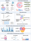
Fig. 1
Fig. 1. Graphical summary of the study workflow and results.
Created in BioRender. Qiang, Y. (2025) https://BioRender.com/b5b9nh8. Abbreviations: GWAS genome-wide association study, HMDB the Human Metabolome Database, KEGG the Kyoto Encyclopedia of Genes and Genomes Pathway database, LDSC linkage disequilibrium score regression, MR Mendelian randomization, WES whole exome sequencing.
Fig. 2
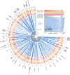
Fig. 2. Overview of the identified loci associated with 249 metabolic measures and their pleiotropy effects.
Top right inset, the number of trait-associated loci for each metabolite, grouped by their pleiotropy type. Main panel, Fuji plot illustrating the GWAS results of 249 metabolic measures across 9 categories. Each dot represents a locus-trait association, with larger dots indicating pleiotropic associations. Each radial line connects all dots for an intercategorical pleiotropic locus, which are associated with traits from more than four categories, with a locus symbol. Source data are available in Supplementary Data 8.
Fig. 3
Fig. 3. Generation of 64 metabolite ratios and visualization of their GWAS results.
a The chord diagram depicts the generation of 64 biologically plausible metabolite ratios. Each connection represents a pathway of ratio derivation. Amino acids are denoted by yellow nodes, while metabolites in other categories are represented by blue nodes. The size of each node represents the number of metabolite ratios involving that metabolite. The darker the connecting lines, the higher the number of significant genome-wide associations for the metabolite ratios. Source data are available in Supplementary Data 5. b Examples of metabolite pairs sharing common proteins as documented in the HMDB database. Source data are available in Supplementary Data 5. c Manhattan plot displaying the GWAS results for 64 metabolite ratios. Each point represents a trait-associated locus, with its corresponding −log10(P) value on the y-axis and its chromosomal position on the x-axis. Statistical analysis was performed using an additive model of linear regression implemented in PLINK2.0. Significant variants (two-sided P < 1.6 × 10−10, derived from Bonferroni correction for 313 metabolic traits) are shown in colors, while insignificant ones are displayed in gray. The −log10(P) values are capped at 300. See abbreviations in Supplementary Data 2 and 5.
Fig. 4
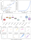
Fig. 4. Genetic architecture of metabolites and derived ratios.
a Correlation between the number of metabolites and the number of significant genetic associations (Bonferroni correction for total metabolic traits, 5 × 10−8/313 = 1.6 × 10−10) within ten major categories. Data are plotted on a log scale, with each point representing a unique category of metabolites. Source data are available in Supplementary Data 3. b Distribution of the number of associated metabolites per genetic locus, illustrating the pleiotropic effects on metabolite profiles. The x-axis represents the percentage of all loci, while the y-axis quantifies the number of metabolites associated with each locus. See details in Supplementary Data 4 and 8. c Box plots illustrating the heritability estimates for metabolic traits grouped by biochemical categories. Colors distinguish different metabolite categories. Boxes represent the IQR, with the horizontal line indicating the median. Whiskers extend to the most extreme data point that is no more than 1.5 × IQR from the edge of the box, with points beyond representing outliers. The numbers of metabolites for each category are provided in Supplementary Data 2. Source data are available in Supplementary Data 9. d Scatterplots for each biochemical category, illustrating the relationship between the heritability of metabolites and the number of associated genetic loci. The fitted lines were derived from a linear regression in each facet, with corresponding Spearman’s correlation coefficients and two-sided P values provided, if applicable. See details in Supplementary Data 4 and 9.
Fig. 5
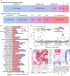
Fig. 5. Summary of fine-mapped associations across 313 metabolic traits.
a FINEMAP summary. At the top, the numbers of association signals identified in each region that contains at least one independent association are shown. This includes a single signal in 5940 regions and 2–10 signals in 8721 regions across 313 metabolites. At the bottom, the numbers of candidate causal variants in the credible set with ≥ 99% posterior probability are displayed. For example, 6620 signals were mapped to a single variant in the credible set across 313 traits. Source data are available in Supplementary Data 10. b Breakdown of the number of fine-mapped variants. Red bars represent causal variants with a posterior probability greater than 0.99. Blue bars represent causal variants with a posterior probability between 0.95 and 0.99. The x-axis shows the number of fine-mapped causal variants, and the y-axis indicates the total variance explained by those variants with a posterior probability greater than 0.99. The 40 traits with the highest total variance explained are displayed. Source data are available in Supplementary Data 11. c A regional association plot showing the fine-mapping result for XS-VLDL-TG% at the MLXIPL loci, based on GWAS summary statistics. Fine-mapped variants are indicated by black outlined points. Exonic or splicing functional variants are represented as diamonds. Lead variants are highlighted in red. The raw two-sided P values are provided. d Heatmaps of phenotypic (top left inset) and genetic (bottom right inset) correlation structure of cholesterol in lipoprotein subclass particles (left) and the association landscapes of variants associated with degree of unsaturation (right). Pairwise Pearson’s correlation coefficients and genetic correlations (left), and effect estimates for the variant–metabolic trait associations (right) are represented as a color range. Stars indicate genome-wide significance and dots indicate suggestive associations. The variant effect sizes were scaled relative to the absolute maximum effect size in each region. The effect allele for each variant is shown. Each column represents a variant, and each row corresponds to a metabolic measure. Two-sided tests were used for statistical analysis. Source data are available in Supplementary Data 12. See abbreviations in Supplementary Data 2 and 5.
Fig. 6
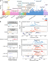
Fig. 6. Genetic insights into metabolite-disease associations.
a Manhattan plot showing the association results from main MR analyses of metabolite-disease pairs with colocalization evidence. Metabolites are labeled on the x-axis, with color coding to distinguish different categories. Statistical analysis was performed using the Wald ratio method for single-instrument cases and the IVW method when multiple instruments were available. For each metabolite category, the four most significant diseases that remained robust in sensitivity analyses and were not significant in reverse MR are labeled. The −log10(P) values are presented on the y-axis, which is capped at 15. Significance thresholds are marked by a blue dashed line at P < 0.05 and a red dashed line indicating corrections for multiple testing (FDR–corrected Q < 0.05, equivalent to P < 2.09 × 10−5). Arrows reflect the impact on disease risk per unit increase in metabolic trait, with upward arrows indicating increased risk and downward arrows suggesting decreased risk. Source data are available in Supplementary Data 26. b Forest plots depicting results for metabolite-disease pairs of interest. Odds ratio estimates (central points), 95% confidence intervals (error bars) and two-sided P values were derived from two-sample MR analysis using the IVW method. An asterisk (*) indicates one standard deviation of the log-normalized value of the metabolic traits. Source data are provided in Supplementary Data 26. c Stacked regional plots illustrating the colocalization (PP.H4 > 0.8) of metabolite-disease pairs. Colocalization analysis was performed using coloc R package with Bayesian approach. A two-color gradient displays LD (R²) with the candidate causal variant pinpointed through colocalization analysis. Blue represents metabolic traits, while red indicates clinical diseases. P-values shown are two-sided and not adjusted for multiple comparisons. Source data are provided in Supplementary Data 25. See abbreviations in Supplementary Data 2 and 5.

References

    1. Johnson, C. H., Ivanisevic, J. & Siuzdak, G. Metabolomics: beyond biomarkers and towards mechanisms. Nat. Rev. Mol. Cell Biol.17, 451–459 (2016). - PMC - PubMed
    1. Qiang, Y.-X. et al. Plasma metabolic profiles predict future dementia and dementia subtypes: a prospective analysis of 274,160 participants. Alz Res. Ther.16, 16 (2024). - PMC - PubMed
    1. Hagenbeek, F. A. Heritability estimates for 361 blood metabolites across 40 genome-wide association studies. 11, 39 (2020). - PMC - PubMed
    1. Sinnott-Armstrong, N. et al. Genetics of 35 blood and urine biomarkers in the UK Biobank. Nat. Genet.53, 185–194 (2021). - PMC - PubMed
    1. Yin, X. et al. Genome-wide association studies of metabolites in Finnish men identify disease-relevant loci. Nat. Commun.13, 1644 (2022). - PMC - PubMed

LinkOut - more resources